
Get all your news in one place.
100's of premium titles.
One app.
Start reading
The Conversation
The Conversation
Lan Anh Nu Ton, Assistant Professor of Marketing, Texas Christian University

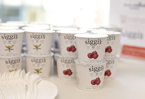
Why more food, toiletry and beauty companies are switching to minimalist package designs

Siggi's Dairy keeps its yogurts simple with white packaging, black text and a dab of color to indicate the flavor. Neilson Barnard/Getty Images

For decades, marketers of consumer goods designed highly adorned packages, deploying bold colors, snazzy text, cartoons and illustrations to seize the attention of shoppers. Conventional wisdom held that with thousands of products competing against one another in the aisles of big box stores and supermarkets, companies needed to do everything in their power to make their products stand out.

But recently, there’s been a move toward simplicity. The stripped-down packaging you’ll often see is reminiscent of the minimalist art that flourished in the 1960s. A reaction against overly complex, representative works, the art that emerged in this period was characterized by spareness and abstraction. Any elements deemed unnecessary were removed.

Sign up to read this article
Read news from 100's of titles, curated specifically for you.
Already a member? Sign in here
Related Stories
Top stories on inkl right now
One subscription that gives you access to news from hundreds of sites
Already a member? Sign in here
Our Picks
Fourteen days free
Download the app
One app. One membership.
100+ trusted global sources.


