Get all your news in one place.
100's of premium titles.
One app.
Start reading
Creative Bloq
Creative Bloq
Technology
Julien Fincker

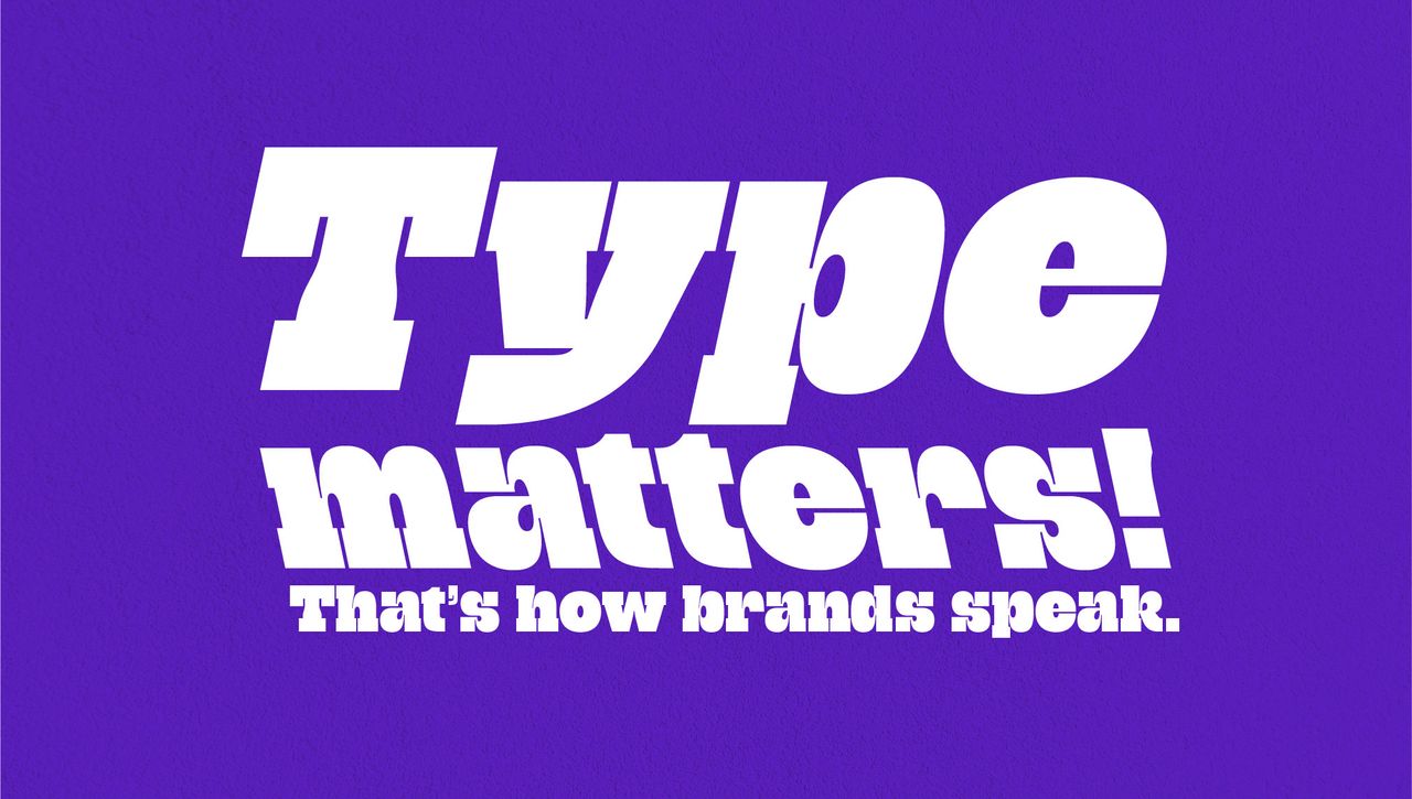
Why typography is so vital to good branding

Typeface examples.

Ask someone what makes a strong brand and you'll probably hear the same answers: a memorable logo, a distinctive colour palette, maybe a clever slogan. Typography rarely makes that list. And yet, it's one of the most powerful branding tools a company has.

A typeface appears almost everywhere a brand exists – on its website, in presentations, social media posts, advertisements, packaging, emails, even invoices. Few design elements are used as consistently or as frequently. That's exactly why typography has such a profound influence on how a brand is perceived. Long before people start reading, they start looking. The shapes of letters already communicate something. They can feel confident or approachable, modern or traditional, technical or human. Typography doesn't just carry words – it shapes how those words are received.

More than just letters

Nestor typeface (Image credit: Julien Fincker)

Branding isn't only about what you say. It's about how people experience what you say. Typography is one of the few visual elements that accompanies almost every interaction with a brand. Campaigns change. Images evolve. Even logos are occasionally redesigned. But the typeface often stays the same for years, quietly becoming part of the brand's identity.

Choosing a typeface is never just a design decision. It's a branding decision

That's why choosing a typeface is never just a design decision. It's a branding decision.

A consistent typographic system creates familiarity. Over time, people begin to recognise a brand not only by its logo or colours but also by the way it looks on the page or on the screen.

Every typeface has a personality

Grantig typeface (Image credit: Julien Fincker)

Typography speaks before the words do. Rounded letterforms often feel warm, approachable and human. Geometric sans-serifs can communicate innovation and clarity. Strong, angular typefaces tend to project confidence, stability and precision. Elegant serif fonts often evoke heritage, craftsmanship or luxury.

None of these associations are accidental. They're rooted in the way we instinctively interpret visual forms. That's why the "best" typeface doesn't exist. The right typeface is simply the one that reflects the personality of the brand. A healthcare company shouldn't look like a heavy machinery manufacturer. A luxury fashion label shouldn't feel like accounting software. Typography helps establish those expectations before a single sentence has been read.

Type gives language a voice

Spitzkant typeface (Image credit: Julien Fincker)

Think of typography as the tone of voice in a conversation.

The exact same sentence can sound warm, confident, playful or authoritative depending on who's saying it and how it's delivered. Typography does the same thing visually. Because type is the visual expression of language.

Royalis typeface (Image credit: Julien Fincker)

A clean, contemporary typeface can make a technology company feel innovative and trustworthy. A handwritten font might make the same company feel less reliable – but could be perfect for an artisan bakery or a children's brand. The words haven't changed. Only the way they are presented has. That's why typography doesn't simply support a message. It becomes part of the message itself.

Consistency creates recognition

Finador typeface (Image credit: Julien Fincker)

Strong brands aren't built through one memorable campaign. They're built through repetition. Every interaction adds another layer to the overall perception of a company. When typography remains consistent across websites, presentations, packaging, advertising and social media, it creates a sense of familiarity. And familiarity builds trust.

People may not consciously notice that a brand always uses the same typeface. But they notice when something feels inconsistent. Suddenly the experience feels fragmented, and the brand loses part of its identity. Good typography isn't loud. It works quietly in the background – connecting every touchpoint into one coherent brand experience.

Final thoughts

Marblis typeface (Image credit: Julien Fincker)

Typography is often treated as a finishing touch. In reality, it's one of the foundations of a strong visual identity. The right typeface communicates personality, reinforces values and gives every piece of communication the same recognisable voice.

It helps people understand not only what a brand says, but who that brand is. Because brands don't just speak through words. They speak through type.

Julien Fincker is a judge for this year's Brand Impact Awards. If you have a standout branding project from the last year that you think deserves recognition, you need to enter the BIAs. You have until July 9 to enter and you can do so on the Brand Impact Awards website.

Sign up to read this article
Read news from 100's of titles, curated specifically for you.
Already a member? Sign in here
Related Stories
Top stories on inkl right now
One subscription that gives you access to news from hundreds of sites
Already a member? Sign in here
Our Picks
Fourteen days free
Download the app
One app. One membership.
100+ trusted global sources.