
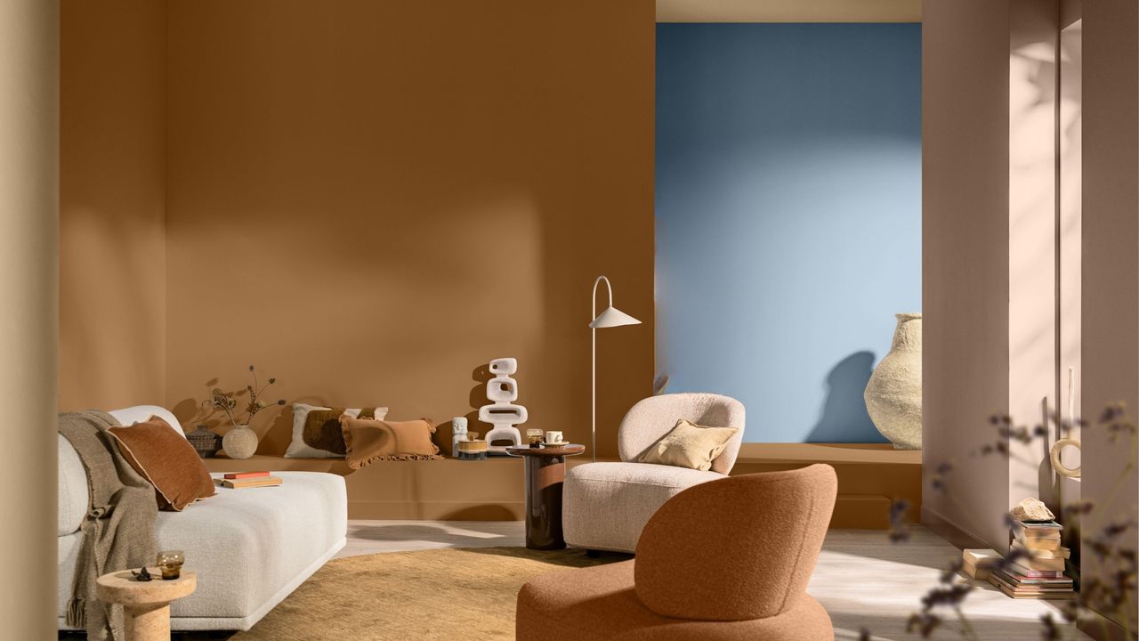
Color brings a home to life, but it can be one of the most intimidating aspects of interior design. Committing to a palette, taking a chance on a bold hue, and learning how to contrast colors effectively takes courage and plenty of nuance. That's why introducing color in small moments feels less intimidating — all you need is a little flash of red or blue to show off your style without drowning a space.
That's the essence of the 'Peek-a-Boo' paint theory, an idea coined by paint brand Dulux. By decorating with color in bite-sized moments it's more approachable, and harnesses the power of hidden or unexpected moments (hence, the name 'Peek-a-Boo'). Think of it like a blue wall visible through the doorway of an orange room, or a red cabinet in an otherwise green kitchen. It's subtle, but effective.