Iconic paint brand Farrow & Ball has announced the winners of its inaugural, and aptly named, competition, Iconic Spaces 2026. Calling on design enthusiasts from around the world, the aim was to select spaces that have used Farrow & Ball paint in creative and inspiring ways, celebrating the positivity of color — a joyful approach to the new season.
Judged by a panel of Farrow & Ball experts, the five categories included: Best Outdoor Space, Best Front Door, Best Use of a Signature Palette, Best Use of an Archive Color, and Best Use of Wallpaper, along with the overall winning space dubbed 'Iconic Space 2026'.
However, due to the strength of the worldwide entries, the judges decided to award two overall winners rather than one. These are the five spaces that came out on top across the five categories, and we can absolutely see why they did — prepare to be inspired.
Overall Winners
Best Use of a Signature Palette
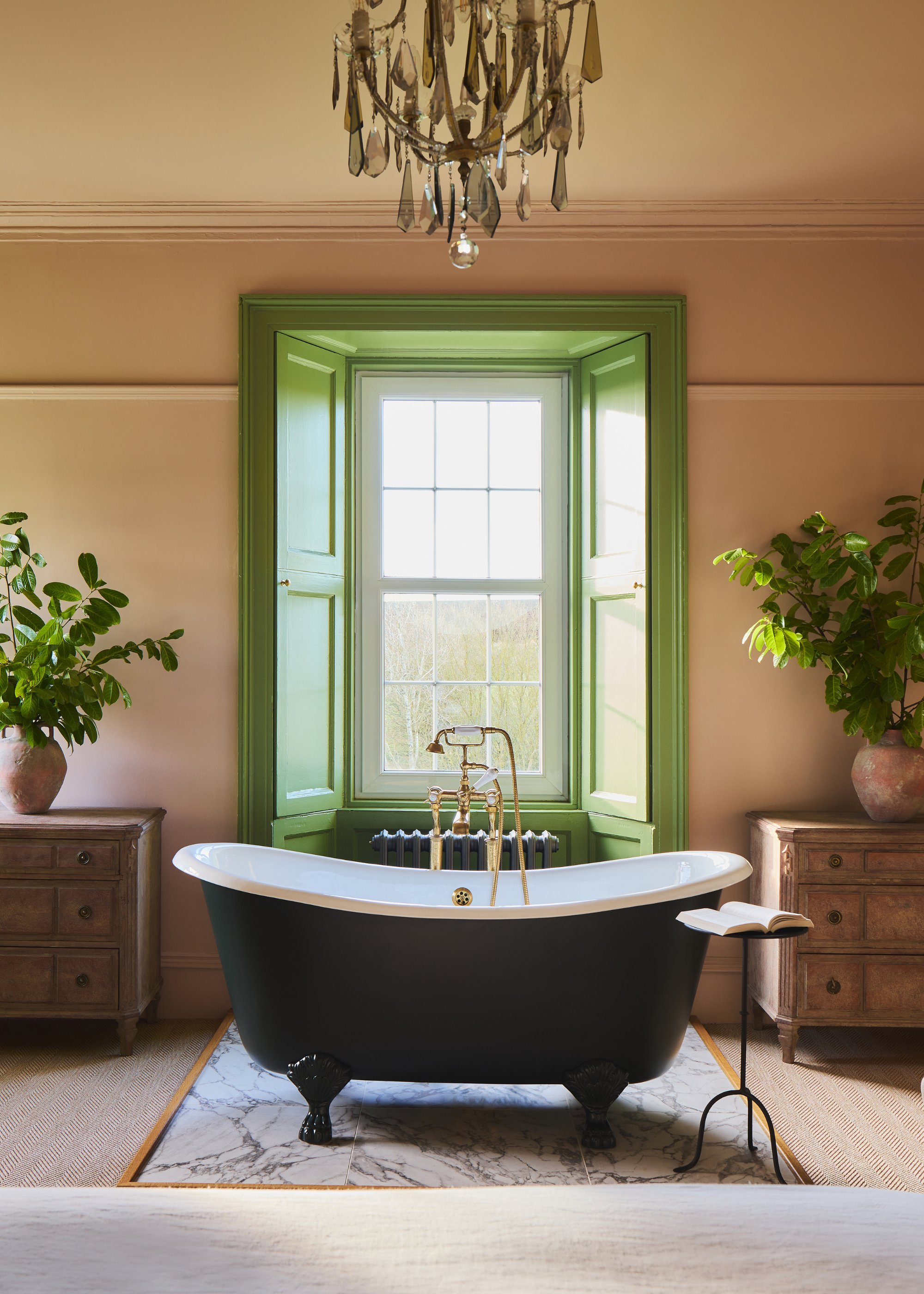
The visually commanding Farrow & Ball green paint on the window recess and shutters frames the view outside, drawing the outdoors in, while also providing a wonderful focal point in the space that brings life to the freestanding bathtub.
Patrick O’Donnell, international brand ambassador for Farrow & Ball, explained, “We were all unanimous that the award should be split to fully represent Farrow & Ball as both a heritage and modern brand.
"We all wanted to dive into the bath and were scenario playing on music and scent to accompany the bubbles." The pop of vibrant color is a wonderful contrast to the otherwise neutral color scheme in the space, and adds depth to the color used on the bathtub.
The owner of this winning space, Jane Manifold, explains, "The Grieves Farmhouse at Banchory Farm has always had an extraordinary story to tell, and my ambition was to honor its heritage while reimagining it for contemporary living. Working with interior designer Ali Heath, we balanced past and present with sensitivity and intent.
A palette of Farrow & Ball colors brings depth and richness that shifts beautifully with the light, creating warmth and a gentle sense of whimsy throughout. The result is a timeless, layered primary bedroom designed to be truly lived in and loved by our guests.”
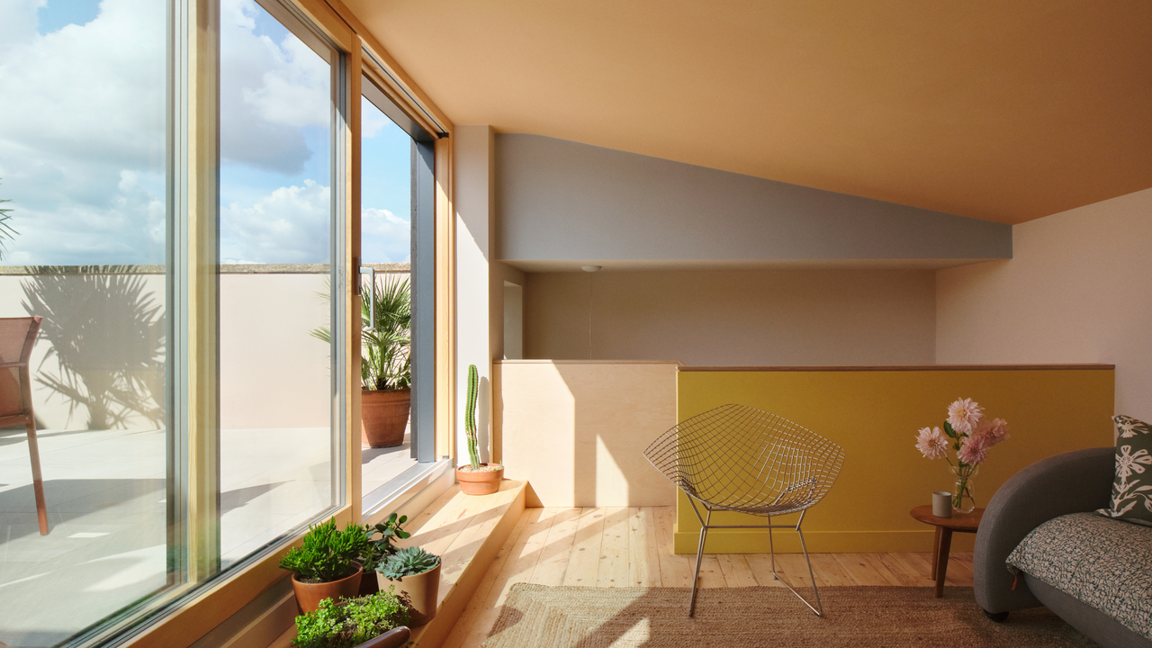
Best Use of an Archive Color
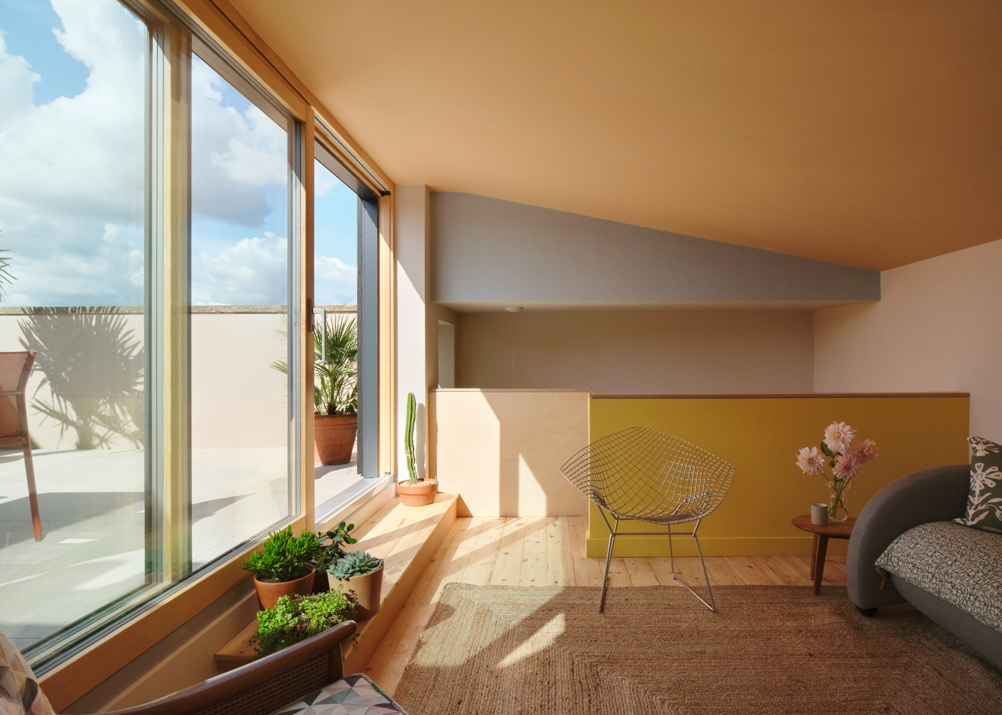
"We loved the way soft pastels played such a striking, yet empathetic role in the structure of the new extension," says Patrick of this winning space in the UK. The joyful colors make the room light and bright, even when the sun isn't shining.
“The skillful layering of our Archive colors in this space can’t help but make one feel happy," adds Joa Studholme, color curator for Farrow & Ball. "The playful use of three colors makes for a sunny and uplifting space created by the juxtaposition of three very different tones, but each with the same intensity."
The winner, Anais Bléhaut, explains, "I chose the California FBKW color scheme to resolve playfully the different panes of the stair volume broken in triangular shapes. I couldn’t select the colors before seeing the surfaces finished and the light; colors are essential sculpting tools in my work; as soon as I saw the space, I thought that was the right place. The roof room was to be my client’s little California, her holiday place away from busy life."
It's a space that radiates warmth, and each tone adds another dimension to the architectural details.
Category Winners
Best Outdoor Space
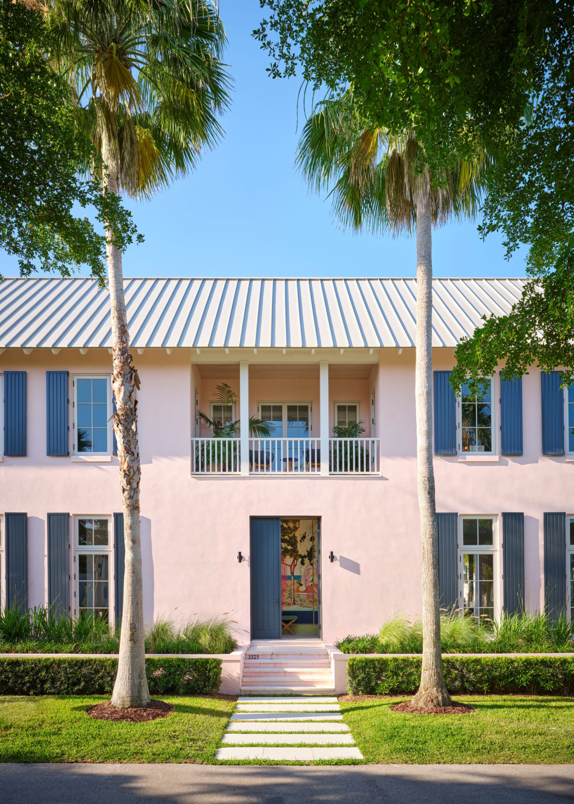
I've only ever seen one other home use pale pink as an exterior wall color, and it was as impactful as this space — it makes its presence known without dominating, and it has a quiet confidence that sparks joy.
“Exteriors have been a major focus for us in the research and development team over the past few years," explains Gareth Hayfield, head of research and development for Farrow & Ball.
"Seeing this color used in such a vast environment, and in such an impactful way, made it an immediate winner for me, evoking a sense of happiness and bringing a smile to my face."
Best Use of Wallpaper
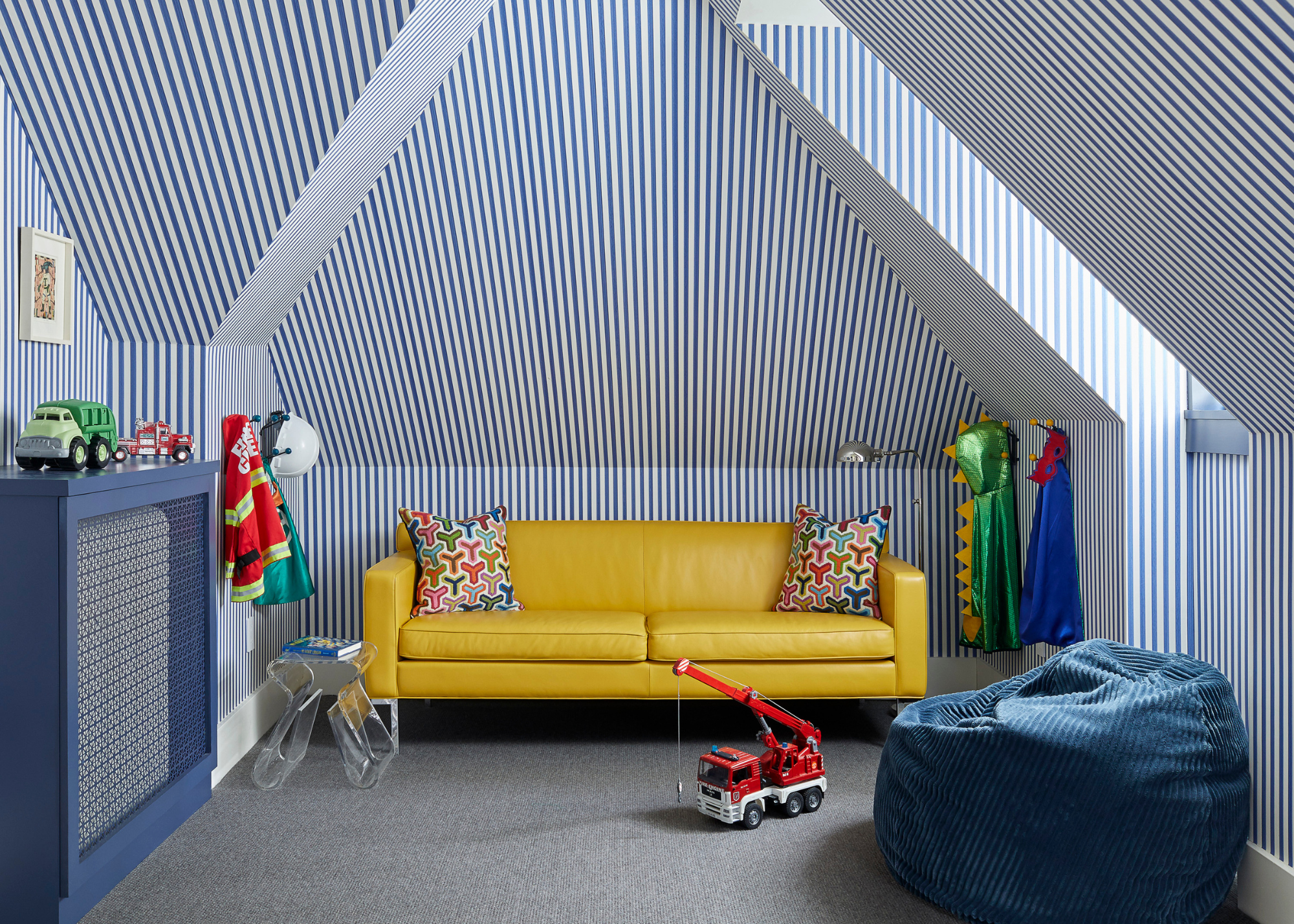
“We loved the bold use of our Closet Stripe wallpaper across every plane. While the tent-like effect draws on a traditional approach, the colorway and architecture gave the space a fresh, modern optimism,” says Charlotte Cosby, creative director of Farrow & Ball.
Hanging wallpaper in this way, with vertical stripes, draws the eye up, elongating the walls and adding dimension and depth to the space — it works with the architecture, rather than against it, creating a bold and playful design.
Best Front Door
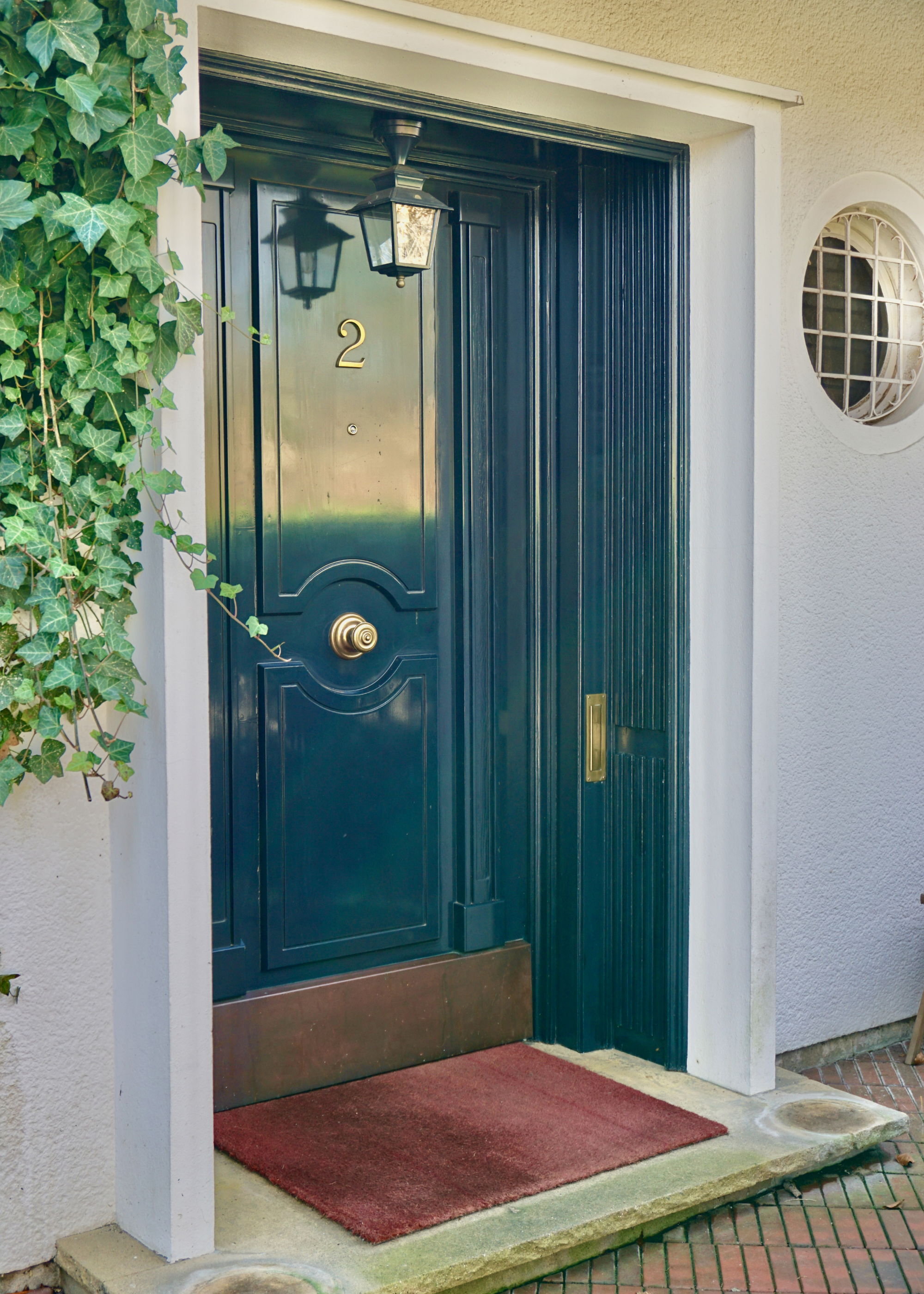
There's something so refined about using this blue-black shade for a front door color. More blue-leaning in this space, it exudes understated drama, and painting the door surround in the same color adds depth and a design moment to delight guests before they even enter the home.
“This statement front door decked in sophisticated Full Gloss grabbed our attention straight away, and we loved how Railings was brought forward onto the door surround for a truly impactful first impression," adds Charlotte.
What I love the most about each of these spaces is how wonderfully unique they all are. And that's the joy of design — creating uplifting, beautiful, character-filled spaces that are uniquely personal, ultimately to be enjoyed by you, but appreciated by others.
If these winning spaces have inspired you to take on some decorating this season, these are the Farrow & Ball colors that designers say work perfectly for kitchens.
And for more color and design ideas, sign up for the Livingetc newsletter, and all the latest will be delivered straight to your inbox.