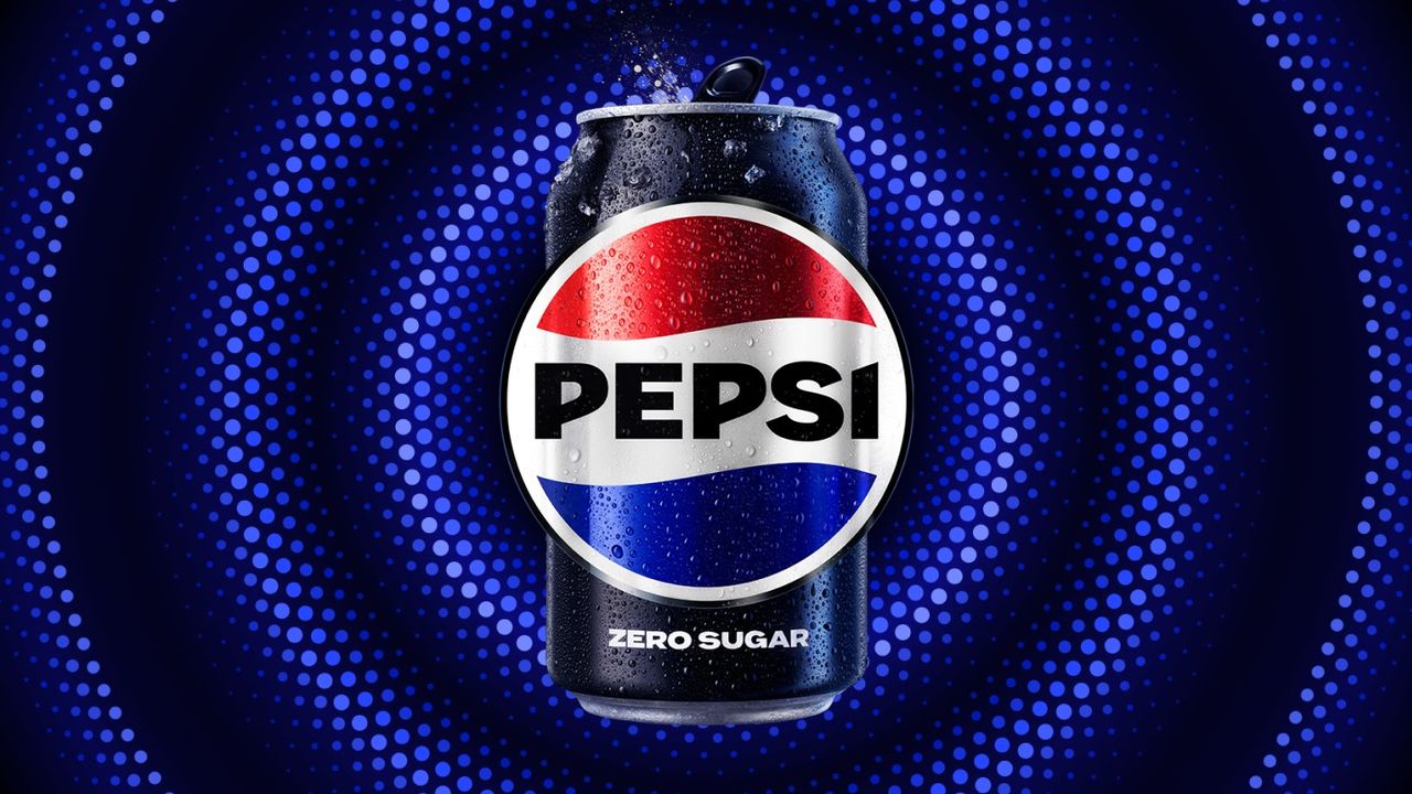
From a medical tonic brewed behind a pharmacist's counter, to one of the biggest and most recognisable brands with one of the best logos on the planet, Pepsi has been on quite a journey since its beginnings in 1893.On the way, its logo has been through more than a few incarnations. The classic red, white and blue Pepsi globe is an instantly recognisable symbol, and the classic Pepsi-Cola wordmark was immortalised in a famous neon sign in New York City – but it wasn’t always quite so smooth. So, let’s take a closer look on a journey through more than a century’s history as we see what we can learn from all the eras of Pepsi’s logo – the good, the bad, and the downright baffling.