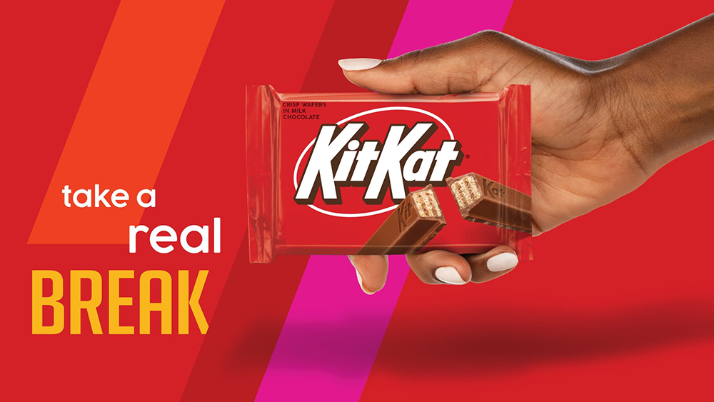
Retro-looking logos seem to be something of a trend at the moment. After Goldman Sachs, the New York Jets and DC Comics turned the clock back on their branding, KitKat has joined the nostalgia party. But in this case, it isn't an old identity making a return. It's a new logo that's designed to look retro while also modernising the brand.
The refresh aims to give KitKat more punch, so it stands out on the shelves while also conveying a nostalgic charm fitting for a brand that's been a household name in the US since the 1970s. The rebrand won't be seen everywhere though: it's exclusively for the US market, where KitKat is owned under licence by Hershey rather than Nestlé.