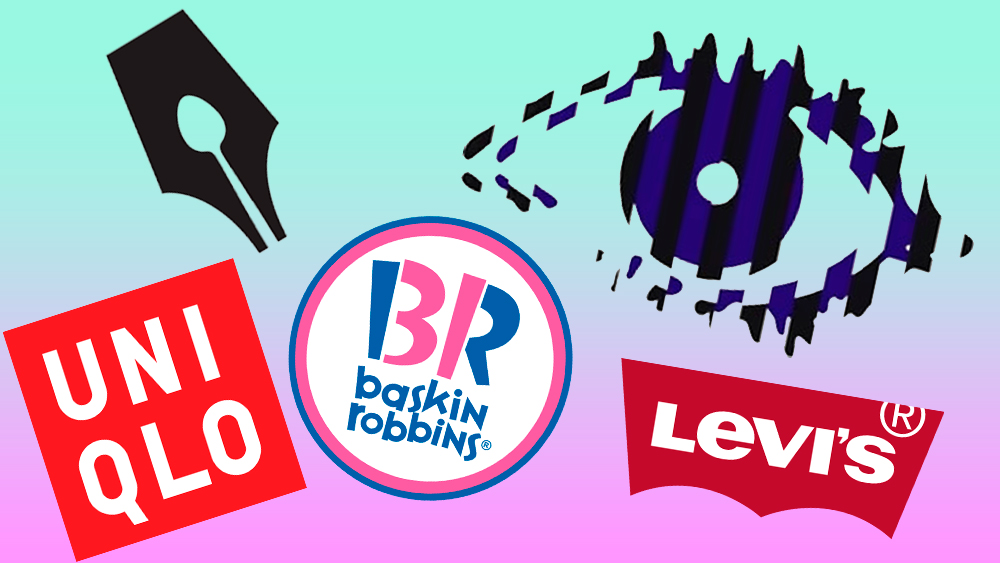
The best logos of the 2000s came at the dawn of a new millennium, when the internet revolution was spreading further and wider. Flashy fashion’s logomania was en vogue, the likes of Facebook (and MySpace) brought a new dimension to networking and consumerism, and there was a proliferation of new tech, including camera phones, and iPods.
Hand in hand with this came a boom in digital marketing, which contributed to the Y2K graphic design aesthetic. We saw vibrant hues, colour gradients, 3D shapes, neons, metallics, thick typefaces and futuristic or novelty elements. At times, it was brash and chaotic and yet many of the era’s logos endured beyond the noughties.