For many, the best ads of the 2000s bring back floods of nostalgia. A snapshot of a unique moment in time, these memorable moments represent the final golden days of TV – a pre-smartphone era when the internet was a clunky wild west with appeal outside of geek circles.
Like the best logos of the 2000s, ads of the era represented a shifting society heading in a new and uncertain direction. In this article, experts from across the design industry look back on the most iconic, entertaining and artful advertising of the 2000s, providing a fascinating window into how both society and marketing evolved through the first 10 years of our current century. For more inspiration from design history, see our collections of best adverts by decade, and the best print ads of all time.
01. Nike: The Morning After (2000)
It's hard to explain to youngsters today just how terrified many of us were of Y2K; the inherent bug that threatened to make our computers malfunction all at once as the clock struck midnight on January 1, 2000. Genuinely, no one knew what would happen. Would planes fall out of the sky, or nuclear reactors melt down? Would all our bank accounts be instantly wiped out? Would civilisation ultimately collapse into barbarism?
As you're probably aware, none of those things took place. However, Nike's 'The Morning After' campaign, directed by Spike Jonze, draws comedy from our deepest fears. To the strains of Auld Lang Syne, a jogger makes his way through an apocalyptic cityscape, entirely unfazed by the carnage going on around him, finally greeting a fellow jogger with a cheery 'Morning!'.
"The ad, created by Wieden+Kennedy Portland, connected us with this shared relief, encouraging us to persevere through uncertainty and adversity," recalls Grace Kim, associate design director at Hook. "Even more, two decades later, it endures as more than an advertisement; it's a cultural symbol, mirroring the fears and hopes of its time. It also reinforces the belief in the strength of determination and perseverance to achieve the seemingly impossible."
02. John West Salmon: Bear Fight (2000)
Back in the 1970s and 80s, the common refrain among British TV viewers was that "the adverts are the best thing on telly". That was partly a comment on low programme standards. But it also reflected how the best adverts were hugely entertaining. In particular, they were often hysterically funny.
That's arguably that's something we seem to have lost over the years; today's ads raise a wry smile at best. But it was still a trend alive and kicking in the 2000s, and here's a good example. Made by Leo Burnett, it involves a representative of John West Salmon stealing food from a bear, in the best traditions of knockabout, physical comedy.
"The brilliance of this ad lies in its weaponisation of the viewing audience," explains Oliver Honess, creative partner at Cubaka."It was launched in November 2000 and is one of the first examples of an ad that was widely downloaded and shared on the internet.
"The budget couldn't have been huge; a seven-foot bear suit, another actor, and a small crew. But the ad punches far above its weight because it takes you on a rollercoaster journey in under 30 seconds. One: 'Shit! What's he doing?!' Two: 'Oh wait…' Three: 'Ha. That's actually pretty funny.' Four: 'I think [friend's name] will enjoy this'. In short, a tactic we now take for granted can trace its family history, at least in part, back to this iconic ad."
03. Metz: Judderman (2000)
Advertisers have long taken inspiration from TV and cinema, often to the point of outright parody or simply copying. But in the 2000s, they spread their net outside of the mainstream and started to gather ideas from more offbeat fair such as independent European cinema.
The first major example of this came in the form of this ad for Metz, a now discontinued Schnapps-based alcopop from Bacardi, made by the now-defunct agency HHCL. Camilla Yates, strategy director at elvis, recalls the impact it made on her at the time.
"'Beware the Judderman my dear, when the moon is fat': the beguiling opening line of my favourite ad of all time is as clear in my memory today as it was when I first saw it, 24 years ago," she says. "A darkly beautiful gothic fairytale of an innocent traveller getting lured into temptation as he wanders through a midnight forest, it's the kind of ad we don't see today."
The commercial was inspired by Czech animator Jan Svankmajer and early cinema such as Nosferatu, she explains. "Shot with a hand-cranked camera on a disused Budapest film set, using double exposures to create dissolves and starring a six-foot-five ballet dancer to play the role of the elegantly elfin Judderman, the spot is as weird as it is ambitious."
From a strategic perspective, she adds, framing the consumption experience as an irresistible 'judder', and then creating a character around that thought, means the appeal of the product remains at the heart of the narrative throughout. "And positioning Metz as a dangerously tempting choice gives it stand-out and allure, versus its syrupy sweet competitors. Overall, this was a sharp-toothed, cunning piece of creative."
04. Harley-Davidson (2002)
"Some ads are good," says Doerte Spengler-Ahrens, non-executive chairwoman at Jung von Matt." Some ads are very good. And then there are ads that are legendarily iconic, because they are never forgotten. Neither by the industry, nor by the consumer. And here's an example."
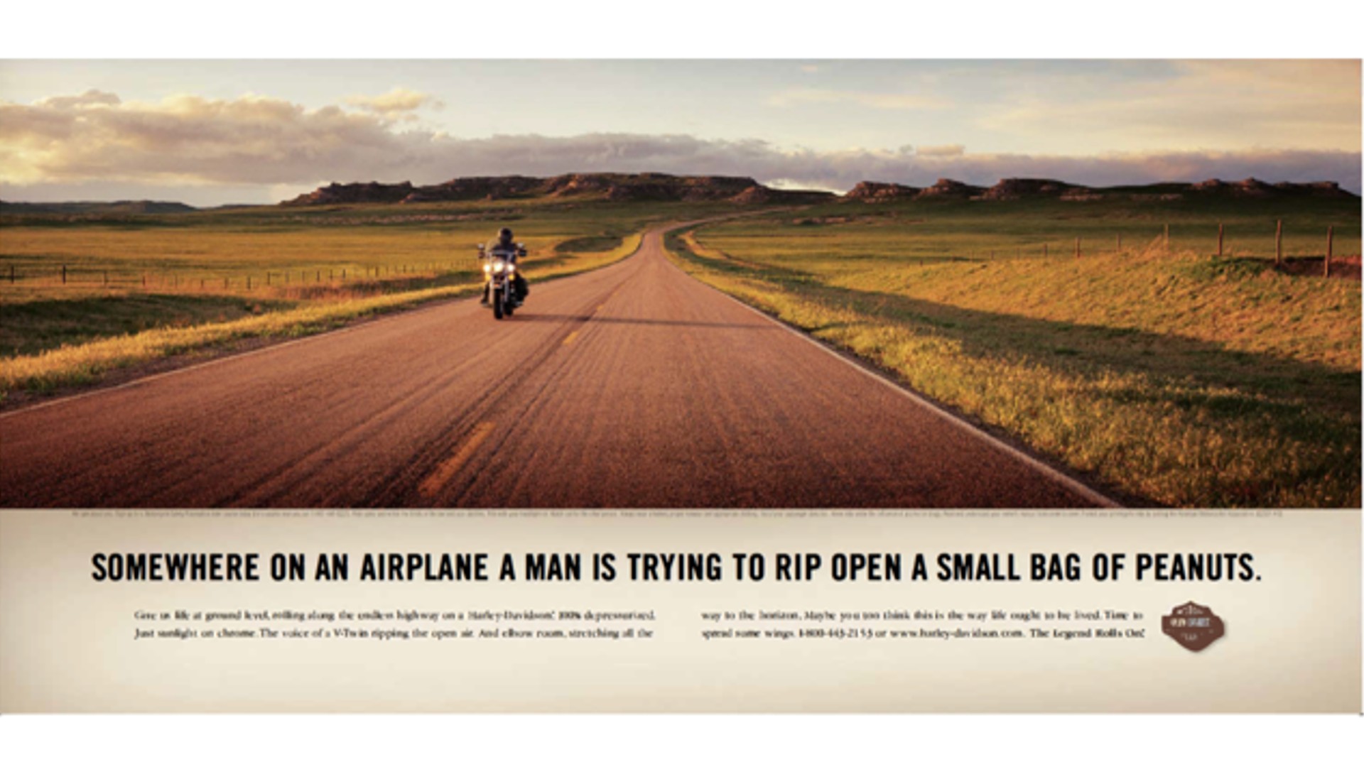
Created by Carmicheal Lynch, this print ad for the legendary motorcycle brand Harley-Davidson was specifically designed to be put into motorcycle magazines, and is a beautiful example of how a powerful image can work together with the right copy.
Centred around a photograph by Chris Wimpey, it featured the Harley Davidson FLHR Road King, a travelling cruising bike designed to be comfortable for long journeys. And as well as evoking the feelings of freedom and adventure you'd expect from Harley, it had extra resonance in the wake of the 9/11 attacks just one year earlier, which had caused widespread fear of flying.
"Sometimes an ad manages to tell a whole story and be a statement for brand fans," says Doerte. "This instant evokes freedom and adventure in a seemingly casual photograph. And the text goes straight to the heart of Harley-Davidson fans who would never trade their seat on a motorcycle for a seat on an airplane."
05. Nike: Secret Tournament (2002)
When the the 2002 FIFA World Cup rolled around, Nike pulled out all the stops. In the days before the widespread use of social media, they created a cryptic advertising campaign around a fictional high-stakes winner-take-all tournament between star athletes. It used guerrilla marketing tactics like putting up mysterious billboards and a website with clues, sparking curiosity and viral buzz.
The campaign unfolded like an alternate reality game, with a rich back story and characters. Fans had to piece together the narrative across different media platforms, keeping them engaged over several months. The integrated campaign rolled out across 30 countries, with a marketing budget estimated at a cool $100 million. The main advert was directed by film director and Monty Python member Terry Gilliam, and featured 24 top contemporary football players and former player Eric Cantona as the tournament 'referee'.
"This ad stands out for me as one of the most impactful ads of the decade," says Matt Hauke, senior designer at Design by Structure "It pitted the best of the best in the game against each other, and truly captured the pure essence of football; skill, tension and entertainment, in a cinematic fashion. Children across the world in playgrounds, asphalt cages, beaches emulated the tournament in a format that still lasts to this day."
06. Dove: Real Beauty Campaign (2004)
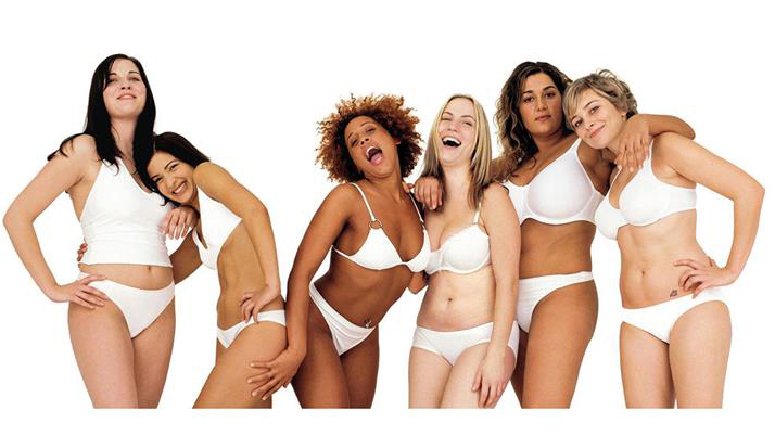
For decades, women (and often men) in advertising had to have perfect skin, perfect bodies, perfect everything. In the 2000s, that started to change, and one of the milestones in this shift was soap brand Dove's Real Beauty campaign, which was led by Ogilvy and first launched in 2004.
Covering a range of media, from billboards to TV and online, the idea was to feature women of all shapes and sizes, as a celebration of how different we all are from each other. In the brand's own words: 'To make women feel comfortable in their own skin and to create a world where beauty is a source of confidence rather than anxiety.'
"It was launched at a time when not many brands were confident enough to speak out about social issues or challenge the status quo," recalls Ellie Duffus, head of sales and marketing at Yonder Consulting. "This campaign called out traditional beauty standards – at a time when it was really needed – and laid the foundation stones for other brands to either follow suit or launch.
"The campaign has been long running, and hasn’t been perfect," she qualifies. "It received a fair bit of criticism when one of the ads in 2017 ‘missed the mark’ and Dove had to apologise. But overall it's earned the trust of customers through a true emotional connection. It's pivoted when it has needed to, and demonstrates how brands can create a real, true deep connection with an audience.”
One of the highpoints of the campaign was 2006's Dove ‘Evolution’ ad. This took the viewer behind the scenes of how models are transformed by hair and makeup professionals and then their image is manipulated using photo editing software, to make them look like entirely different people. It was an ad that resonated personally with Andrea Petrou, a copywriter at Cheil UK.
"As an impressionable teenager growing up in the 90s, not a day went by where I wasn’t exposed to ads featuring beautiful women with svelte figures," she explains. "It was a tried and tested way for companies to rake in the millions, encouraging us to buy the products that promised to make us look like this."
Then, Dove changed the game. "Its 'Evolution' advert lifted the lid on how heavily edited these ads were, focussing on what the model looked like before the makeup, lights and photo shopping. The closing line, 'No wonder our beauty standards are distorted', sent a very powerful message in just a few words.
"This ad paved the way for brands to be more real about their brand positioning, and today we see ‘realness’ coming from every angle in marketing. Dove itself has also taken this successful messaging and created ads under its Dove Self Esteem umbrella for the past decades, focussing on ‘real life’ beauty.
"Most poignantly, its Cost Of Beauty campaign has brought its original messaging into relevance today, making a powerful impact by showing how social media has led to children being exposed to weight-loss content."
07. Honda: Grrr (2004)
The vast majority of advertising is positive, optimistic and upbeat. Which is as it should be, because no one wants to be made miserable by marketing. But what happens when the emotion you wish to convey is negative? That's exactly the dilemma which confronted Wieden & Kennedy when they developed the 'Grr' campaign for Honda.
The genesis for the campaign was that Honda’s chief engineer hated diesel cars, and pledged to change noisy, dirty, expensive engines for the better. W&K took this and spun story of a positive hate, with the tagline of ‘hate something, change something'. The aim was to promote the its newly launched i-CTDi diesel engines in the UK, and the campaign comprised TV, cinema, print, radio, online assets and an interactive website.
The main TV ad is a child-like animation that depicts engines flying across a fantastical landscape, to a whistling folksy tune. The jolly visuals and music act as the perfect foil to the eventual climax when cute rabbits fire arrows into the engines, which explode in a sea of colours.
"Can hate be good?" asks Eli Vasiliou, group creative director at Iris. "Yes, when it inspires one of the greatest ads of the 2000s. This TV spot is firmly in my top five: I love it personally and covet it professionally." And goes on to explain exactly why.
"We’re often too timid to acknowledge even a hint of negativity in our ads," argues Eli. "Yet here Honda are, not only bouncing off it as the insight but embracing it in glorious technicolour, complete with headphone-eared bunnies. Strategically, it’s a very clever ad. But it was also a crowd-pleaser. The song – so insanely catchy there was talk of releasing it as a single – is a masterclass in storytelling, and whistling. We should put more songs in ads. And hate more."
08. Sony Bravia: Bouncy Balls (2005)
The 2000s saw huge strides in screen technology, shifting the world from square displays to widescreens and blurry pictures to high-definition quality. This ad for Sony, created by Fallon, was perhaps the most memorable symbol of this shift.
Showcasing the high-definition LCD screen on its Bravia TV, its simple tagline read “Color like no other”. And it instantly grabbed attention by showing more than 250,000 coloured balls bouncing down the street. No CG was used: these were real balls, and the budget for the spot exceeded $25 million. Tara Ellis, senior strategist at Wonderhood Studios, reckons it was worth it, though.
"When someone asks me why I got into advertising, there’s only one real answer: Sony Bouncy Balls," she enthuses. "I was 11 years old, mesmerised by my TV. Nearly 20 years later, with a bit more experience in the game, it remains my favourite ad of all time.
“'Bounce a million colourful balls down a San Francisco hill' is undoubtedly one of the most epic briefs, and moments, our industry has ever seen," she adds. "But this ad is so much more than that. The combination of the music, the slow motion, the hiding humans, the falling bins, and even a leaping frog make it a masterpiece. It’s no wonder Sky Sports have recreated it – but with tennis balls – to launch their new channel. Homage or rip-off? I’ll let you decide."
09. Renault Clio: France vs Britain (2005)
Ah, 2005. More than a decade before the Brexit vote, our relationship with our European neighbours – at least in the eyes of advertisers – was no more complicated than a spot of friendly joshing.
Hence this Renault Clio ad featured an English man and a French woman playing a good-natured game of Top Trumps, comparing things like the Eiffel Tower to Blackpool Tower, Sartre to Shakespeare, and so on. At the climax of the ad, created by Publicis, the couple realise that the car they're driving combines the best qualities of both nations.
"A playful take on a classic rivalry, the 2005 Renault Clio advert is the perfect mix of humour, fun, flirtation, and cool," says Katie Lowndes, creative lead at TrailerFarm. "This commercial is a perfect example of how, by nailing the script, the product is able to sell itself.
"Coupled with fantastic acting and chemistry between a couple who are not seen in the same location until the last second, the entire thing feels like a movie trailer for the romantic comedy of the year," she adds. "Renault weaves in the exposition of the car seamlessly, putting the story front and centre, and even years later I’ve never been able to stop saying 'Shhhakespeare' in the same way."
10. Carlton Draught: Big Ad (2005)
The 1990s may have been the decade of peak irony, but advertisers' tongues remained firmly in their cheeks throughout the 2000s. The 'Big Ad' is perhaps the ultimate example, parodying the advertising industry itself as a clever way to sell otherwise unremarkable beer.
Created by George Patterson and Partners (now Y&R ANZ), for Australian brand Carlton Draught, it's epic in scale, as two armies meet across a vast plain. By 2005, though, big budget ads were no longer particularly noteworthy. So this one grabs attention through humour, as the massed ranks sing a rousing, hilariously self-aware battle hymn about what an expensive ad they're taking part in.
As Sarah Hetherington, senior marketing manager at C-Screens, puts it "It’s big, bright and unserious, but mostly, it’s extremely memorable. The score and the scenery are pitch perfect and the creativity and humour cuts through, creating an ad that people actually wanted to sit down and watch. Being entertaining instead of disruptive meant they kept eyes on screens and created a cultural moment, and an ad that was viewed and downloaded worldwide."
11. Apple 'Get A Mac' 2006
Apple's been responsible for many standout ads across the decades, and the 'Get a Mac' campaign of 2006 by TBWA remains one of the best-loved. Featuring witty personifications of the Mac and PC, the campaign resonated with audiences by highlighting the simplicity and reliability of Mac computers, in contrast to the more cumbersome nature of most PCs.
"The ads quickly and efficiently relayed the brand's key selling points in a humorous yet relatable manner," explains Karim Salama, director at e-innovate. "They succeeded not only in showcasing the product's extensive features but also by crafting a memorable and engaging narrative that positioned Apple as the superior choice for consumers seeking user-friendly experiences.
"This is a prime example of how storytelling and humour can elevate brand messaging to connect with audiences on a deeper level," he adds.
12. Cadbury's Gorilla 2007
Working in advertising is mostly a serious business, but it can sometimes be a lot of fun. And when that fun resonates with the audience at home, you have a winning formula. We can't think of a better example than this ad for Cadbury's from 2007. Created by Fallon, it features a gorilla playing along to a Phil Collins song on the drums and, well, that's basically it.
"Apart from the purple background, it has very little connection to Cadbury," notes Jess Dickenson, managing director at Precis. "But it was so different it got people talking. This led to several awards and multiple spoofs, and led to further successes such as Cadbury's eyebrows and clothes adverts."
13. Skoda: Cake (2007)
Cake was a TV and cinema advertisement launched in 2007 by Škoda Auto to promote its new Fabia supermini car in the UK. The concept was both unexpected and straightforward. To the soundtrack of My Favourite Things from the Sound of Music, a team of cake-makers create a lifesize model of the new car using a variety of baked goods.
"I was fortunate enough to be working with Skoda when Fallon made their famous Cake ad," recalls Sarah Stratford, founder and strategic partner at Favour the Brave. "It was time when everything Fallon touched turned to gold; awards-wise this was literally as well as metaphorically true. But even then, Skoda Cake was a bit special.
"It was part of a trend of stunts as ads, where the making of the film essentially was the film," she explains. "And people loved it. I remember a newspaper running a double-page spread about how it was done. People didn’t just enjoy it when it came on their tellies, they actively sought it out in the early days of YouTube. Unsurprisingly, the results were incredible and Skoda could barely make Fabias quickly enough to keep up with demand."
14. PG Tips: Monkey (2007)
It's strange to think that not so long ago, live animals were routinely used in TV commercials. The best known example was the PG Tips campaign featuring chimpanzees drinking tea; launched in the 1950s it was eventually recognised as the longest-running ad campaign of all time.
By the 2000s, though, animal rights rights organisations were on the brand's back, so they decided to swap real-life animals for a loveable puppet called Monkey, teamed with comedian Johnny Vegas. As Sinita Khela, junior 3D designer at Wonder, explains: "From 2007 to 2017, the loveable duo were tasked with reviving the brand’s reputation. And they quickly became household names following several memorable TV ads, including one featuring a surreal recreation of When Harry Met Sally's diner scene.
"Monkey’s popularity overtook the tea bags’, and he even went on to star in a film and attend the BRIT Awards," Sinita adds. "Overall, this campaign is a great example of a brand transcending popular culture and successfully reviving their image for a new generation.”
15. Virgin Atlantic: Still Red Hot (2009)
The golden rule of advertising states that the public is constantly nostalgic for the decade before last. Consequently, the 2000s saw endless nostalgia for the 1980s, and here's our favourite example.
Celebrating 25 years of Virgin Atlantic in 2009, it follows a stockbroker walking through a series of 1980s cliches as he talks loudly on his oversized mobile phone. Then everything stops as a group of glamorous air stewardesses from Virgin emerge to the sound of Frankie Goes to Hollywood. His response: 'I need to change my ticket'.
"If a single line can still evoke an ad 15 years later, you could argue it’s stood the test of time," says Vicky Janaway, chief client officer at The Gate London. "And this ad, which was based on 80s nostalgia, is now nostalgic itself, in some sort of mind-bending meta-nostalgia multi-layered nostalgia cake.
"To summarise: in 2009, this ad gave me the chills. And whilst the 2000s gender stereotyping hasn’t dated well, the ad still does. And if that's a test of time, I’d say it’s not far off advertising perfection."
16. adidas Originals: House Party (2009)
In 2009, Sid Lee had just taken over the Adidas account and had a couple of big targets to hit. Firstly, they needed to celebrate the brand's anniversary. And secondly, they needed to introduce the brand, which was mainly known in Europe, to the USA.
Their concept was suitably ambitious: host the best house party ever, with the planet's coolest celebrities all in one room. This would then be shared via a hero TV spot, photo shoots, store design and online activations. It's the sort of idea that could easily misfire, but somehow the agency pulled it off. It really did become the ultra-hip event that everyone around the world was talking about.
"For me, the adidas Originals House Party spot from 2009 made a dent in culture," recalls Andrew Casher, founder of Hyperactive. "It did more than capture the zeitgeist: it was a stylised, sexy reflection of youth culture and fashion in the late noughties. It managed to be the most aspirational party on the planet, while at the same time being totally relatable to any millennial.
"I’ve never been to a party with Beckham, Missy Elliott, Estelle, Method Man, Run DMC…" he adds. "But by dropping those heavyweights into a regular crib, with skateboarders in the backroom, ravers in the front room, the rebels jumping into the pool, fully styled in OG adidas gear, the vandals tagging the walls… this real-life approach culminated in the most epic party scene. Set to a banging soundtrack, House Party was without doubt the ultimate culture bomb for a generation."
17. Compare the Market: Compare the Meerkat (2009)
The 2000s saw the dawn of a whole new way to buy and sell. Being present on price comparison websites meant you could compete on price alone, and not worry about promotion, which was a bit of a worry for the ad industry. The comparison sites themselves, though, were eager to throw money at commercials to boost their market share in a feverishly competitive space.
VCCP's campaign for Comparethemarket.com simply swapped the word 'market' for 'meerkat', introducing two fun animal characters with Russian accents that instantly won over the public. It might not have been sophisticated humour, but that was kind of the point.
As Catherine Wells, associate creative director at krow, explains: "It’s fun, simple and instantly gettable. You can easily sum the concept up in one sentence: 'A meerkat complains at the confusion between his site, comparethemeerkat.com, and comparethemarket.com.' And you can instantly imagine how the campaign rolls out across all channels; absolute gold for a creative."
The ads came out around the time Catherine was starting her first copywriting job. "And I quickly realised that having great ideas isn’t the hardest part," she recalls. "The real challenge is selling them in and getting them through rounds of amends. So, for that reason, Meerkats really struck me.
"VCCP had achieved the ultimate win-win of delivering exactly what the client needed – they say the full URL four times in 30 seconds – while making a creatively fresh and surreal ad for its time."
Now 15 years on, the Meerkats have transcended advertising and entered popular culture. "The characters are still relevant and talked about, years after their initial launch," notes Ellie. "The storytelling on display since the campaign launch has shown how both the Meerkats and the brand itself have evolved over time. And it's paid dividends, with Compare The Market being the fourth most-visited insurance website in the UK today.”
For more on advertising, read our interview with Ogilvy UK's chief creative officer.
