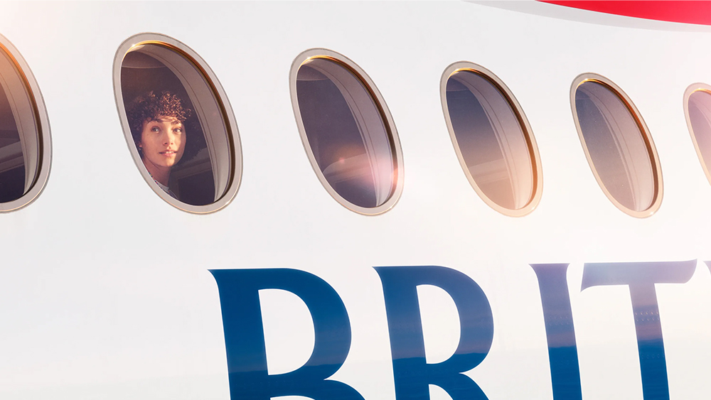
The best billboard ads need to be simple but powerful to make an impression in the brief time that people spend looking at them. That's what British Airways is aiming for in its latest campaign, dubbed 'Windows'.
The OHH campaign comprises 11 billboard posters that each show someone looking out of a window on a BA flight. And that's all. The British Airways logo is partially visible, so we know what the brand is, but there's no other text. It's epic in its simplicity, but some are wondering what the message is.
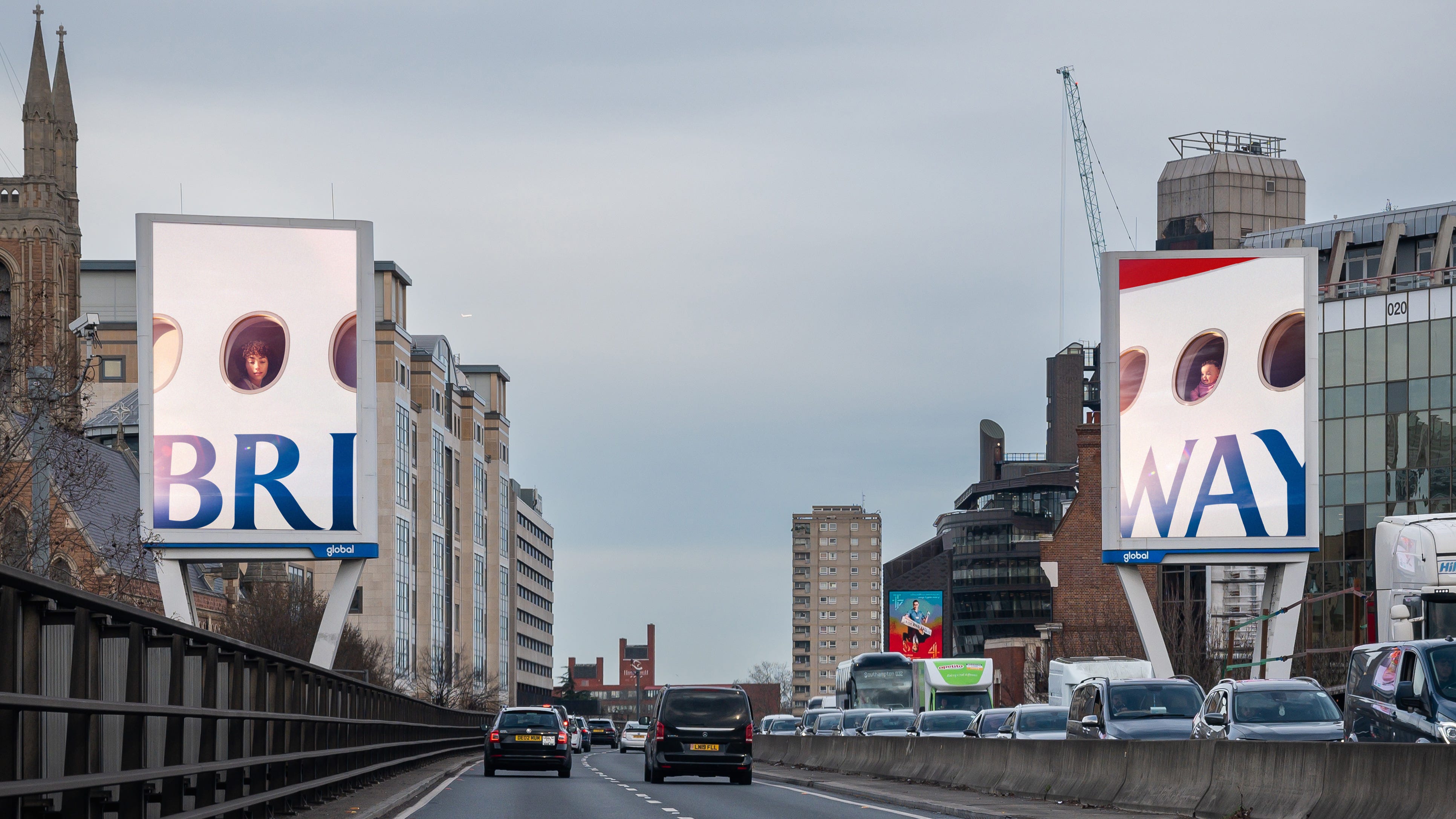
Devised by Uncommon and featuring photography from Pulitzer Prize nominee Christopher Anderson, the campaign will be displayed at 324 sites, including on digital and print billboards in Edinburgh, Cardiff, Manchester and Piccadilly Circus in London. The photography is striking, applying a heavy diffuse glow to give the impression of early morning sunlight. And the simplicity of the campaign has got a lot of positive reaction from creatives on social media.
"Breathtakingly simple but works incredibly hard," one person wrote on X. "Simple, immersive, surprising – everything a poster should be," someone else said. One person even "felt almost proud to be British." Over on LinkedIn, Paul Taylor, senior director of brand and creative at ATP Tour, wrote: "Only baller brands with built credit in the bank can cash in on saying nothing, but literally everything at the same time."
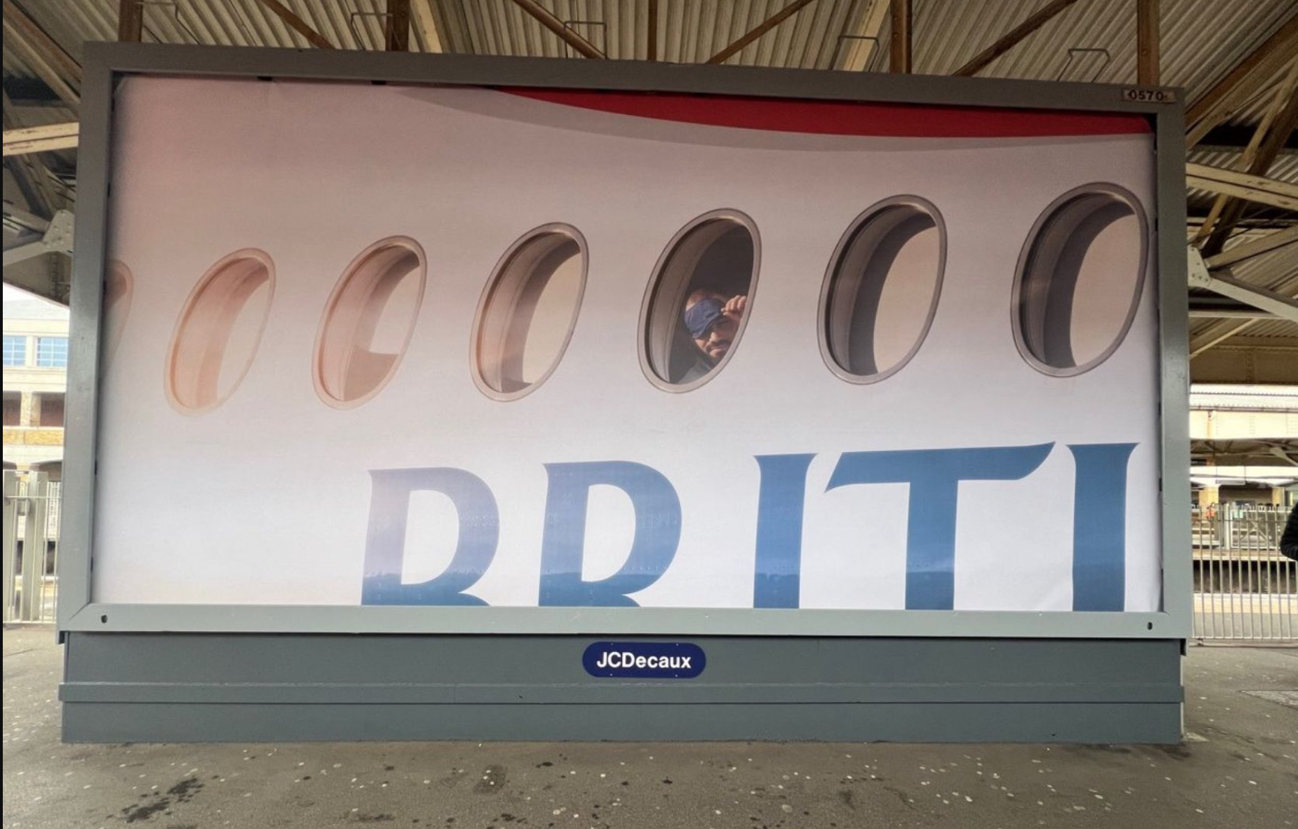
But some people aren't afraid to admit they don't get it. The imagery aims to capture "the wonder on customers’ faces" when they look down on the world from 35,000ft up. But surely that's something any airline can offer? In which case, the ads seem to promote flying rather than saying anything about IAG's British Airways brand.
Harry Lang, VP of marketing at Kwalee wrote on X: "I don't get it, and I'm not ashamed to ask for some help. Likely it's not aimed at me (although after my last BA flight to Bangalore, that's not terrible news). Is it a celeb?"
Responding on LinkedIn, graphic designer Cam Syme wrote: "All I can think is that: 1. Boeing are about to have another accident because that 787 appears to not have any glazing in that porthole, and 2. I don't get what the ad is trying to say about BA. You can sleep on our planes? You might get sucked out while you're asleep? You can (literally) look out of the windows? Our airline has planes? None of that speaks to the experiencial value of why one would choose BA over other (cheaper) carriers."
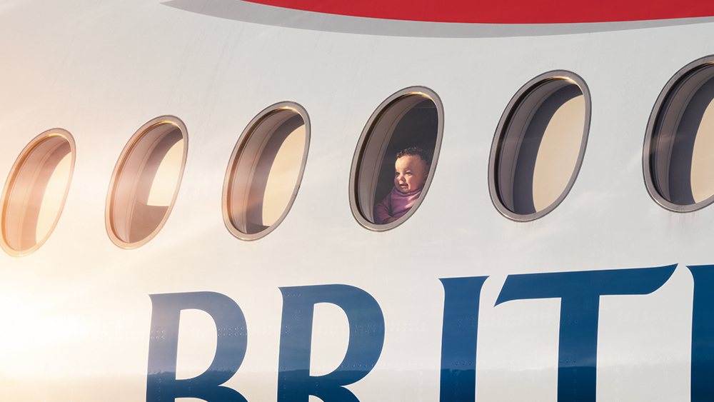
According to Uncommon's release, "the concept plays on the idea that customers usually take photographs from their seat out of the aircraft window, but instead, reversing the camera and spotlighting customers’ emotions as they look onto their destination, can give a deeper insight into their unique stories and original reasons for travel."
Co-founder Nils Leonard said: “Only truly iconic brands can say less. The magazine you notice most is the one with the least on the cover, the same is true of posters. We’re proud to share our latest outdoor with our partners — capturing the magic of that window view in a new place, the many different faces that board a BA plane — each and every one a British original.”
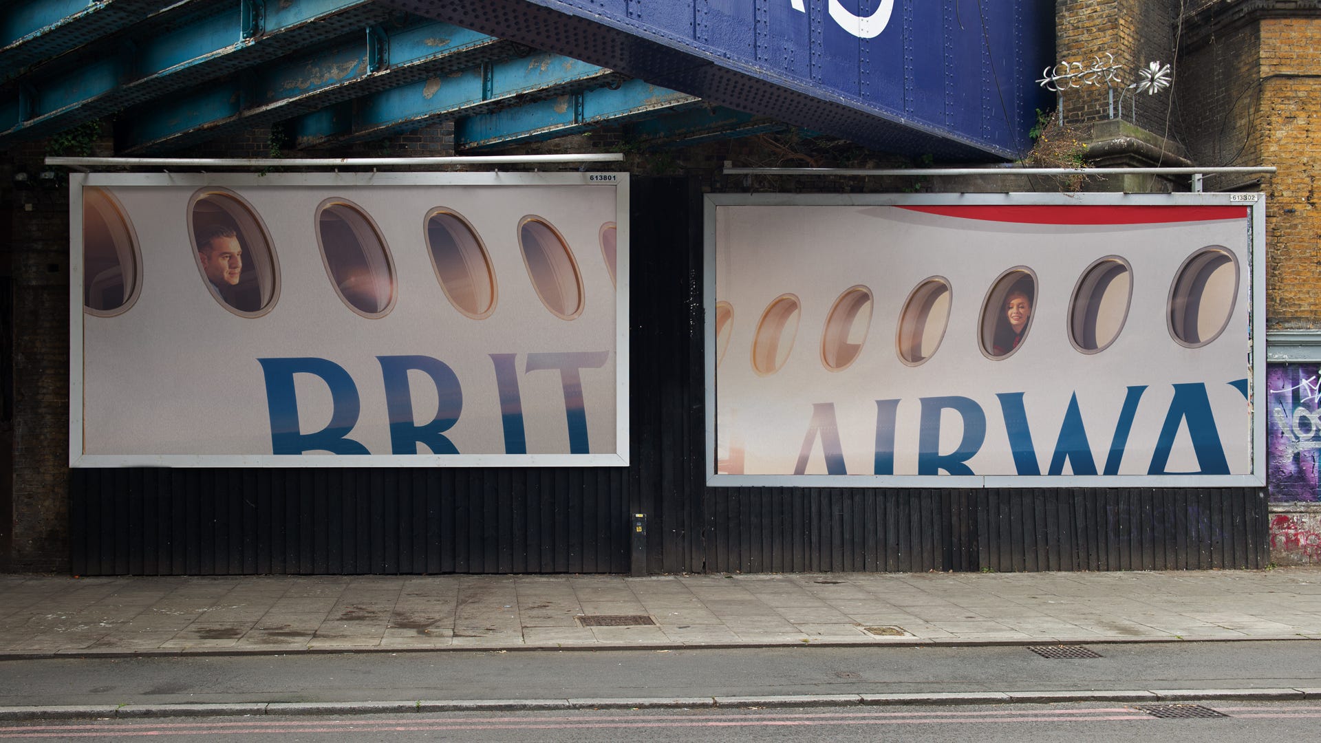
The piece does highlight the recognisability of the British Airways logo through an approach the likes of Coca-Cola and McDonald's have played with a lot, although in this case recognition is aided by the context. But the logo could probably be replaced by that of sister airline Iberia or an airline from a different group with similar results. Ultimately, whether the viewer can relate to the wonder on the faces of the passengers in the ads will depend on their own past experience of BA's service.
The new outdoor series follows on from a film released earlier this month. Emmy Award winner and Grammy nominee Miles Jay directed the film while Groove Armada vocalist Saint Saviour curated the music.
For more advertising news, see the Coca-Cola logo free-for-all and Ed Gamble's censored poster.
