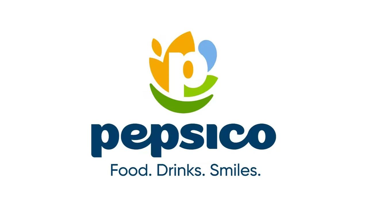
PepsiCo is home to over 500 brands, including Gatorade, Quaker, Siete, and of course, Pepsi. You probably weren't super-aware of its corporate brand logo, but it had been the same for almost 25 years and consisted of a globe with lines around it and the word 'PepsiCo' written in capital letters. Will the new look make it to our list of best logos?
The new logo marks a shift to lower-case letters and a focus on the letter 'P'. Surrounding this 'P' are forms that are supposedly a nod to "the values guiding our future". There's a shape that represents food and grains, showing that PepsiCo is rooted in agriculture, there's a blue shape for drinks or water, showing PepsiCo's commitment to "hydrate, replenish, refuel" and there's a green leaf-like form that is supposed to represent "winning with pep+". This is to represent PepsiCo's positive impact for people and planet. I'm unclear on what the '+' means.