Get all your news in one place.
100's of premium titles.
One app.
Start reading
Livingetc
Livingetc
Linda Clayton

It’s Not as Simple as ‘Light Uppers, Dark Lowers’ Any More — This Is How Designers Are Doing Two-Tone Kitchens in 2026

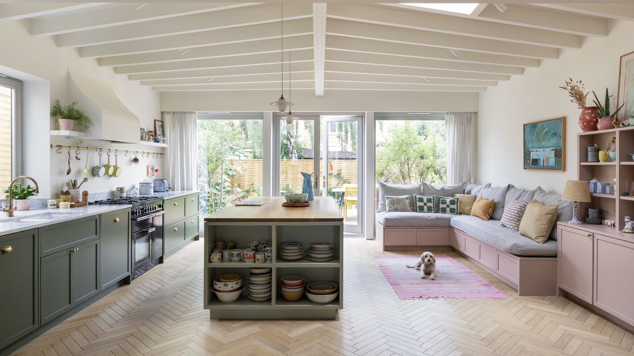
Two tone kitchen in green and pink with wood flooring.

There was a time when painting the upper cabinets light and the lowers dark was considered wildly original. Then everyone copied it. Don't get me wrong, it still looks good, but the once-radical formula has become a bit too safe. Today’s most interesting kitchens are finding entirely new places for that second color hit, using the contrast to shape architecture, disguise scale and create moments that unfold gradually rather than all at once.

The latest kitchen color ideas aren’t about neatly splitting the room at waist height. Instead, they’re placing a second finish exactly where it has the biggest visual payoff — across a pair of full-height cupboards, inside a pantry or as little more than a painted outline. It’s less about following a formula and more about giving cabinetry personality.

Whether you’re drawn to rich timber, playful paint or dramatic color drenching, these projects prove two-tone kitchens have become infinitely more sophisticated. Here’s how the designers are rewriting the rules.

1. Repeat, but Be Subtle

A sleek timber detail on the island discreetly links it back to the wall of cabinetry. (Image credit: Nacho Rivera. Design: 28 a.m)

Not every second color needs equal billing. One of the easiest ways to make a two-tone kitchen feel more sophisticated is to use the contrasting finish sparingly, allowing it to pop up once or twice like a visual callback. Just enough repetition in the interior design provides a sense of purpose, without making the whole room feel overly coordinated.

Winnie Tam has nailed it in this smart space. “We used a rich, dark timber finish to anchor the full-height cabinetry, then subtly reintroduced it as a grounding detail as the magazine rack of the island,” explains the founder and director of 28 a.m. “This intentional repetition creates a seamless visual cohesion across the space, allowing the lighter surfaces to breathe while ensuring the island feels perfectly connected to the primary units.”

2. Draw the Line

Colored outlines bring crisp definition to cabinetry without relying on bold blocks of paint. (Image credit: Alexander James. Design: Studio Peake/202 Design)

Two-tone doesn’t have to be poured on by the bucketload. In fact, one of the freshest interpretations uses remarkably little paint at all. Designed by Sarah Peake of Studio Peake and brought to life by bespoke kitchen maker 202 Design, this white and green kitchen scheme uses color almost like pinstriping, tracing the profile of each cabinet door to create subtle contrast while emphasizing the craftsmanship of the joinery.

“This approach shifts the focus from color blocking to detailing. Instead of separating the kitchen into two contrasting halves, the green detailing traces the profile of the white cabinetry, giving the joinery greater definition while introducing two-tone color in a far subtler way,” says Benjamin Kempton, founder of 202 Design.

Because the contrast sits around the edges rather than across whole doors, the cabinetry feels lighter and more refined. It’s an elegant way of introducing a second color without letting it dominate the whole room.

Get the Look

3. Hide Your Boldest Color

Restricting the second color to the pantry gives it maximum impact without dominating the kitchen. (Image credit: Herringbone House)

Rather than splitting the kitchen itself into two contrasting finishes, the designers at Herringbone House gave the second color a room of its own. Cabinetry painted in Herringbone Paints Canteen Blue forms the calm outer shell, while the walk-in pantry beyond is wrapped in the richer Herringbone Paints Lindsey Lapis, creating a bold focal point framed by glazed screens.

“We wanted to rethink the traditional two-tone kitchen. Instead of applying two finishes across the cabinetry, we concentrated the bolder colour inside the pantry. Framed by the glazed screen, it creates depth and a sense of discovery every time you look through,” explains William Durrant, owner and director of Herringbone House.

Looking through the steel-framed glazing creates layers of depth, making the pantry feel almost like a stage set beyond the main kitchen. The stronger color has real presence, but because it’s visually separated from the working space, the overall scheme is calm and restrained.

4. Flip the Formula

A vertical switch in timber breaks up long runs of cabinetry while linking back to the island. (Image credit: James McDonald. Design: Martin Moore Kitchen and Samantha Bartlett)

For years, two-tone kitchens almost always followed a horizontal line — darker below, lighter above. But there’s no reason contrast has to work that way. Turning the idea on its side creates a completely different effect, drawing the eye across the room rather than dividing it in half.

It’s a particularly useful trick in kitchens with lots of full-height cabinetry, where introducing a second finish vertically subtly changes how you read the room. “Rather than keeping all the tall cabinetry in one finish, we echoed the darker timber of the island on two full-height cupboards. This creates a visual rhythm across the elevation, breaking up the run and allowing those pieces to read more like standalone dressers than fitted units,” explains Richard Moore, creative director of Martin Moore.

5. That’s a Wrap

Repeating a two-tone palette across stone, flooring and ceiling creates a fully immersive experience. (Image credit: Barbara Corsico. Design: Róisín Lafferty)

Two-tone kitchens don’t have to begin and end with the cabinetry, as this total jewel-box of a kitchen proves. “Rather than treating two-tone as a simple contrast between cabinet colours, we looked at how the palette could influence the entire space. Walnut flooring with bespoke inlays of J’Adore pale green quartzite echoes the matching quartzite backsplash, allowing the palette to flow throughout the room,” says interior designer Róisín Lafferty. “The bronze-toned mirrored ceiling and backsplash reflect the mint and walnut throughout the space, giving the scheme greater depth and transforming the kitchen into an immersive environment.”

It’s a shift in thinking as much as aesthetics. Instead of asking where a second cabinet color should go, consider where else the palette can appear. Repeating one or two key materials around the room creates a stronger sense of identity than introducing a string of unrelated finishes, especially in small kitchens where visual clutter can quickly take over.

6. Use Two Tone to Zone

Split cabinetry colors help define each area of this open-plan kitchen extension without disrupting its flow. (Image credit: Anna Batchelor. Design: Charles Tashima Architecture)

As kitchens have become part of larger open-plan living spaces, cabinetry has had to work harder than ever. It’s no longer just about storage — the joinery itself can help organize the room, subtly distinguishing one area from another while maintaining a cohesive overall scheme.

“For this open-plan kitchen-living-dining extension, we wanted to create a sense of spatial definition while maintaining the social heart of the home as a single, generous room. The green cabinetry establishes the cooking area, while the complementary blush tone defines the transition towards living and relaxing. It’s an interpretation of the two-tone kitchen, where colour becomes a tool for spatial zoning as much as a decorative choice,” says Charles Tashima, founder of Studio Tashima.

Instead of relying on walls or changes in flooring, using contrasting cabinetry creates a natural shift in atmosphere as you move through the space. It’s a thoughtful approach that gives each zone its own identity while ensuring the kitchen still feels fully connected to the rest of the home.

Get the Look

7. Take It Overhead

Extending wall color onto the ceiling softens the room’s edges and makes dark cabinetry feel more enveloping. (Image credit: deVOL)

The ceiling color is often the forgotten part of the palette in a two-tone kitchen, left white almost by default. Carrying wall color overhead changes the proportions of a room completely, blurring where the walls end and creating a more immersive backdrop for your color switch.

“Sometimes when a room is naturally dark and north-facing, it is tempting to make everything light and bright, paint the cupboards in creams or whites and have lots of lighting," says Helen Parker, creative director of deVOL Kitchens. "Well, we did the opposite in here, we went for dusky pink on the walls and rich dark blue Shaker cupboards, in the hope of creating a really moody atmosphere. Dark can be dingy and dull but more often, if embraced, it can create a magical space."

Feeling inspired? Next, discover why brown kitchens are having a major moment, explore the beauty of tonal kitchen color schemes, or see which timeless kitchen colors designers never tire of.

And for more design inspiration delivered straight to your inbox, sign up for the Livingetc newsletter.

M&S Wicker Graduated Base Table Lamp Habitat Twisted Glass Vase Addison Ross Lacquered Ottoman Tray
Sign up to read this article
Read news from 100's of titles, curated specifically for you.
Already a member? Sign in here
Related Stories
Top stories on inkl right now
One subscription that gives you access to news from hundreds of sites
Already a member? Sign in here
Our Picks
Fourteen days free
Download the app
One app. One membership.
100+ trusted global sources.