
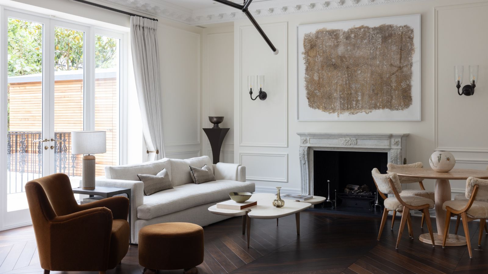
You'd be forgiven for not really noticing Farrow & Ball's Pointing, a subtle off-white paint nestled somewhere in the middle of its color card. Creamy, warm, and very neutral, it doesn't grab the headlines in the way of the brand's bolder colors like Hague Blue, Railings, or Jitney. But it's a quietly popular shade, one of Farrow & Ball's best selling paints in fact, and one that designers can't get enough.
Why? Because it's so versatile. Good for rooms with bright light, low light, calming schemes, or clashing patterns, this best neutral paint manages to work in them all. As a detail color, a ceiling, cabinets, or whole house, designers have embraced this unsung hero of a hue.