Choosing a front door color can involve more deliberation than you might imagine. Responsible for setting the first impression of your home, you'll want to choose one that aligns with your style while offering a timeless look in its exterior context.
And while the most stylish front door color ideas are a helpful starting point, it can be equally important to know the colors designers are moving away from, to avoid your front door looking dated. Here, designers share five shades they're ditching, along with the more stylish alternatives that feel in keeping with the latest design trends.
Keep in mind that while designers may be bidding farewell to these colors, color is subjective, and it's important to consider the context of your home. 'There's no one-size-fits-all answer when selecting a color for your front door,' says the designer Michelle Morgan Harrison. 'The right choice always depends on the surrounding materials, your personal style, and the story you're trying to tell.'
1. Black
Black front doors have, for a long time, been a popular choice for front doors. But, in 2026, as color trends increasingly favor richer and warmer colors that add personality, some designers are saying goodbye to this dark neutral. 'Black has long been the “safe” choice for front doors, but that’s precisely the issue,' says the NYC-based interior designer Jennifer Hunter. 'It’s become a bit too predictable, almost like the default setting rather than a considered design decision.'
If you still want to add richness and depth to your front door, try a dark shade of green paint instead. 'Instead of a flat black, I’m drawn to Farrow & Ball’s Carriage Green,' she adds. 'It’s actually an archive color that has a richness and complexity that shifts beautifully in different light. That subtle variation is what makes a front door feel intentional. It still reads as classic, but with far more personality than a standard black.'
2. Cool Gray
Lighter than black but still a neutral, it's easy to understand why gray front doors have been a popular choice for many. And although it's a versatile shade, gray front doors are beginning to fall out of favor for the very same reason they did in interiors: they lack warmth and can appear drab.
'Trendy gray colors have become less popular in recent years,' explains the Dallas-based designer Lauren Saab. 'Especially those flat, mid-tone grays that dominated the last decade. They tend to drain warmth from a home’s exterior and can make an entry feel lifeless rather than inviting.'
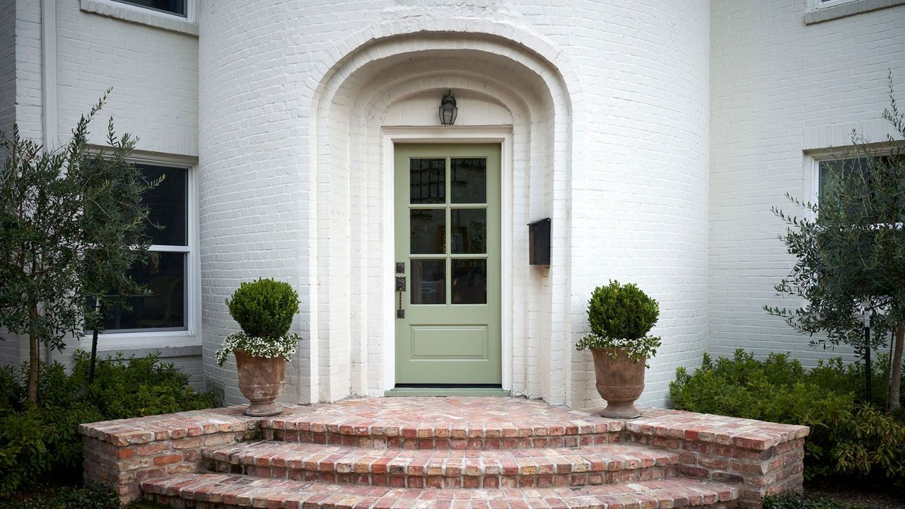
3. Safe Neutrals
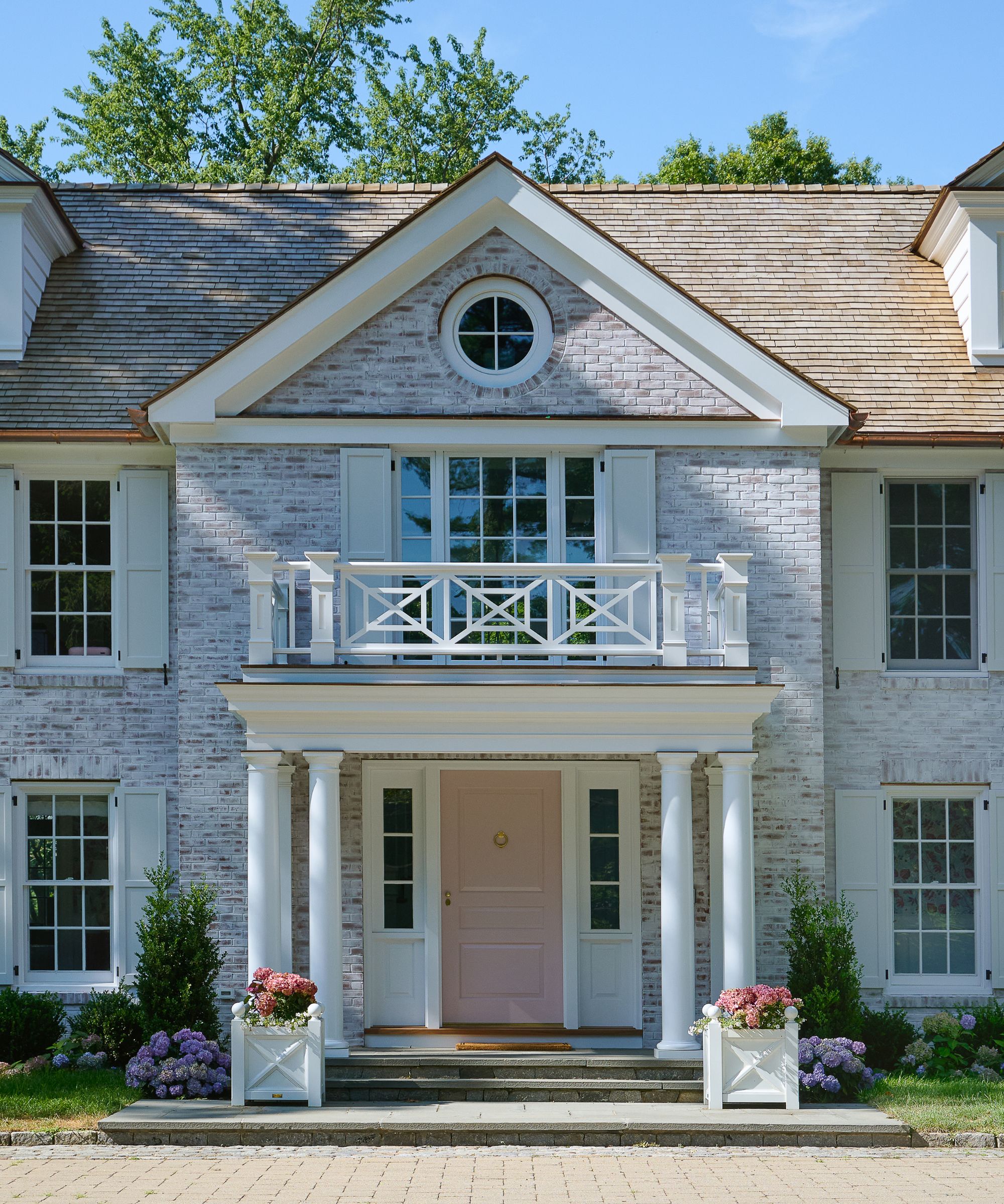
While Michelle Morgan Harrison, the principal designer behind Morgan Harrison Home, doesn't rule out any shade entirely, she notices a shift away from predictable neutrals paints for front doors, such as white. 'Generally, we've found that clients are branching out beyond classic whites, grays, and blacks, and we love getting to play with bolder choices for a front door,' she says.
This home demonstrates the impact of a welcoming front door color that also feels a lot more interesting than white. 'We'd used a palette of shades of pink and eggplant throughout the home, and this specific paint color in the home's mudroom, so it felt only natural to extend that choice to the home's entry point,' explains Michelle.
4. Pillar Box Red
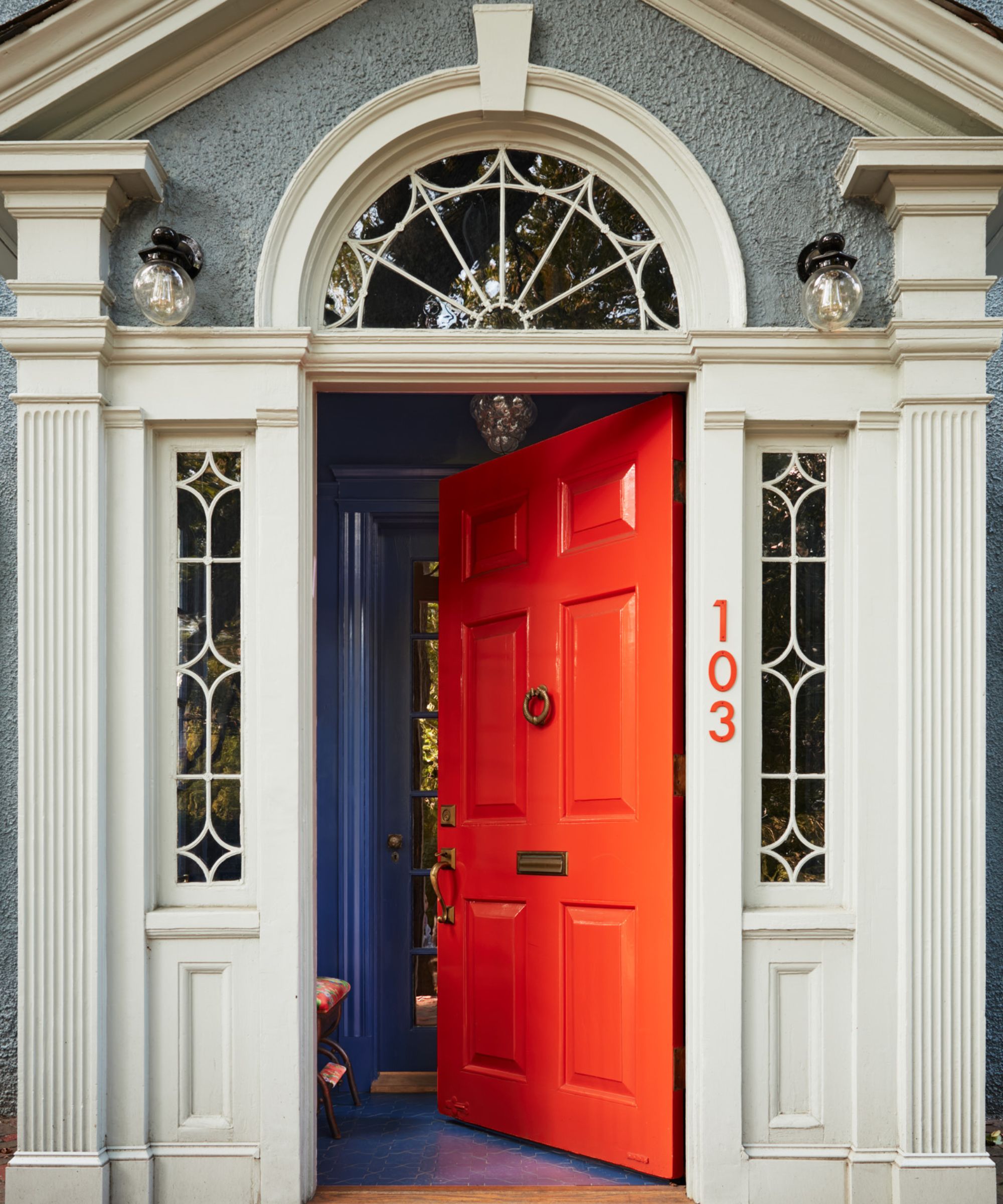
For designer Cecilia Casagrande of Boston-based Casagrande Studio, the classic primary red front door is one to skip in 2026. 'The classic red front door and dark gray are feeling tired to me – too expected, and honestly, neither reads that well in flat daylight or on a cloudy New England day,' she says.
While this nostalgic shade of red may be on its way out, that's not to say bright colors should be avoided altogether. Far from it: warm and vibrant orange paints are a favorite for Cecilia, adding excitement to the entrance of a home. 'Orange is different,' she says. 'It's a burst of sunshine in any season – retro on the right house, completely modern on another. Charlotte's Locks by Farrow & Ball will certainly do it.'
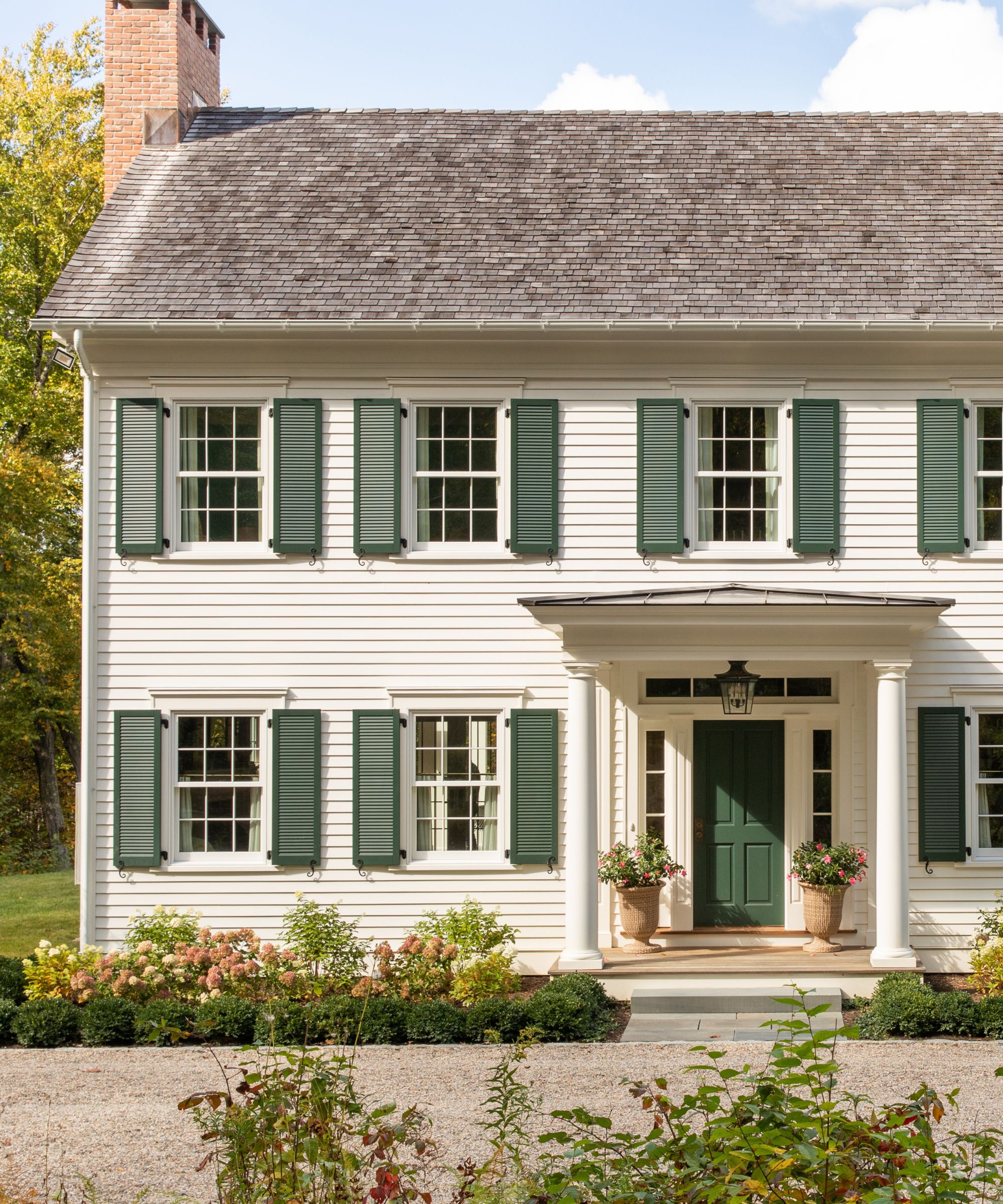
5. Navy Blue
Although this front door color can make a home look expensive, some designers are ditching navy blue this year. 'Saturated navy is another color falling out of favor for front doors,' says designer Lauren Saab. 'It had a strong run as a safe alternative to black, but it can feel heavy and predictable, whereas warmer tones bring more depth and a more refined, current feel.'
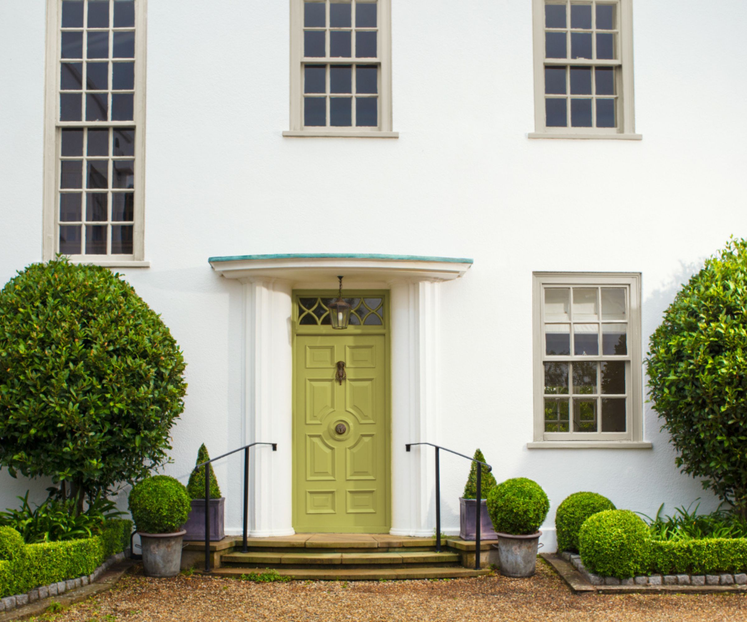
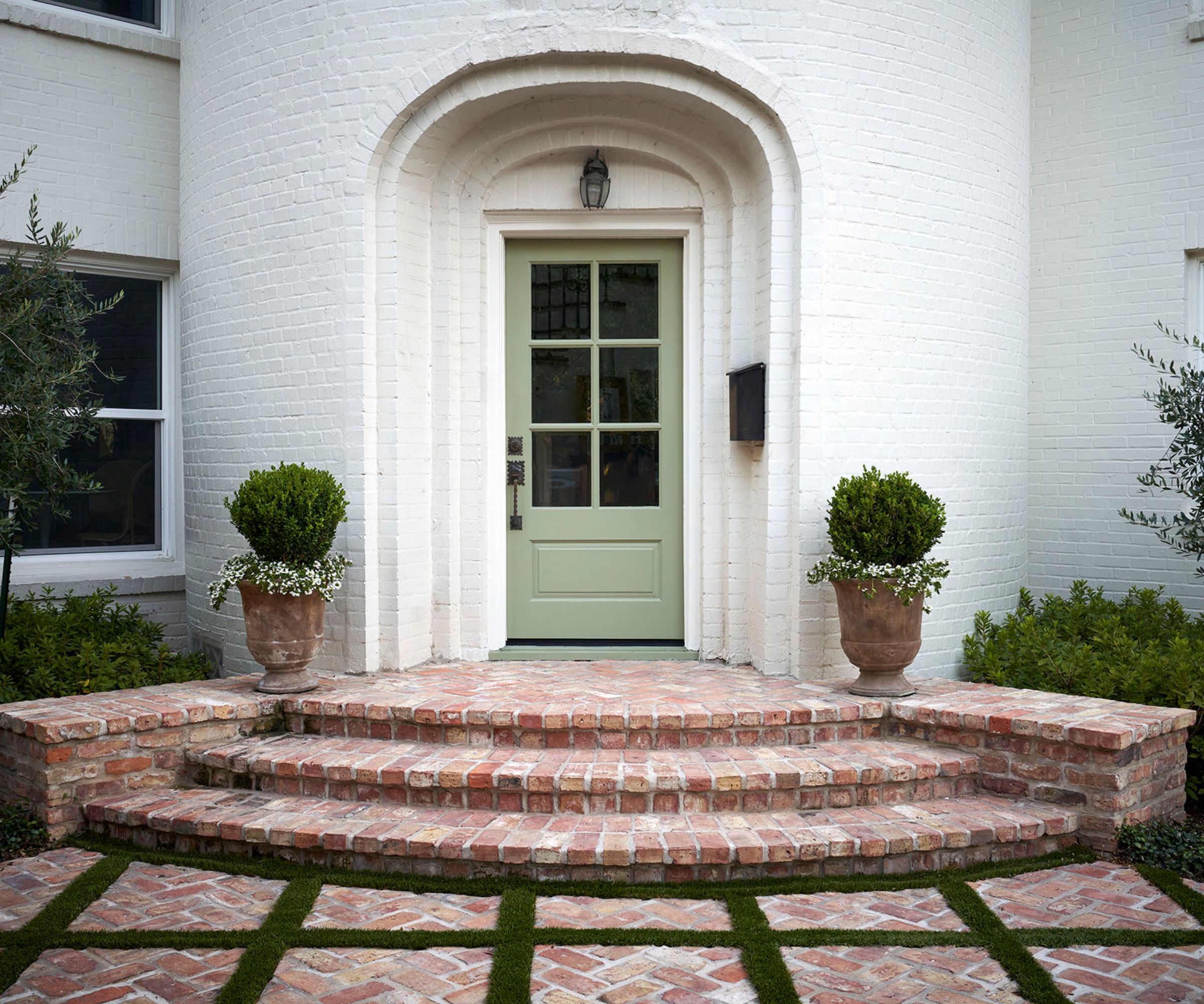
The Nashville and Houston-based designer Minnette Jackson also sees similar, contrasting shades going out of favor. 'There’s a quiet shift happening away from high-contrast, statement front doors toward tones that feel rooted in nature,' she says. 'Colors like soft, mossy greens – such as Farrow & Ball Lichen – offer a sense of warmth and approachability while still feeling elevated and intentional. These organic hues blur the line between architecture and landscape, allowing a home to feel more connected to its surroundings.'
From overly dark colors that can appear harsh to neutrals that can easily be lacking in personality, it's easy to see why designers are moving away from these front door colors this year.
If you're looking for more guidance in the color-selection process, turning to the colors inside your home can be a great starting point. 'I love for the front door to reflect or hint at the palette of the interiors, letting what's inside guide our front door's color choice,' says Michelle Morgan Harrison.
Love beautiful design ideas, expert advice, and inspiring decor trends? Sign up for our newsletter and get the latest features delivered straight to your inbox.