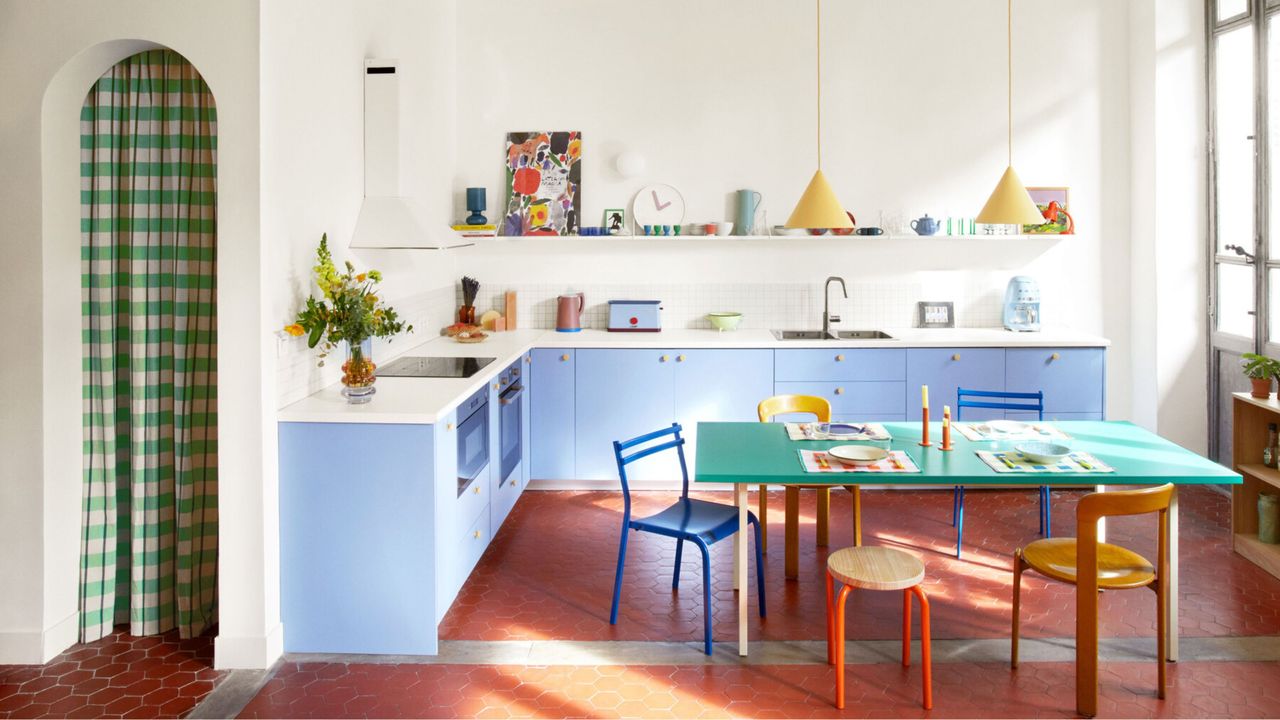
Let’s just be open about it. Decorating with primary colors is probably one of the scariest, most intimidating color concepts in the interiors world. They’re extreme. Brazen. Audacious. But, happily, with a few tips, tweaks, and tricks, there are ways to slip such richly pigmented tones into the home with ease, and harness their power for contemporary decorative good.
The primaries — red, yellow, and blue — are color stripped back to its purest form. They’re the origins, the base notes of the whole spectrum. Bold, punchy, full of possibility, they can’t be made by mixing other colors, yet together they can be combined to create almost any other shade on the spectrum. Think of all of the colors laid out like a family tree — the primaries are poised at the top, looking proudly down at the rainbow of life they’ve created.