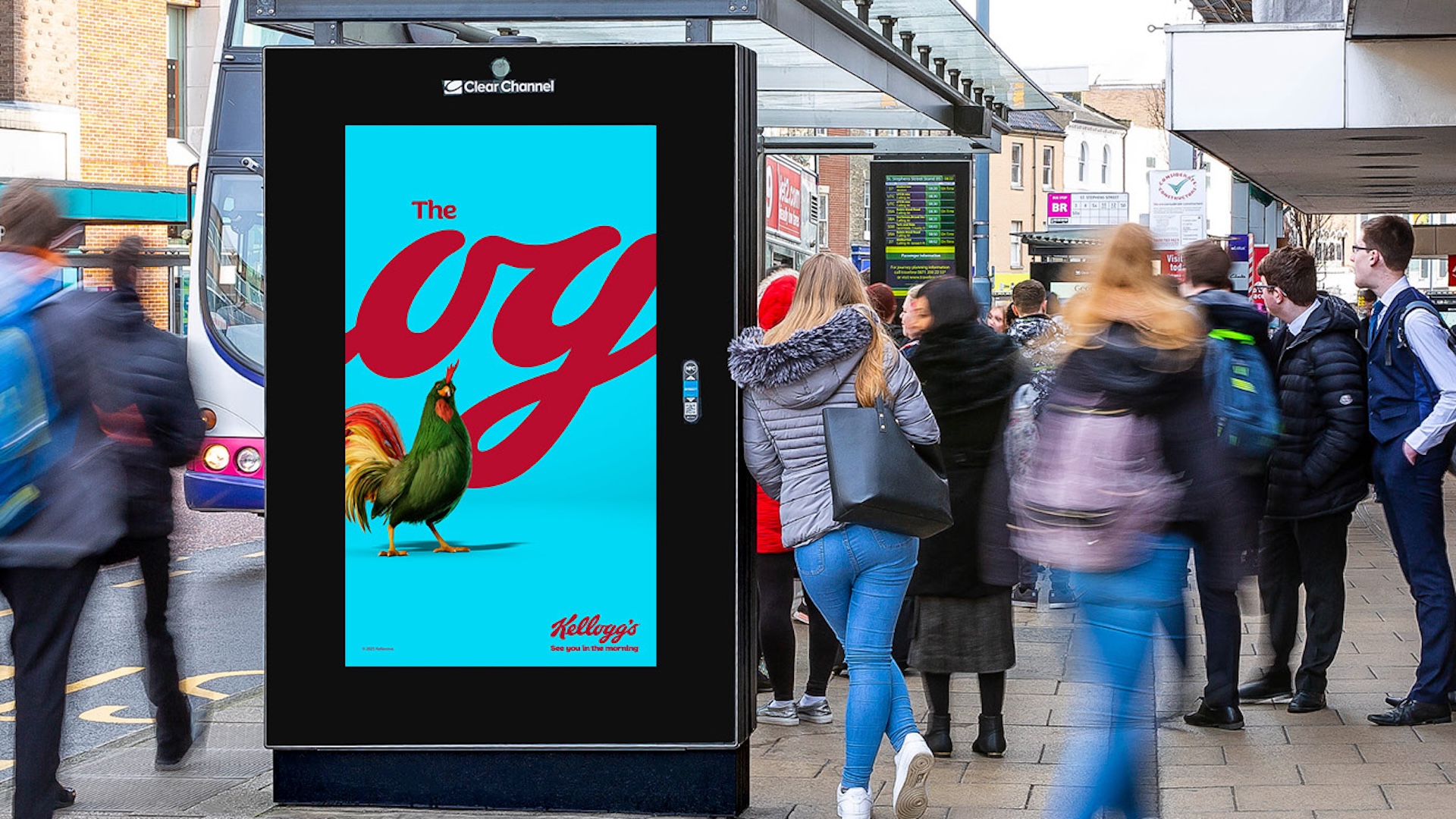
Cereal brand Kellogg’s recently launched a bold new out-of-home campaign making creative (and selective) use of its logo. With the wordmark cropped to show just the 'og', the new billboards suggest Kellogg's is the 'original' breakfast choice – and the clever campaign is already making a splash.
"‘The OG’ in the logo is a gift—it’s been there all along, and now we’re shining a spotlight on it as a reminder of Kellogg’s enduring appeal," announces Leo Burnett UK, the agency behind the ads. Indeed, the blending of contemporary internet parlance with a heritage logo is somewhat inspired, and it's no surprise that the campaign is being lauded by many online. But it seems to have attracted a fair amount of detractors too, igniting a debate over whether we're looking at one of the best print ads of recent years, or an 'ad for ad people'.