Right now, we want our homes to be a place we can stabilize after the unpredictability of the outside world. To be somewhere we can exhale, become ourselves again, and reach equilibrium, rather than responding to constant stimuli all of the time. A home should balance our brains and steady our souls — and mood-stabilizing colors can help do just that.
We’ve already been decorating with calming paint colors — so how are mood-stabilizing hues different? They anchor us much more than calming tones, maintaining and sustaining our energy level rather than lowering and relaxing it. They feel grounded rather than gentle, helping us carry on with daily life rather than necessarily just wind down and switch off, and they’re emotionally neutral rather than comforting and soothing. In practice, they’re often muted rather than pale or bright, are tempered rather than highly saturated, have subtle undertones, are warm-leaning, and are rooted in the earth. Think weathered, dusty blue over restful, powder blue, sunbaked clay pink instead of blush pink or earthy sage green over mint.
I spoke to six designers about the colors they turn to when they want to root a space and bring it into quiet alignment. So, consider this your guide to the shades that keep a room — and its occupants — on a firm foundation, fostering balance without dulling vitality.
1. Charcoal Blacks
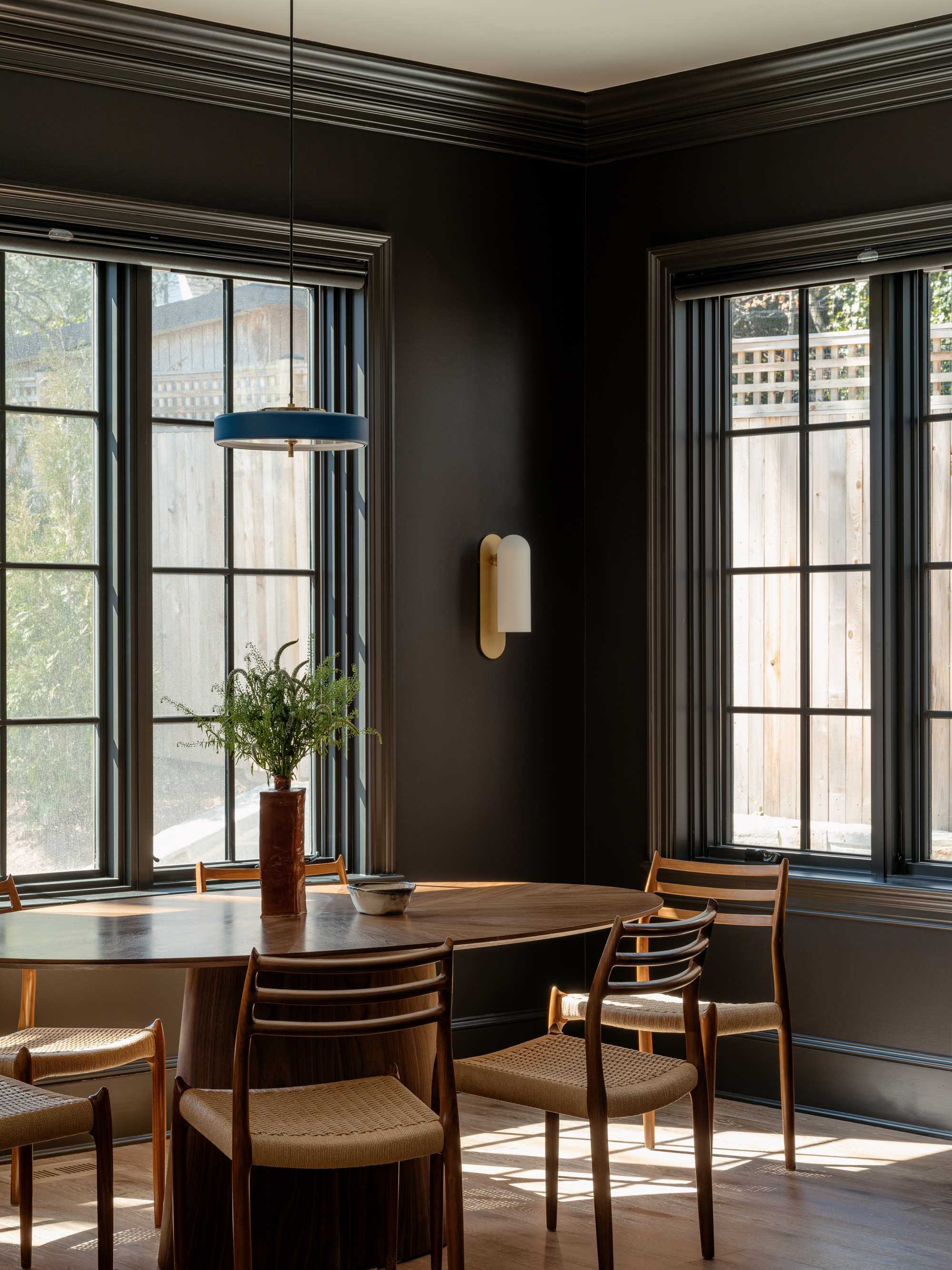
Decorating with black equals oppression, angst, and a general air of down-in-the-dumps-ness, right? Not when it’s a charcoal black. The tone is slightly grayed compared to jet black, with warm brown undertones. It feels velvety and matte versus the starkness of black-black, and diffuses light softly rather than completely absorbing it. Rather than being imposing, charcoal comes across as amiable, composed, and reassuring — just the ticket to keep us all nice and levelled out.
“Charcoal blacks are deep and moody, yet softened in a way that feels expansive rather than heavy,” explains Zoë Feldman, principal and founder of interiors studio Zoë Feldman Design. “They create a sense of intimacy and confidence at the same time, their depth and richness establishing a grounding point of view that has a noticeably balancing overall effect.”
Since decorating with charcoal can read as enveloping or oppressive, its success depends on how fully you commit to it. “The shade works best when color drenching a room or when used across full walls to make the space feel intentional and expansive,” Zoë advises.
2. Dusky Pinks
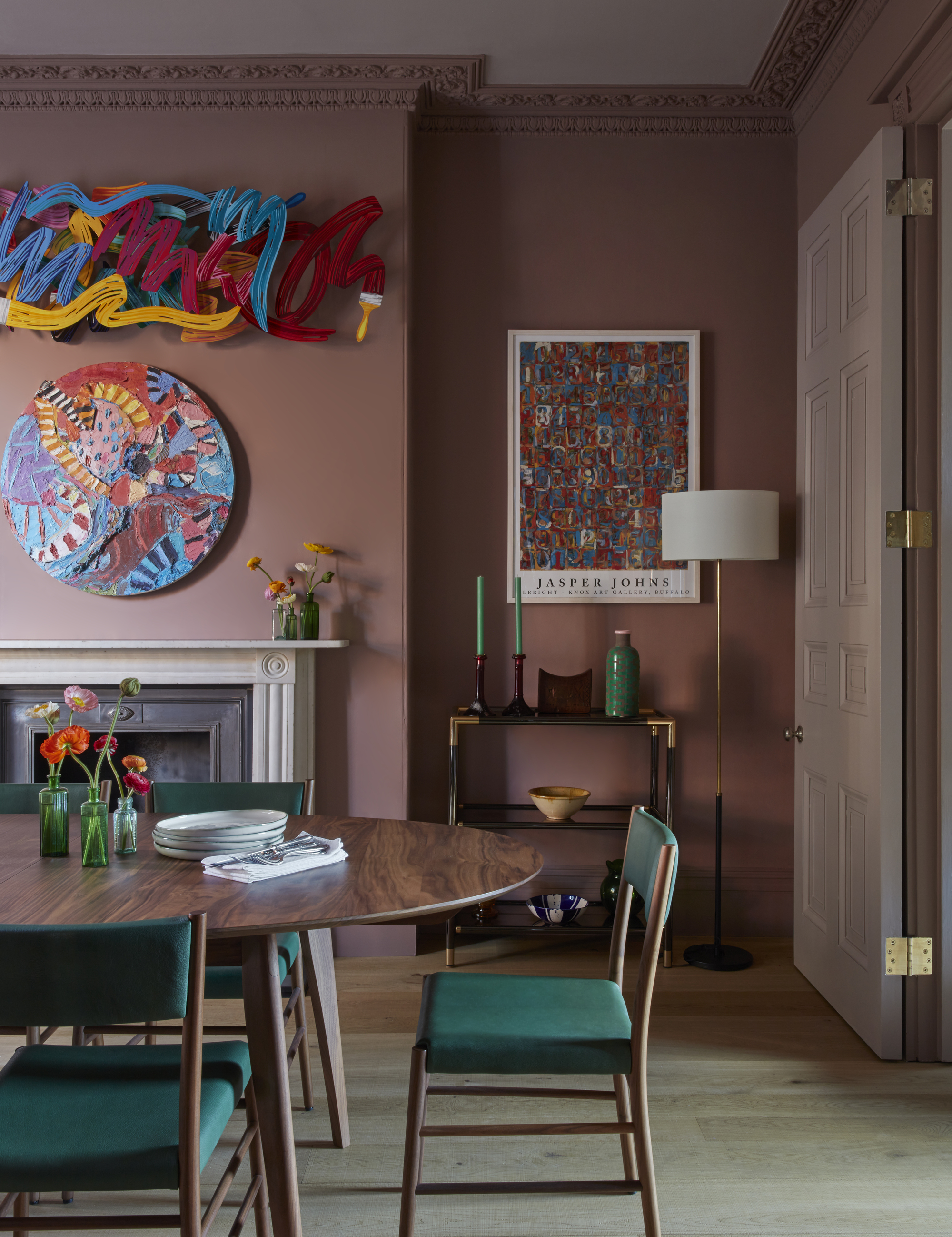
Decorating with pink in the home can often err on the side of delicate and pretty, sugary and candy-floss-esque, or overly romantic and excessively whimsical. This is where dusky pink becomes your feeling-balanced-and-grown-up scheme savior — one that regulates the psyche rather than just pleasing the eye.
“Dusky pinks have more impact than classic, paler pinks and bring greater harmony,” explains Kate Guinness, founder and director of interior design and decoration studio Kate Guinness Design. “Dusky pinks have a way of injecting spaces with a sense of warmth, creating a dramatic yet simultaneously intimate mood.”
“To maximize the mood-stabilizing properties, try dusky pinks in a space where the light levels aren’t particularly high, so they can take on a heavier tone — which also works particularly well with atmospheric evening lighting,” Kate continues. “Pair them with a complementary color in the same palette to inject a more vital energy to steady and solidify the space.”
3. Sooty Blues
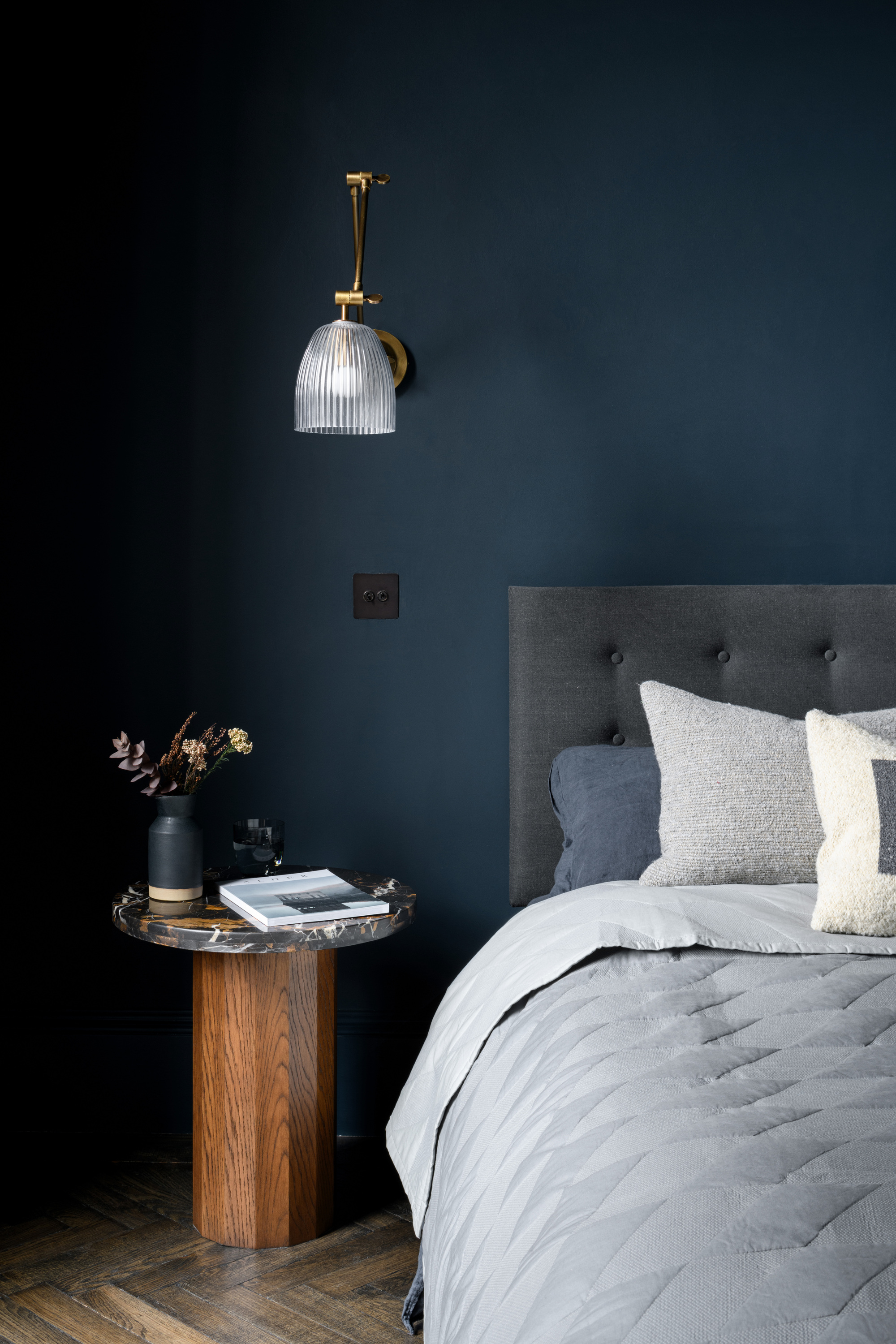
Blues are revered for being tranquil, meditative, and connecting to nature in an elemental, depths-of-the-ocean way. These shades inject a cool, airy, lifted quality into a room, making it feel open to a horizon beyond the walls.
But blue paints tinted by a black or gray as if a layer of smoke hovers over them — ‘sooty’ blues, if you will — are softened, muted, and touched by shadow, their gentle darkness acting as a sensory sponge, quieting emotional noise and shifting from outward-looking openness to forming inward-facing, protective bubbles.
“Sooty blues are a bold and strong choice on first appearance, but they surprise the viewer over time with the great level of depth they can display,” says Ben MacFarlane, associate at Pend Architects.
Much of the shade’s emotional levelling power comes from how it hangs on the threshold between visibility and shadow. As Ben explains: “It’s right on the boundary of how dark a color can be while still acting as a canvas for natural light and shadow, the subtle, desaturated blues pull through in the daylight, while it’s sophisticated and edgy in the darker corners.”
“Color drench a whole space to fully harness the mood-stabilizing properties of sooty blues,” he advises. “This balances and fortifies a consistent atmosphere, creating a large and continuous canvas for the paint to interact with different materials, lighting, and perspectives.”
4. Mineral Greens
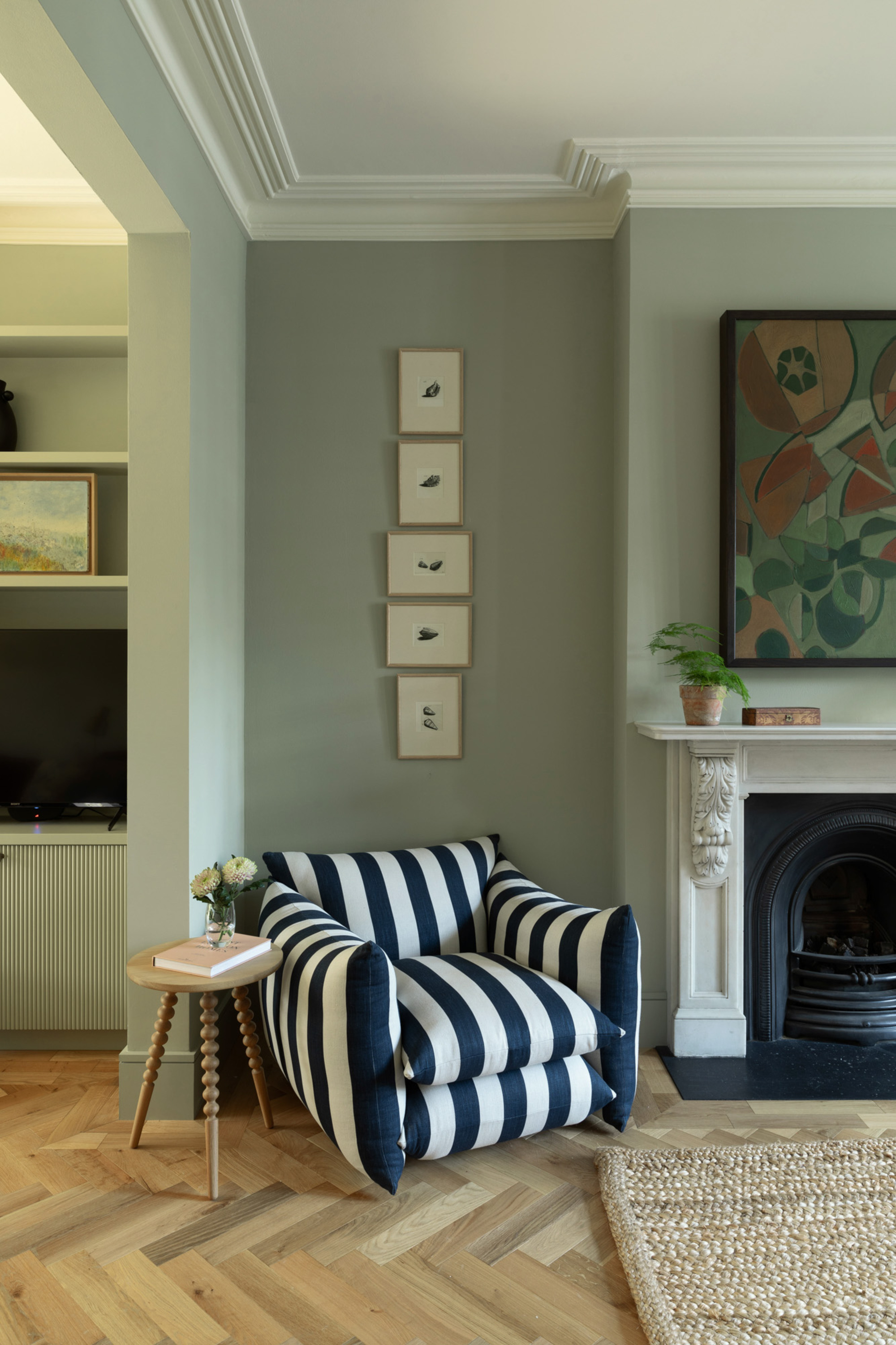
Fresh, spritely, and lively, greens typically bring life and optimism into a room, uplifting our spirits and sharpening our senses. Greens with a more mineral base — those that speak more of the landscape (earth, stone…) rather than plant life — are imbued with a grayed-out, dirty-ish tint that gives them weight and makes them feel moored in place. In other words, you can rely on a mineral green.
“Mineral greens are homely but also fresh — the perfect combination,” says interior designer Rebecca Wakefield. “They feel uplifting enough without being bright, and calm enough without being too dark."
Their true mood-levelling character reveals itself once they’re on the walls. “They’re a steady kind of color, and green doesn't change as much in the light as most neutrals, which makes a room feel harmonious and even,” says Rebecca. “They have a really beautiful mid tone, not too dark or too bright — perfect when creating a grounding space.
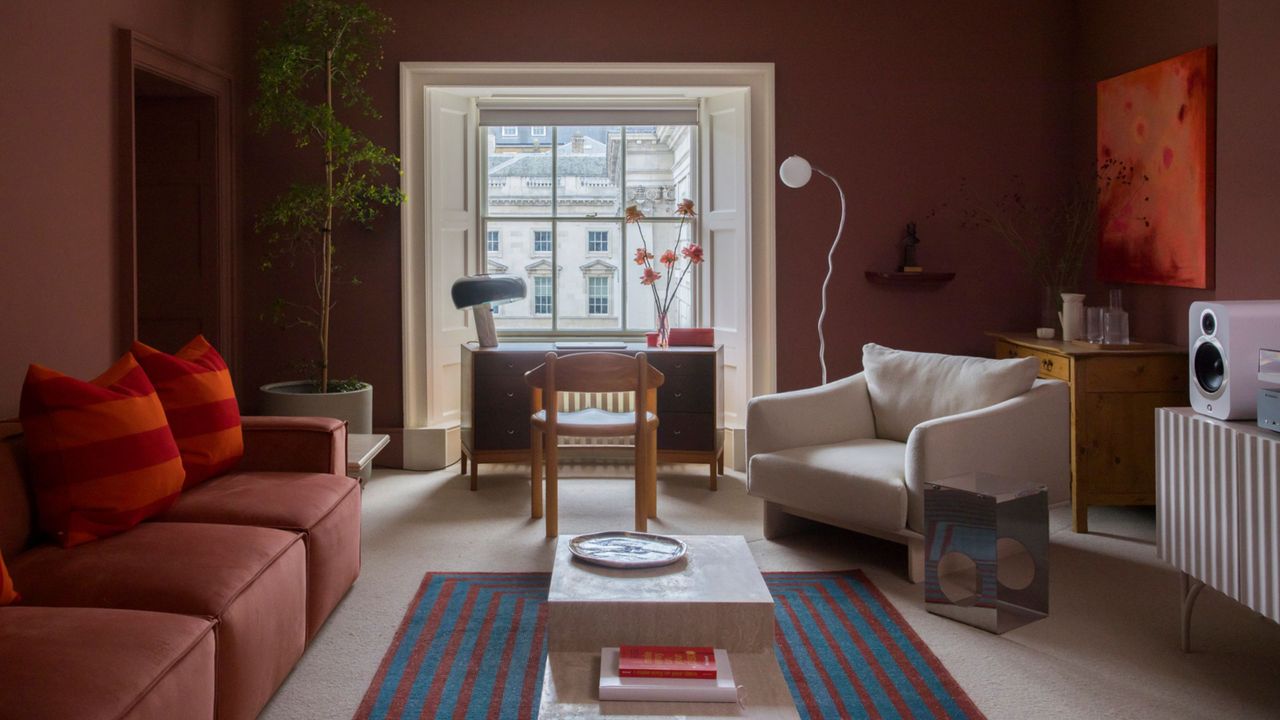
5. Rusty Reds
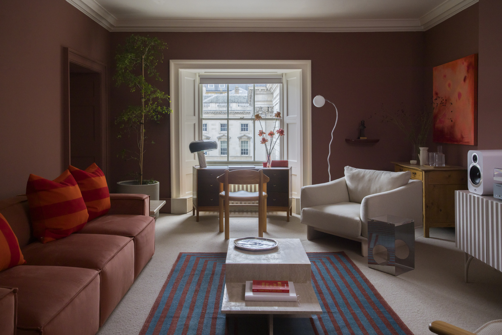
Decorating with dark reds in the home can be overwhelming. But add in a tint of rust, and suddenly it feels organic, enveloping, and rich. Teetering on the edge of brown, it can act as a neutral, while its subtle pink undertone keeps it feeling lively and dimensional. The rustiness loosens the stuffy formality of the traditional dark red, making it feel more natural and less imposing.
“Deep, blackened reds are simultaneously rich and muted, with warmth as well as gravitas,” says Russell Whitehead, designer and co-founder of 2LG Studio. “They’re powerful but calm.”
Merging richness with restraint, these reds cultivate a quietly regulated environment. “Rusty reds are strong and powerful — we have always been instinctively drawn to these hues as they’re so easy to use as a foundation color and work with many accent shades,” Russell continues. “Wash it across all walls for a simple immersive impact, so it feels cocooning and maintains a sense of equilibrium, and balance its redness with cool metals and raw natural finishes such as wood or stone.”
6. Linen Whites
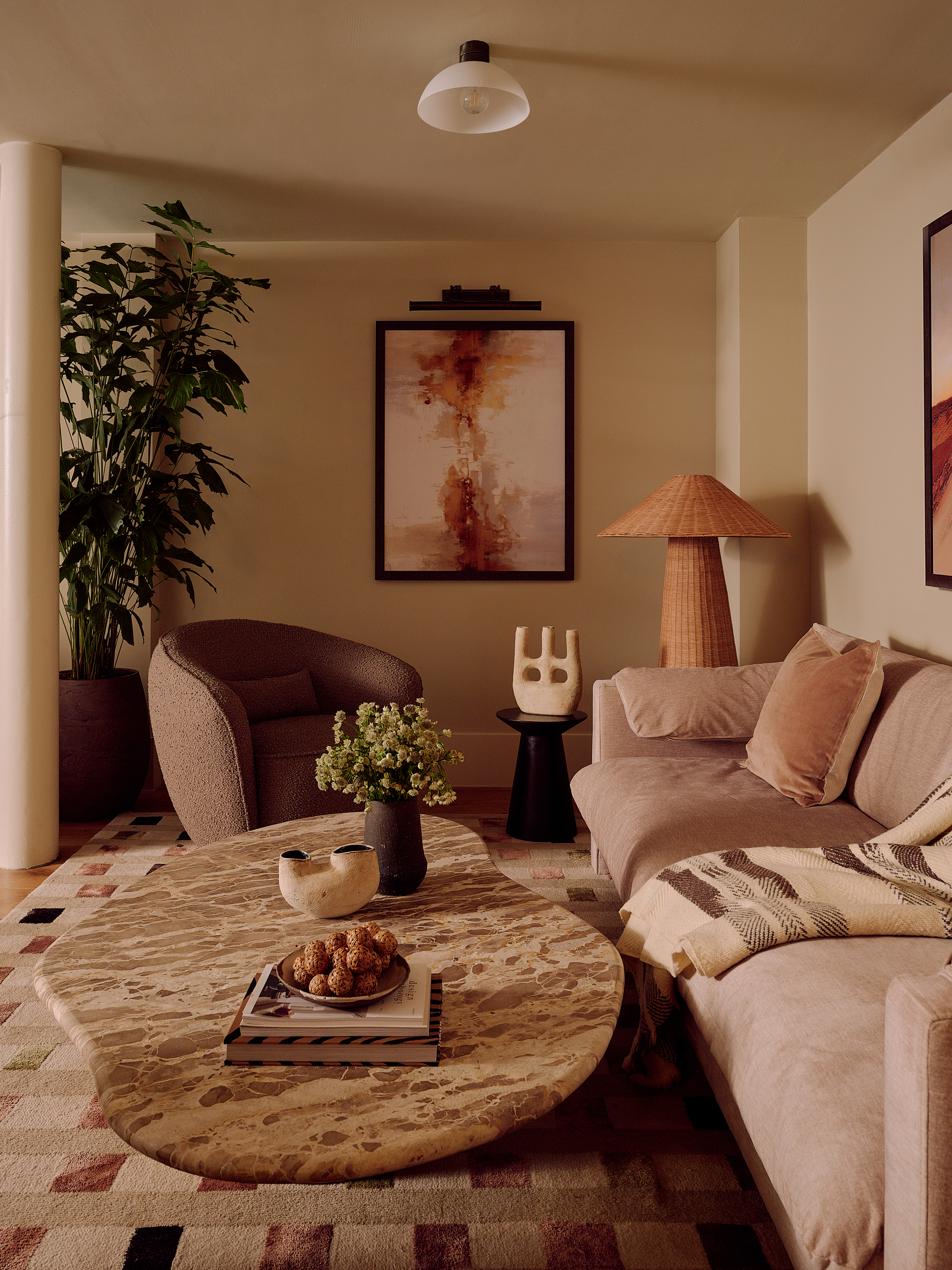
Linen whites are whites with vitality, with presence. The antithesis of a stark Brilliant white, they’re infused with a gentle creaminess, harnessing the glow of the sun and ushering it indoors. The result is a backdrop that is understated yet humming with constant warmth, diffusing any glare to keep things resolved and consistently calibrated.
“Linen whites are earthy tones with subtle warmth and lots of depth, reminiscent of stone or clay rather than a flat neutral,” says Franky Rousell, founder & CEO of interior design studio Jolie. “The earthiness of the color gives it a grounding quality, encouraging calm and helping to create a feeling of balance and emotional regulation.”
Linen whites respond to shifting light and texture in a way that quietly steadies the space all day long. “Pair it with elemental textures — wood, stone, or linen itself — and keep any contrasts soft, so the space feels cohesive,” says Franky.
The strength of the mood-stabilizing color lies not in drama, but in a soothing sense of permanence. Its color that doesn't feel overstimulating, but it's not about sedating the ambiance either; by deftly modulating the atmosphere around them, the colors foster spaces that are emotionally under control, and deeply, beautifully, livable.