Windows 11 has arrived, and with it comes Microsoft’s vision for the future of personal computing. This is a softer, more rounded Windows, one that puts the Start menu front and center while doing away with some of the cruft that cluttered up Windows 10.
But while Windows 11 does introduce some welcome improvements, many are so subtle you probably won’t notice them unless you’re specifically looking. One such update that will fly under the radar for most users is the removal of Internet Explorer, which was officially retired by Microsoft in June. Other changes that do manage to grab your attention — like the newly centered Start button — tend to fade into the background quickly.
But perhaps that’s part of the plan. Microsoft is pitching Windows 11 as a safer, more performant Windows that’s simple to use, with a welcoming design that’s meant to make using your PC for work and play easier than ever. If moving from Windows 8 to Windows 10 was a minor revolution, moving to Windows 11 is a refinement. Moving to Windows 11 might be worth all this fuss, as after the big Windows 11 2022 Update it now offers helpful features like tabs in File Explorer, folders in the Start Menu and Voice Access, which helps you control your Windows 11 PC with your voice.
And since just about every Windows 10 user with a qualifying machine has the chance to upgrade for free, the only thing most of us have to do is decide whether the revamped design and new feature of Windows 11 are worth the hassle of upgrading. To help you make that decision for yourself, read on for our full Windows 11 review.
If you've already upgraded or are thinking of upgrading, check out our guides on the best hidden Windows 11 features and how to speed up Windows 11.
Windows 11 review cheat sheet
- Windows Copilot for Windows 11 could be a Cortana you’d want to use
- AI apps are getting their own section in Microsoft's Windows 11 Store
- Windows 11 recently got its own screen recording tool — here's how it works.
- Windows 11 just got update that fixes an annoying gaming bug — and adds these features to boot.
- Pre-release versions of Windows 11 have been caught upselling other Microsoft services multiple times, though Microsoft has so far not rolled any of these ads into the release version.
- The new Windows 11 Voice Access feature is a game changer for work.
- Windows 11 got its first major update on September 20 -- here's what's new and how to get it.
- As of May 2022, Windows 11 is getting a much-needed feature that will make your life simpler: an easy app restore system.
- Windows 11 has a more inviting and streamlined look, with rounded corners and a new Start menu that's front and center. Microsoft is continuing to update and streamline it -- the latest Windows 11 update finally axes ugly volume UI, for example.
- New Desktops feature helps you set up multiple desktops for work and play.
- New Snap Assist and Layouts make it easier to manage multiple windows on your screen.
- Windows 11 widgets are fine if all you care about is the news, weather and your calendar, but at launch there aren't many others available and what's here is barebones.
- Auto HDR and DirectStorage will improve game performance — if you have compatible hardware.
- Steep system requirements mean most PCs built before 2018 are out of luck.
- Google launched a Google Play Games for PC app for Windows 10 and 11 in 2022, opening the door to all Android games on Windows 11.
- Windows 11 is officially getting some new features for iPhone owners, bringing increased iCloud integration and standalone Apple Music and Apple TV apps.
Windows 11 review: Price and availability
- Windows 11 launched on Oct. 5th, 2021
- Upgrading to Windows 11 from Windows 10 is free
Windows 11 officially arrived on October 5, 2021. If you’re buying a new copy, the update will be available in Home and Pro versions on Microsoft’s website and at select third-party retailers, just like Windows 10. It's worth noting that while Windows 11 Home requires a Microsoft account and an Internet connection to activate, Windows 11 Pro does not.
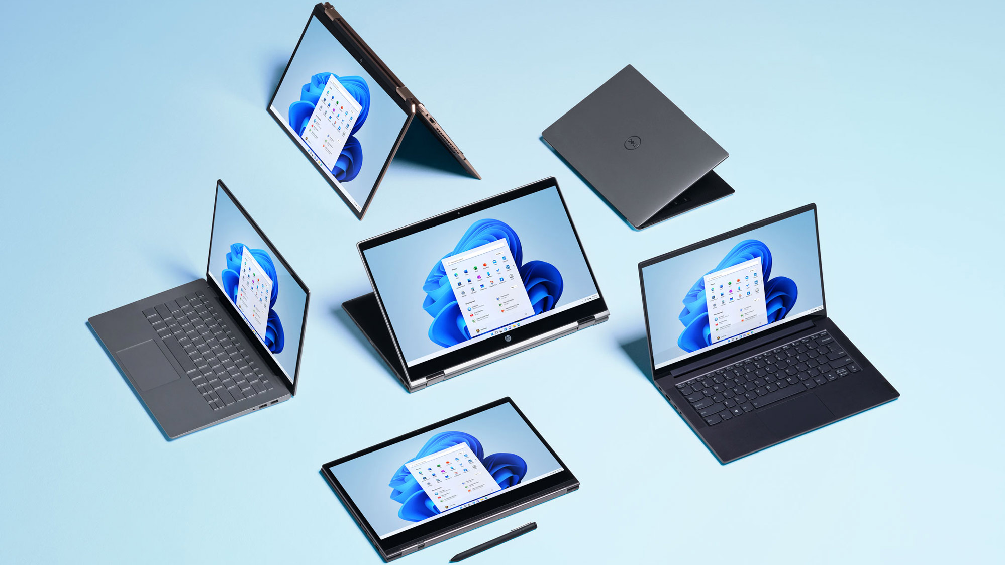
If your PC qualifies, upgrading to Windows 11 from Windows 10 will be free. Microsoft began rolling out Windows 11 updates to Windows 10 machines since launch but it has been a staggered release. Even now, Microsoft has prioritized PCs based on factors such as how old they are and how compatible they are with Windows 11. All compatible machines should get the option to upgrade by the middle of 2022.
That said, you can install Windows 11 on your PC right now if you’re willing to do a clean install of Windows 11 using an ISO file, but that means you’ll have to download the .ISO file yourself and mount it as a bootable drive.
Perhaps the most important thing to know about the release of Windows 11 is that we should expect it to change significantly over the next few years. I used beta versions of Windows 11 for a month in the lead-up to writing this review, and it seemed like there was a minor new feature or redesigned app to check out every few days. The frequency of updates has slowed since launch, but we've still received significant ones such as Android support for Windows 11.
So if you have any trepidation about upgrading, there’s no harm in waiting — while Windows 11 is, by my estimation, a completely decent and usable version of Windows with a slick new look, it’s not yet feature-complete. Plus, most of us won’t have the chance to upgrade for a while yet anyhow. And Microsoft has pledged to support Windows 10 into 2025, so there’s little risk in holding off.
Windows 11 review: System requirements
- Steep system requirements mean most PCs built before 2018 are out of luck
- It's still possible to install Windows 11 on non-compliant PCs — for now
The minimum specs Microsoft claims your PC needs to install Windows 11 have been controversial, to put it politely. As of this writing, the Windows 11 system requirements dictate that your PC must have the following:
- CPU: 1GHz or faster with 2 or more cores on a compatible 64-bit processor or system on a chip (SoC)
- RAM: 4GB
- Storage: 64GB of larger
- System firmware: UEFI, Secure Boot capable
- TPM: Trusted Platform Module (TPM) version 2.0
- Graphics card: Compatible with DirectX 12 or later with WDDM 2.0 driver
- Display: High definition (720p) display that is greater than 9 inches diagonally, 8 bits per color channel
- Internet: Windows 11 Home edition requires internet connectivity and a Microsoft account to complete device setup on first use. Windows 11 Pro edition does not.
These requirements are stringent enough to make installing Windows 11 on even semi-recent PCs a chore. Microsoft’s list of CPUs compatible with Windows 11 is both remarkably complex and way too short, since it’s limited chiefly to CPUs released since 2018. And the requirement to have an active TPM 2.0 has proven even more frustrating, since most of us have no clue what a Trusted Platform Module is, or how to tell if we have one in our PC. Here are more details on what a TPM is and why it matters for Windows 11 as well as how to check if your PC has a TPM.
Windows 10, by comparison, has a much broader range of acceptable CPUs and does not require you to have a TPM 2.0 enabled. Microsoft claims the stricter system requirements of Windows 11 are meant to make it a safer ecosystem by ensuring Windows 11 PCs are more hardened against cyberattacks, but it’s hard to take that claim seriously when it seems easy enough to get around the Windows 11 system requirements, During the Windows 11 beta period, it’s been possible to install Windows 11 on PCs that don’t meet the minimum system requirements by installing from an .ISO file, rather than upgrading directly.
Windows 11 will warn you that your PC isn’t up to snuff, but will otherwise let you carry on your merry way. You should be able to circumvent the system requirements in this way (or others) even after the official launch of Windows 11, though Microsoft has regularly told us that systems running Windows 11 without meeting the minimum system requirements may not receive updates via Windows Update — including essential security updates.
Windows 11 review: Updates and new features
Since its launch, Windows 11 has been evolving with new features added via major updates and a whole host of patches squashing bugs and shoring up the operating system. And the updates keep coming.
The Windows 11 Beta preview is a good way to get an idea of what features could come next to the OS. For example, the latest update (at the time of writing) to build 22624.1610 introduces Presence sensing, which can let apps detect when a user is active or inactive and lock themselves down if it's the latter in order to enhance user privacy.
Windows 11 review: Design
- Redesigned icons and menus to be rounder and more inviting
- Windows 11 looks nicer than Windows 10, out of the box
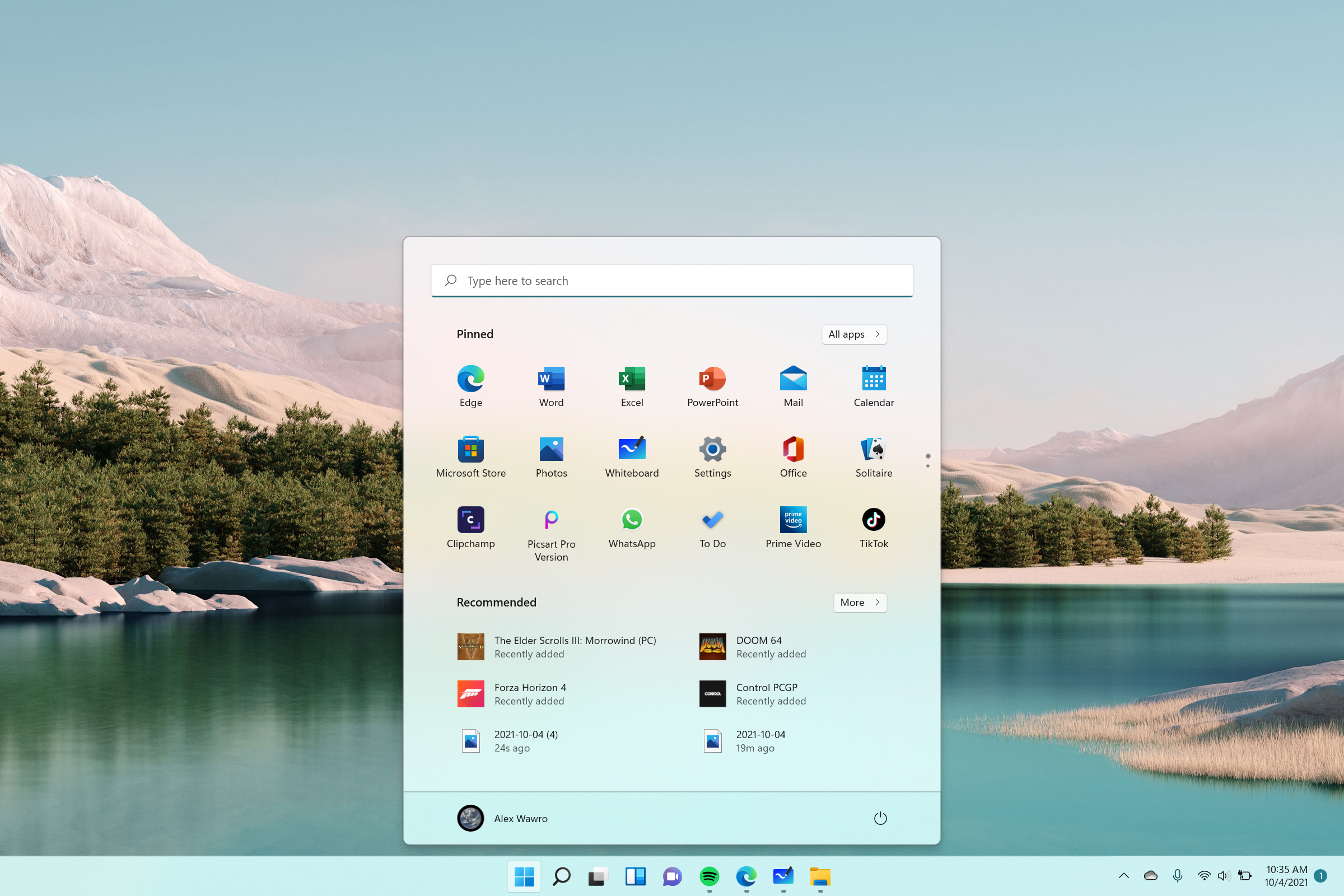
The biggest change you’ll notice when upgrading to Windows 11 is the new design. When you launch Windows you’re still greeted with a taskbar and desktop, but now there are some new buttons on the taskbar and they’re all centered in the middle, rather than clustered in the left corner.
During the lead-up to launch, I regularly heard words like “calm,” “focused,” and “freedom” to describe how Windows’ new look is intended to make users feel. Microsoft seems keenly aware that most of us have spent the past could of years enduring various forms of COVID-19 lockdown, and it’s selling Windows 11 as an operating system that can help you do more with your PC in a warmer, more inviting way, whether you’re using it for work or play.
It’s a nice idea, and after using Windows 11 (in various forms of beta) for over a month, I can tell you that some of the new features incorporated into its design do work well. They give me more tools for managing what I’m paying attention to on my PC, and when.
Windows 11 review: Desktops
- Helps give you more control over how you focus your attention
- Optional and easily ignored, like many Windows 11 features
Notably, there’s a new Desktops feature that helps you set up and manage multiple iterations of your desktop. It sounds complicated, but in practice it’s simple. There’s a new Task View button alongside the Start button which looks like two contrasting windows overlapping one another. Hover your pointer over it, and you’ll see a small preview of all the desktops you have open, as well as the option to set up a new one.
When you set up a new desktop, it’s effectively just a cosmetic difference. You can give a different name to each desktop, but they all access the same files on your PC and pull from the same Microsoft account. In my testing, I also found that desktop icons are shared across desktops, so if you delete your shortcut to Microsoft Edge from one desktop, it’s gone from all desktops. However, apps and windows you have open on one desktop aren’t duplicated on other desktops, and each desktop can also have its own custom cosmetics like wallpaper and theme.
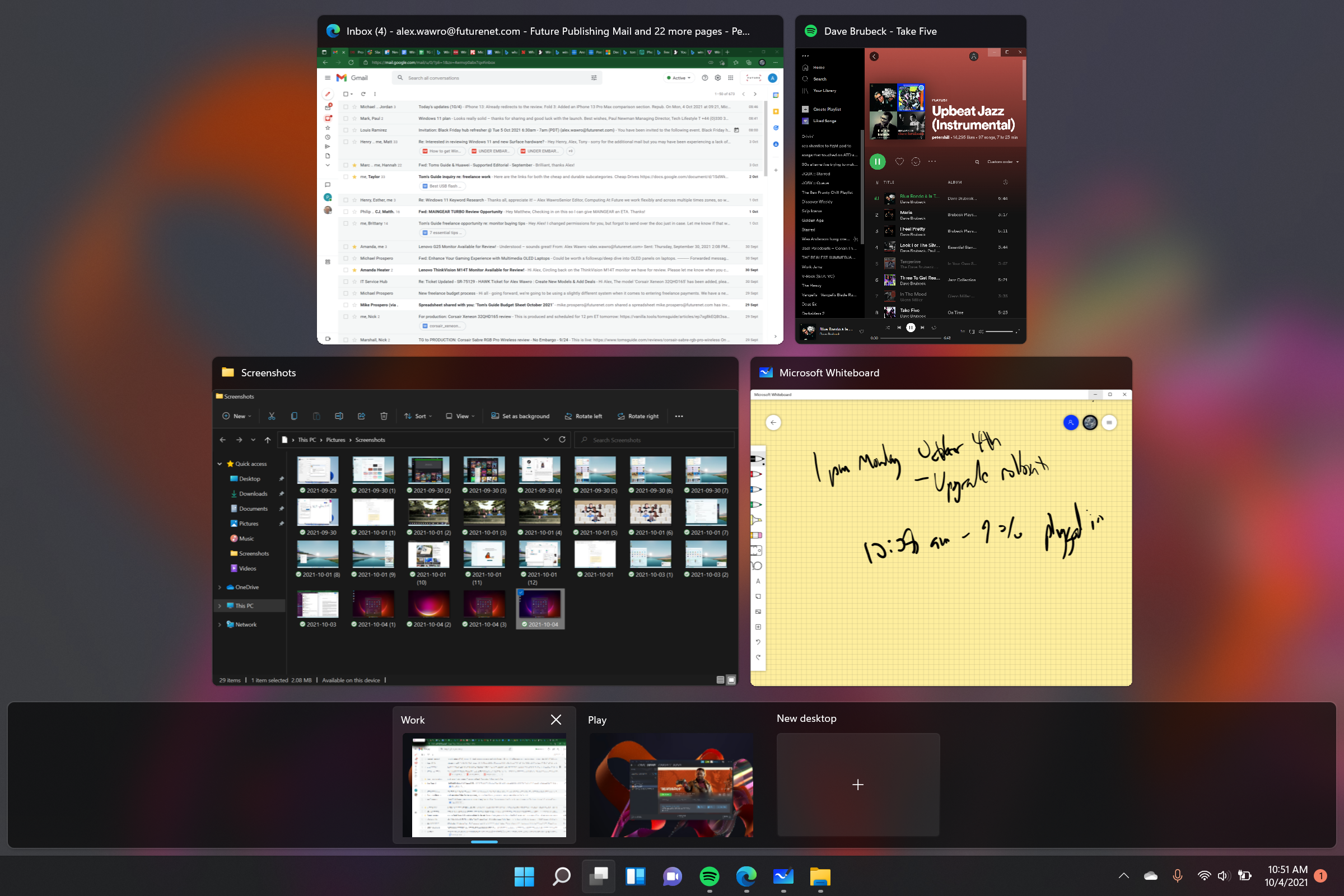
What this means, in practice, is that you can use desktops to silo your projects. If, like many of us, you’re using your Windows PC to both work from home and pursue your own personal projects, you could have one desktop named “Work” set up with your work apps open and another named “Play” with Steam and the Xbox app ready to go.
I’ve been using Windows 11 this way for some time now, and it feels like a natural evolution of how I already split my attention between work and personal stuff. When I’m using two monitors, I’ll have one earmarked for work apps (Slack, email, our CMS) and another set up to display my personal email, Twitter, and the like. Even when I’m using a single monitor, I tend to put browser windows side-by-side in Windows 10 so that I can focus on work while keeping tabs on my personal social media feeds.
If you work in similar ways, I think you’ll find Windows 11’s expanded Desktop groups feature useful once you spend some time coming to grips with it. But if you don’t care to, that’s fine too — like many new features of Windows 11, these desktop groups are optional and can easily be ignored. You can even remove the button from the taskbar entirely, though you’re still able to access the Task View by hitting the Windows key + Tab.
Windows 11 review: Teams
- Teams is now integrated into Windows, which is good for Teams power users
- If you don't use Teams, you can safely ignore it
Incidentally, there’s another easily ignored new button on the Windows 11 taskbar: a little purple Microsoft Teams icon. In the wake of the COVID-19 pandemic, Teams saw a big boost in users and now Microsoft has made it a more central component of Windows.
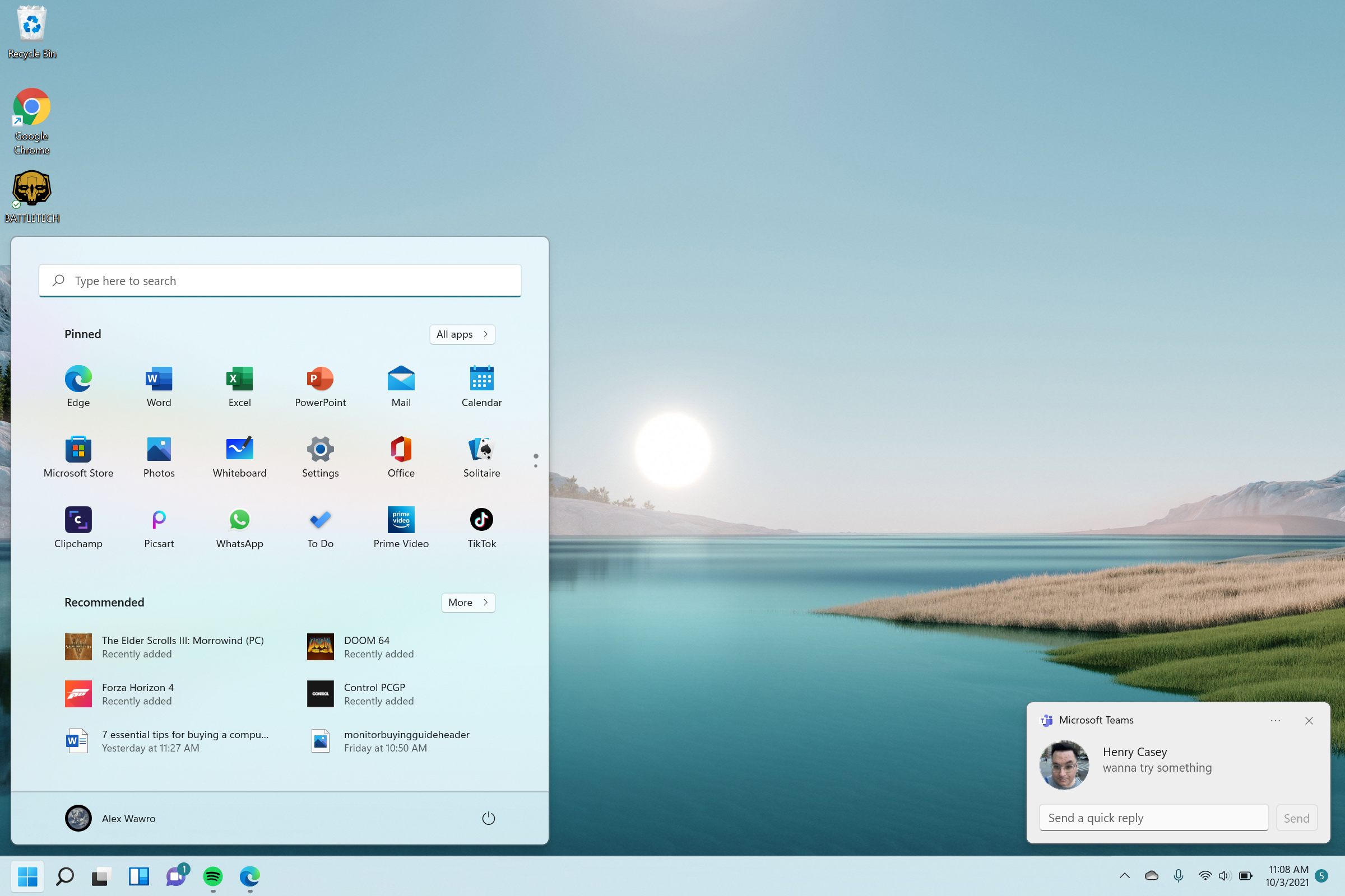
However if you never use Teams, you don’t have to start now — you can remove the icon from the taskbar and uninstall Teams entirely without losing out on any meaningful features.
Windows 11 review: Snap Assist, Layouts and Groups
- Layouts give you more granular control over screen real estate
- Groups let you batch control groups of related windows
A more notable new feature of Windows 11 is Snap Assist, which makes it easier to arrange open apps on your desktop into Layouts and Groups. Like much of Windows 11, it’s a more granular version of a Windows 10 feature —specifically, the way you can already “snap” windows into pre-configured layouts on Windows 10.
On Windows 11, instead of having to drag them into position (or know the keyboard shortcuts), you can just hover your pointer over the minimize/maximize button in the top-right corner of any app window. A little pop-up window will quickly appear showing pictographs of different layout options: splitting the screen 50/50 between two apps, for example, or 50/25/25 between three, or even giving one app two-thirds of the screen while a second app lies narrowly alongside it in the remaining third.
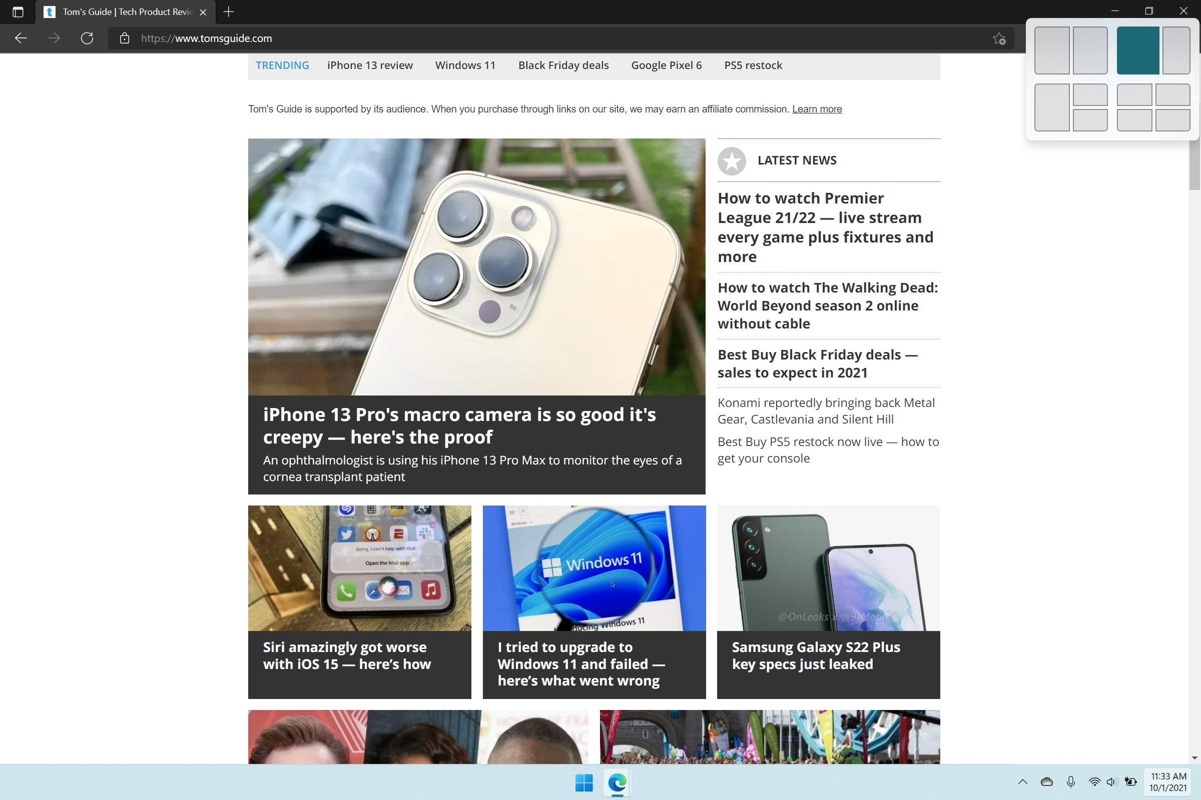
Once you pick a layout (by moving your pointer to hover over your chosen layout, highlighting where you want the current app to go), Windows will help you fill in the rest of it by serving up a menu of apps you currently have open and letting you assign them to different parts of the screen.
Windows 11 will also attempt to automatically remember your layout as a group, which means that if you minimize everything you can quickly open all the same apps in the same arrangement by mousing over the minimized app’s icon in the taskbar and selecting the Group option that pops up. It's very similar to how Spaces works on macOS and serves much the same function.
These are neat features that improve upon the screen real estate management options already available in Windows 10. Admittedly, during testing, I found myself rarely using snap assist or groups, and the only layout I reliably used was the simple 50/50 side-by-side view I’ve been using in Windows 10 for years. But if you’re more of a power user than I am, these new features should help you feel a little more productive in Windows 11.
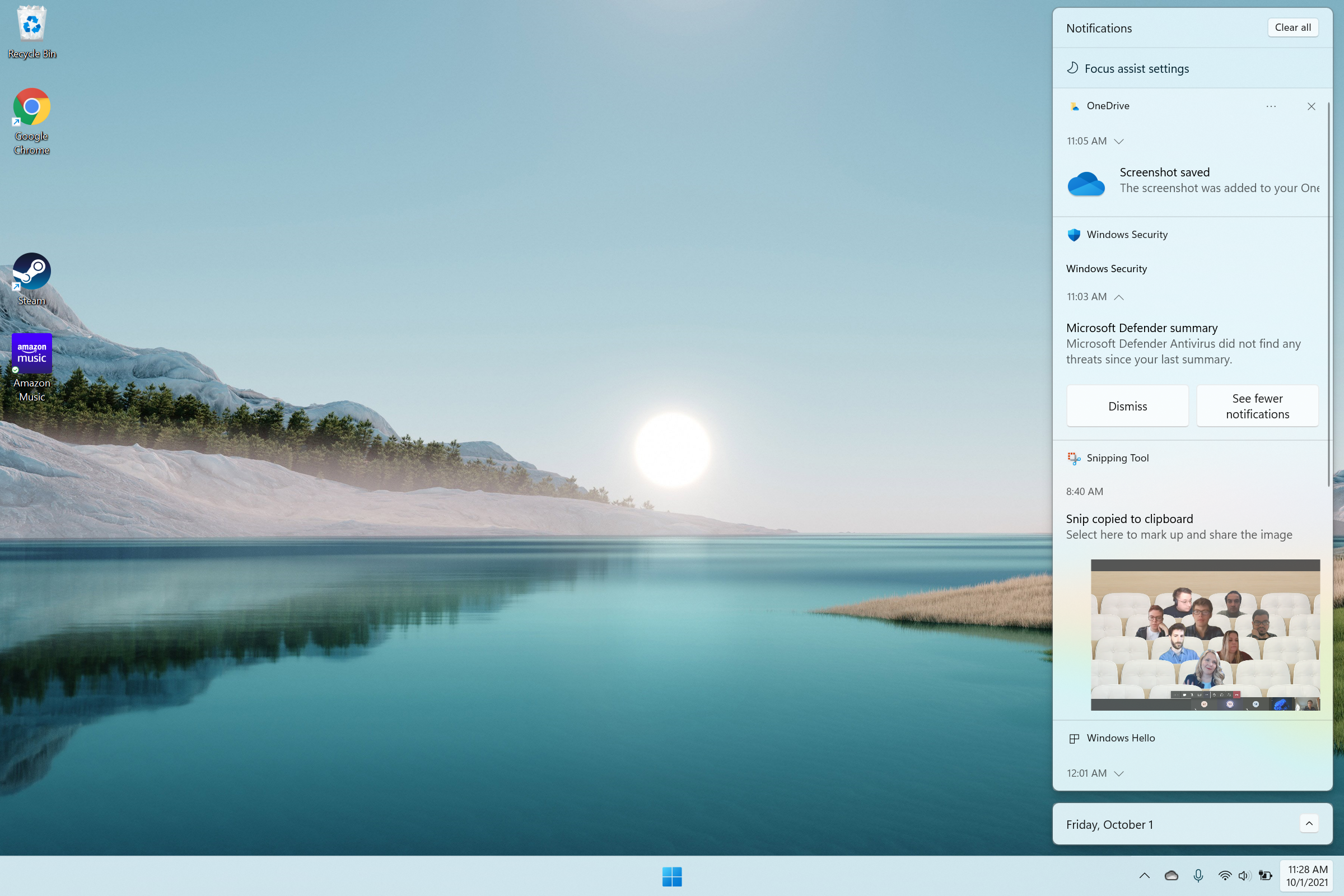
There are countless other small changes lurking in the design of Microsoft’s latest OS that are too numerous to get into here, and in my experience, all of them are pretty easy to adjust to once you spend a few hours getting to know Windows 11.
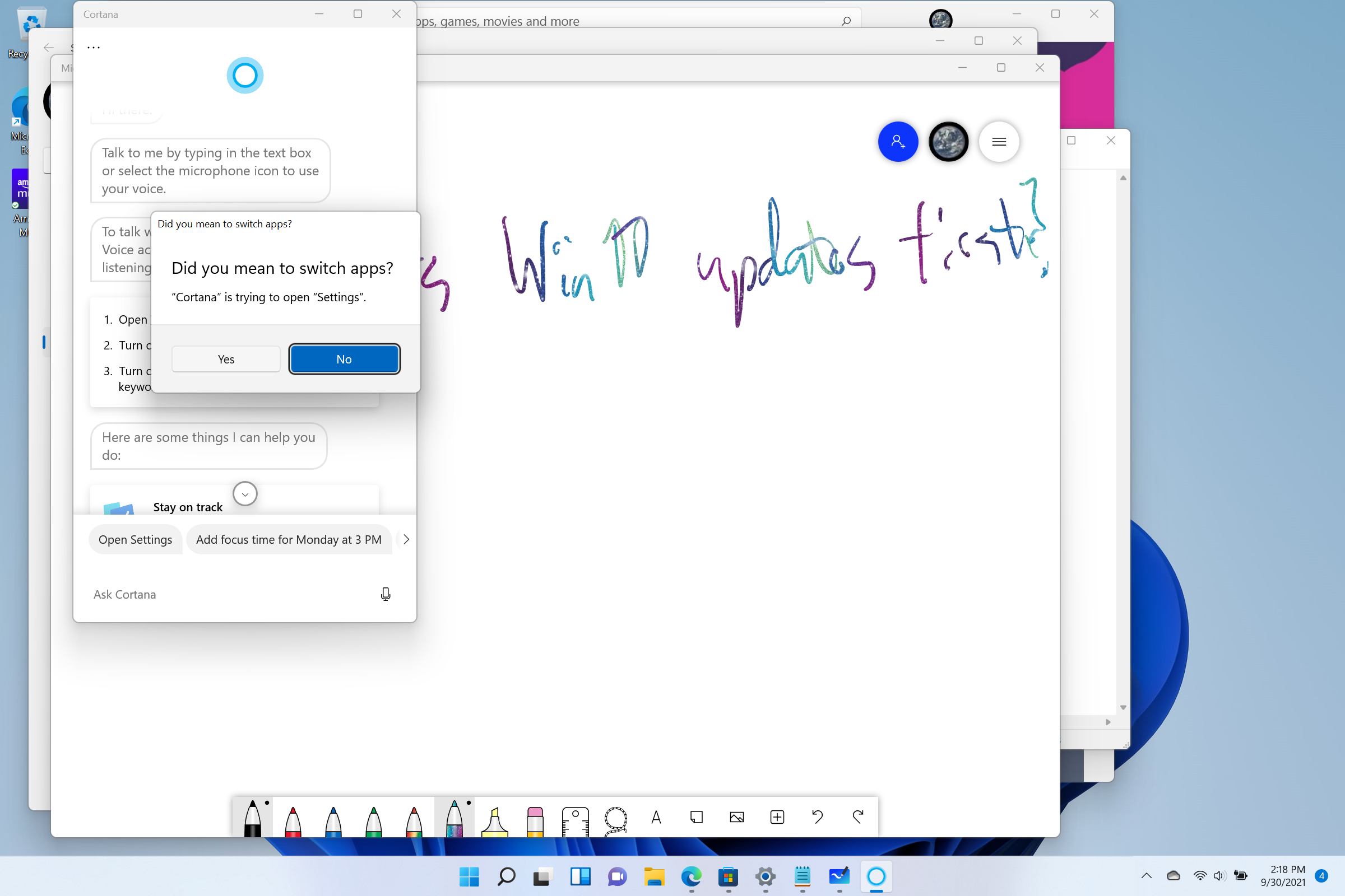
There’s a new tiered notification menu that slides out of the right side of the screen, for example and more granular options for controlling which notifications you see and when. Cortana is completely gone, though you can still download it from the Microsoft Store.
There are also newer, more streamlined context menus in many parts of Windows, so that when you do something like right-click a file in File Explorer you now get a smaller menu with fewer options that are crowned by icons for common tasks like Cut, Rename, or Share.
At the same time, if you dig just a little bit behind the surface of Windows 11, you’ll find the familiar face of old Windows there to greet you. There’s typically an option to “Show more options” at the bottom of those new, shorter context menus, for example, and if you hit it you’ll see the longer, messier context menus we know from Windows 10. Mingling legacy components of Windows into Windows 11 like this has the potential to be deeply confusing for casual users, but Windows vets may appreciate that the old ways of doing things still (by and large) work.
Windows 11 review: The new Start menu
- Yes, it's in the center now and yes, you can move it back to the left
- New design is simpler and more functional
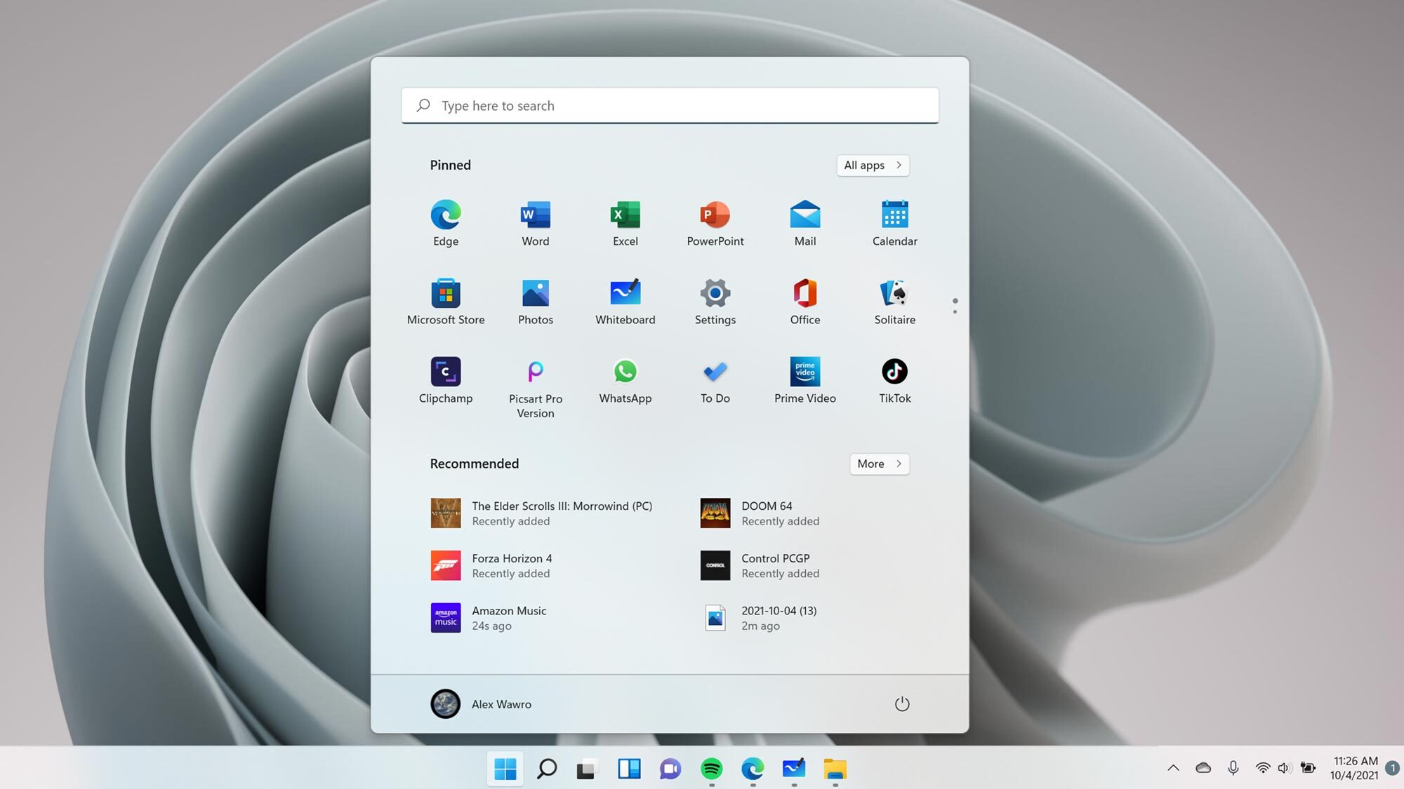
Let’s focus on one of the most controversial changes coming with Windows 11 — the Start button, which has been uprooted from its decades-long home in the bottom left corner of the taskbar and slid over the center. So, too, have the row of pinned apps typically nestled next to the Start button: now they’re all centered in the taskbar. When you hit the Start button a compact rectangular menu that looks a lot like Android’s app drawer opens above them.
This new Start Menu bears all the hallmarks of Microsoft’s Fluent Design language: it has rounded corners, centered text, and big, colorful icons. It also has a search bar prominently displayed across the top, which I think is great because hitting the Start button and typing the name of whatever program, file, or menu you’re after is one of the fastest ways to get around Windows.
The trick is, there’s no clear indicator you can do this on older Windows Start menus — you have to read about it or just stumble into it by accident. Now that there’s a clear Search bar at the top of the Start menu, hopefully more people will have an easier time getting around Windows.
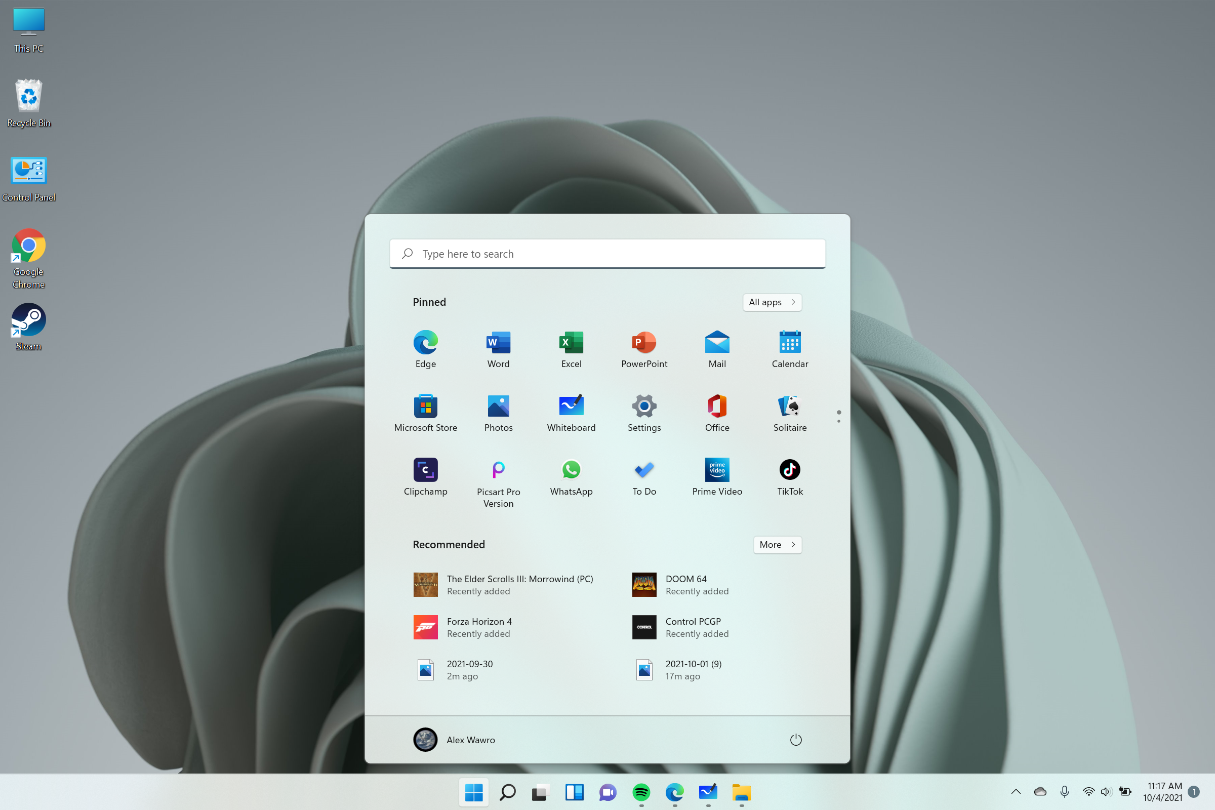
Below the Search bar, most of the Start menu of it is taken up by a 3 x 18 scrollable grid of pinned apps: this is where you put your most-used apps, and by default it’s full of Microsoft standbys like Edge, Excel, Notepad, Word, the Microsoft Store, and of course, Solitaire. There’s also an “All apps” button in the top right corner of the menu which opens an alphabetical list of all programs and program folders you have installed.
Below the scrollable grid of apps is a “Recommended” section that shows a 2 x 3 grid of programs, files, or folders Windows thinks you might want to access. As far as I can tell, the algorithm that determines what shows up in this lower section of the Start menu predominantly cares about what you most recently used, and in my experience this “Recommended” section mostly shows the most recent apps and files you’ve used or downloaded.
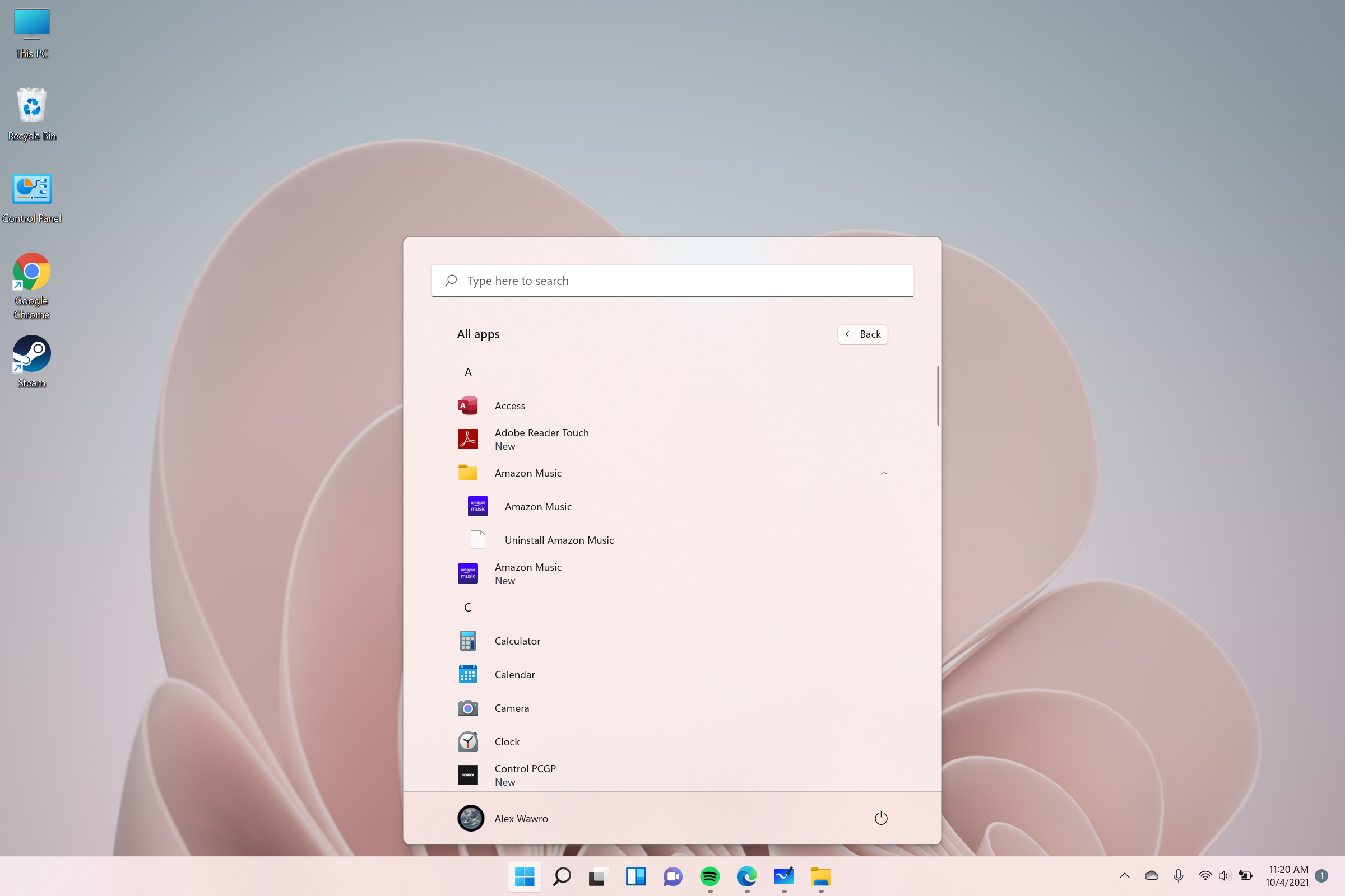
It’s a simpler, streamlined menu that’s effectively a refinement of the existing Windows 10 Start menu. Gone are the Live Tiles which used to haphazardly fill up the right-hand side of the Win 10 Start menu. Gone also are the quick links to Settings, Pictures, and Documents, though these can all be quickly accessed in Windows 11 by typing the relevant term while you have the Start menu open. You can access the same “secret” Start button context menu as you can on Windows 10, too, with the same trick: just right-click the Windows 11 Start button and you’ll see a simple list of useful shortcuts to things like the Task Manager, the Settings menu, your power options, and more.
Just as a small aside, one of the nicest aspects of the new Start menu is that after more than a month of using it, I’ve yet to notice a single “Suggested” ad from Microsoft inserted without my knowledge. This is a nice change from Windows 10, which will often insert a link in the Start menu to advertise something to you (in my case, the Bing Weekly News Quiz) unless you specifically right-click said ad and tell Windows to turn off all suggestions.
Windows 11 review: Widgets
- Widgets available at launch are bland and unhelpful
- We need more control over what headlines appear in Widgets menu
One of the big new features Microsoft touts for Windows 11 is Widgets. These are auto-updating tiles showing things like news headlines, weather, and your calendar, and the concept should not be unfamiliar if you spend a lot of time staring at a mobile phone.
Windows 11 widgets also aren’t so far removed from the Desktop Gadgets we saw in Windows 8; instead of sitting on your desktop, though, Windows 11 Widgets reside in a hidden tray that slides out from the left side of the screen when you hit the Widgets button. Speaking of that button, it’s now embedded alongside the Start button on the taskbar.
It’s a neat idea, and perhaps in the future I’ll come to rely on Windows 11 Widgets during my daily routine. But right now, Widgets on Windows 11 are quite limited and easily forgotten. When Microsoft first announced they were coming to Windows 11, we were shown demos of a Widgets panel that can be customized, expanded into full-screen mode, and rearranged to your liking.
But In the lead-up to the formal launch of Windows, 11 I’ve played around with Widgets and found them terribly rigid: there aren't many available yet, I can’t customize much of what they show me, and at the time of writing this review, I couldn’t resize the Widgets panel at all.
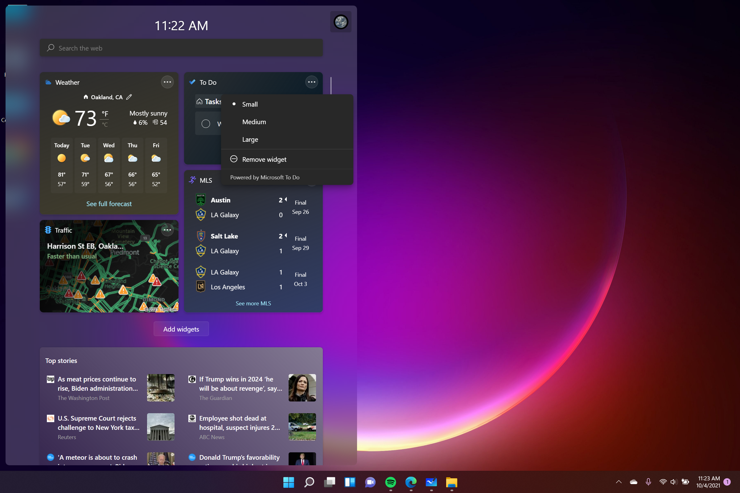
Of course, your experience could be completely different if Microsoft changes the way Widgets work by the time you read this. But here at the launch of Windows 11, when I hit the Widget key I’m greeted by a pane that slides out from the left. At the top of that pane are widgets that show data like the local weather, some current financial stock values, and my to-do list. I can move them around and change their size, remove them, or swap in new ones by opening the Widgets menu in the top-right corner, but right now there are only 9 available.
Beneath the widgets is a Top Stories module listing six headlines from major media outlets I had no obvious hand in choosing, and I can choose to see more or less stories from those outlets with little 3-dot menus on each headline. Below that Top Stories module is an endlessly scrollable list of rectangular tiles, each of which shows a headline and image from a curated list of media organizations I had nothing to do with selecting. Each of these stories can be removed by hitting a little “X” button in the corner, and they each have their own little 3-dot menu button which gives you options for seeing more or less stories from that outlet.
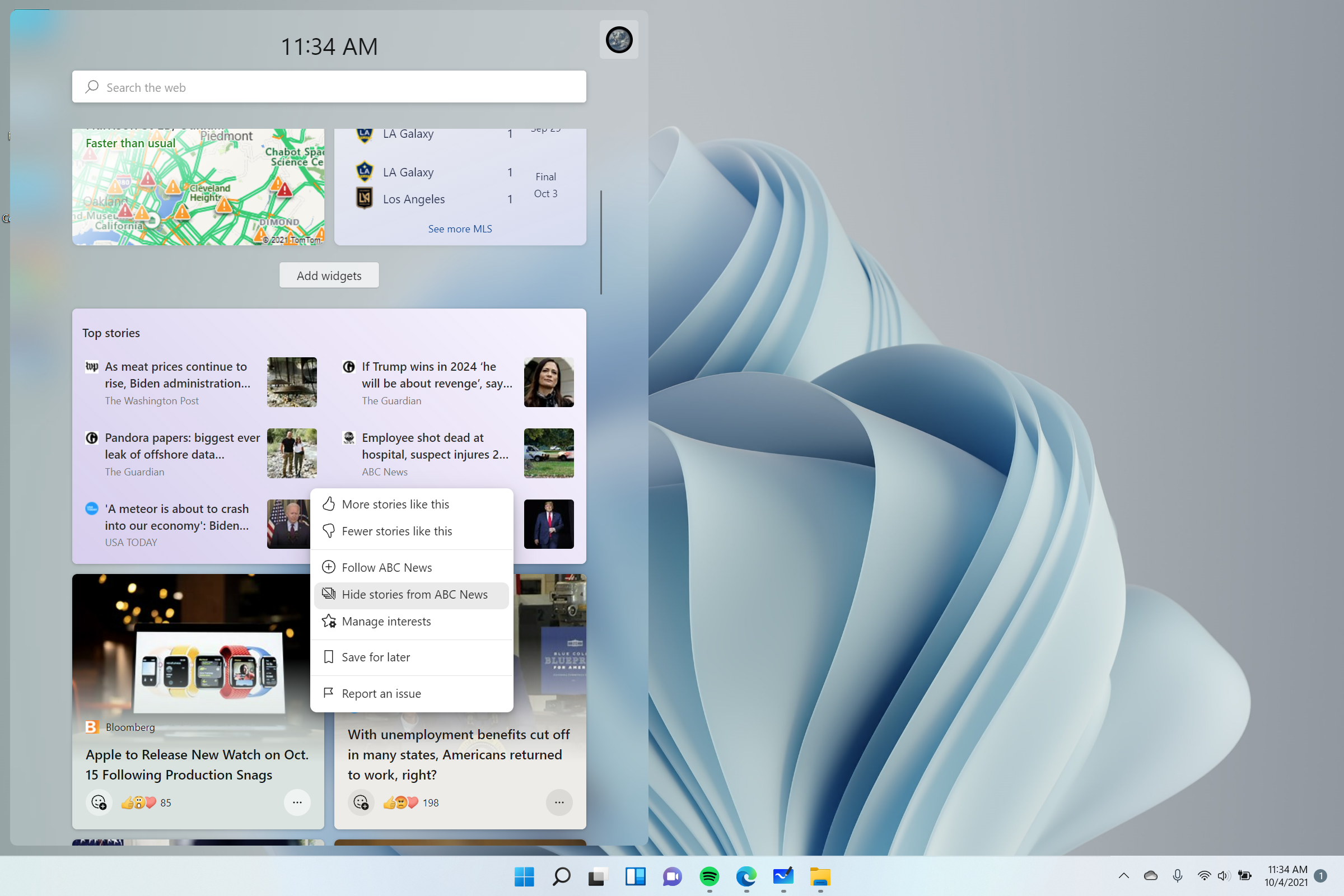
This news feed is tied into your Interests, which Microsoft introduced earlier this year as part of Windows 10. You’re asked to select some Interests when you first set up Windows 11, and the main way of controlling what appears in the news feed of your Widgets menu appears to be changing your interests in the My Interests section of Microsoft’s website.
Maybe that's useful for some, but in my experience the widgets and news stories available in the Widgets menu are completely superfluous and hard to configure. I hope Microsoft makes some big changes to Windows 11 Widgets quickly, because I can’t see why anyone would use them at this stage. At best, the Widgets menu appears to be a hard-to-customize way of catching up on news, weather, and sports scores, all of which can be accomplished just as easily in a browser or on your phone.
Windows 11 review: New gaming features
- Auto HDR is great — if you have an HDR-capable display
- Likewise, DirectStorage is nice if you have a compatible NVMe SSD
There are two new Windows 11 features that game enthusiasts will care about: Auto HDR and DirectStorage. Put simply, the former can make the lighting in games look much better, while the latter can help games load more quickly. However, both require specific hardware in order to work.
Auto HDR is a feature which uses machine learning to replicate the effect of high dynamic range lighting in DirectX 11/12 games which lack it. It’s hard to describe the difference HDR makes if you haven’t seen it yourself, but in essence, lighting looks better thanks to an increase in the spectrum between the lightest and darkest parts of the picture. It works well on the Xbox Series X/S consoles, but less so on Windows 10.
It’s a neat feature to have in Windows 11, and it really makes the lighting in games pop, but to take advantage of it you have to have one of the best monitors capable of displaying HDR content. HDR-capable monitors are still pretty rare, and HDR support is equally rare in laptop panels, so chances are the majority of Windows users don’t currently have displays which can take advantage of Auto HDR.
In contrast, DirectStorage is all about cutting down loading times by using some tricks to pipe game data directly to the graphics card, rather than involving the CPU. That should make games load faster, but to use this feature, you’ve got to be playing a game that takes advantage of the DirectStorage API on a PC with an NVMe SSD and a GPU that supports DirectX12 Ultimate.
Luckily, those two components are pretty common in new PCs these days, so as long as your machine isn’t too ancient, there’s a good chance you’ll see faster game load times on Windows 11. Anecdotally, I saw games like Forza Horizon 4, Control, and The Elder Scrolls III: Morrowind load quite speedily in Windows 11.
Windows 11 review: Native Android apps
- You can (finally) install native Androids apps on Windows 11
When Windows 11 was announced, one of its most interesting features was the ability to install and run Android apps natively, rather than relying on third-party methods. And while the feature wasn't made available upon the OS's release, if you're based in the US, it's now possible to install Android apps on your PC natively.
You can run Android apps on Windows 11 thanks to a collaboration between Microsoft and Amazon, with apps being supplied from Amazon's own app store. Admittedly, with the Amazon Appstore still being in preview, the selection isn't that great so far. Still, if you want to play a round or two of Subway Surfers without having to bust your phone out, Windows 11 has you covered. Here's how to install Androids apps on Windows 11.
Windows 11 is now blocking Edge blockers
Previously, Windows 11 Insiders got an early look at Microsoft’s move to block users avoiding the Edge browser for certain functions. Now, the update has rolled out to everyone using Windows 11 in build 22000.376.
While Windows 11 makes it easier to change default browser functions, some functionality within the OS — such as the news and weather widgets — are hardcoded to open in Microsoft Edge via “microsoft-edge://” links. Previously, apps like EdgeDeflector could redirect this to a browser of your choice, but that loophole has now been closed.
Thankfully, there is a workaround via an app called MSEdgeRedirect, that can download from GitHub here. According to the app's description, it “filters and passes the command line arguments of Microsoft Edge processes into your default browser.”
The main issue with this solution is that it has to be running in the background at all times to function. There's little doubt that Microsoft will also block this app from working. But for the moment, it's an option if you aren't a fan of Edge.
Windows 11 review: Known issues
In addition to missing advertised features, Windows 11 has some known issues at launch that you should at least be aware of before you try to upgrade.
For example, Windows 11 ships with VBS (virtualization-based security) enabled by default, and that can be bad news for gaming PCs (at least, pre-built ones) because VBS uses up resources in a way that can negatively impact game performance.
Also, folks who reside in China are out of luck right now if they want to install Windows 11, because it requires TPM 2.0, and foreign-made TPM chips are currently banned in China.
And while it's not an issue per se, Microsoft seems determined to promote its Edge browser in its latest operating system, which can get irritating.
For more up-to-date details, check out our guide to the latest Windows 11 problems and fixes.
Windows 11 updates
As part of a Windows 11 update, Windows Insiders get access to a bunch of new enhancements in the Notepad app, which will be coming to all users. The Notepad app now has dark mode, which flips the traditional black text on white background for a look that’s both visually appealing and something that should offer a bit less strain on the eyes.
In addition, ‘Find and replace’ and the text search tool have been combined into a single floating bar, and there is now support for multi-level undo. We will be updating this review with other Windows 11 updates as they are released.
A more recent update indicates that Microsoft seems to be pushing forward to migrating Control Panel features to the Settings app in Windows 11.
The upcoming Sun Valley 2 (the first major Windows 11 update of 2022) will make using the Alt+Tab shortcut easier on the eyes and help you be more productive. Pressing Alt+Tab brings up a small window showing your open windows. This happened previously, but the main difference now is that the background around the window is blurred. The shortcut works exactly as before, but the blurred background is decidedly more aesthetically pleasing.
Windows 11 review: Verdict
It’s hard to make a definitive judgment about Windows 11 because so much of it is still being built out in front of us. Native Android app support took too long to arrive, Widgets lack some advertised features, and during testing, I ran into annoying (but not critical) bugs in apps like Snipping Tool and Cortana. I expect Microsoft will address all of these issues in due time, which means it should be a whole different OS by the time many of us get the offer to upgrade from Windows 10.
The Windows 11 you log into on your brand-new PC will be different from the Windows 11 I used in the weeks prior to launch, and they’ll both look different than whatever Windows 10 users see when they upgrade in the future.
But so far, what’s here is pretty good. Windows 11 refines what’s good about Windows 10 without losing too much in the process, and once you learn how everything works, the new operating system is rarely any harder to use. It’s more customizable, and new tools like Desktops and Snap Assist give you more granular control over how you divide up your screen and your time.
Windows 11 is more streamlined and easier to navigate with a touchscreen, with bigger touch zones and simpler, rounder menus. In many ways, Windows 11 is more akin to competitors like macOS, Android, and Chrome than ever before — and I think that’s generally a good thing.
Most importantly, if you don’t like the changes, most of them can be safely ignored or changed back to the way you like them — even the Start button can be slid back into the lower-left corner by clicking a button in the taskbar settings. And if you don’t like the look of Windows 11, you can safely ignore it and keep using Windows 10 for years — though Microsoft will eventually expect you to upgrade.
But right now, as much as I like Windows 11, I don’t recommend you upgrade unless you’re really excited about the new tools and revamped design. There just isn’t a compelling reason to, and you’d be well-served by giving Microsoft time to address some of the bugs and build out the features a bit more.
Read next: Windows vs macOS: Which is better for you?


