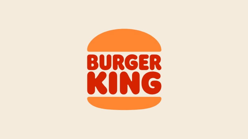
When Burger King unveiled its first full rebrand in over 20 years in January 2021, we called it a celebratory and personality filled masterclass in flat design. At a time when many brands were busy sanding down their identities into bland, minimalist sameness, Burger King did something far more interesting. The brand went backwards, arguably kickstarting one of the biggest design trends of this decade.
Created by JKR, the overhaul touched everything, from the logo and packaging to uniforms, menus and digital interfaces. It was, as the brand put it, “mouthwatering, big and bold, playfully irreverent and proudly true.” The centrepiece was a new logo that ditched the glossy 3D blue swoosh of the 1999 design in favour of something radically simpler yet familiar: a modern take on Burger King's 1969 logo.