Watch design is necessarily conservative – apart from the obvious restrictions of form and function, there are brand codes and commercial realities in play. So, when a new idea does break out of the less constrained independent sector, commercial brands go all in (as with the last decade’s obsession with all things Gerald Genta).
Brutalist watch design
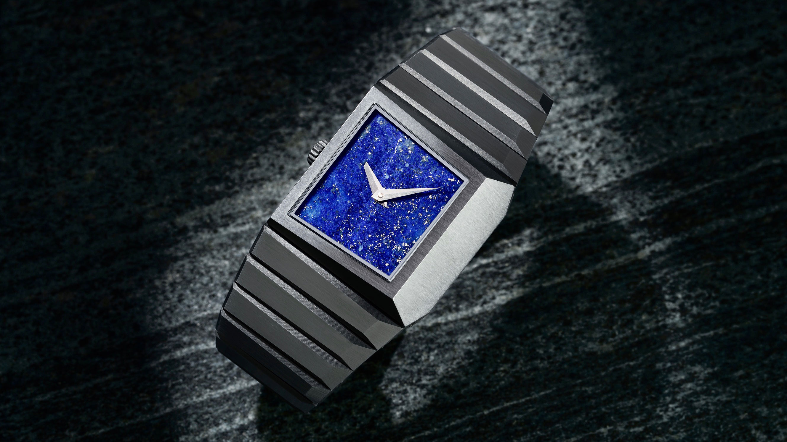
The runaway success of the B/1, a limited-edition $4,000 debut watch by Toledano & Chan (pictured top) partly inspired by Marcel Breuer’s brutalist building for the Whitney Museum in New York, caught the attention of the watch world for both the speed at which the edition sold out and the fact that Phillip Toledano and Alfred Chan, a conceptual artist and designer respectively, are well connected with social media tastemakers.

The B/1 hit a sweet spot, its creators noted, ‘between the major brands rehashing their back catalogue and the wild, rococo exuberance of independent watch brands’. The 33.5mm case is certainly drawn from a window on the Breuer building, though you can’t imagine anything as purely decorative as the lapis dial getting anywhere near Breuer’s design concepts. And that’s where the other, perhaps more important, influences come into play.

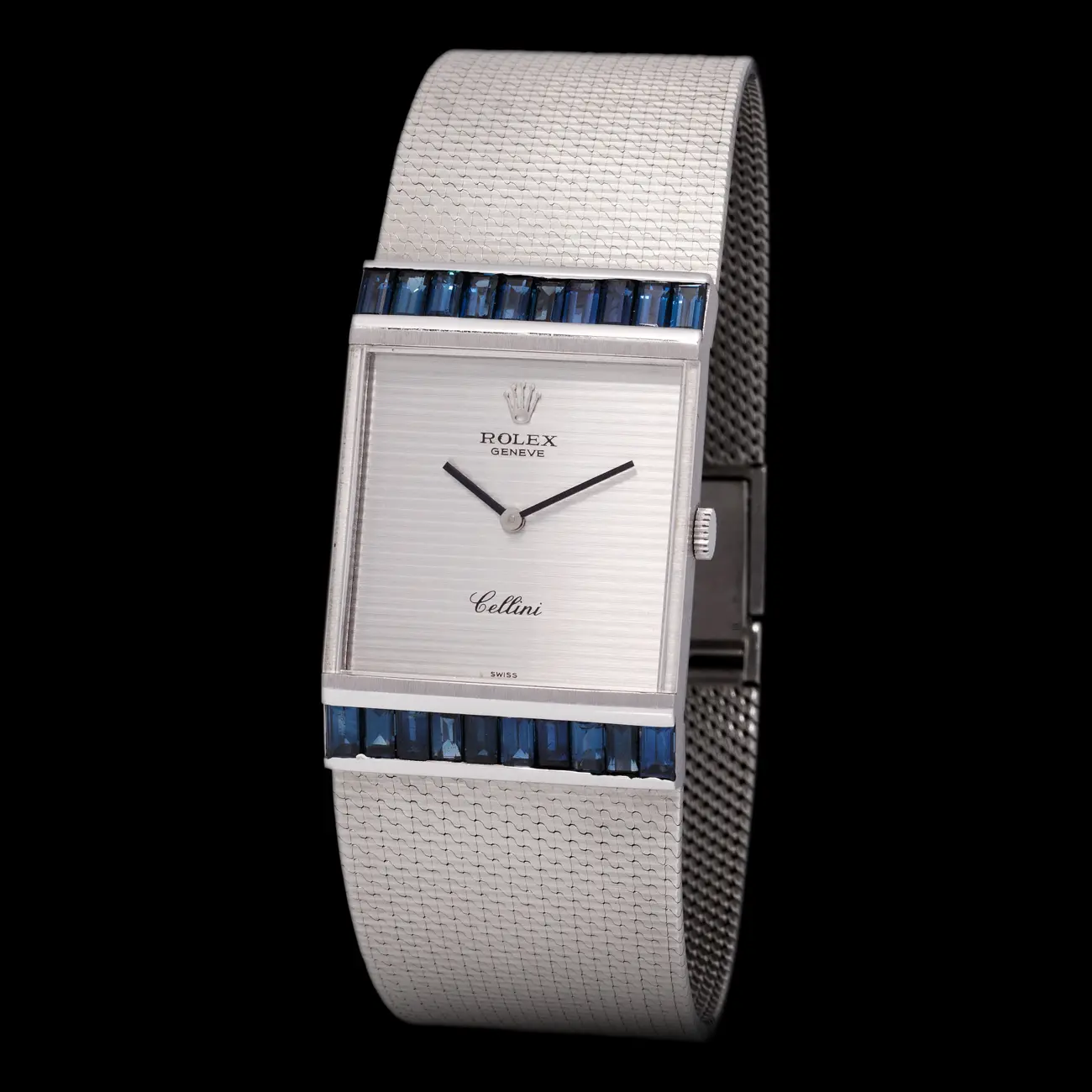
The pair acknowledge the 1970s decade as a reference, but one that’s more free-wheeling and ambitious in design terms than is sometimes remembered – the era of the Rolex Midas, Piaget Polo, Patek Philippe’s variations on the Ellipse and this from Van Cleef Arpels – all of which quietly do well at auction – not to mention the space futurism of Andrew Grima and Pierre Cardin.

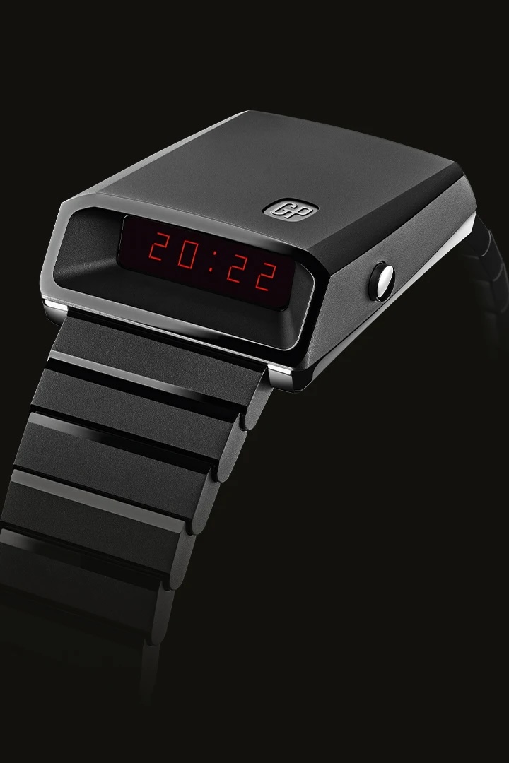
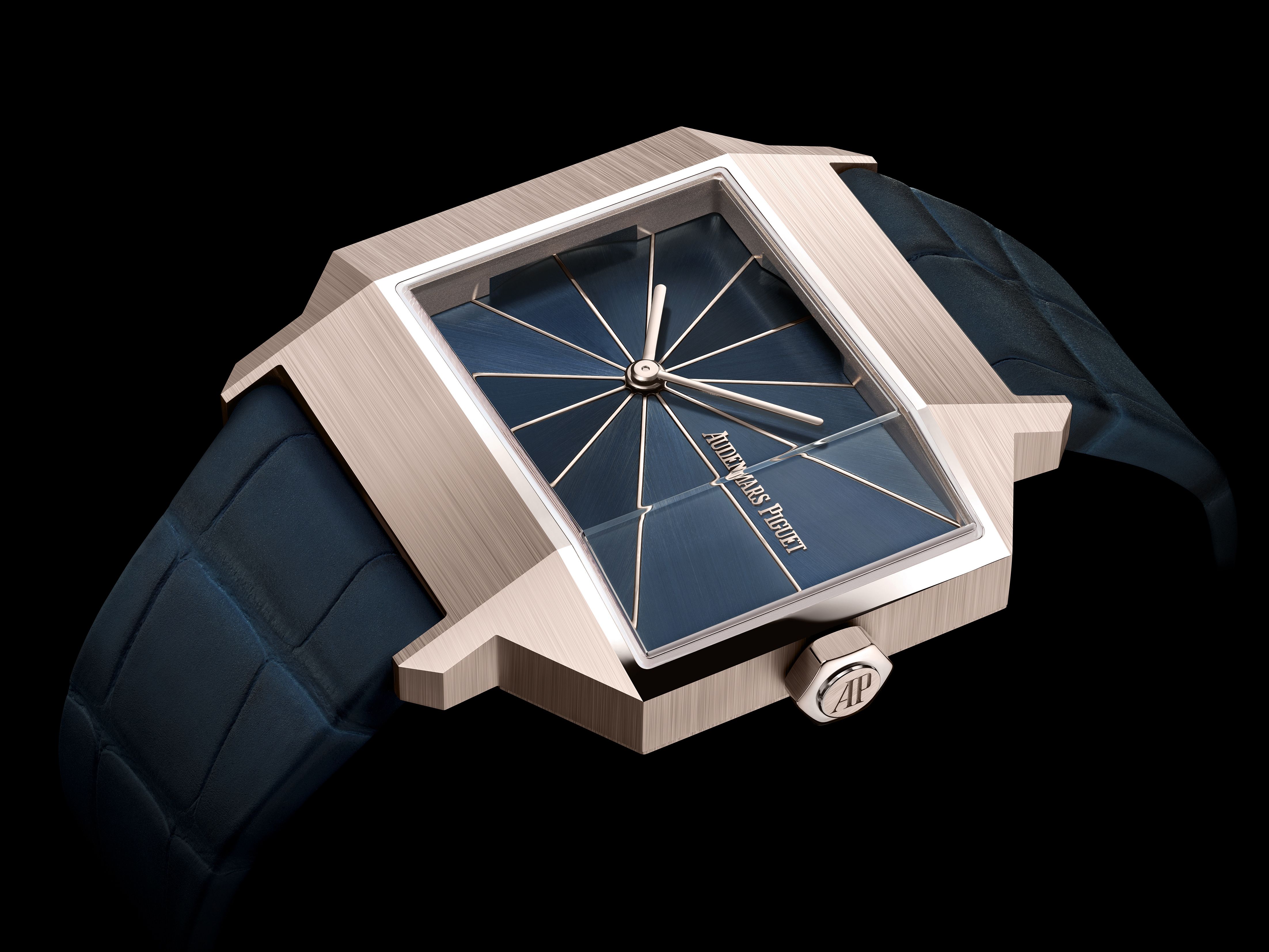
It seems that it’s this desire for more sculpturally daring case shapes that caught collectors’ imaginations, a sentiment that can be seen in the demand for Girard-Perregaux’s recent Casquette 2.0, based on a 1970s original, and the revived Amida Digitrend. It’s also apparent in Audemars Piguet’s [Re]Master02, which takes inspiration from the brand's 1960 5159BA model. With its faceted asymmetrical case and dial made of 12 triangular segments, it shows how surface treatments can be used to create light and shadow.

How this will play out with the bigger brands will start to become clear next year. After all, who wouldn’t want to see Patek Philippe revisit the 1970s from a different angle or Cartier reprise its asymmetric designs?


