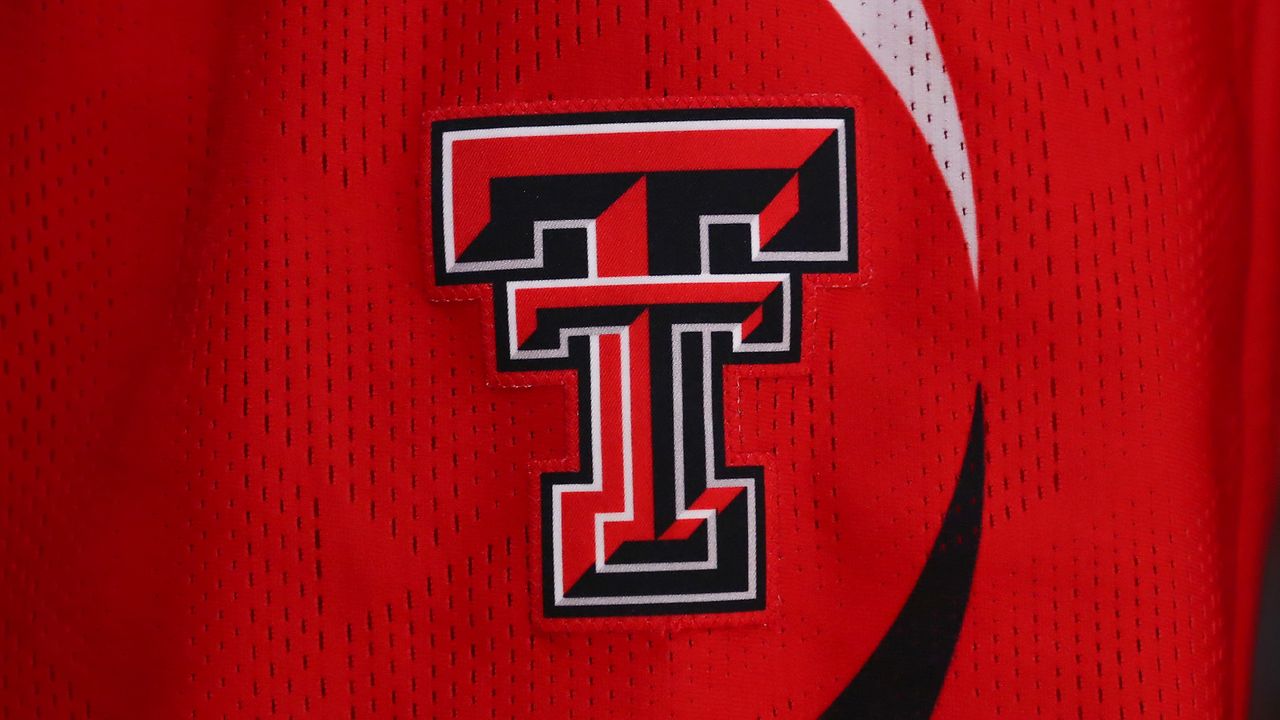
It's hard enough to please the general public with a new logo, but impressing sports fans is a whole other battle, as evidenced by the heated response to Texas Tech's new logo. Unveiling a collection of new logos and emblems, the university claims its new look is simply the work of modernisation, while some fans think it's a disappointing downgrade.
The best sports logos often tap into heritage, which in turn leads to fans getting attached to a classic design. While it's great to unite supporters with a simple design, it's a double-edged sword, as some fans can be resistant to change, making logo evolution a delicate task.