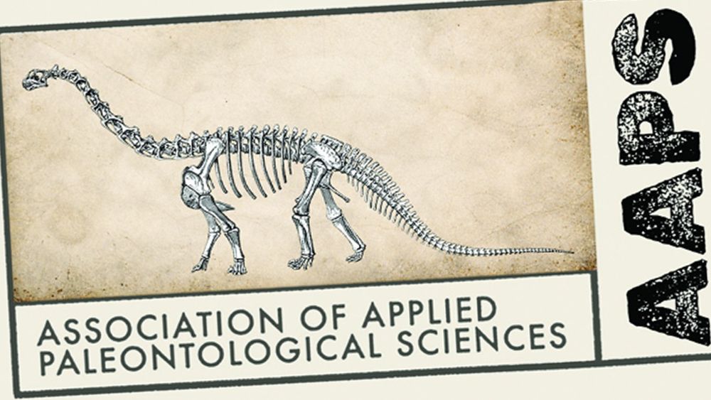
How do you modernise the logo design for an institution that's all about the distant past?
You might be tempted to go for minimalist abstraction and bold colours, but the Association of Applied Paleontological Sciences' new logo takes a surprisingly complex approach. The design blends a minimalist contemporary aesthetic with grungy type and a vintage archival feel for a strikingly different identity that breaks many rules of logo design but excels in storytelling.

The Association of Applied Paleontological Sciences brings together professional fossil dealers, academic paleontologists, collectors and enthusiasts for commercial and academic relationships. Its new logo is a big departure from the previous design. It's more modern and professional yet avoids a strongly institutional feel, leaning almost into fashion logo territory.
The design is the work of creative director Grant Sanders of New England-based SAND Agency. He was tasked with creating a logo with a contemporary aesthetic but which reflected the nature of the ancient fossils the association works with.
The design immediately breaks several core rules of logo design. Versatility? With the multiple typefaces and hierarchies of text running in different directions, it's likely to have legibility issues. Simplicity and scalability? The competing elements, rigid rectangular share, detailed dinosaur illustration and complex textures of the aged paper all conspire against many applications, but there's a separate avatar for things like social media.
Where the design shines is in its immersive theme and brilliant conceptual storytelling. From the slightly aged cream background to the hand-applied blue script font, the design creates a convincingly scholarly found in an archive feel that reflects what the organisation does.
The stencil font for "AAPS" has a rugged personality making it stand out. while the 'Specimen No.' is the year in which the organisation was founded in Tucson.
Sometimes the rules are there to be broken.