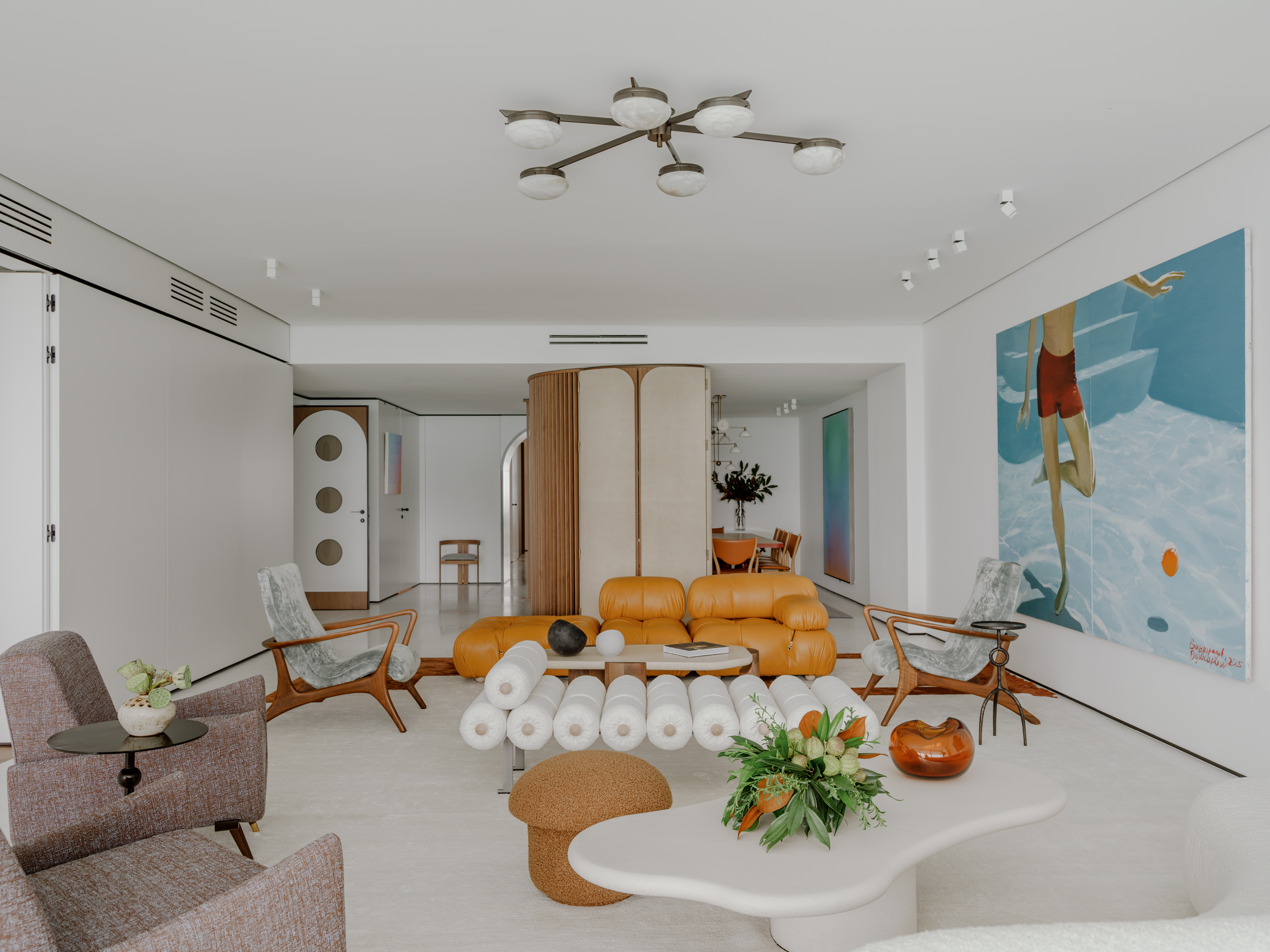
No matter the size and space available, a home can have everything you need, all with the magic of clever design ideas. A prime example is this 3,500 sq feet home located in a high-end residential building in Bal Harbour, Florida. The apartment features three bedrooms and four and a half bathrooms. All spaces are furnished with statement furniture pieces, and eye-catching artworks, all against the backdrop of clean, muted walls.
What truly makes this home stand out, however, aren't just the smart decor elements but cleverly customized wooden partitions, that not only discreetly zone spaces but also hide within them, more rooms. It's truly a home that unravels as you explore more. 'This was our second time working with the clients, therefore we had carte blanche to bring modern European design elements with a Latin flair,' says Sabrina Maclean, founder of Hino Studio.
Take a tour of this modern home.
Entranceway
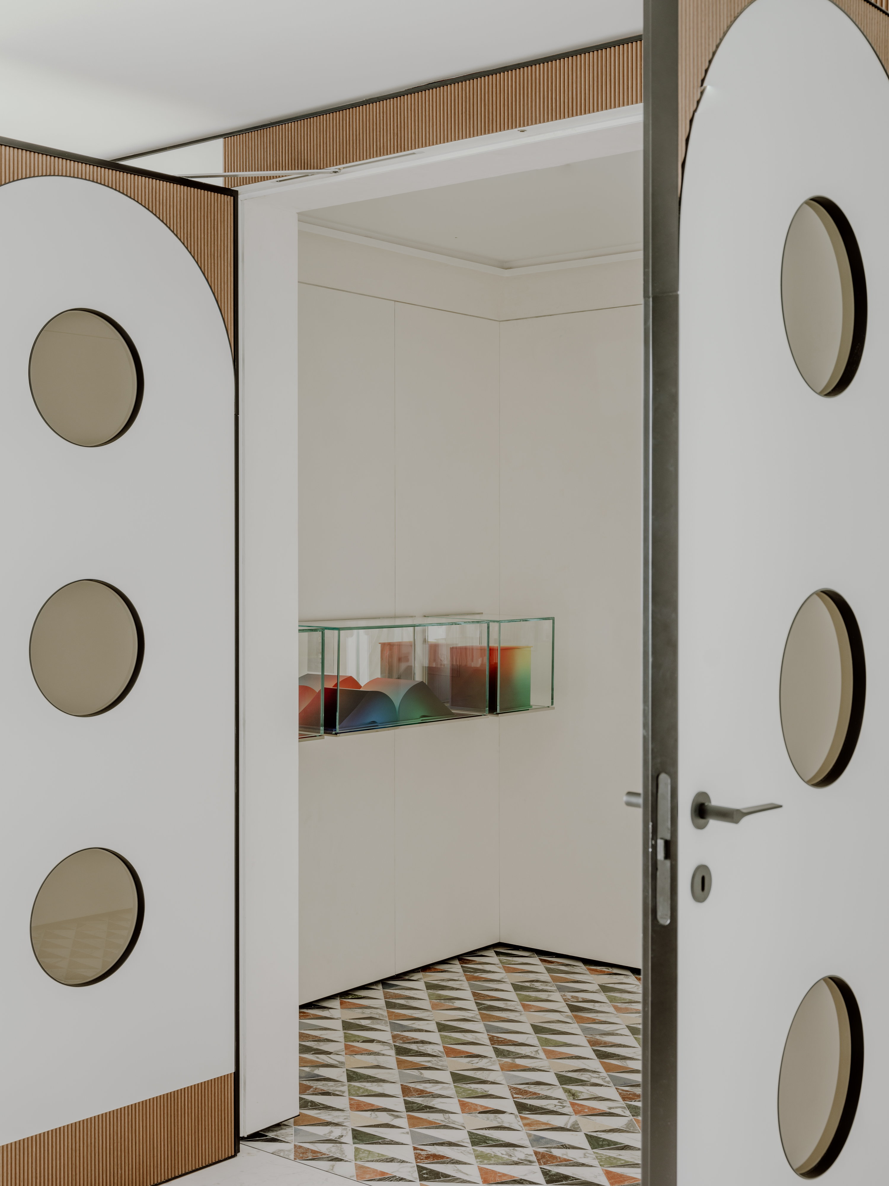
The first impression is the last, and when it comes to this home, that stands true, thanks to the creatively designed entrance door.
The white front door color is punctuated wonderfully with round glass, pointing to a retro European style. 'The door's design was inspired by the beautiful flooring selection that resembled the Italian Cosmati floors and also some of the mid-century doors of some of the old buildings in Milan,' says Sabrina. 'We incorporated the handles by Gio Ponti to accentuate this beautiful era.'
Living room

Against a muted background is a room peppered with the statement and modern living room furniture and art pieces, each personality-filled yet wonderfully coordinated to create a cohesive, cozy interior. Floor-to-ceiling windows open up views of the sea, creating a calming interior in the process.
'The living room was designed to have an open layout,' says Sabrina. 'We wanted this space to have more than one sitting area and to be very conversational where the art would always be the protagonist no matter where the person was sitting.'
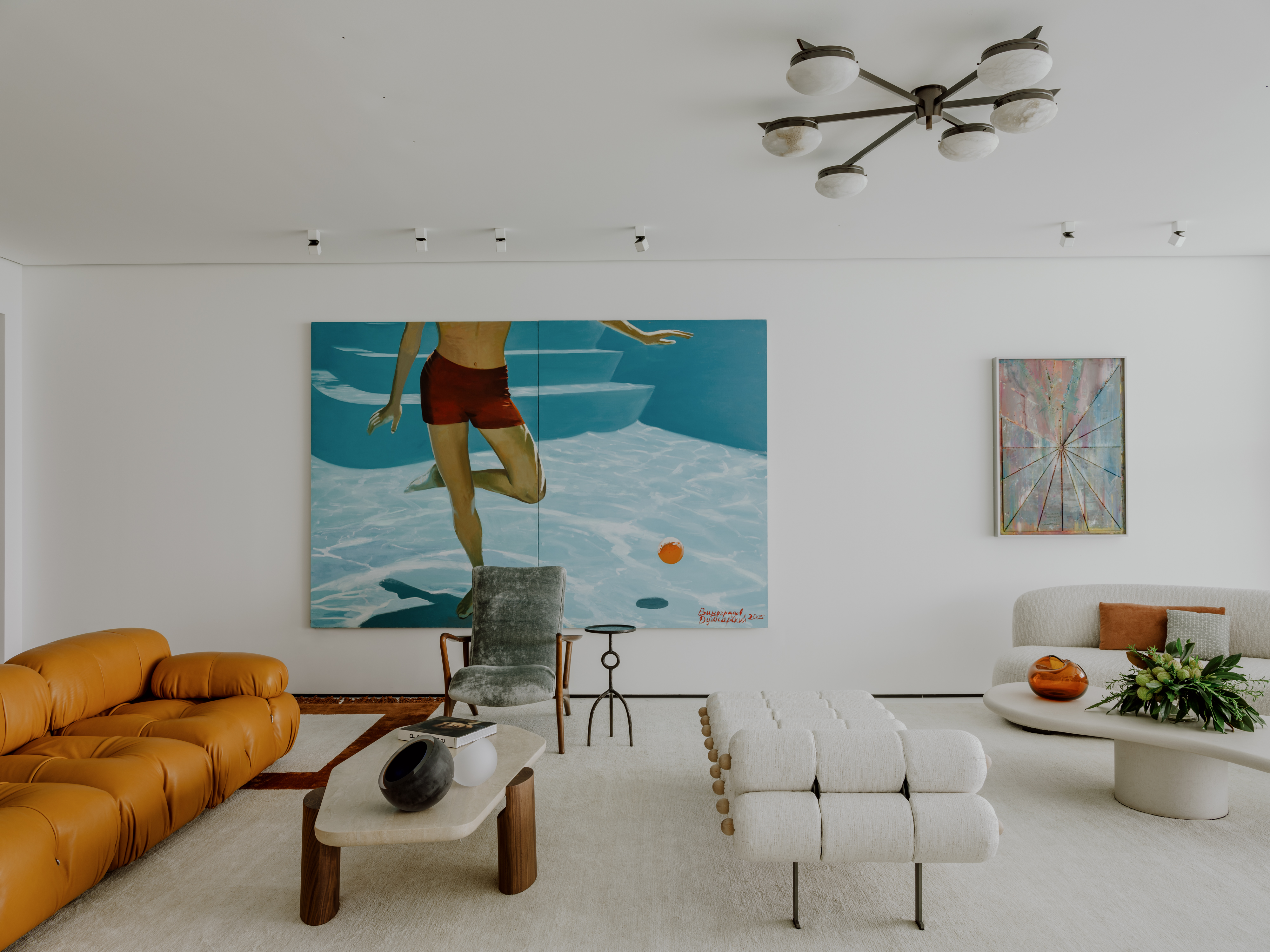
'The carpet was a custom design from Art & Loom,' says Sabrina. 'We worked closely on the design based on the open layout in the living room. We wanted to frame all the conversational areas without drawing too much attention away from the art. The architectural living room lighting is from Apure Lighting. This lighting is very minimal which creates a beautiful discrete illumination. We also sourced some decorative lighting fixtures from galleries in Paris, London, Netherlands, among other places.'
The tan leather seater is the Camaleonda sofa from B&B Italia. The daybed was sourced from Mario Milana. The coffee tables were sourced from Avenue Road and the artwork is from the personal collection of the client, as they are art collectors.
Dining room
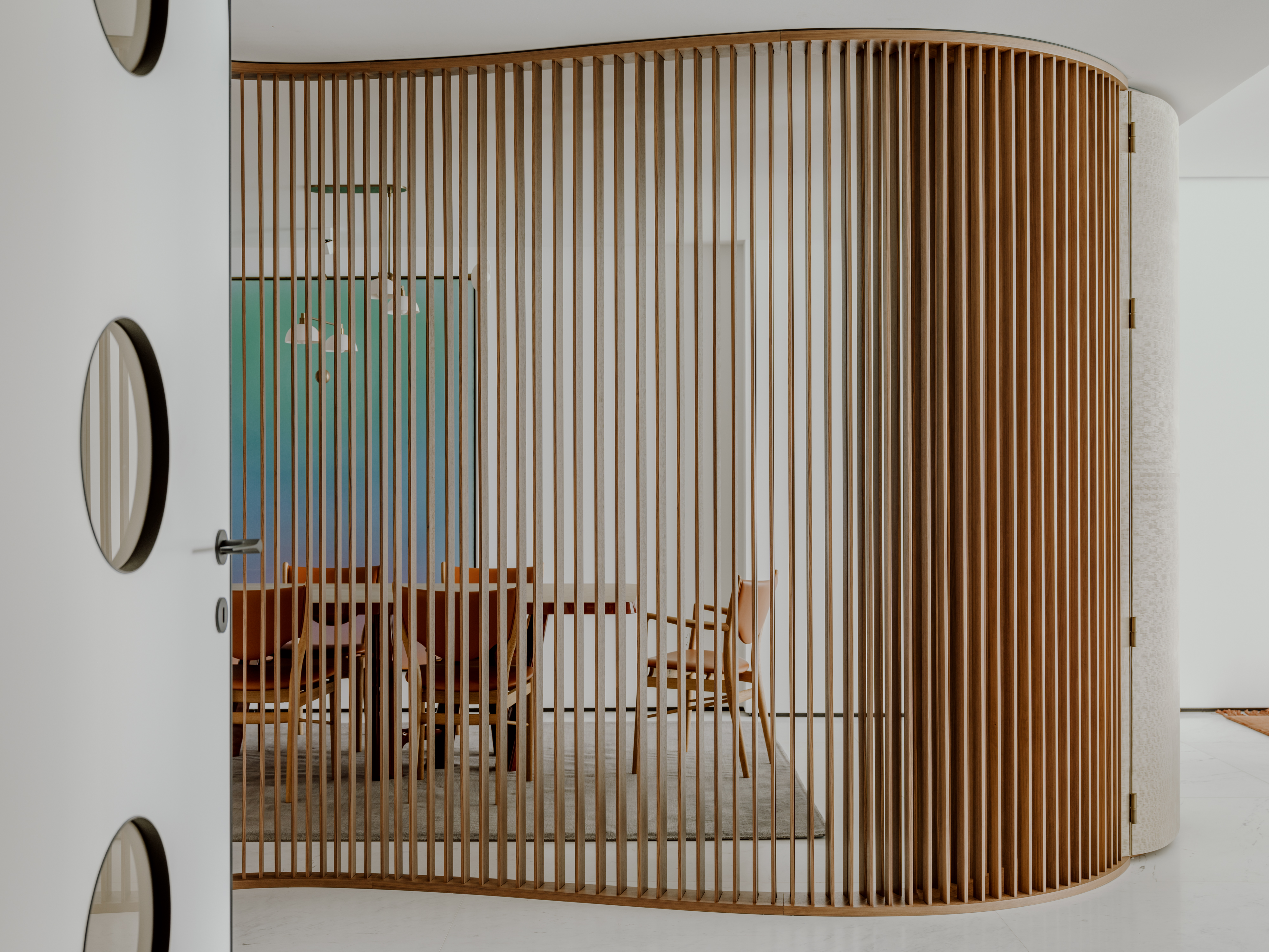
The open living room dining room combo is segregated by a special design feature, that cleverly zones the eating area from the socializing one, yet doesn't completely hinder sightlines, so the room doesn't feel small or compressed.
'We wanted to create a paneling that would help divide the dining room with the entry of the apartment without entirely closing it off,' says Sabrina. 'Also, we wanted this paneling to serve as a beautiful decorative element that would give at least a glimpse of this beautiful room.'
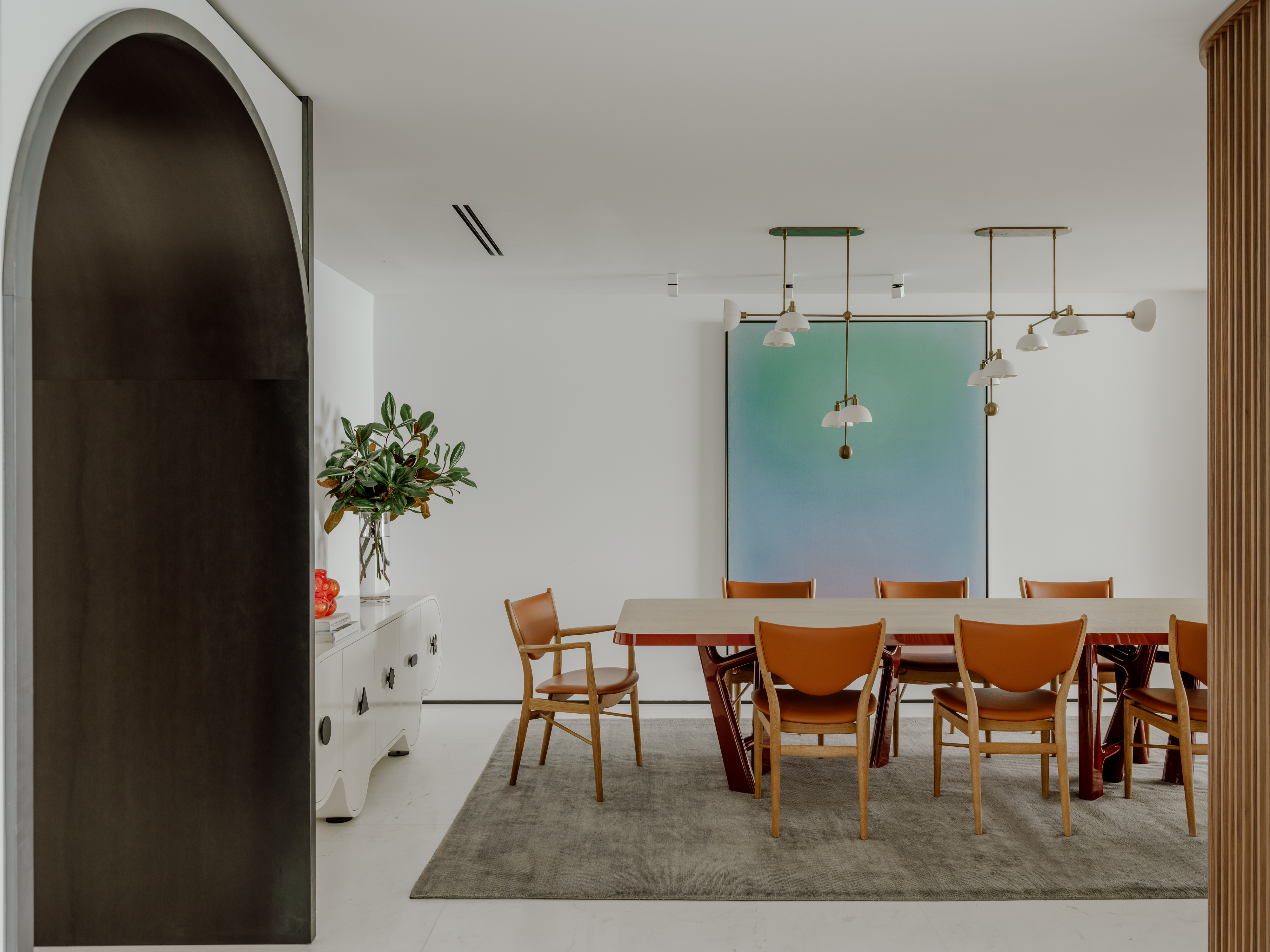
'For the dining room color, we wanted to blend the hues of the artwork with some complementary colors and textures such as saddle, walnut, off-white and red lacquers, and blue wool tones,' says Sabrina.
The dining table is designed by Christophe Delcourt, the chairs are from Finn Juhl and were sourced from Fair NYC, and the dining room Credenza is designed by Atelier Caracas for Studio Boheme. The rug is from Rosemary Hallgarten. The lighting piece is by Apparatus Studio.
'We adjusted the design of the lamp so each of the shades would perfectly reflect the artwork and paneling,' says Sabrina.
Bar

Another genius design intervention within this home is this hidden living room bar. Convenient, smart, and space-saving, this unit adds oodles of functionality and style to the open floor plan.
'Our first intention was to make the paneling the key element in the living/dining space,' says Sabrina. 'So, that’s when we came up with the idea to integrate the two spaces so that it feels like the paneling is part of the bar. The bar is a mix of different materials that give layering and texture to the space. Some of these materials used are leather, walnut, cipollini marble, suede, and mirror, among others. We also did a concealed lighting that perfectly illuminates this iconic piece.'
Kitchen
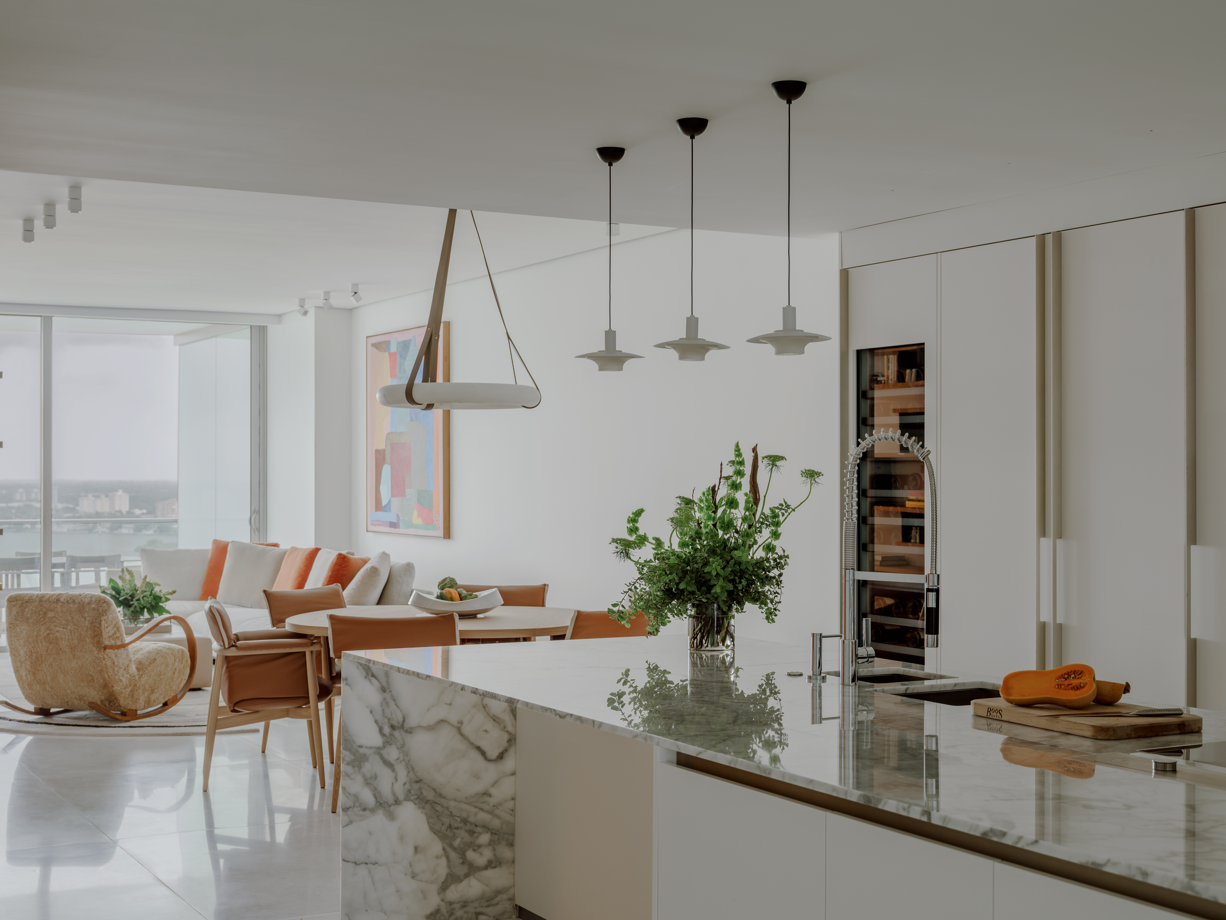
Another wonderfully open yet cohesive space in the house is the kitchen and a small sitting area. The all-white cooking space with a small kitchen island in marble speaks of modern elegance, with floor-to-ceiling cabinets and an integrated pantry. Adding a modern touch to the space are the kitchen pendants, also drenched in muted tones.
The seating area in white, highlighted with vivid cushions looks out to the stunning views of the city. A large artwork adds a punch of hue to the space.
Corner room

Hidden close to the kitchen is a small, cozy corner that can be used for reading, painting, or working. The long wooden slats beautifully encase the space, yet refrain it from feeling too closed in or dark.
'This space is in a corner near the breakfast area and family room,' says Sabrina. 'This was originally a shower space for one of the auxiliary bathrooms, but we decided to convert it into a nook office. This nook opens and closes with beautiful millwork in walnut and glass to create some privacy.'
Home office
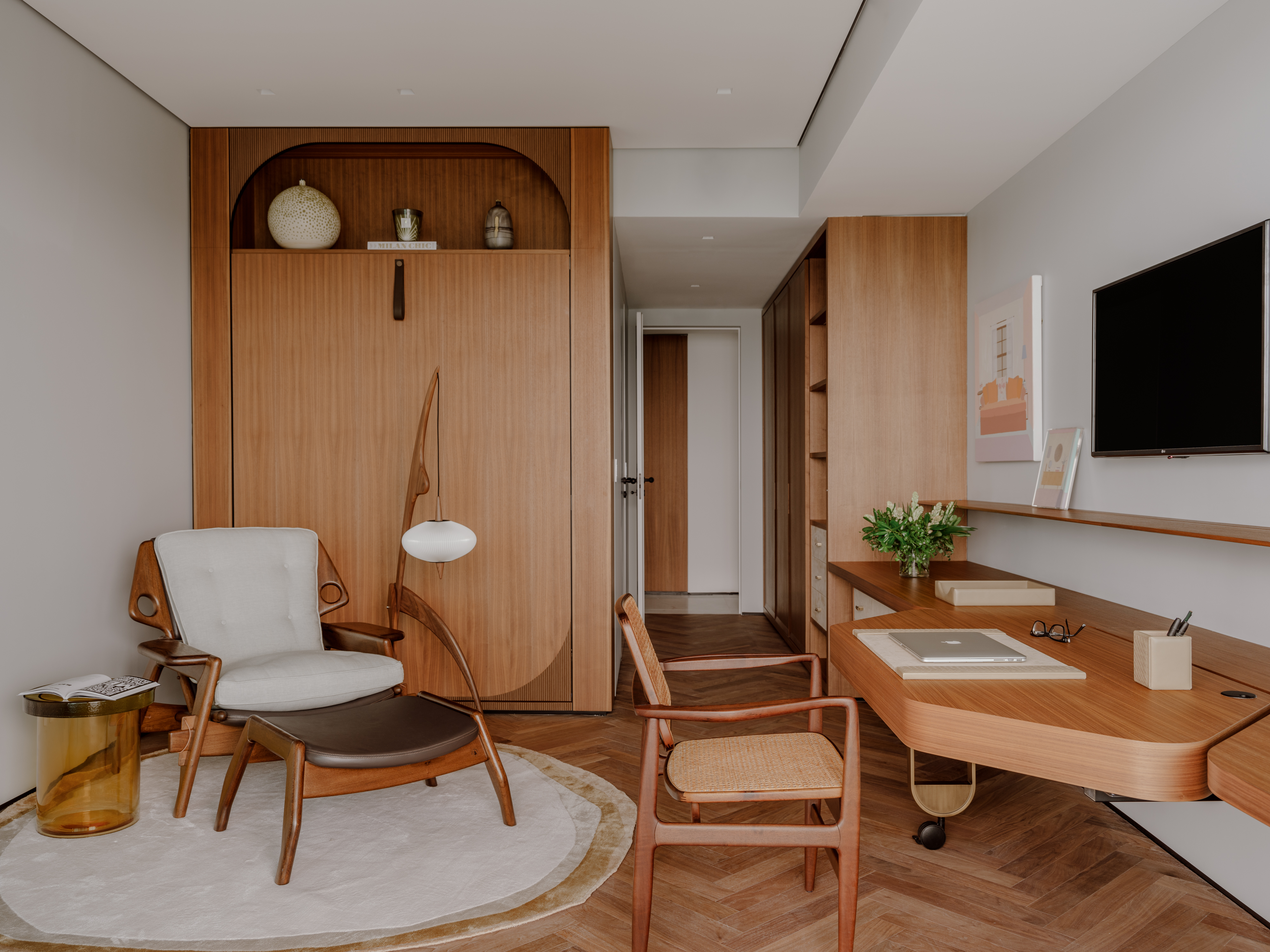
One of the rooms within the home has been converted into a modern home office, replete with an in-built desk, chair, and even a lounging space where one can take frequent breaks. Wood dominates this space too, and storage is seamlessly hidden within cabinets, while the walls remain a neutral white.
'All the paneling of the office was custom made in Italy by our millworker,' says Sabrina. 'We added a combination of walnut and suede to give it a masculine but warm appeal. The armchair and desk chair are both sourced from Espasso, and the rug is a custom piece from Art & Loom.'
Bathroom
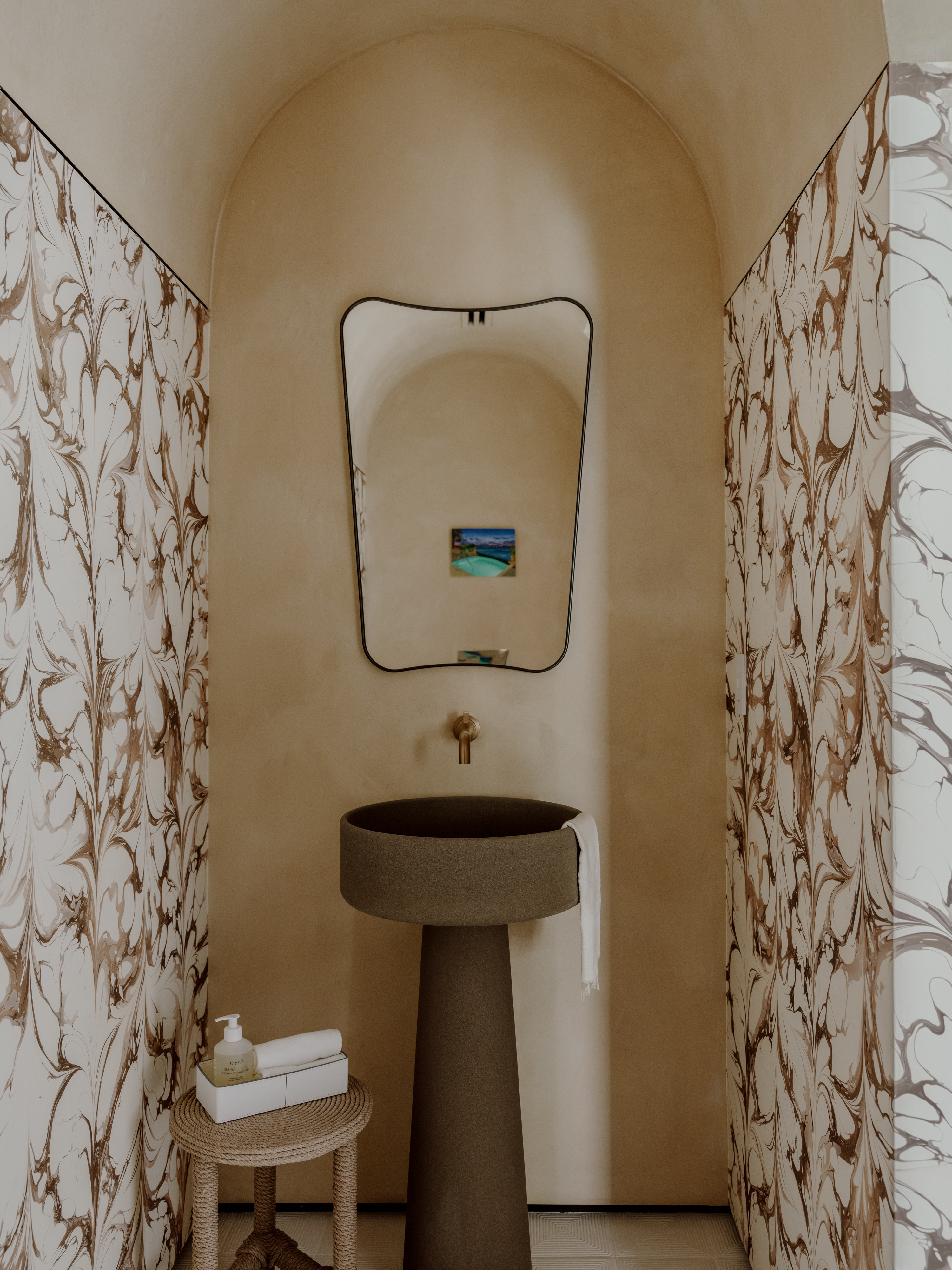
Emerging as a jewel box within the home is this powder bathroom, finished with the choicest materials, and laced with textural elegance.
'For the design of this bathroom we wanted to bring in some of the arch details that are seen in the transition from the dining room and the kitchen,' says Sabrina. 'We wanted this powder to feel like you were in a serene chapel located in Europe. We used the vanity of Angelo Mangiarotti in a cement finish and incorporated it with a sophisticated wallpaper and a lime wash finish on the ceiling and walls.'
Master bedroom
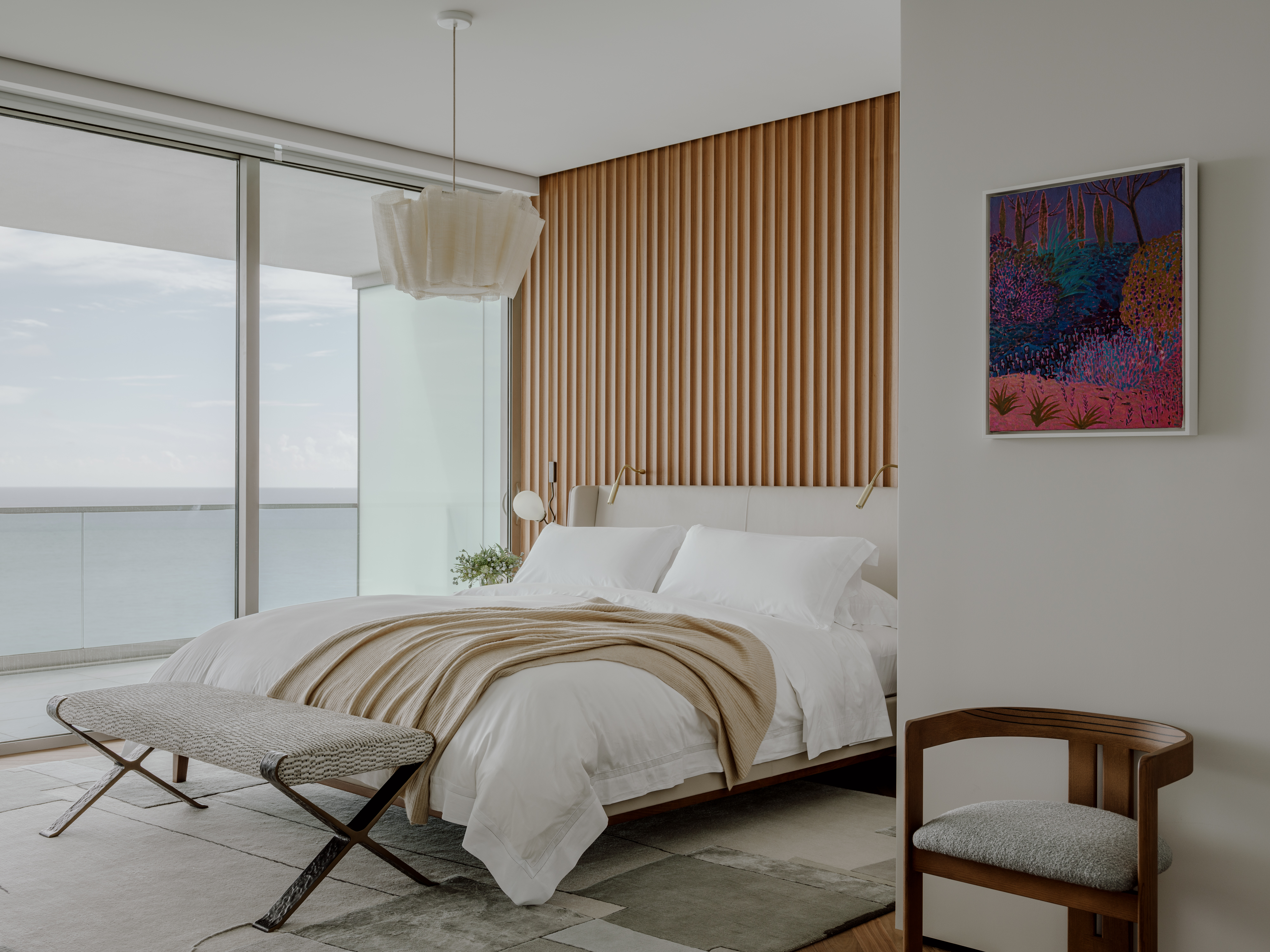
The master bedroom is a picture of serenity, where the views, colors, and materials help create a space that is easy to rest, relax, and even daydream in.
'We wanted to design a cozy room that’s why we wanted to include a scalloped paneling in the back wall of the bedroom to complement the beautiful selection of furniture,' says Sabrina. 'The bed is from Holly Hunt, the nightstands are from Wud, the lamp is from Pinch, and the rug is from Art & Loom.'
Balcony
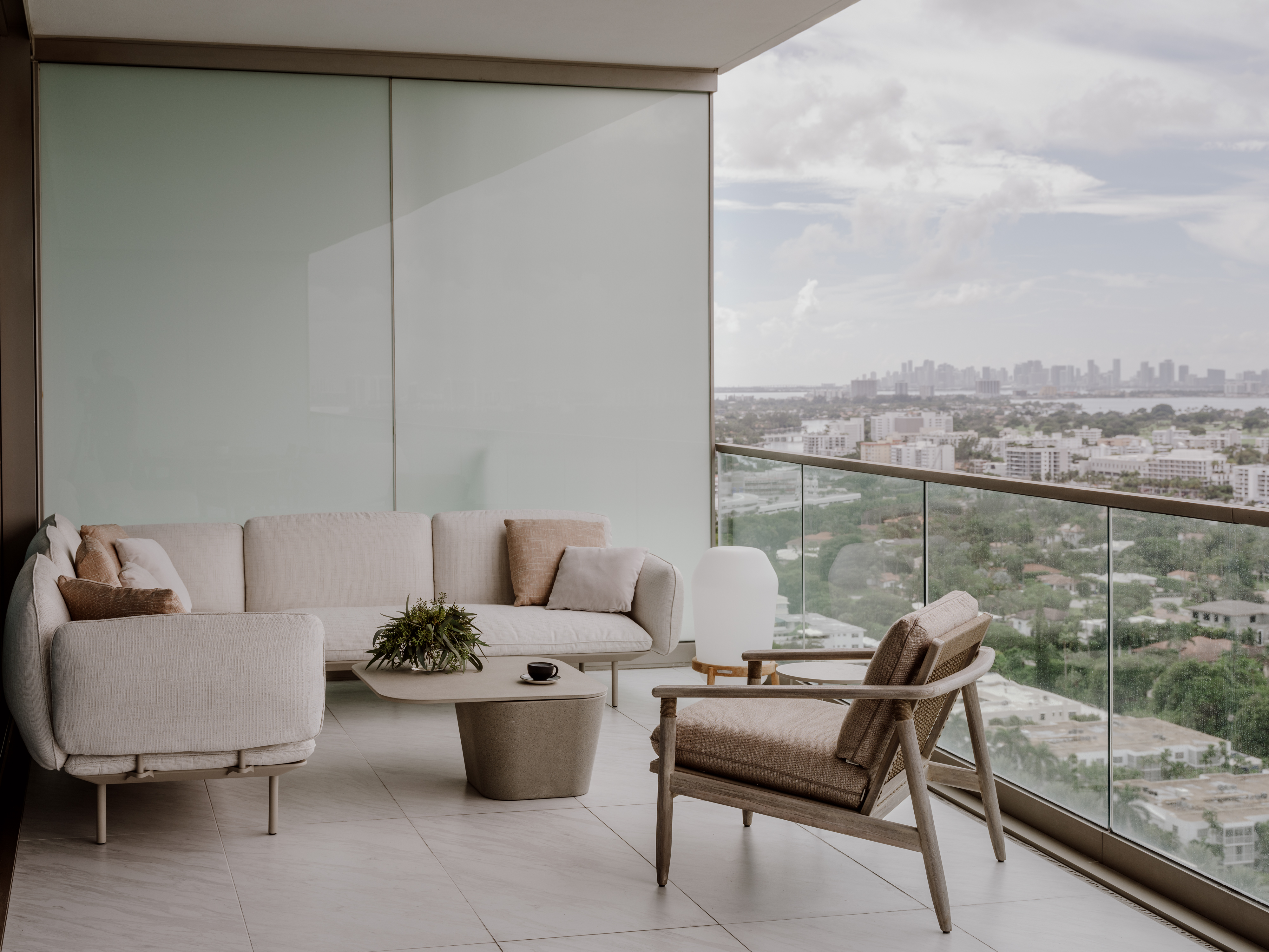
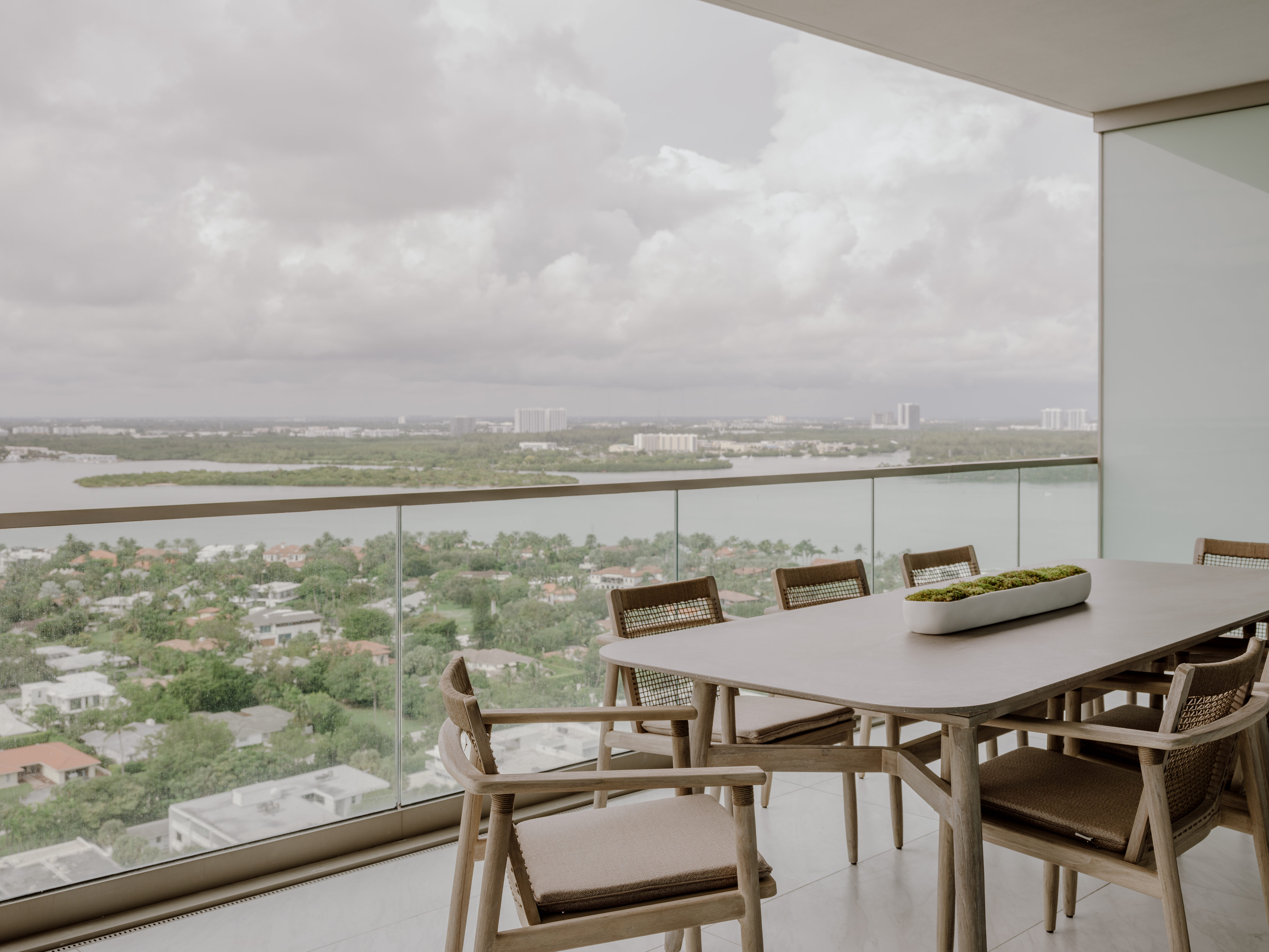
The balcony is split into two separate seating zones; one with a dining table, and one with a cozy living room setting. Each space is designed to capture the best views of the area.
'One of the most important aspects of this apartment is the astonishing views of not only the beach but also the Bal Harbour bay,' says Sabrina. 'Each area has its beauty and offers unique views during different times of the day. In the mornings, the terrace is a lovely spot to admire the blue ocean hues, while the bay terrace seating is where you can see the sun set beautifully while enjoying a nice glass of wine.'
More projects by Hino Studio.


