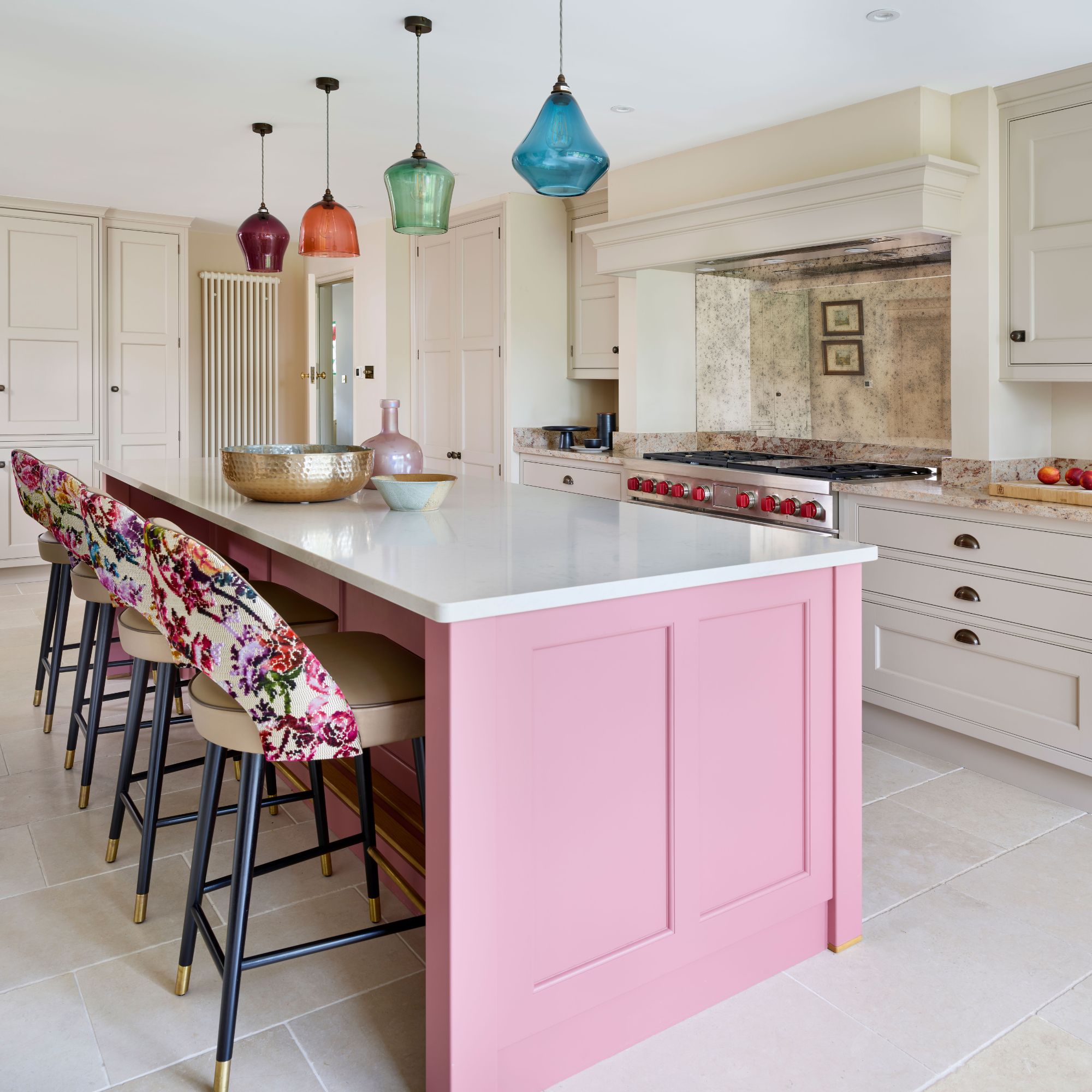
Having lived with the tired, cherry wood kitchen fitted by the previous owners in the 1990s, Peta-Anne and Stefan Barrow were ready for a change. They wanted to create a welcoming family kitchen with a bright feel so they could enjoy the space with their two teenage children.
From the outset, their kitchen ideas were clear: they planned to trade their old table for an island, which would create a social hub in the centre of the room and, as keen cooks, they also hoped to add more storage and work surfaces.
Perfecting the layout
Unsure about how to design a kitchen, the couple consulted Pam Baker, senior designer at Martin Moore, and together, they worked to create a new design that would breathe life back into this dated space. ‘I went round to the property for a site visit,’ Pam recalls, ‘and, as sometimes happens, the layout instantly fell into place in my mind, with one significant exception.’
A window above the sink dominated the centre of one wall, meaning that the cooker was squashed into a corner and pushed into a recess, which exacerbated the cramped feel. ‘I suggested moving the window along the wall, towards the French doors – it was the key to a more practical and balanced kitchen layout,’ explains Pam. ‘Once agreed, I knew we could transform the whole room.’
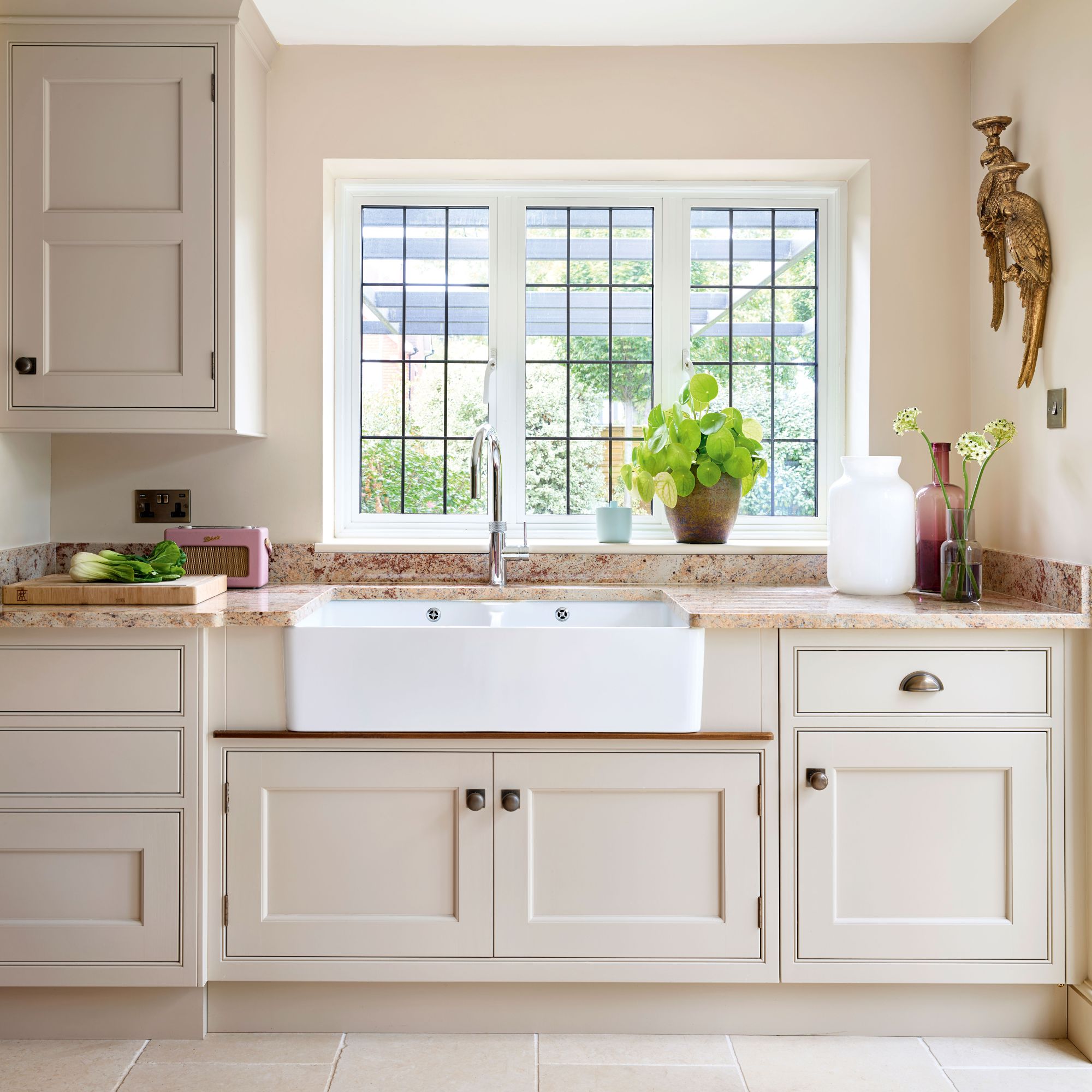
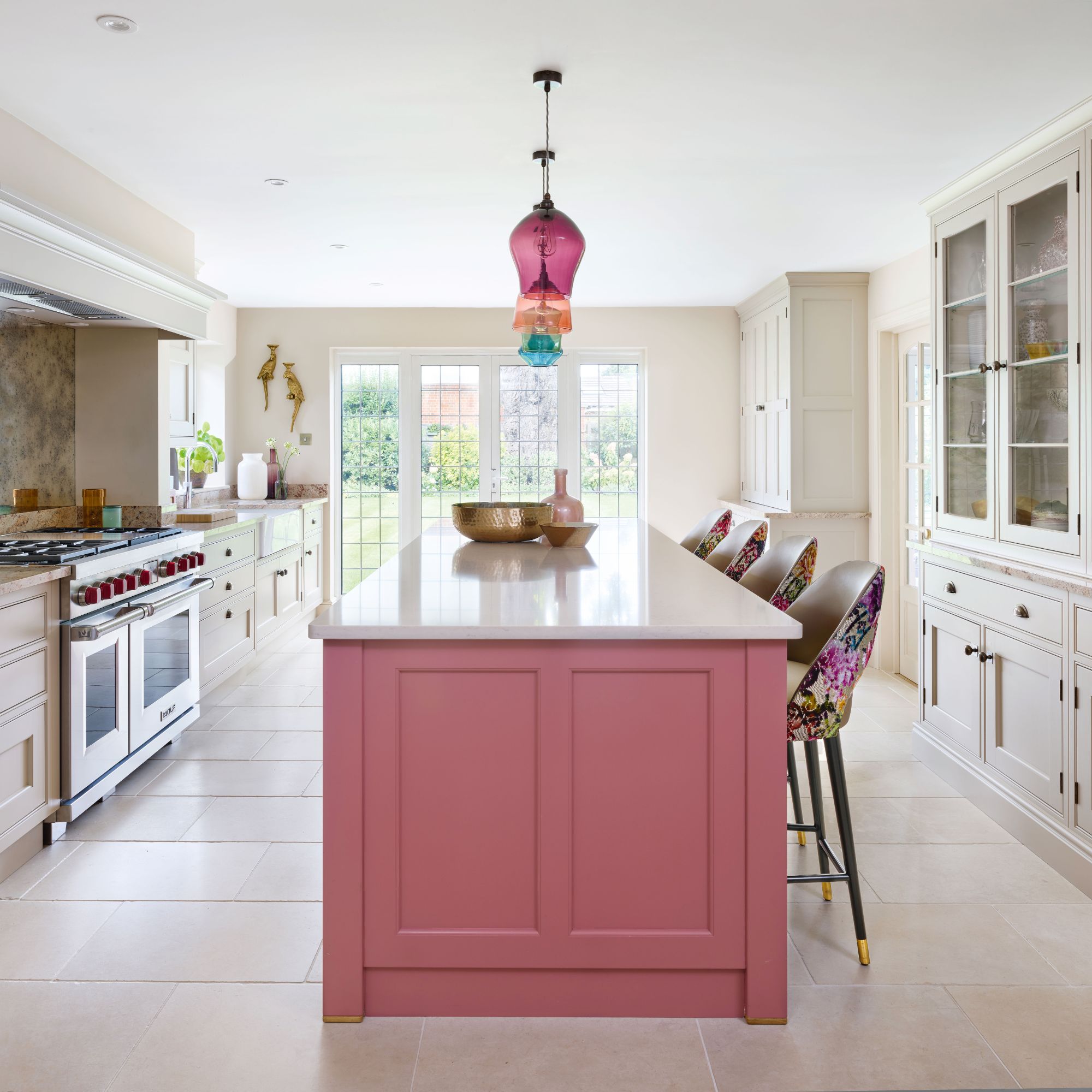
By bringing the cooker into the centre of the wall, Pam could frame it with an elegant chimney mantle, enhancing its role as an impressive feature in the design of the kitchen. A larder cupboard makes practical use of the former cooker niche, while a breakfast cupboard, with bi-fold doors and built-in sockets, helps to keep the morning routine running smoothly.
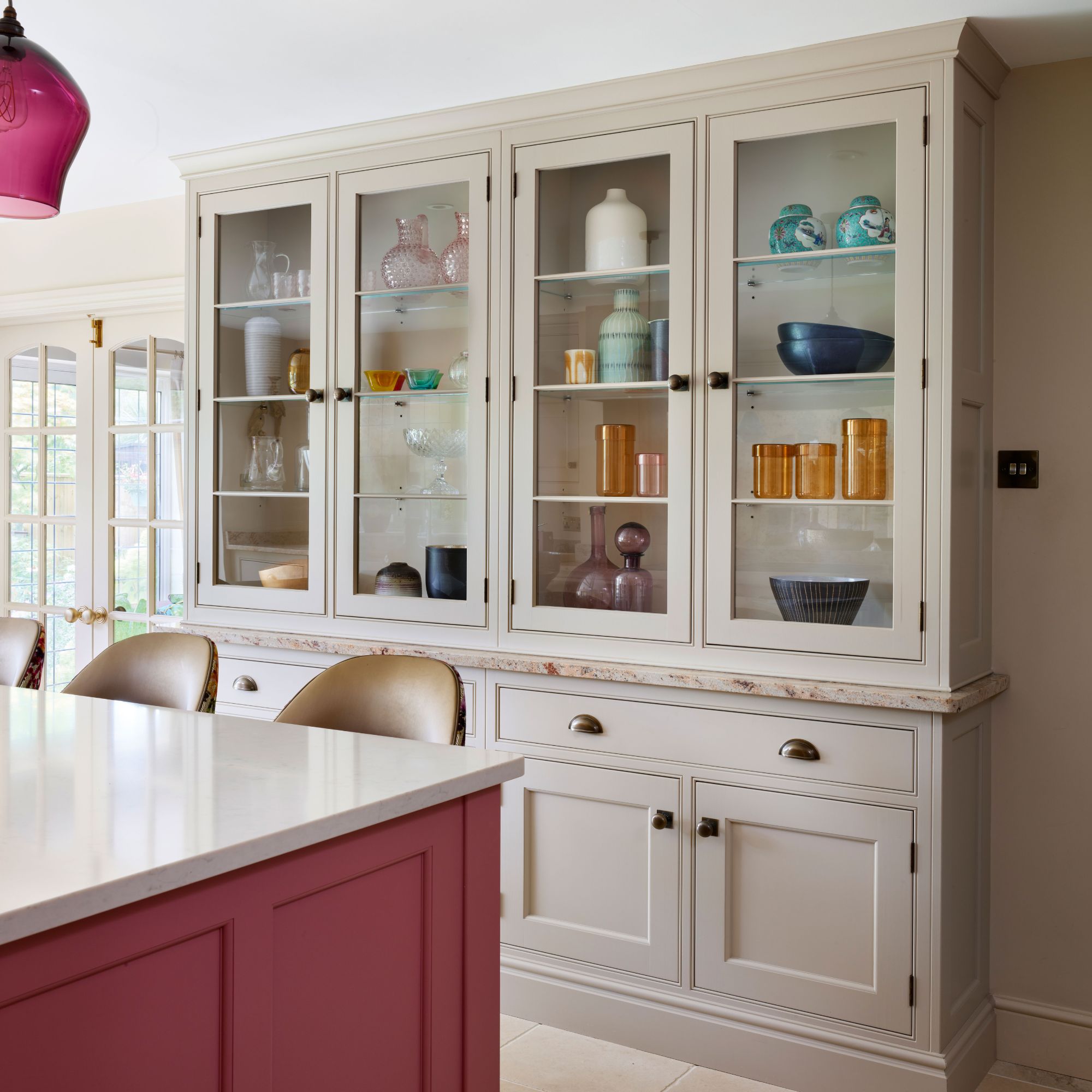
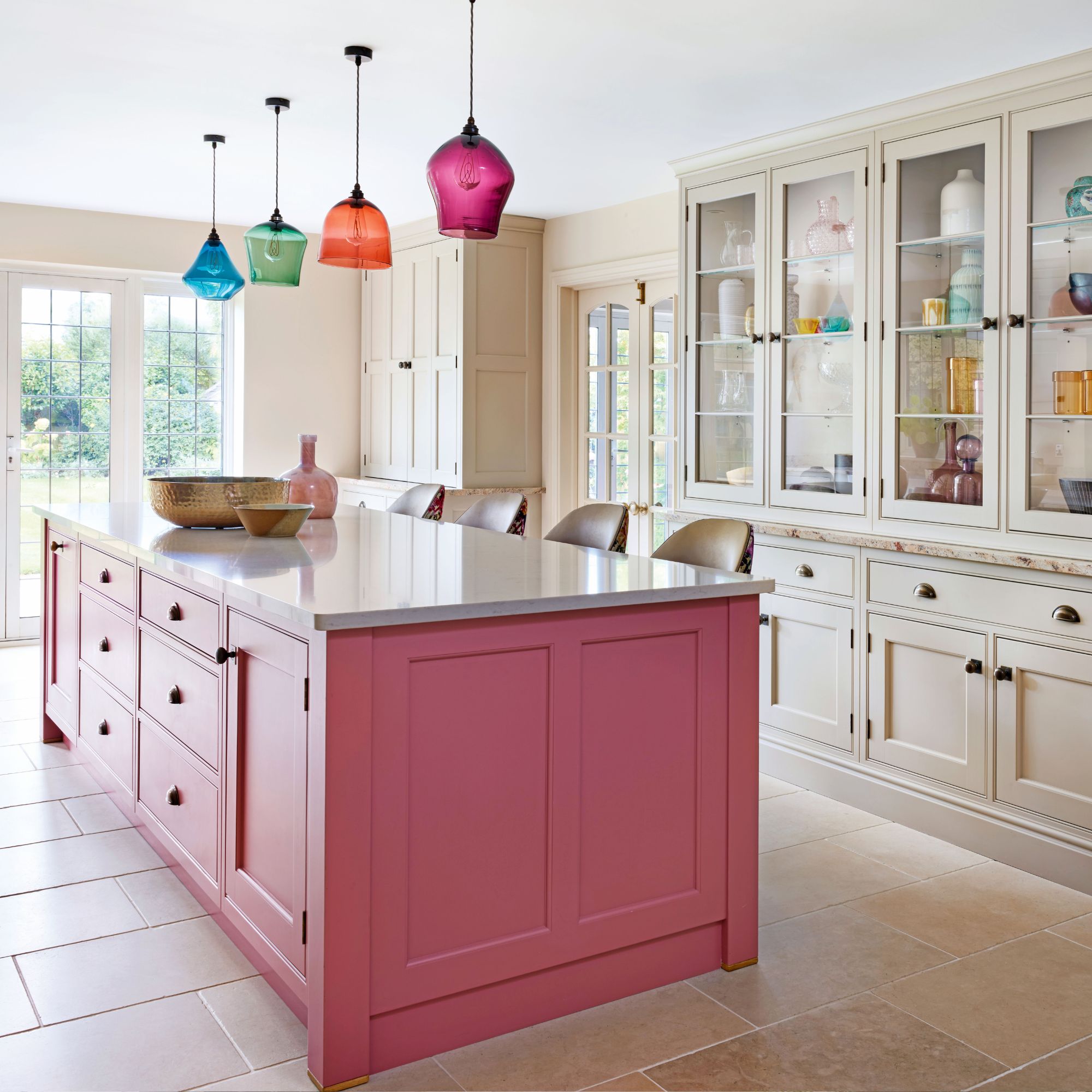
The uniform, rectangular room was perfectly suited to a symmetrical kitchen design with a central kitchen island overlooking the cooking area, delivering a welcoming space that allows guests to relax on the bar stools and socialise with the cook.
‘The furniture is carefully proportioned to suit the size of the room,’ explains Pam. ‘Even the dresser is slightly shallower than normal, so there is sufficient space to pull out the bar stools without banging into the cupboard doors.’
Adding lighting
Maximising natural light was also high on the priority list for Peta-Anne and Stefan. The introduction of glazed wall cabinetry and an antiqued mirror kitchen splashback help to bounce natural and artificial light around the room. Opting for foxed glass mirrored splashback brings a heritage charm to the space and is infinitely more practical than a traditional flat mirror, which would have shown every streak and smudge – not ideal above a cooker.
Colourful Impact
Colour played an essential role in brightening the kitchen, too. The owners opted for shades of pink, with Pam selecting Martin Moore’s delicate Pale Peony for the cabinetry and its bolder Raspberry for the island.
‘Classic cabinetry gives the room a timeless elegance,’ explains Pam. ‘Using the softer neutral shade creates the light feel required for this kitchen.’ This pink kitchen is now a world away from the dark cherry wood cabinets, that were previously here.
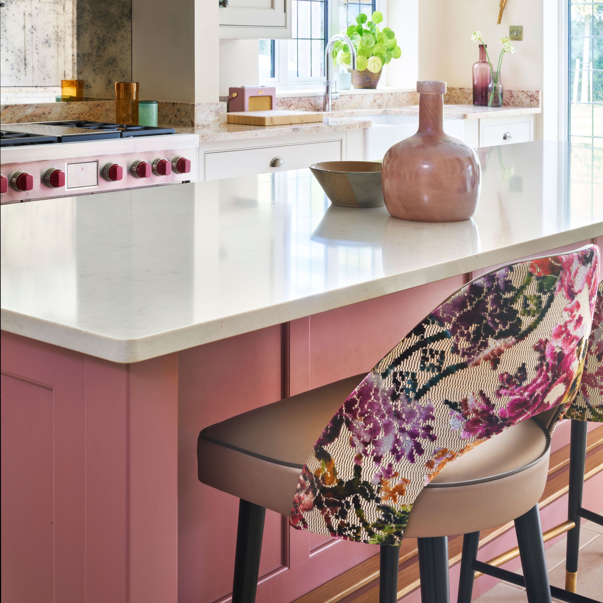
The pink island brings in valuable warmth and personality. ‘The island is the place to be bold, drawing the eye to the heart of the room,’ adds Pam, ‘and the stronger colour is balanced by the cool tones of the polished quartz island kitchen worktop.’
A row of jewel-like pendant lights boosts the impact of the island, as do bar stools upholstered with richly patterned backs. When hanging pendant lights above a kitchen island it is important to get the right cable height and the size of the shades to achieve the maximum impact.
‘The kitchen now feels so inviting and is filled with so much brightness and colour.’

