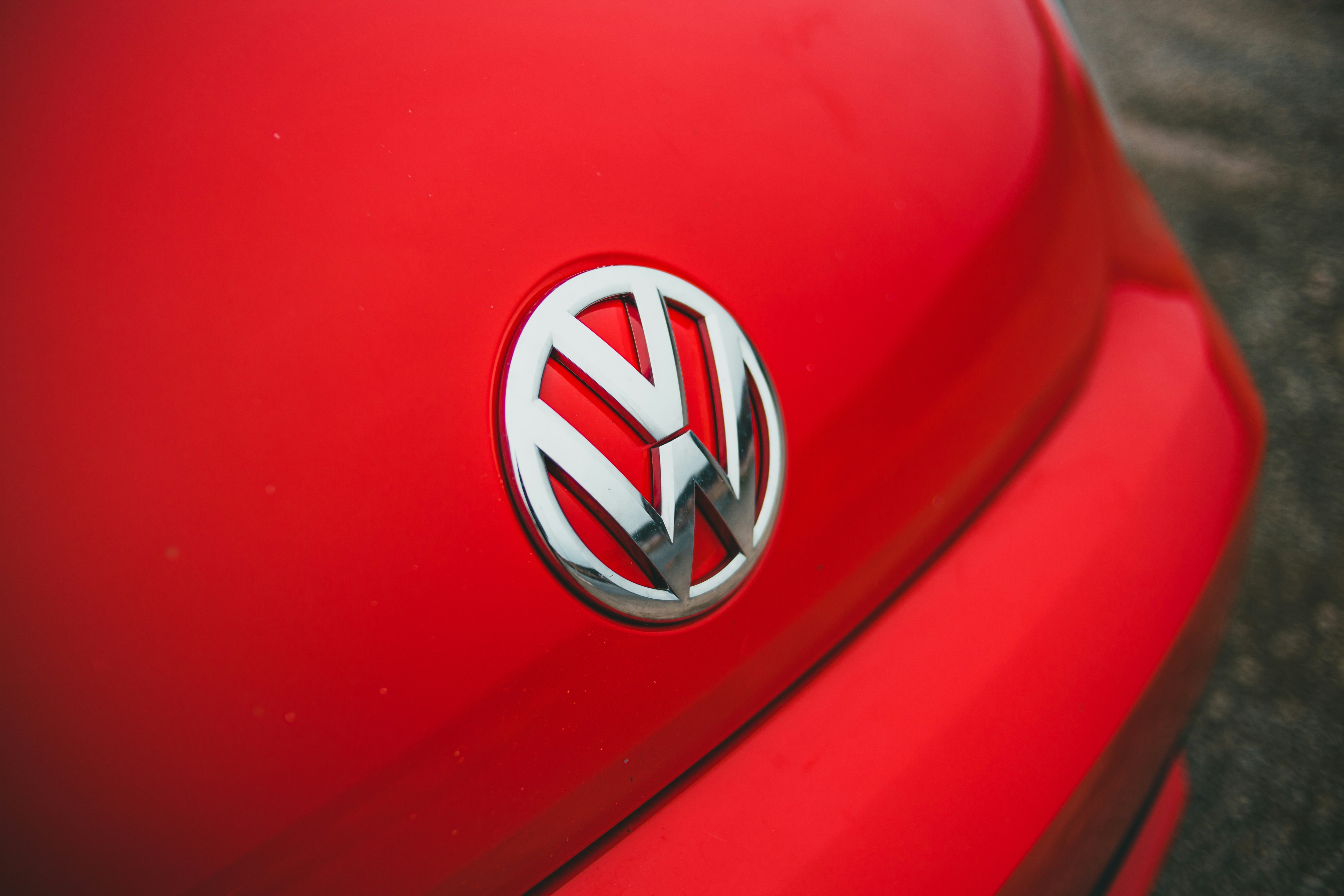
The Volkswagen logo is one of the most memorable car logos around. Everyone knows what it looks like. And at first glance, it would seem the only changes in recent decades were to make the Volkswagen logo flat and to narrow the lines for a time.
It's a simple and distinctive brand identity. Surely there's nothing to argue about? So I thought, but it seems a furious debate is raging. Some people are adamant that at some point the Volkswagen logo changed in a way not seen on official design documents.