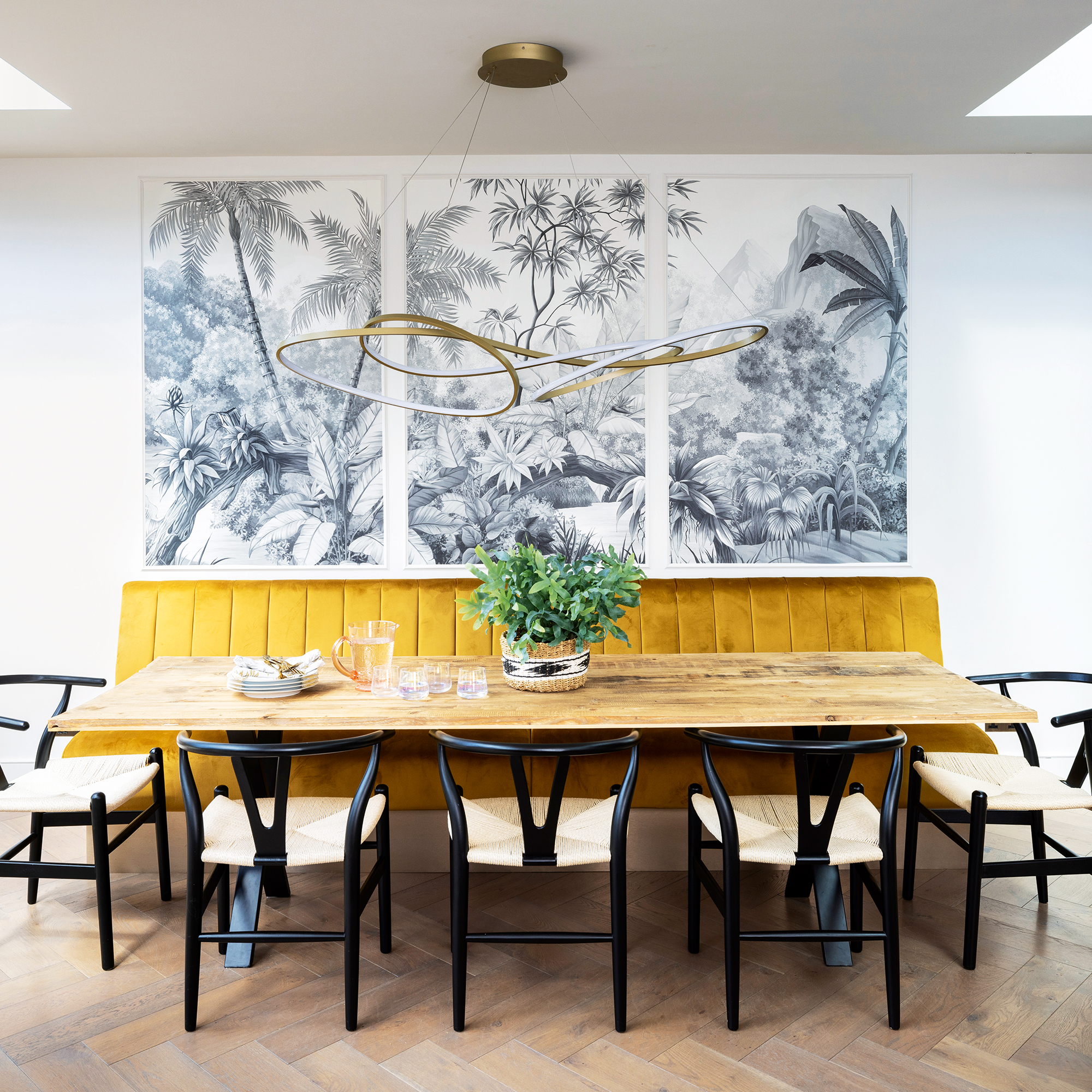
One of the most widely used interior design guidelines has to be the rule of three - and it's a rule you may be following without even being aware of it.
Whether you're talking about displaying objects, hanging art or colour combinations the rule of three is a wonderful way of adding balance to a space.
'It's based on the principle of odd numbers,' says Emma Deterding, Founder and Creative Director, Kelling Designs. 'This is that grouping objects in threes or odd numbers makes it more eye-catching, beautiful and aesthetically pleasing than grouping items in even numbers.'
'Ultimately, the best design decisions are based on a combination of guidelines from a design and function perspective, as well as personal preference, but rules like this can help alleviate some of the stress when it comes to making design and styling decisions.'
What is the rule of three?
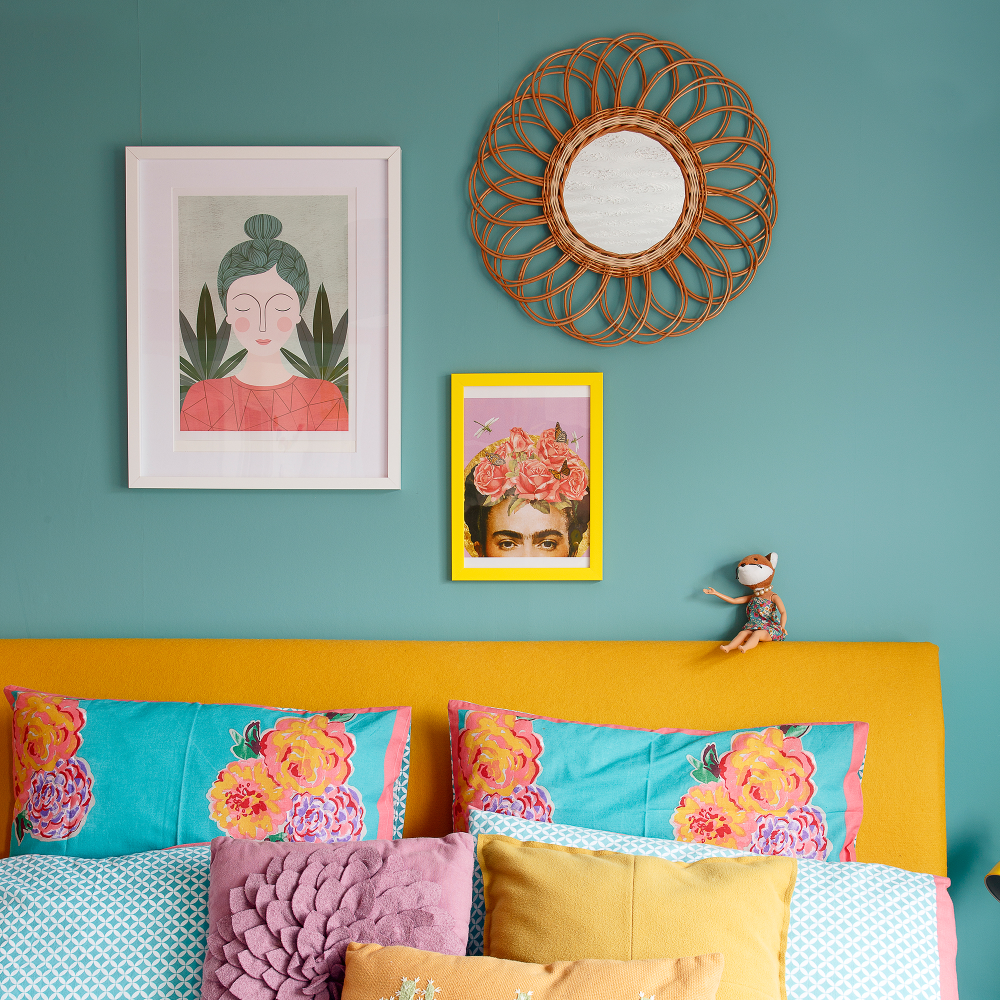
Like with the other design principles, like the 60-30-10 rule, let's break the rule of three down a little further, and explain exactly what it is.
'The rule of three is a guideline that centres around grouping items in threes to create a harmonious and balanced design,' explains Emma from Kelling.
'The rule can be applied to a variety of design elements, be it colour, texture, pattern or form. For example, you could use three different colours on a piece of furniture, or three different prints/patterns in a room.'
'The idea is to create a look that is balanced and cohesive, whilst bringing in personality and character. As with all rules, it's not a hard and fast rule that you have to follow and can be adapted as needed, but its applications can bring many benefits.'
Why do designers use the rule of three?
So why is the rule of three so popular - why does it work so well? 'The reason the rule is said to work is that it is said that humans process information that groups things in odd numbers,' answers Samantha Wilson, Interior Designer and Founder, Collection Noir.
'So when the rule is applied to interior design, it feels more natural, calming and helps to create a sense of harmony and balance that makes a room more inviting.'
'By helping to place design elements evenly, it can help to add balance and symmetry in a space,' adds Emma from Kelling. 'A grouping in an odd number such as three adds visual interest and can help to create a focal point in a room.'
'Another key benefit is the versatility that the rule brings. It can be applied to different design elements in various ways, making it useful for a wide variety of applications and design styles.'
How can you use the rule of three?
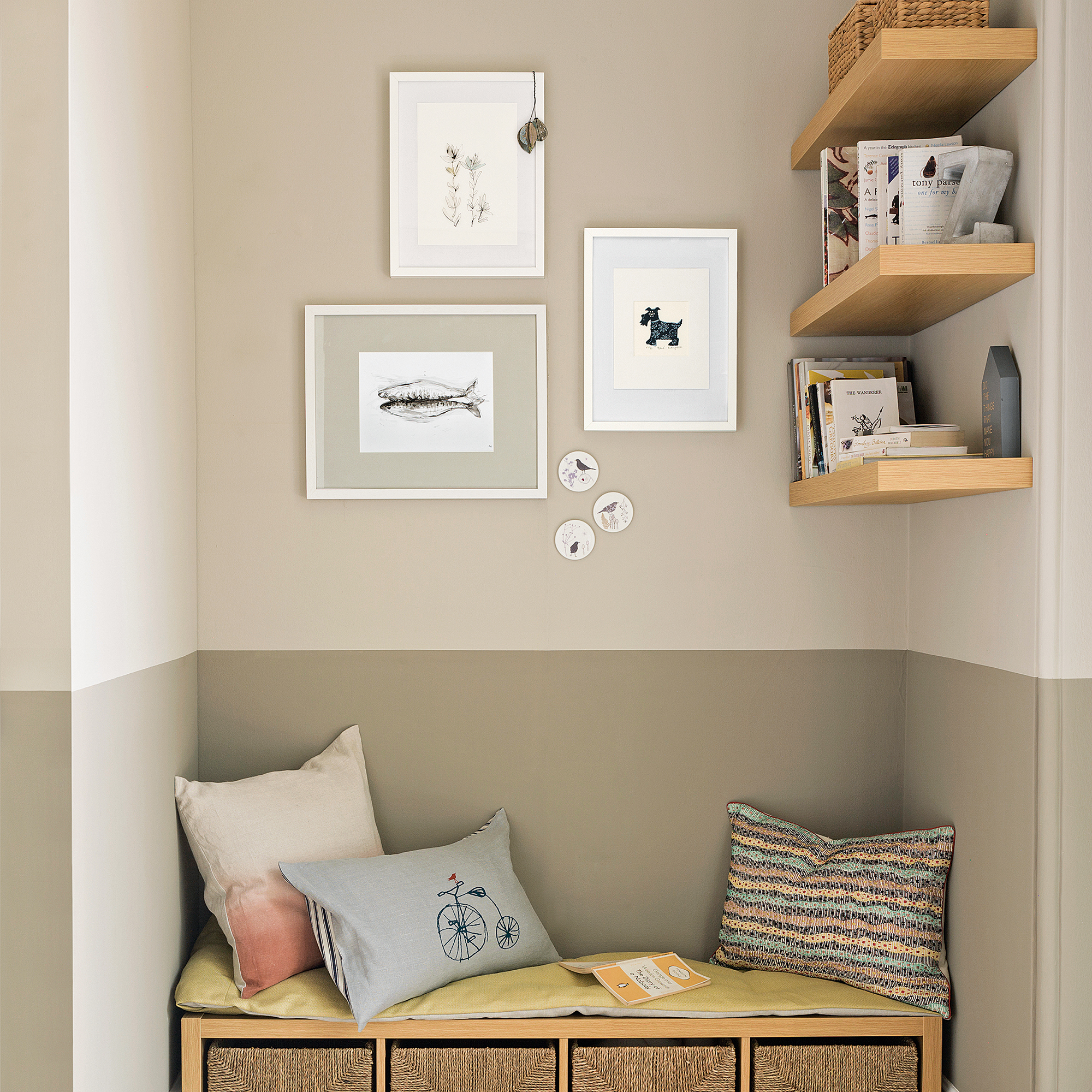
Samantha from Collection Noir breaks down a few specific examples of where to utilise this rule.
- Cushions - arranging cushions in odd numbers works really well. Think of a bed with two large cushions and the none oblong placed in the centre, bringing balance and symmetry
- Objects - grouping objects in odd numbers creates a display that not only becomes more manageable, but more of a feature. Try varying height, shape and texture for added interest
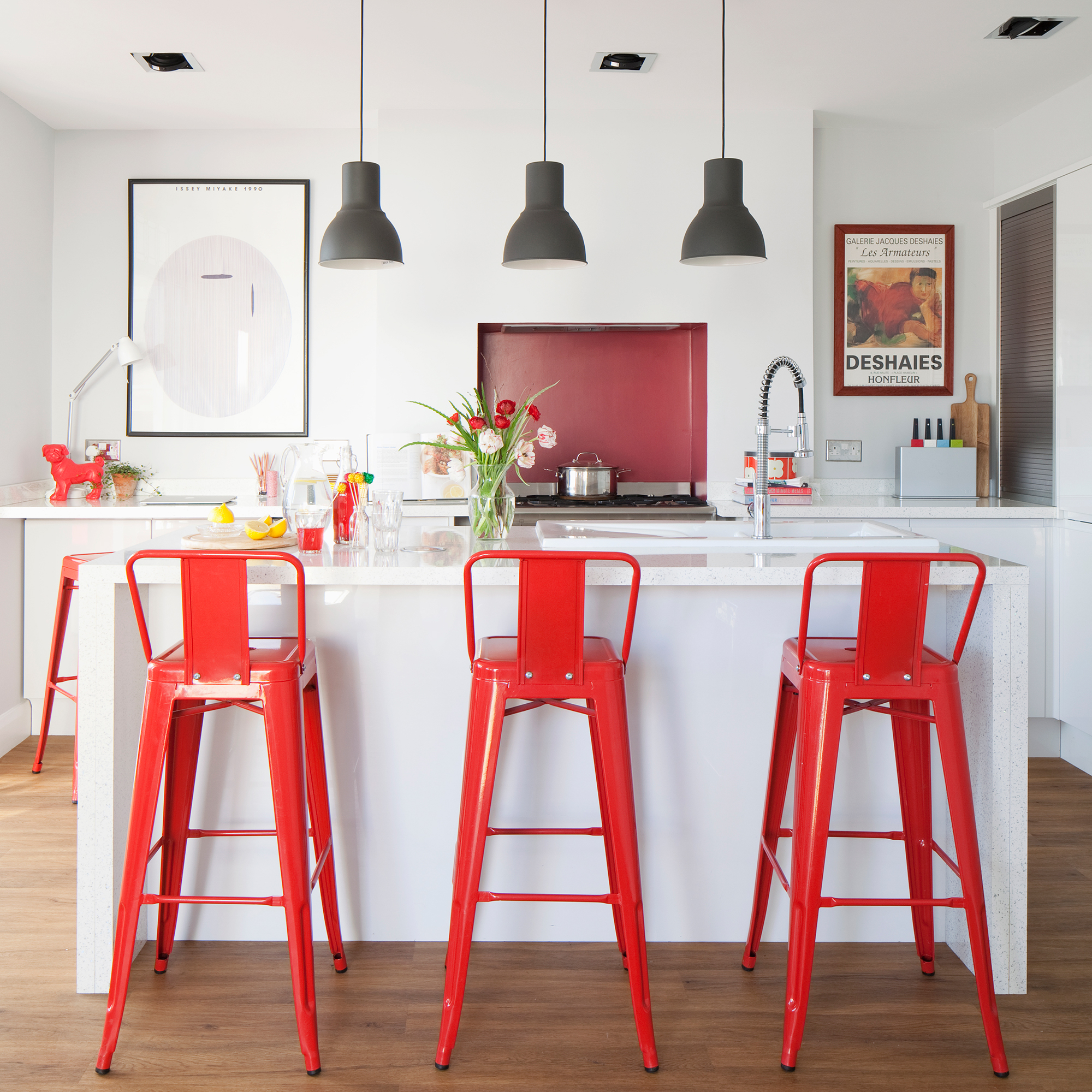
- Lighting - using three pendants for your dining table or kitchen island lighting not only provides ample lighting, but also creates a sense of balance whilst making a statement
- Art - placid three works of art in a row allows for a curated feature wall that can provoke harmony in a space. This can be applied across many interior styles and still be effective
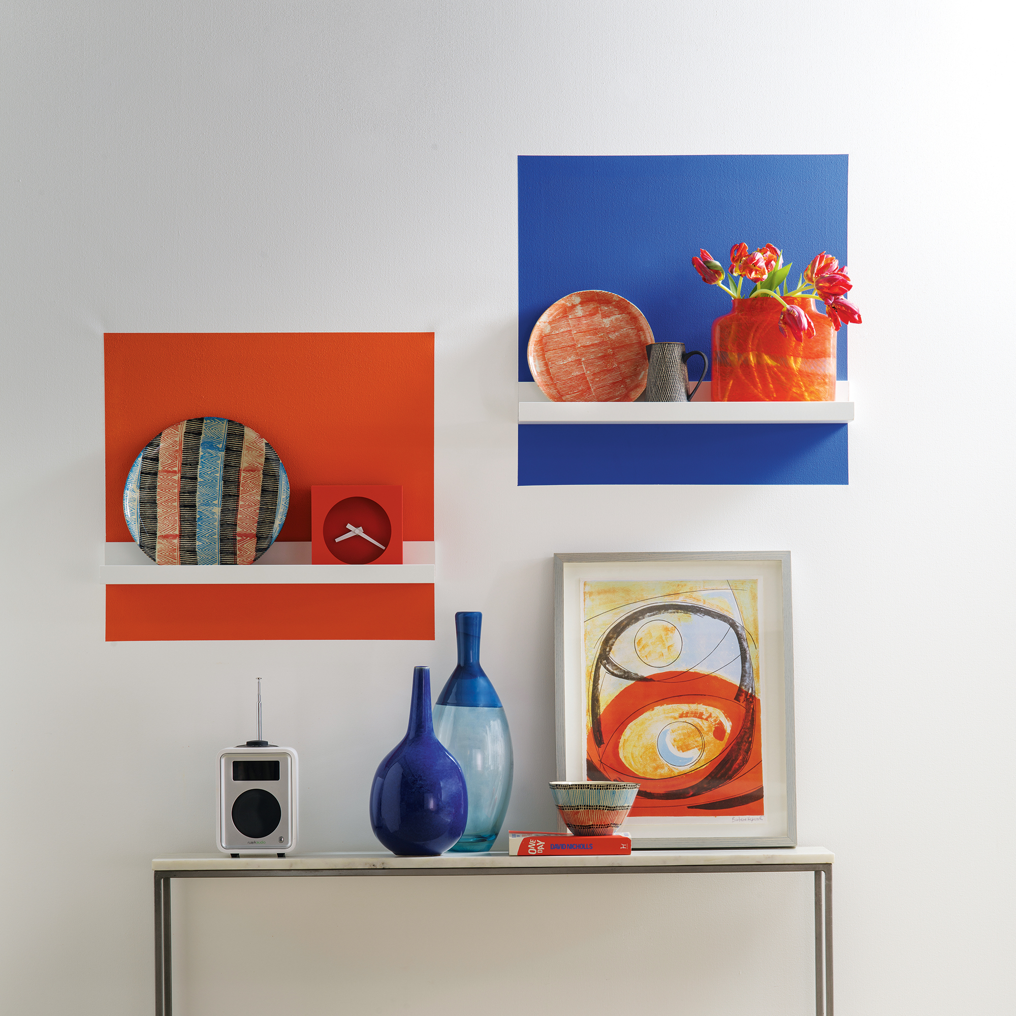
There are additional ways to add interest when using the rule of three by playing with the textures and colours of the objects that you're grouping together.
'Three items with similar design features such as colour, shape or material will help create a harmonious aesthetic,' suggests Emma from Kelling.
'On the best sofa, using three cushions in the same pattern but with different colours for instance, will help to tie a colour scheme together.'
'The rule can also be used to create contrast by using three different items that feature different colours, textures or shapes. This could be hanging three pendant lights together that are different in size and finish.'


