Using colour can be a little scary and daunting for many people, especially when it comes to bold shades. This is where the ‘peek-a-boo’ paint theory comes in as it’s an easy way to use contrasting colour through small but unexpected flashes.
Colour is usually what makes a space interesting and memorable. But covering large areas like entire walls in colour is not something everyone’s up for and feels comfortable doing in their homes. But since the peek-a-boo paint trend consists of only small colour accents, experts recommend it even for the most colour-hesitant. According to research conducted by paint brand Dulux, 76% of homeowners say they were taught to avoid ‘clashing’ colours, and 43% say they fear ‘getting it wrong’ when decorating.
‘It’s a great way for those who are a little colour-shy to add personality into their home through subtle yet vibrant details, rather than committing to a fully painted wall or large block of colour,’ says Helen Shaw, international director of marketing at Benjamin Moore. ‘It encourages people to be brave and rebel against decorating rules. It takes confidence to “paint outside of the lines”, but it’s one of the easiest ways to make an impressive impact.’
What is the ‘peek-a-boo’ paint theory?
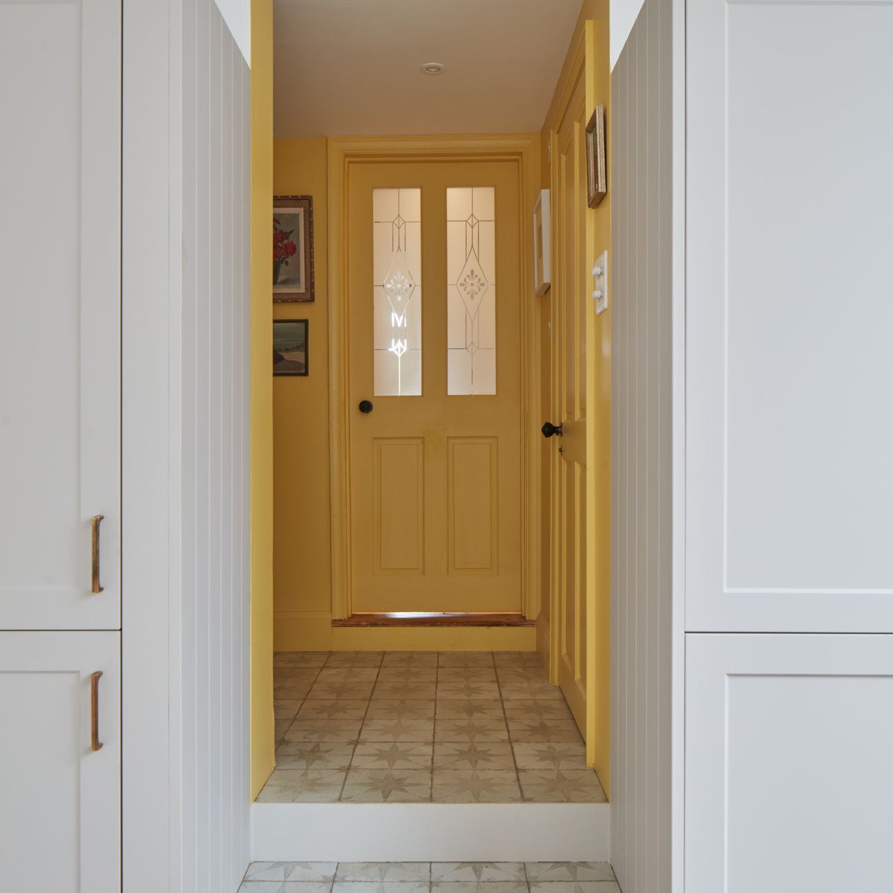
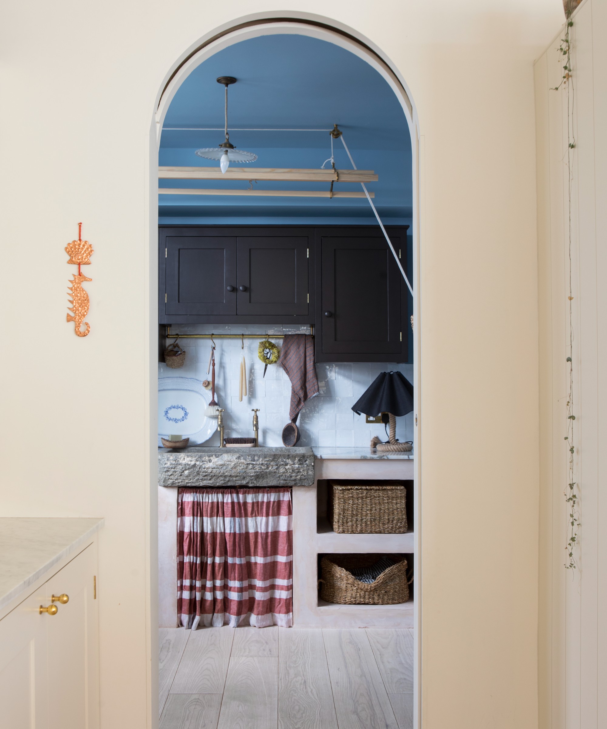
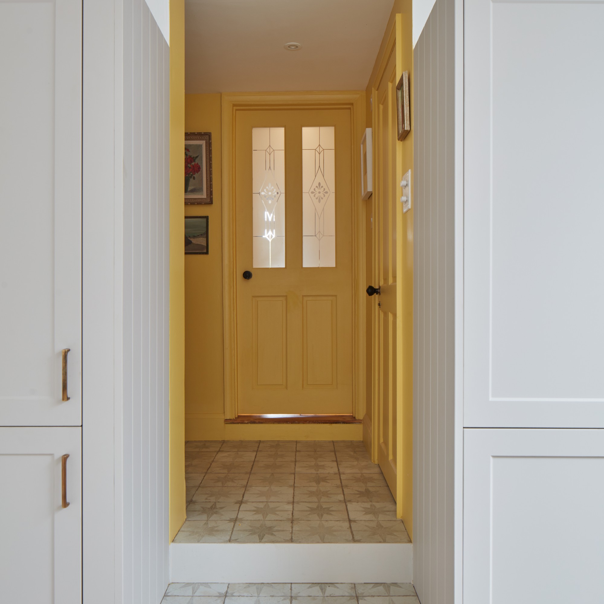
Coined by Dulux, the ‘peek-a-boo’ paint theory is about adding bold, contrasting but small accents of colour in unexpected places, such as on skirting boards, inside shelving or even in a place visible when looking through the door from one room to another, framed by the doorway.
Lucy Steele, senior brand manager and resident colour expert at Valspar Paint, explains, ‘The peek-a-boo paint trend is something I’ve certainly noticed more people experimenting with recently. This more refined technique is the perfect way of incorporating intentional character into rooms without leaving a heavy or unsophisticated feel.
'As colour is used sparingly on shelves, cabinets or skirting boards, the peek-a-boo theory provides an option for those who want to add brightness into their homes without committing to bold, and sometimes daunting techniques like colour drenching or feature walls. It’s an approachable way of experimenting without completely redecorating.’
How to use the ‘peek-a-boo’ paint theory
This paint idea is best used to highlight small details and architectural features to add depth and intrigue to the room.
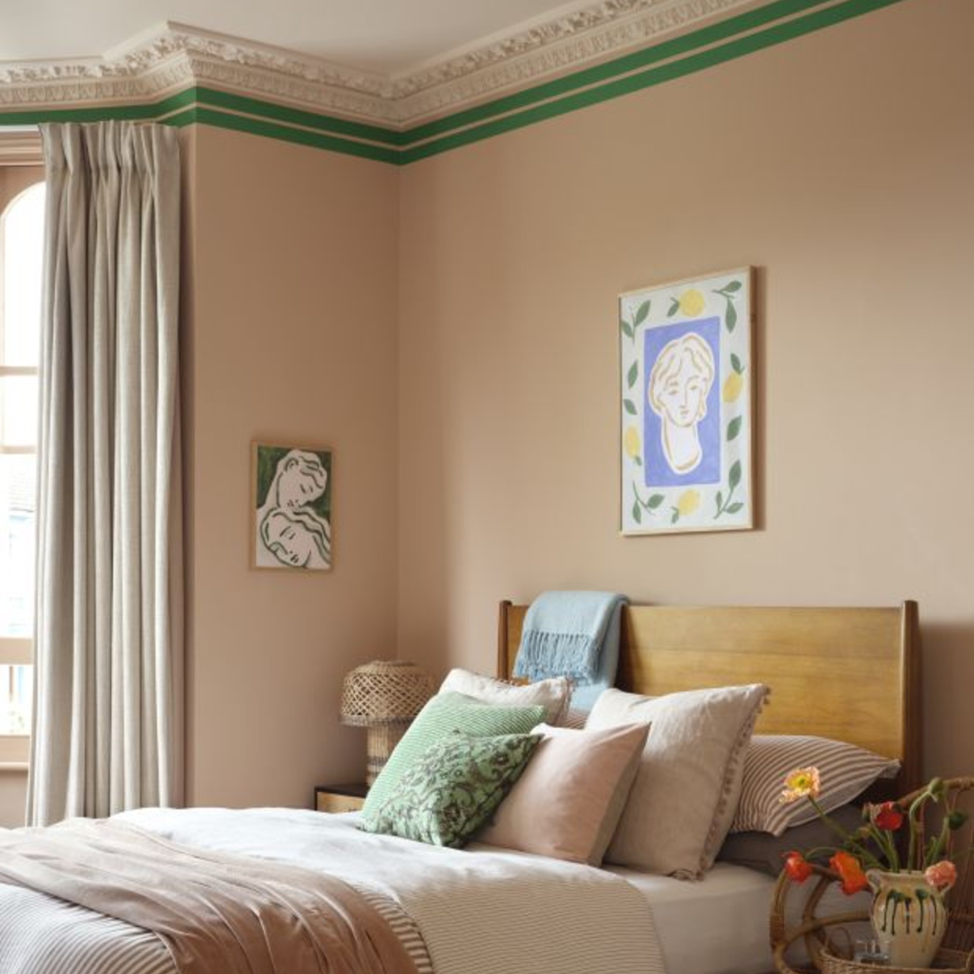
Ruth Mottershead, creative director at Little Greene, says, ‘Adding small but contrasting flashes of colour within a scheme, such as across skirting boards, window frames or within cupboards, is a great way to accentuate these areas and introduce a playful design detail that brings visual interest and depth. Often, skirting boards are painted in a neutral or white shade out of habit. However, their relatively small proportion means they provide the perfect opportunity to introduce colour and refresh a space without it feeling overwhelming.’
Helen at Benjamin Moore adds, ‘The peek-a-boo paint theory works particularly well in places where small glimpses of colour appear as you move through a space, such as inside cupboards or along the edges of windows or doors. These subtle flashes of colour create moments of surprise and visual interest.’
What colours should you use?
In order to create a true contrast, it’s recommended to opt for colours that sit opposite one another on the colour wheel, such as blue and orange, which is one of the best ways to use the colour wheel like a pro.
‘Colours that sit opposite each other on the colour wheel balance and enhance one another in a really joyful way, they have this slightly surprising magic that makes a space feel alive, not overwhelming,’ explains Marianne Shillingford, creative director and colour expert at Dulux. ‘Seeing a contrasting colour through a doorway instantly adds interest. It draws you through the home and makes spaces feel connected rather than flat. Blue and orange work particularly well here. Sitting directly opposite each other on the colour wheel, they form a complementary pairing that feels vibrant yet balanced.’
You don't necessarily have to go full on bright or dark blue. You can opt for a soft, light blue shade like Valspar's Summer Rain instead.
Farrow & Ball's punchy Charlotte's Locks orange shade will pair perfectly with a soft blue like Valspar's Summer Rain. And it's one of the brand's most popular colours.
Dulux's Heritage range is one that rivals even the likes of Farrow & Ball. And the classic sage green shade is one of the top sellers.
I'm a big fan of earthy red shades like Lick's Red 01. It looks especially lovely when paired with a shade of green as it sits opposite on the colour wheel.
Ruth at Little Greene concludes, ‘These small details can make a big impact on your final scheme and completely change the feeling of a room, as well as being the perfect place to be more adventurous with colour.’
If you enjoyed reading this, sign up for the Ideal Home newsletter for all the latest home decor trends and inspiration delivered straight to your inbox