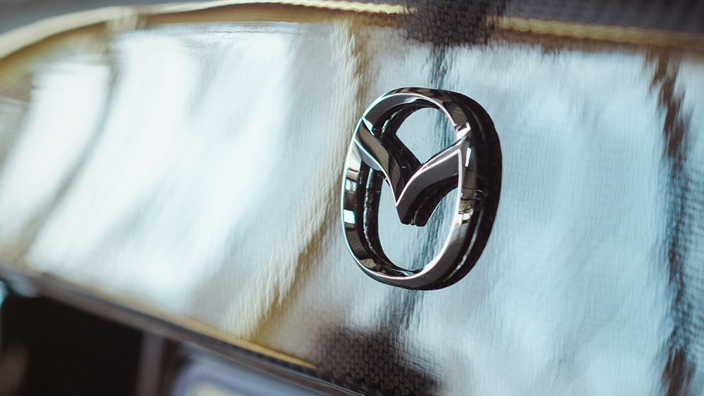
The new Mazda logo may not break the mould, but it's very necessary. The Japanese brand has been trying to move upmarket, but it's been doing so with a logo that's starting to look very dated. The new design follows the trend in recent car logo redesigns, but it's a much better fit.
Based on trademark documents the new logo is flatter and has a slightly different shape. We've seen this flattening of logos in pretty much every other car logo redesign of the past five years, but it makes sense for a brand that aims to modernise.