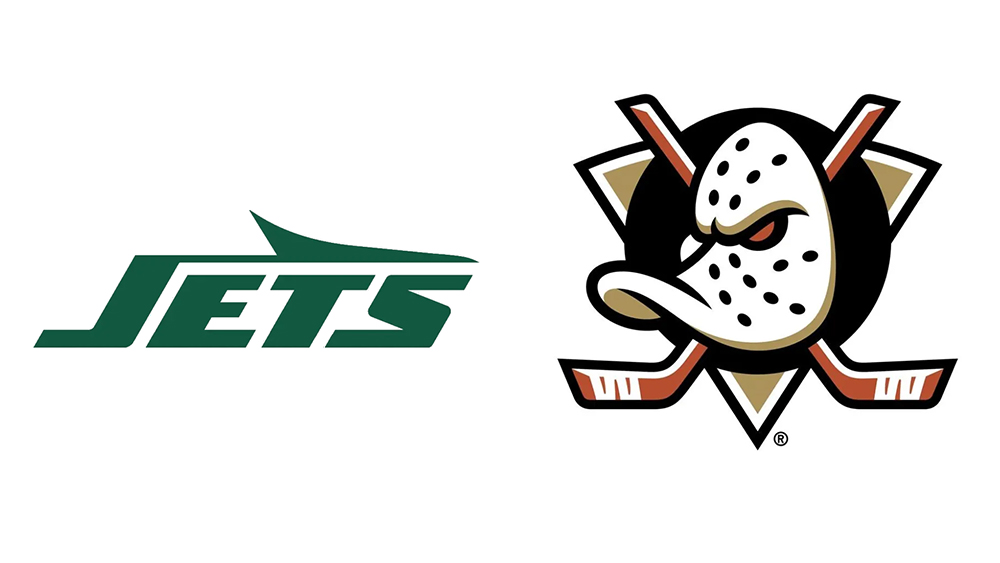
Retro logo designs are having their day in sports at the moment, particularly in the US. From the New York Jets to the Anaheim Ducks, several teams have turned back the clock, adopting new logos very closely inspired by past designs.
The new LA Kings logo is the latest example, taking us back to the 1990s. Is it just part of a trend towards nostalgia, or are teams finally recognising that their noughties rebrands got things wrong? (Also see our pick of the best NHL logos).
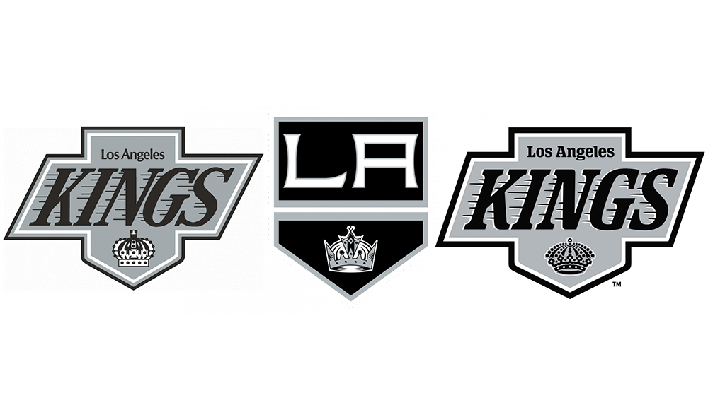
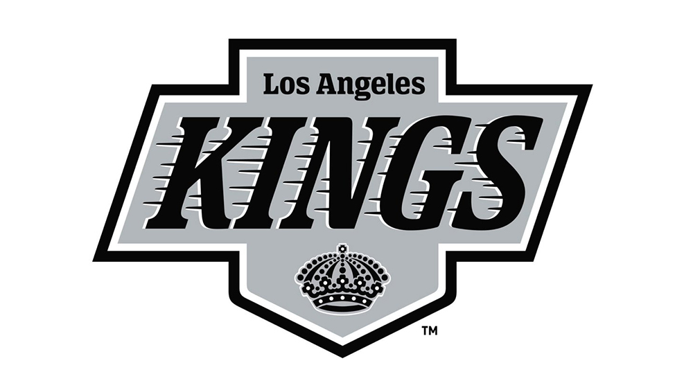
The new LA Kings logo is very closely based on the NHL team's logo from 1988, ditching the more streamlined 'LA' shield design used in recent years, which relied on the graphic of the crown to identify the team's regality. The new design looks even more 1990s than the logo it was inspired by, with a bolder, more curved font and drop shadow. The speed lines are back, while the crown has been simplified and modernised.
The Kings are just the latest of several teams to go back to old designs. Sports teams change their logos with considerable frequency, including to help the sale of merchandise, but have they grown lazy? It's possible that that teams are recognising that some rebrands over the years were unpopular among fans, and certainly fans of a certain age, who will often view a past design as the real identity of their team, particularly if it was associated with sporting success. The LA Kings' logo from the 1990s is remembered fondly because it was the design worn by Wayne Gretzky and the team that won the Kings' first conference championship in 1993.
In a podcast discussing the new logo, Kings COO Kelly Cheeseman told LA Kings Insider that “the players spoke and the fans spoke". Andy Cruz from House Industries added that the design team spent more time designing crowns than any other part of the rebranding. "...Are they multi crosses, are they round corners, are they sharp? Is someone going to think that this is British royalty or Danish royalty, so you’ve got all this baggage that comes with the 'royal' aspect of designing a crown,” he said.
Alas, the 'new' design is generating mixed opinions among fans. On social media, some are saying they prefer it, while others want the team to go back even further and revert to its purple and gold colours from the 1960s and 70s.
For more logo news, see our pick of the best new logo designs of 2024 so far.