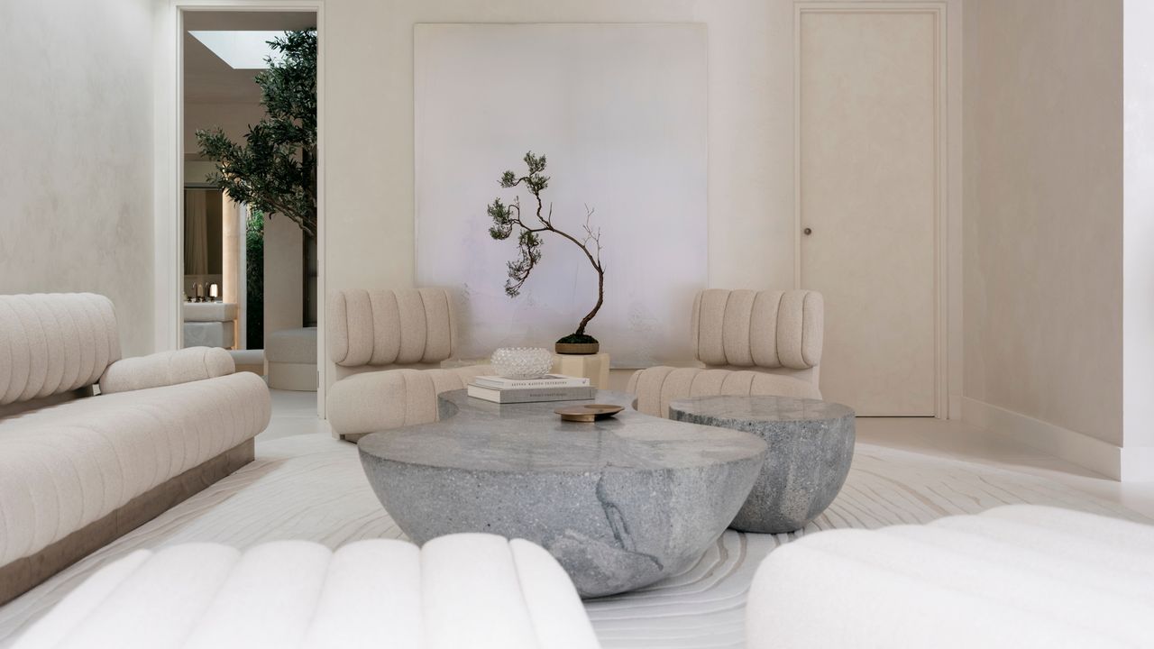
A perfectly balanced neutral color palette may come across as effortless, but any designer will tell you that getting neutrals 'just right' is an art form. The reason? Neutrals aren’t really neutral at all. Each one carries subtle undertones that can either harmonize beautifully or clash in a way that leaves a space feeling flat, mismatched, or even unintentionally cold.
"The biggest challenge I see when speaking to clients is that people often think neutrals are the 'safe' choice, but they can actually be quite tricky," says Tash Bradley, director of design at paint company Lick. The secret to a rich and layered neutral space lies entirely in paying attention to the undertones — a concept I'm dubbing the 'hidden hue rule'. Just like with bold, saturated, or bright color palettes, matching the hidden undertones will ultimately lead to a more curated space.