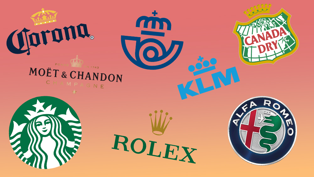
The best logos with crowns illustrate just how effective a simple, recognisable icon can be when it comes to building a brand identity. So as the UK marks King Charles III's coronation (yes; it's a tenuous connection, but hear us out), we're exploring the enduring appeal of crown logos.
From luxury brands to dog food and beer, crowns are among the most commonly used symbols in logo designs. But why do so many brands use them, what do they communicate and who uses them best? (see, it is interesting; take a look at our guide to how to design a logo for more inspiration).
The best logos with crowns
Once you start looking, you suddenly realise that crowns are everywhere in logo design, appearing in some of the world's best-known marks. In fact, crowns are so common in logos that if you use one of the best free logo makers, it's highly likely that it will generate at least a couple of designs featuring regal headgear for your brand.
Some crowns in logos are obvious and unmistakable, others are such a small element of the design that you might never have noticed them. But just why do so many brands think they're royalty? We take a look in this roundup of the best logos with crowns.
01. Royal Mail logo
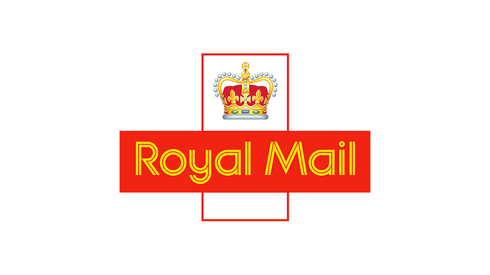
Some logos feature crowns for fairly obvious reasons – because the brand belongs to, or at least belonged to, a country with a monarchy. The UK's postal service may have been privatised back in 2013, but it still clings to tradition with this longstanding logo, which is probably wise after its disastrous flirtation with a name change to Consignia early in the century.
The current Royal Mail logo was created in 1989, but it closely followed a previous design introduced in 1974. Refreshingly, the service has resisted any urge to follow the flat design craze and simplify things, keeping an intricate realist illustration of a crown complete with gradient shadows (see the more abstract logo for Spain's post office below for comparison.) Based on the 13th-century crown of St. Edwards, it may look fussy but it emphasises tradition and reliability, while the red colour palette reflects the company's traditional red post boxes.
02. KLM logo
Here's another example of a company that's hung on to its royal connections. The Netherlands' KLM is now part of Air France–KLM, but despite that link to a country whose royalty lost its crown in the most violent way, it retains its allusions to the Dutch monarchy, from whom it received a royal predicate (Koninklijk) in 1919.
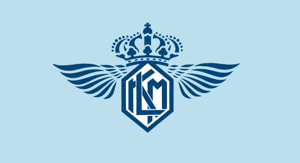
Closely based on a 1964 design by the British designer Henri Kay Henrion, KLM's current logo with a crown was last updated way back in 1991. Its simplicity makes it adaptable to pretty much any application (not something that can be said for the original logo from 1919 (see below). Indeed, the designers seem to have cannily foreseen today's trend for flat designs, dropping the previous two shades of blue for a single hue (00A1DE to be precise).
As KLM says itself on its website, "Maybe they were thinking “Hmm, it might be useful for our future designers and aircraft painters if our logo is just one colour,” and they would’ve been right."
03. Moët & Chandon logo
While some brands use crown logos because of genuine, albeit historical, royal connections, for some it's a case of patronage. Claude Moët's early customers included Louis XV, whose crown inspired its original logo design. The logo was updated in 2006, but it made good sense to keep a symbol that communicates the champagne maker's history and luxury status, which is also emphasised in the elegant capitals of the serif font.
04. Corona beer logo
From champagne to beer. The world's most highly esteemed champagne producer might not have much in common with an omnipresent beer brand, but they both have crown logos. Corona can't claim to have had royal patronage, though. It took its name and logo inspiration from a statue of the Virgin Mary wearing a crown in the Cathedral of Our Lady of Guadalupe in Puerto Vallarta, Mexico (despite some bizarre confusion during the Covid-19 pandemic, Corona is simply the world 'crown' in Spanish).
05. Canada Dry

Canada Dry is another beverage brand that sports a crown logo due to royal patronage. Its original logo actually depicted a beaver over the map of Canada, but the aquatic rodent was replaced with a more regal emblem when the drink was appointed to the Viceregal Household of Canada's Governor General in 1907.
06. Rolex
Rolex might not have royal connections, but a crown logo feels entirely appropriate for a luxury watchmaker. The design also fits with Rolex's original tagline, "a Crown for Every Achievement." Originally used in black, the logo was designed by the company's founders Hans Wilsdorf and Alfred Davis. The crown was made gold and the typeface green in 2003 to add to the sense of luxury and wealth. The crown is fairly abstract, not resembling a real royal headress, but its unrealistic height adds to the feeling of sophistication and elegance. There's a theory that the five points were chosen to represent the five fingers on the human hand.
07. Hallmark
The simple elegance of a crown logo also works for the greetings cards and television company Hallmark. Since 1952, it's made only small tweaks to this design, which oozes class and sophistication with its calligraphy font and monochrome application. The crown feels like a seal, which makes perfect sense on greetings cards and envelopes, and it matches the script style of the logotype for a handcrafted look.
08. Starbucks
Even mermaids have royalty, and the queen of the underwater realm is depicted in the Starbucks logo. The brand is named after a character in Melville's Moby-Dick, which (sorry for the spoiler) does not feature any mermaids, but the seemingly tenuous connection came from an idea that the logo would work the way sirens lure sailors to rocky shores in mythology, bringing in customers to buy coffee.
Associating your brand with shipwrecks might not seem a great idea, but the logo still features a mermaid with a crown, although in much more streamlined form than the original Starbucks logo. The logo was redesigned by Terry Heckler in 1987 and saw further facelifts in 1992 and 2011. The only reason for the crown seems to be to make it clearer that we're looking at a mermaid and not a woman doing the 'happy baby' logo pose.
09. Royal Canin
Royal Canin is another brand with no royal connection, but royals love dogs, right?The pet food brand initially focused mainly on supplying breeders, and French vet founder Jean Cathary adopted a regal name as a statement of intent when he launched the company in the late 1960s.
Up until the 1970s, the brand had a logo that matched its lofty aspiration to connect with elitist traditions, with a ribbon featuring gothic text under a highly elaborate illustration of a crown, making the brand look older than it was. By the mid-1980s, it had done away with that, adopting the streamlined logo that's still in use today. The company is now owned by Mars.
10. Alfa Romeo
On some logos with crowns, the crown is unmissable, but others include a crown so small you might never have noticed it was there. You might also not have noticed that the Alfa Romeo logo features a man being eaten by a snake. The design has been through nine iterations since its debut in 1910, and following the trend we've seen in most car logo rebrands, the crown has become more simplified and less noticeable.
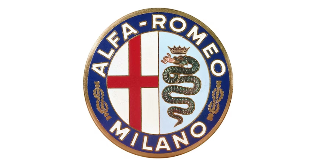
But why exactly does the Alfa Romeo logo feature a man-eating snake king? It's because the brand was founded in Milan. What looks like the English flag is actually the flag of the Italian city, and the other portion of the design comes from the city's coat of arms. the snake is a biscione, a traditional heraldic symbol associated with the Visconti family, which came to rule Milan in medieval times. The symbol is used by many companies from Milan.
11. Scania
Crowns are one of the most common symbols in logos designs, and lions are another. Scania manages to use both. The creature is actually a mythical griffin (part lion – part eagle), which serves as a symbol of strength and speed for the lorry manufacturer. But, again, more than anything this crown logo links the company to tradition. It was inspired by the coat of arms for Sweden's southern region of Skåne (also the source of the company's name).
12. Juicy Couture
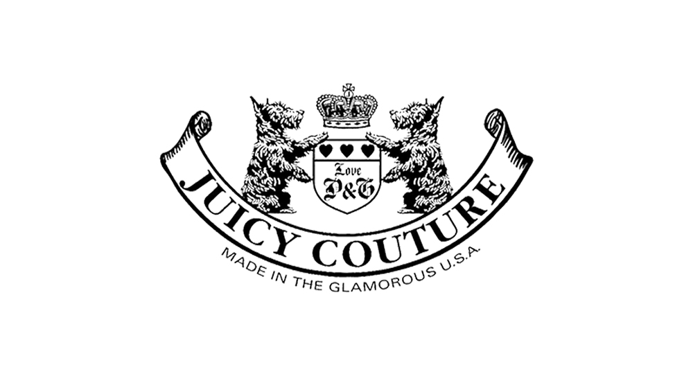
Finally, there are cheeky ironic uses of crown logos. The casualwear brand Juicy Couture, famous for its velour tracksuits, was only founded in 1997, but it's dressed fashion queens such as Britney Spears, Paris Hilton and Madonna so it we can understand it might feel like royalty. Its logo is an over-the-top parody of traditional wealth and status, throwing in everything. There's gothic text, a ribbon, a shield, the founders' initials, highland terriers and, of course, a crown. Here the logo works as a joke, communicating the brand's brash, upstart attitude. It focuses on gaudy luxury for the new rich, and it's proud of it.
Why do so many brands have logos with crowns?
It might seem like a lazy design decision, but including a crown in a logo design can be an effective way to communicate luxury, wealth, legitimacy and superior quality. Crowns are easily recognisable and fairly universal, with many cultures around the world being familiar with some form of headdress as a status symbol. It's also a clean, solid symbol that can be easily rendered in an abstract form for use in small sizes.
Finally, crowns are now so widely seen that they've lost their exclusive connection with royalty, so it doesn't necessarily come across as pretentious for a small brand with no royal connections to use one – even graffiti artists use crowns in their tags. It can be seen as arrogant or conceited, but with the right brand, a crown can communicate tradition and permanence.

