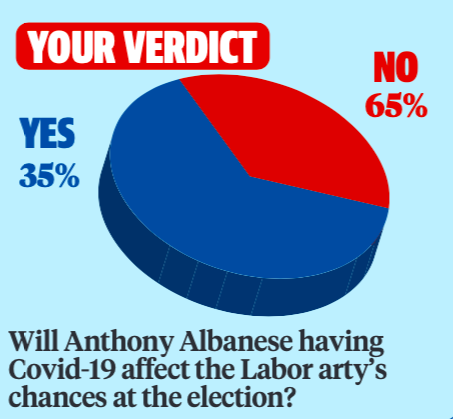
Another day, another Murdoch newspaper publishing extremely questionable pie charts that have me wondering where on earth these people get the audacity. Do they think we won’t notice?? First we had *that* ridiculous pie chart from The Australian. Now I introduce to you our latest culprit, the Herald Sun.
In the publication’s April 24th newspaper, on page 11, a very curious (read: completely mind-boggling in its obvious meddling of facts) image can be found.
Probably not the only questionable graphic to ever appear in a Herald Sun newspaper, but certainly the most amusing: this totally accurate, not misleading at all graph that surely wholly represents the Australian public:

Alongside the question “Will Anthony Albanese having COVID-19 affect the Labor [Party’s] chances at the election?”, a graph shows “your verdict”.
Apparently the poll found the majority of its audience voted no at 65 per cent. Yet for some reason that number is represented by the smaller segment of the pie chart?? The bigger segment represents the yes vote at only 35 per cent. Oh, and there’s a typo in “Labor arty”. What kind of trickery is this?!
Of course, maybe I shouldn’t be surprised. It’s not like misleading pie charts are exactly new for News Corp pubs.
But still, you’d think after all the other times they’ve been called out that they’d stop. Are you not embarazzed???
Twitter account @GraphRehab (lol) fixed the graph to show what it should actually look like.
There, I fixed it lol
Special thanks to https://t.co/7Aa0b3xFBT pic.twitter.com/KErfBWJLDh
— Graph Rehab (@GraphRehab) April 24, 2022
There we go! It’s exactly the same but with the colours swapped around, as it should be.
I'm going to use this graph with my students this week to illustrate how not to use data
— Sometime from the alternative left (@Kristyg1) April 24, 2022
Now, is it possible that the graph designer just made a mistake and ~accidentally~ mislabelled the sides of the graph? Sure. Especially given the typo in its question, it’s possible it was missed in the proof-read.
Weird how the mistakes never seem to flatter the Labor Party though, hey?
The post Take A Look At This Herald Sun Pie Chart For A Lesson On How *Not* To Use Data appeared first on PEDESTRIAN.TV .


