When directing someone to a location, chances are you’ll probably guide them with signages, eschewing formal road names. “Turn left after the Mother Dairy hoarding; take a U-turn when you see the SBI ATM; the office is bang opposite the Croma showroom!”
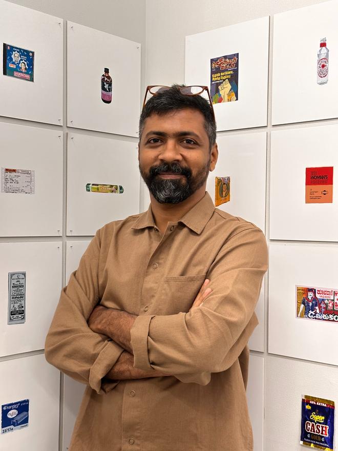
Brands, and their signs and logos, are omnipresent in our lives and make up a large part of our visual and cognitive language without us realising it — sparking everything from assurance and nostalgia to confusion at the garble of jargon. “Graphic design in India is overloaded with all kinds of forms, sizes and colours, and it can be overwhelming to our senses. One tends to call it a ‘mess’ or ‘chaotic’. This show points the viewer in a direction to change their perspective and biases, and understand why it all seems so overwhelming,” explains artist and designer Sameer Kulavoor, who co-founded Bombay Duck Designs, an independent design studio in Mumbai, with designer Zeenat Kulavoor. Together, they’ve put together an illustrated documentation of Indian printed and painted graphic design samples and signages across the decades in an exhibition titled Everyday India at 47-A, in Khotachiwadi.