We all know that a front door color is one of the most crucial paint decisions you can make for your home. Not only does it set the tone for the rest of the home, but it can also boost curb appeal.
When we saw Cynthia Nixon's yellow door, we couldn't help but admire its sunny shade and brightening properties, and with hues like butter yellow and ochre having taken over interiors this year, we know that yellow is a decor choice that is as trendy as it is timeless.
Cynthia's door in particular adds some vibrancy to her otherwise neutral hallway, which features white walls, wood floors, and wood-framed photographs. It's a move we can absolutely get behind.
Shop the yellow decor edit

This soft, buttery throw is a great accessory for any neutral sofa, adding just the right amount of color.
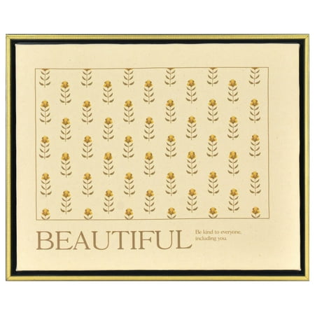
Nothing feels quite as retro as this print, which combines classic floral imagery with inspirational words. A pattern of tiny pale yellow flowers printed on natural canvas translates to every kind of room, but we think it has a particularly perfect place in the kitchen.

This vessel for florals is sleek and bright, making it just as much a piece of decor as bouquets themselves.
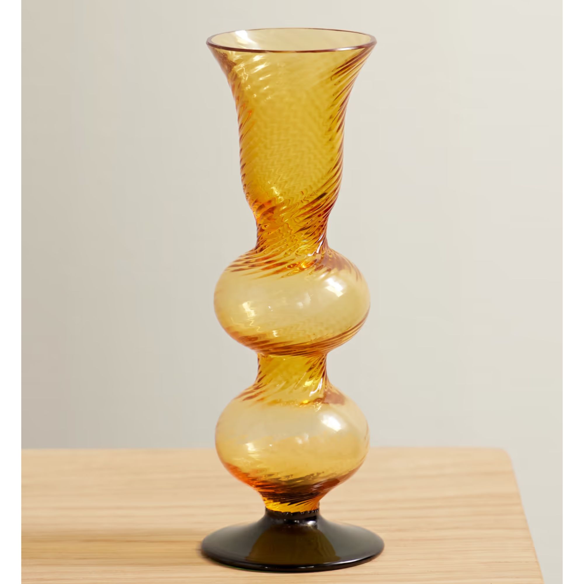
For a really fashionable choice, La DoubleJ's 'Baby Bubble' candlestick holder makes for the perfect addition to your mantel. Handmade in Murano, Venice, by expert glassmakers, it has a unique, retro look.
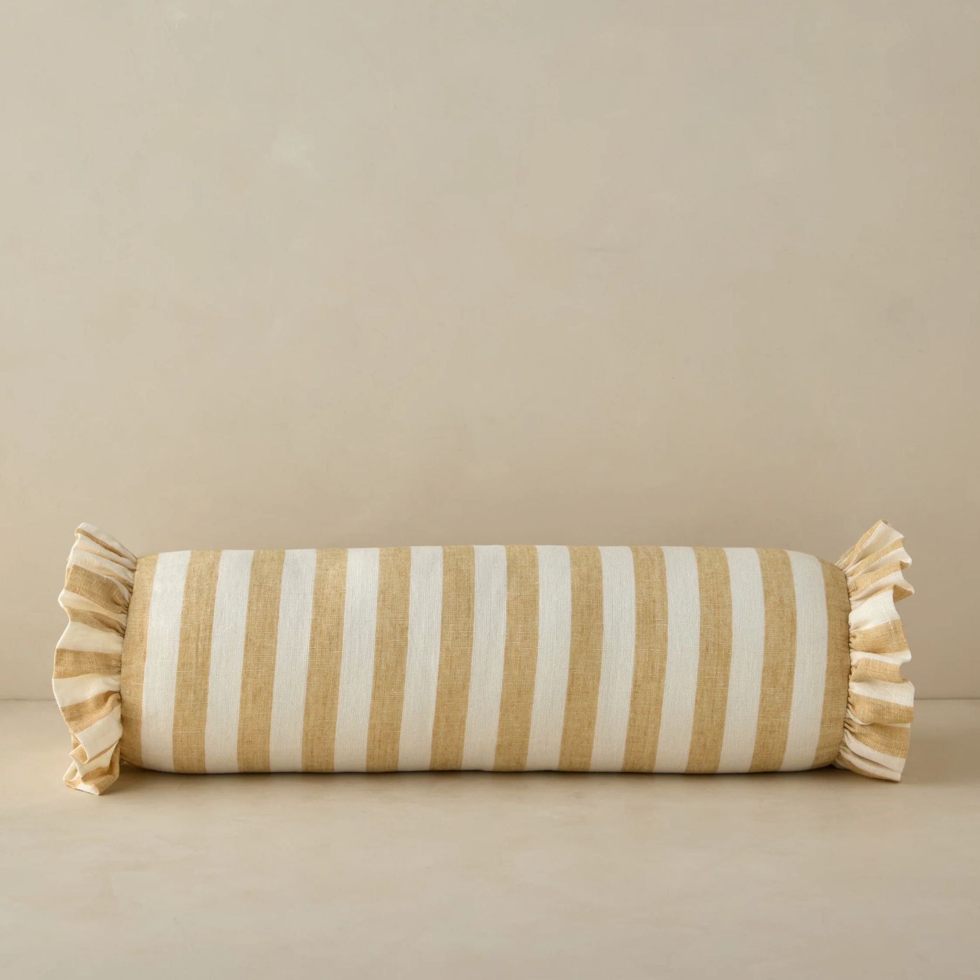
Add the cherry on top of your pillow edit on your bed or couch with this fun bolster pillow. I love the ivory and butter striped design, and the trending ruffled edge brings texture and playfulness to your space.
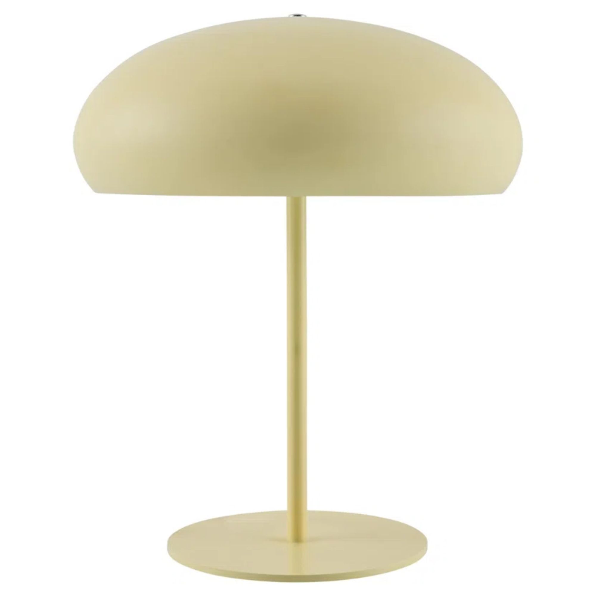
The sleek, Mid-Century-inspired table lamp is perfect for minimalists who want to bring a touch of butter yellow into neutral spaces. Standing 18 inches tall, it's perfect for adding some chic, contemporary flair to your desk or bedside table.
Design experts say that when it comes to choosing a yellow paint for your front door, try going for more nuanced shades rather than a bold, bright pick.
'For homeowners who are drawn to yellow, my advice is to lean into softer, muted shades rather than bold, saturated tones,' says Rossella Marzocchella, interior designer at Decor & Decor.
'A buttery or pale yellow, for instance, can add a gentle warmth that complements natural surroundings without overwhelming the eye. This approach creates a balanced, welcoming look that doesn’t overpower the home’s structure.'
This butter yellow paint from Benjamin Moore would have to be our top pick. Rossella also suggests considering your home's exterior, from the porch to the hardware materials and colors.
'When working with yellow, I always suggest pairing it with grounding colors – deep charcoal, muted navy, or crisp white on trims and shutters can provide a sophisticated contrast, allowing yellow to be the highlight rather than dominating the design,' she says.
'Additionally, for clients who may not want to commit to a full yellow facade, adding yellow in smaller touches – such as on the front door or window shutters - can create a lovely focal point that feels tasteful and controlled.'
She continues, 'To complete the look, we recommend using exterior hardware in complementary finishes like matte black or brushed bronze, which grounds the brightness of yellow and adds a polished finish. Yellow may be a bold choice, but with a thoughtful approach, it can bring a unique charm and curb appeal to the home without overwhelming the overall design.'