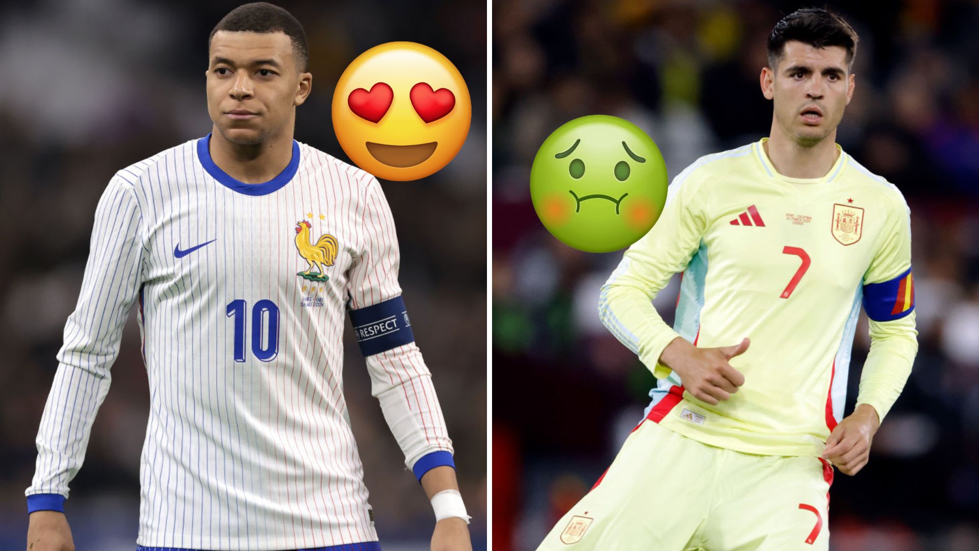
Every Euro 2024 kit has been unveiled ahead of the tournament this summer, with a real blend of beauty and beastly.
But while football shirts conjure up vociferous opinions among football fans regardless of their persuasion, we asked our esteemed team at FourFourTwo to offer their opinion on which shirts they love, hate and are indifferent to ahead of landing in Germany.
What we've managed to amalgamate, as a result, is the definitive ranking of every home and away shirt set to star on the international stage at Euro 2024 this summer. There are 48 kits in total, so strap in and enjoy...
Ranked! Every Euro 2024 kit
48. Slovakia Away
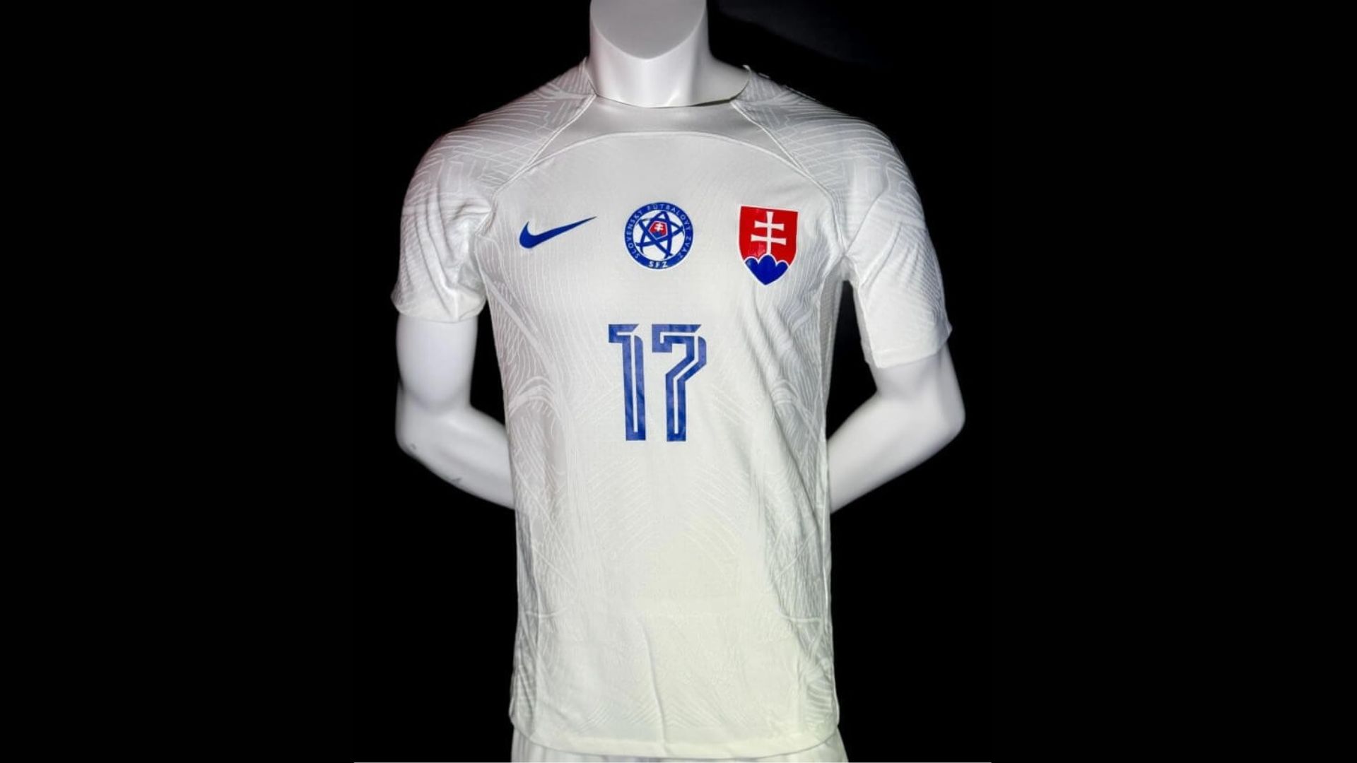
Talk about bland and boring, Slovakia's away kit is just white. There's literally nothing else to it. There's no design element, no attempt to create something even mildly interesting: just white.
The score our judges gave this was a four, which seems awfully generous, while it also received the only 0 out of all 48 kits, too. The less seen of this in Germany, the better.
47. Spain Away
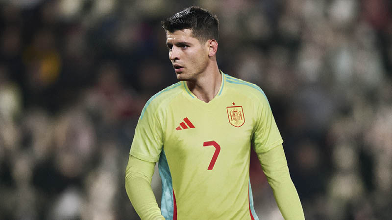
Honestly, what did Adidas think when combining these colours together? It's ambitious and vibrant, but by no means is that in a good way.
Putting bright yellow, pale blue and a striking red all one shirt is an eye-sore, but apparently it "applies the visual of waves and the beauty of the flower but with an unconventional colour pairing on the base and side panels – resulting in an aesthetic that represents a bustling Spanish beach in the middle of summer.” Whatever you say, Adidas.
46. Slovakia Home
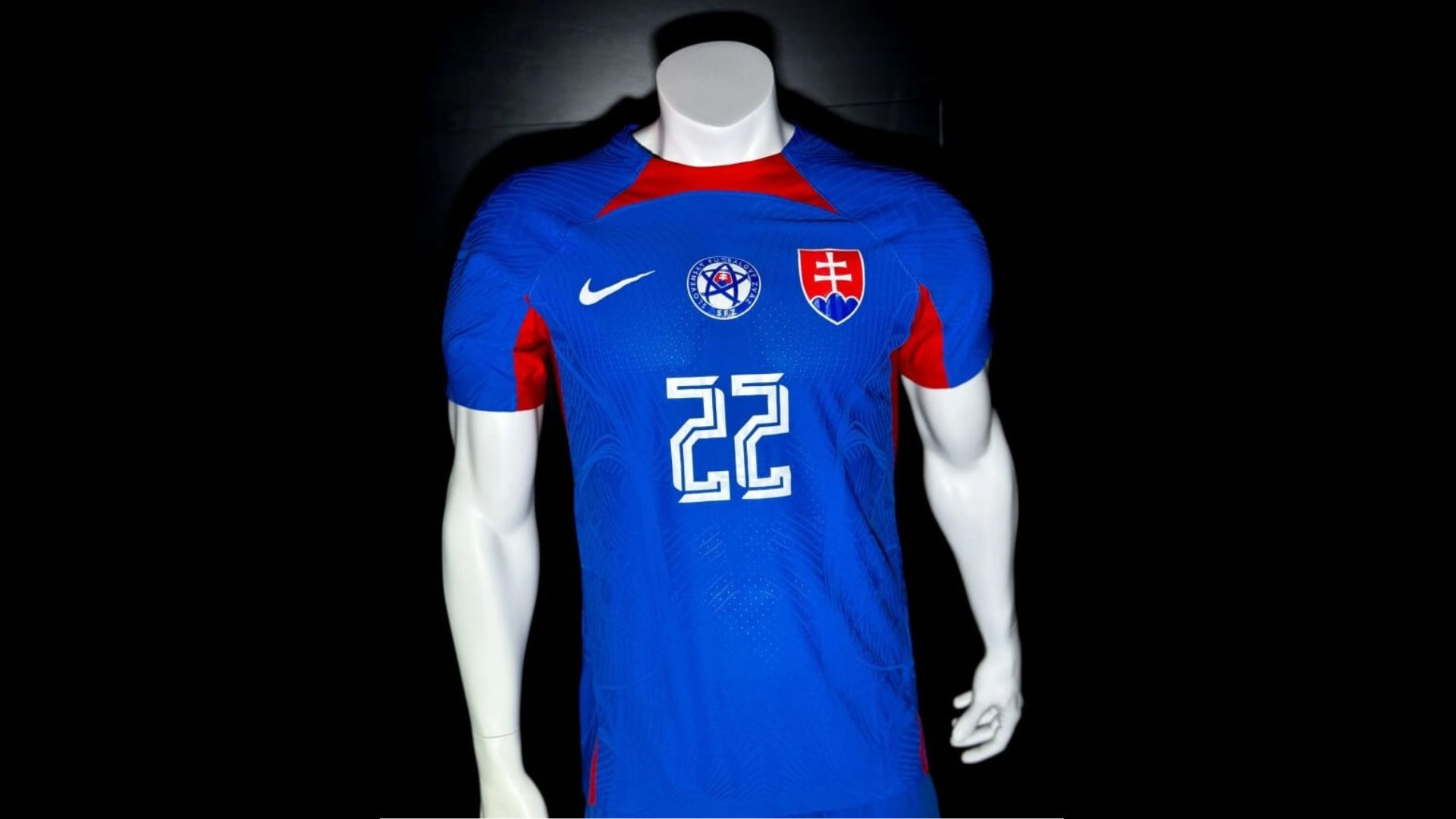
And just like that, one nation has already aready knocked out of our Euro 2024 kit ranking - and we're just three kits in.
Placed on another template, the red and blue clash in such a garish fashion that we at FourFourTwo are genuinely not looking forward to seeing Slovakia play this summer while in their home kit. Mostly twos were awarded here, and it's obvious to see why.
45. Poland Away
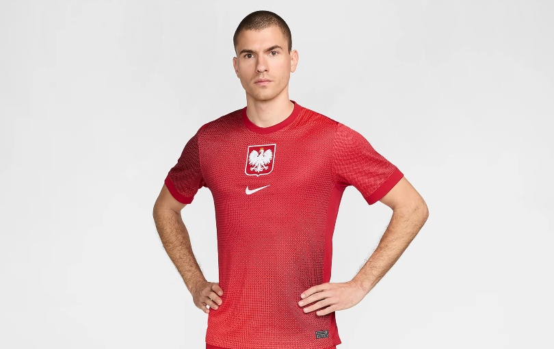
If ever a shirt looked more like a training top than an actual match kit, then Poland's away offering is it. With three red tones layered together to provide a gradient effect, it almost looks like Nike have employed a group of kids to all come up with their own designs before just mashing them all together. The thinking is all a bit jumbled up, hence the low score.
44. Ukraine Home
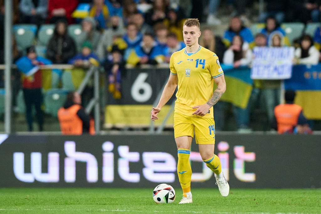
The Ukraine home shirt was released in 2021, but, due to a dispute with Joma as the brand decided to continue to manufacture kits for Russian clubs following the nation's invasion of Ukraine, the two parties have fallen out, thus meaning Ukraine will move to Adidas after the tournament.
As a result, the Ukraine home shirt hasn't changed in three years, leading to a low score from our judges.
43. Croatia Home

Croatia's classic checkerboard pattern has been supersized, with extremely large blocks replacing the often loved smaller squares on which actual chess pieces could play. But now? God forbid a knight attempting to make any more than one move in quick succession.
Even more strangely, Nike have decided to stick the design on their Euro 2024 template, creating something that looks even worse.
42. Ukraine Away
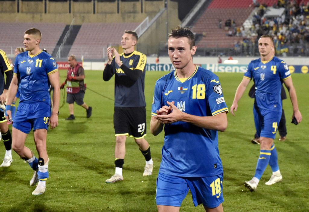
Flipping the colours of the home kit, Ukraine's away sees blue become the base - something our judges marginally preferred on this occasion. In fact, the yellow accents pop extremely well on this variation, so much so that it received a couple of sixes in the voting.
Other judges were less convinced, giving it a low average score.
41. Romania Away
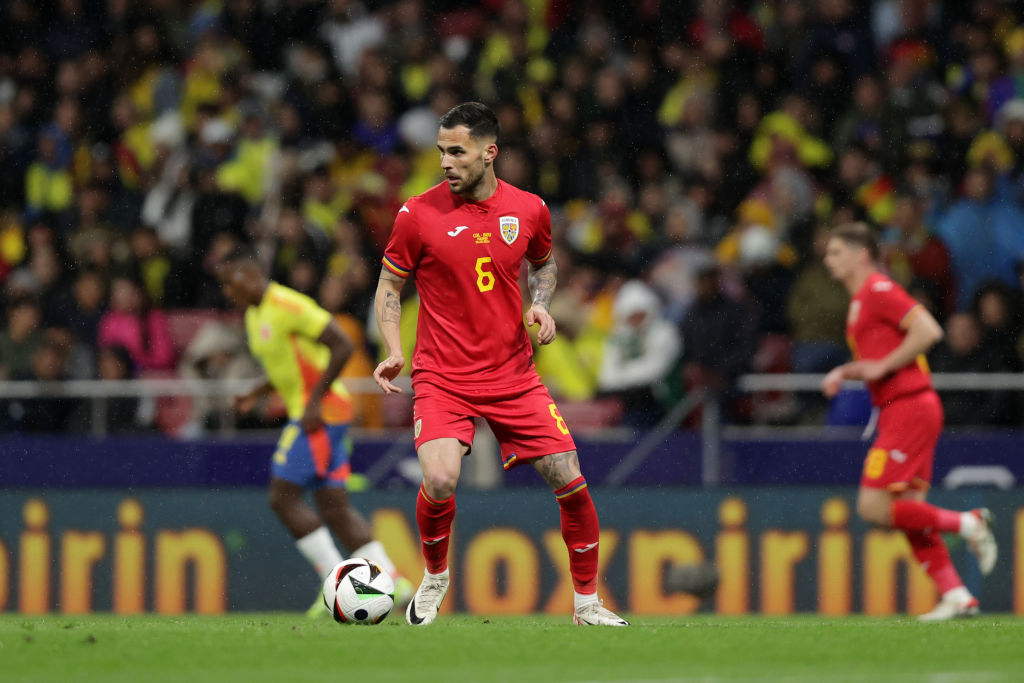
Bringing back the classic red after a brief spell in blue, Romania's away kit has a slightly different shade to the classic colour other nations rely on. To some, this helps it stand out, but our judges weren't convinced with the attempt. After all, it's just a plain kit; there's nothing else going on, with a real lack of design elements to focus on.
40. Romania Home

With nothing to separate their home and away kits, Romania's natural colour just edges out the red from their away. Coming in a vibrant yellow, the home kit is alright, but not much else. It's in the exact same style as the away, with Joma lacking in the creativity department.
On nostalgia reasons alone, Romania's home kit's highest score was a six. Perhaps the flag on the sleeve cuffs elevates this ever so slightly, too.
39. Turkey Away
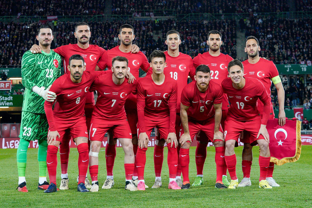
Flipping Turkey's home and away colours around was certainly an interesting decision from Nike, but to then completely neglect any element of design on the away offering is a cardinal sin.
While the red is striking, there's a lack of anything else really happening - and when considering how far Nike have pushed the boat out for some of their other away kits, this is certainly a disappointment. A wide variety of mostly low scores were awarded, as a result.
38. Portugal Home

Perhaps somewhat surprising, Portugal's new home kit hasn't been received all that well by the FFT judging team. though not awful by any stretch, the red is a little too vibrant than what we've come to expect from Cristiano Ronaldo's national team, while the combination with the classic green isn't as suited as in previous iterations.
Despite that, one judge loved it, giving it a very high score of eight - proving just how much others disliked it.
37. Georgia Away

Do you know what ruins this shirt? That shiny black panel sitting atop the already black base of the shirt. Not only does it not work, it just doesn't make sense. Who at Macron thought that was a good idea to sign off?
One judge hated it so much they awarded it a measly 1/10, with the others settling on points around the middle mark.
36. Poland Home

For some, this shirt is a beauty; for others, it just doesn't cut it whatsoever. The white and red combination is sharp, while the centralised Nike logo and Poland crest keeps things working seamlessly together.
However, there's a lack of innovation, looking, well, exactly as you'd expect from a Poland home kit. Shame.
35. Slovenia Away
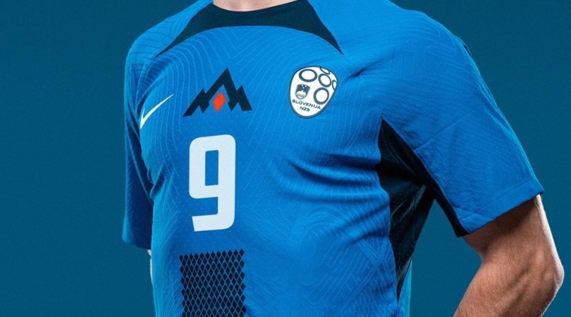
We're really not sure the combination of blue and navy works here, especially when placed onto a Nike template that incorporates a rather garish collar. The pattern of tiny diamonds moving vertically down from the chest to the base of the shirt adds something different at least, but the colourway is what lost the majority of the points from our judges.
34. Switzerland Away
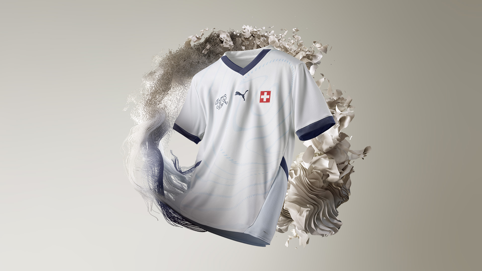
Arguably a little too subtle for its own good, the Switzerland away kit has some good qualities - the navy, white and light blue coupled with the minute detailing - but it failed to capture the attention of our judges on the whole.
Mostly fours and fives were awarded, though it did receive an optimistic seven to prove it's not all bad.
33. Czech Republic Away
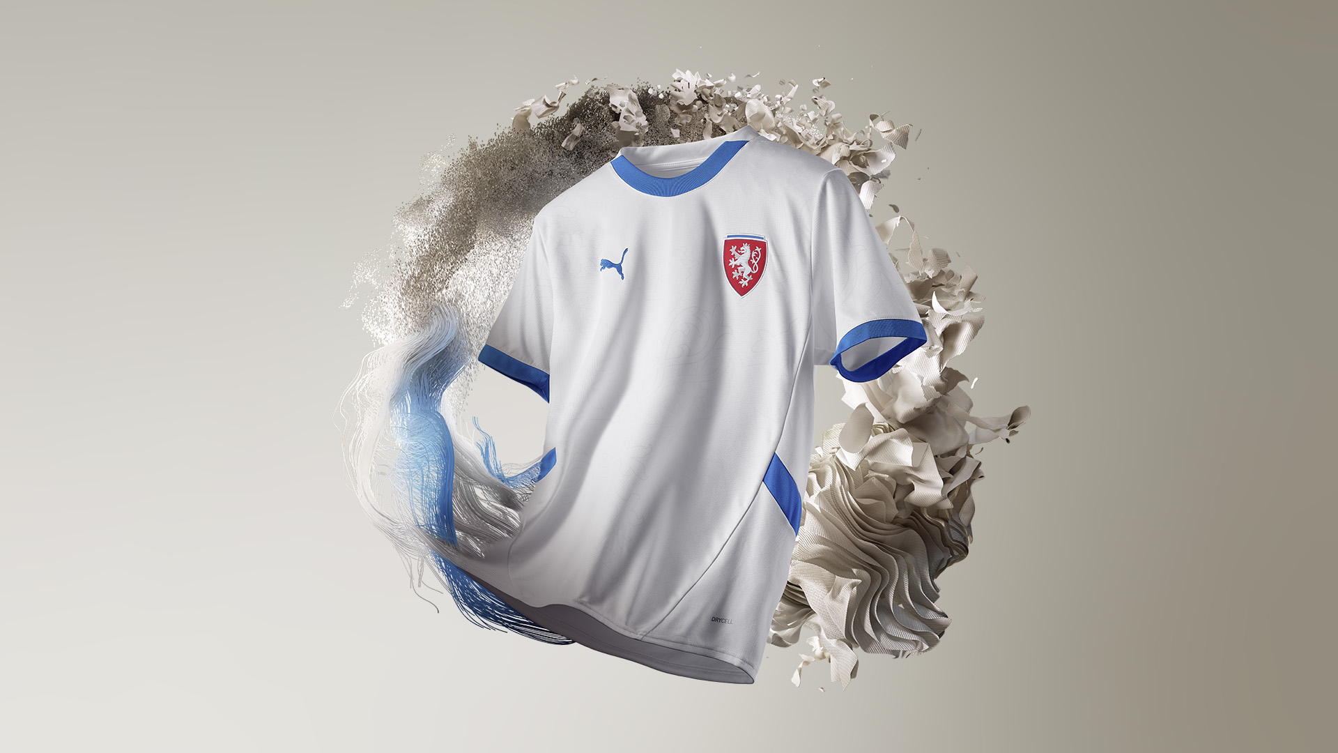
Looking two decades out of date, the new Czech Republic away kit looks a bit too nice and friendly for a nation that utilises a sharp red for their home kit. The white is fine, but the light blue accents don't seem to quite work, seeing a range of scores five and below.
32. Albania Away

Without the red emanating from the Albania crest, there's no question this kit would've scored a lot lower. It's fine, but the white and black template is a little uninspiring, especially when considering it takes the exact same design as the home shirt.
More of that later, though...
31. Scotland Away

Hmm, "almost blue" and purple is a brave choice for the Tartan Army, and we're unconvinced it works all that well. The side panel pattern works tremendously, but the colour choice is certainly an intriguing one - especially when Adidas claims it's inspired by a previous Scotland kit. Which one, though, we're not sure.
Mostly fours and fives as scores here.
30. Georgia Home
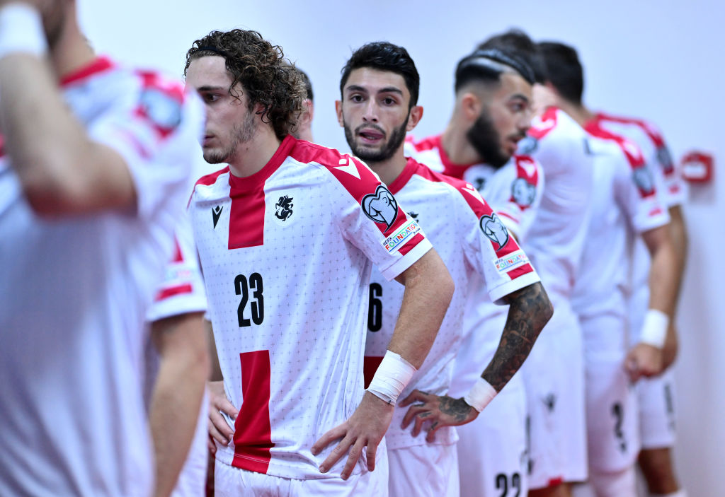
Competing in their first-ever international tournament, Georgia will have the eye-catching red cross adorning their shirt, inspired by the nation's flag and replete with sublte bolnur-katskhuri crosses throughout.
The kit's overall score was negatively impacted by the 1/10 it received by one judge. The Caucasas nation will hope to sore their eyes some more by reaching the knockout stages against all odds.
29. Serbia Home
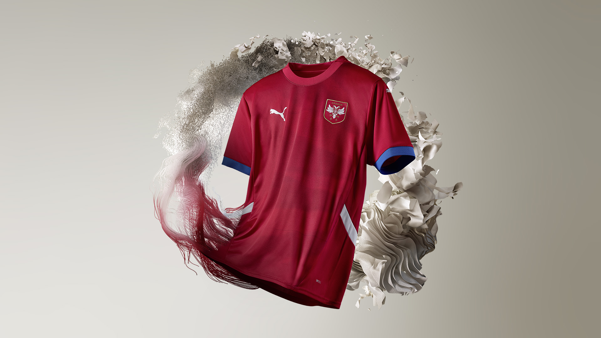
While most sides who wear red play in a vibrant, popping colour, Serbia opt for a deeper red to intimidate opponents, while the shirt features eagle wings spreading across it, too.
Despite these features, all judges though the kit was decent, nothing more, nothing less.
28. Hungary Away

There's no question: this ranking seems harsh. Sure, Adidas are using the same template a lot of other nations have been handed for this tournament, but the colours on this occasion work together in great harmony. The majority of judges weren't fans of the green and red accents, however, which sit atop the white base to mimic the colours of the Hungarian flag.
27. Albania Home

The dark red base is certainly intimidating, while the black collar ensures the Albania home kit is a smart option for players and fans alike to wear. One gripe we had with the kit, though, was the Macron logo coming in white, detracting from the overall aesthetic of what would otherwise be a sound design.
26. Slovenia Home
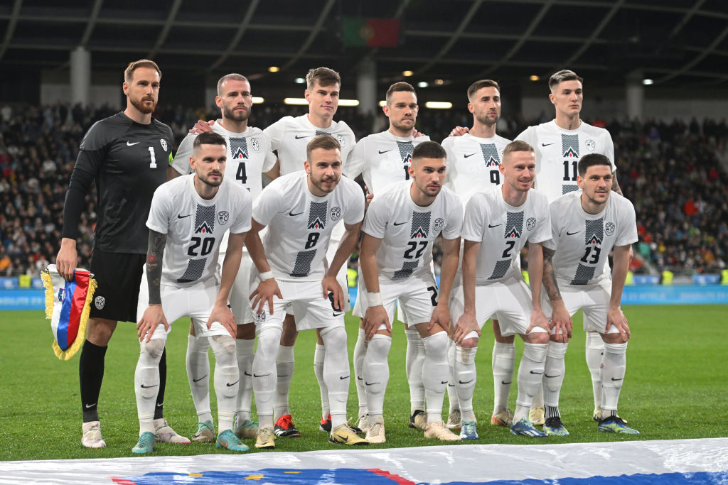
In the exact same template design as the away shirt, it's perhaps a surprise to see the Slovakia home kit reach so high on this list. The white and black works a lot better than the blue and black on the away, though, and the pattern utilised is actually quite interesting.
It'd be interesting to see how this would've been scored if the away kit didn't follow the same template.
25. Croatia Away

In previous years, the Croatia away kit has been where Nike experiment with a slightly whackier version of the nation's home kit, an alternative that plays on the checkerboard flag in a blue variation.
This time around, though, there's not as much innovation. The checkboard remains, though with two different tones of blue that barely stand out against one another - let alone when placed under the floodlights at a stadium. Modric deserves better, according to our judges.
24. Hungary Home
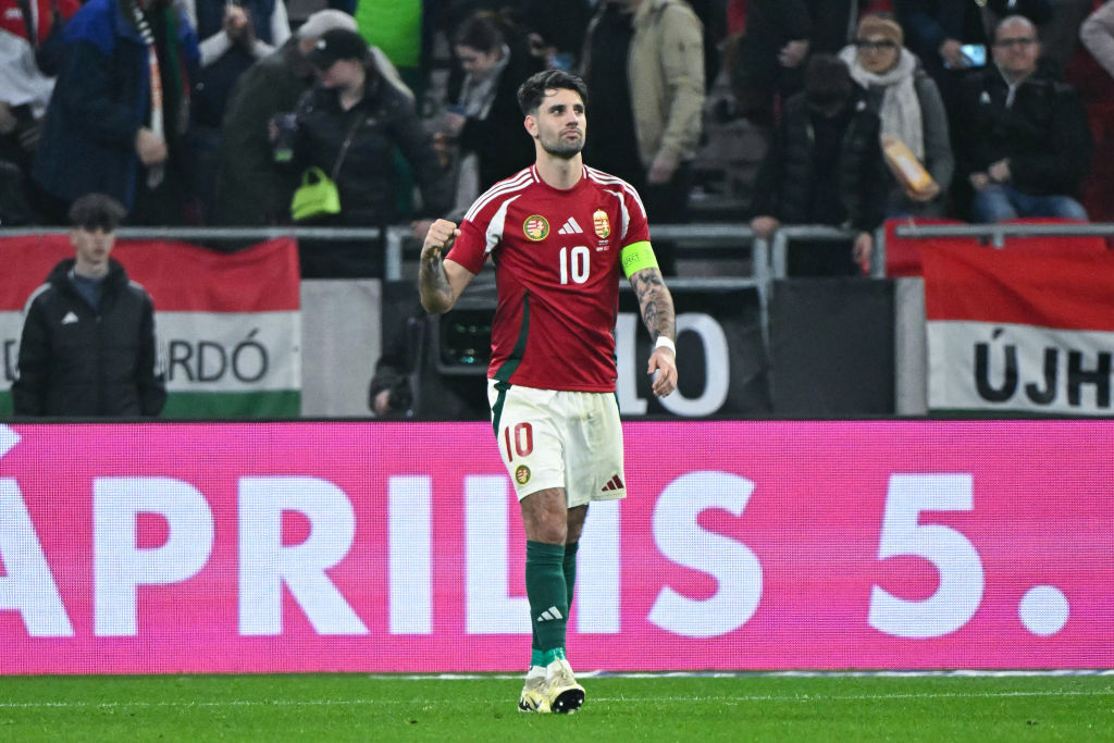
Straddling the mark between good and bad, the Hungary home kit is fairly bogstandard, it has to be said. It's a decently aesthetic design, though it is stuck onto Adidas' template, which will be a prominent feature of how sides will look this summer.
One redeeming aspect is the fact green has been incorporated into that template design, which at least attempts to recognise all of the Hungarian colours.
23. Denmark Away

White and red is always a combination that comes together in seamless fashion, but the Denmark away shirt doesn't quite manage to get things right. Maybe it's the collar with the red trim? Perhaps it's the bland white base? Who knows - all that is clear is our judges weren't massively impressed.
22. Serbia Away
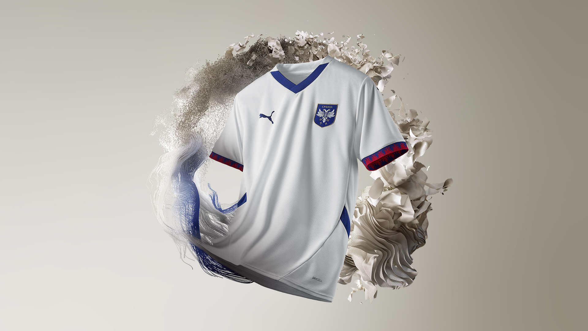
Fresh, clean and visually appealing, the Serbia away kit utilises the colours of the nation's flag in a clever and subtle way: a white base, blue accents and patterned sleeve cuffs, it's a good attempt by Puma to create something sophisticated for, err, Aleksandar Mitrovic...
One judge loved it so much that they scored it a 9/10, too. But, then again, that's maybe because they're a Fulham fan yearning after their former marksman.
21. Netherlands Home

The orange of the Oranje is unmistakable and iconic, and barely messes with the beauty that made the nation so revered 50 years ago under Rinus Michels when Johan Cruyff was adorning the pitch. The blue is a welcome feature, too, with the crest more aqua-like than the navy accents featuring elsewhere.
A few judges didn't quite see the appeal, however, marking the kit down for its lack of inventiveness. Comparing it to the 1988 Euro-winning kit perhaps doesn't help.
20. Switzerland Home
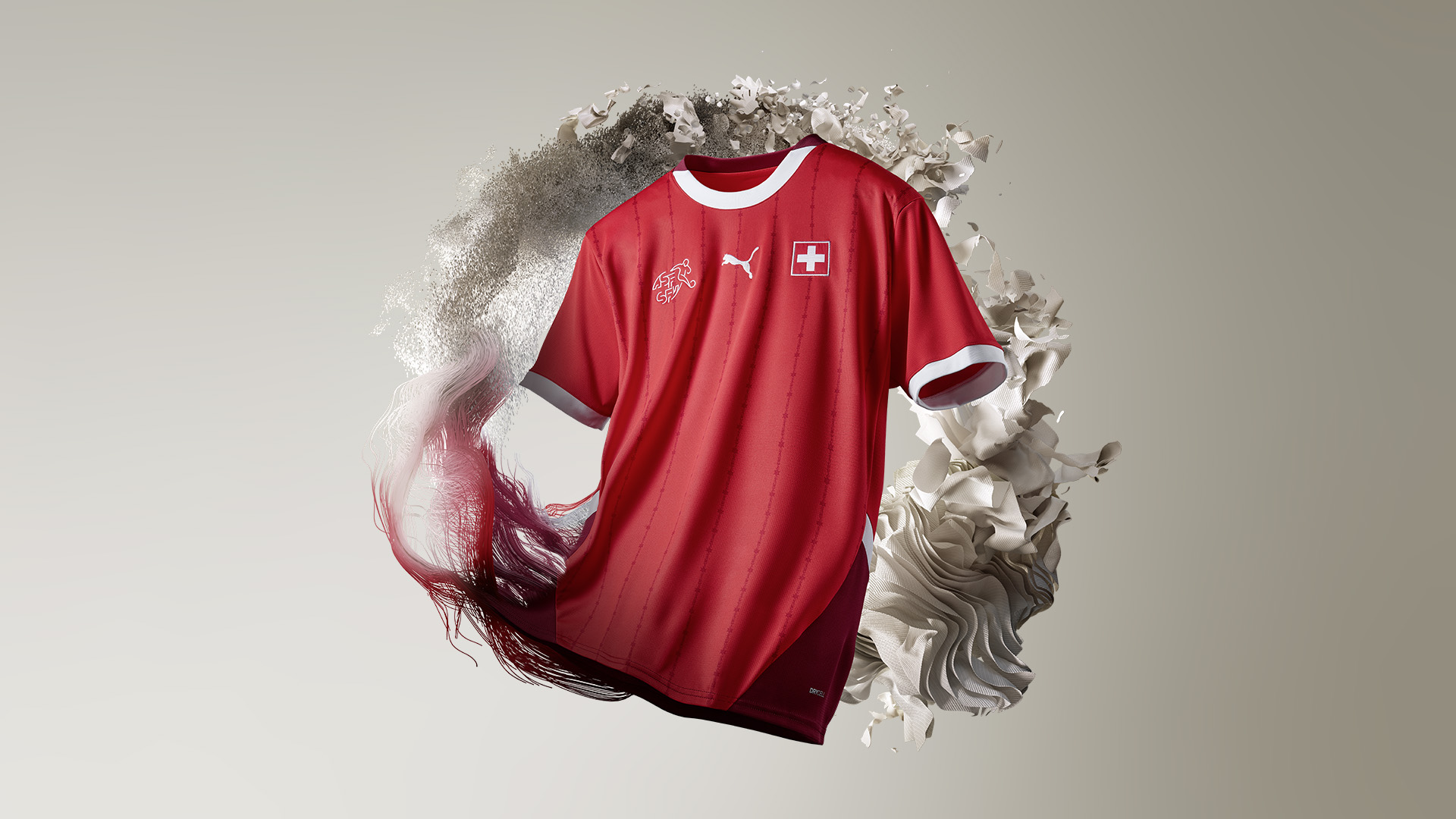
What isn't immediately obvious with the Switzerland jersey is the two-tone red and extremely thin white pinstripes running horizontally down the shirt. Towards the back of the shirt is a darker, burgundy red that adds a real sense of royalty to the Swiss offering, but it's not to everyone tastes.
After receiving one 9/10, our other judges weren't quite as convinced by its quality. Plus, the pinstripes could be a little more obvious, with the two-tone red engulffing them, unfortunately.
19. Spain Home
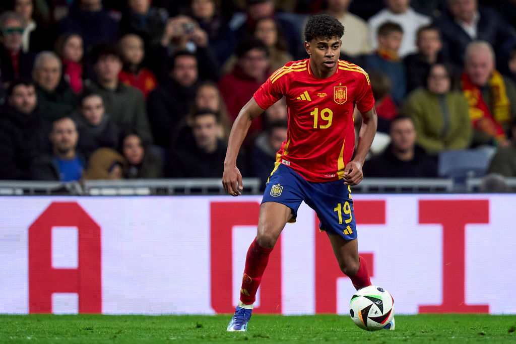
Another of Adidas' template design, more was certainly expected of Spain in their efforts for the Euros. Sure, the traditional red and yellow top is clean, but there's a lack of innovation that just doesn't quite do Rodri, Pedri and Lamine Yamal justice for the summer.
A middling scorer, our judges found nothing overtly wrong with this kit - just perhaps Spain have offered a little more in the past.
18. Czech Republic Home
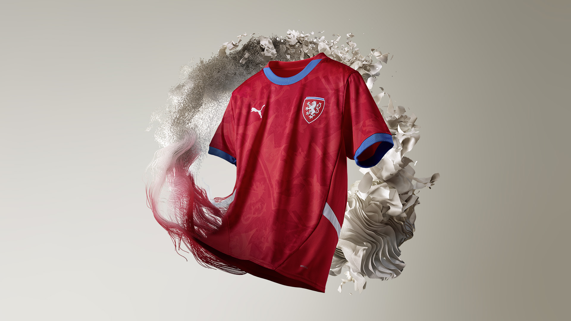
Our judges found there wasn't anything glaringly offensive about the Czech Republic home shirt, though in the same breath nothing stood out massively, either, with it receiving scores between five-and-seven out of 10.
The blue cuffs and collar are a nice contrast to the red base, while the subtle pattern on the shirt makes it a lot more interesting. Whether Patrick Schick and Co. will be able to celebrate in this top this summer remains to be seen, however.
17. Belgium Away
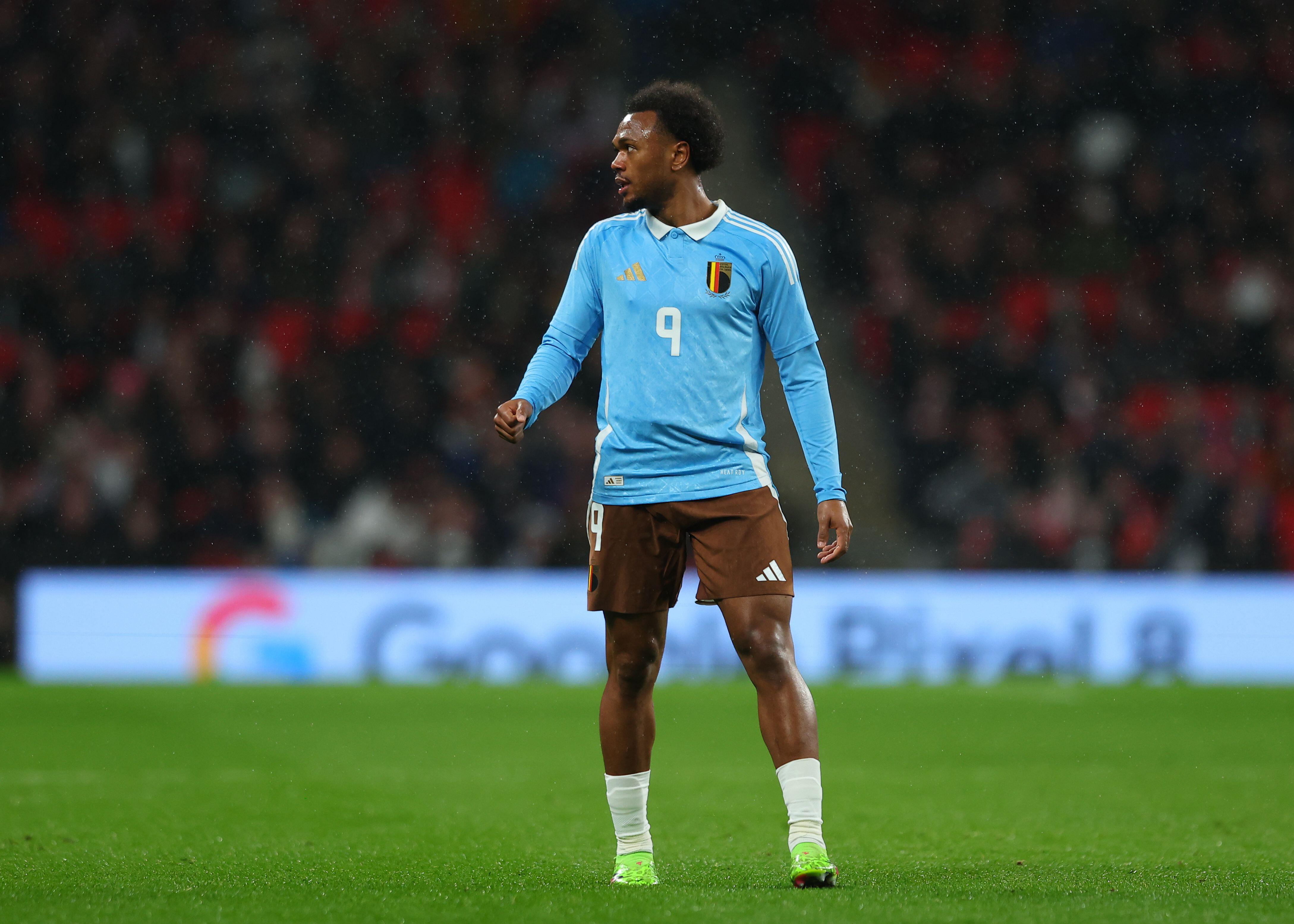
Our judges both loved and hated this shirt. Some awarded it a score as low as 2/10, while others deemed the Belgium away kit worthy of the full points. One thing is for certain, though, and that's the uniqueness this kit truly has.
Inspired by Tintin, the Belgium away shirt is truly one-of-a-kind, with the light blue scheme supplemented by a collar stunning base design. The brown shorts were offensive to one judge in particular, who couldn't see past the garish choice of colour.
16. England Away
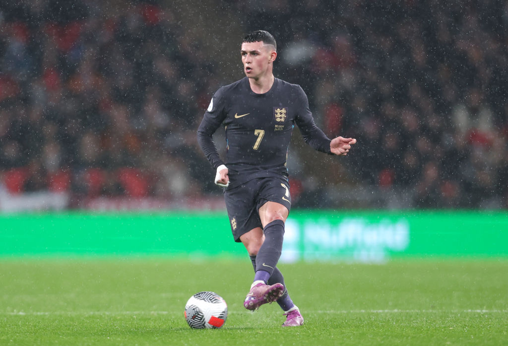
Change is good, change is fresh, change is exciting, so it's certainly intriguing to see Nike take what it claims is a "prismatic" approach to England's traditional colour scheme of red and blue for away kits. Instead, they have been daringly mixed together to create this muted purple design, in what is certainly a first for the national team.
Though unconventional, the colour detailing down the side panels helps bring this shirt to life, while the gold accents could signal in a summer of success...
15. Austria Away
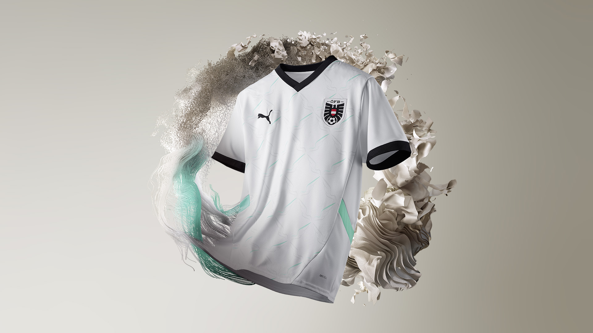
Understated but not underrated, our judges were left impressed with the subtle detailing on the Austria away kit. On the surface of it, it just looks like a bland white and black design with no airs and graces
Upon closer inspection, though, a vibrant splash of blue accents pops out at you, combining traditional looks with modern styles. It's a shame David Alaba will be injured this summer and be unable to wear this particular number.
14. Italy Home
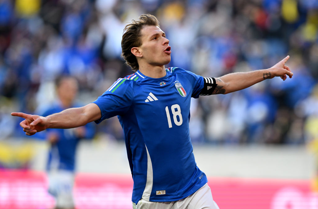
Italy's blue and white combination is always something that gets the juices flowing, and for Euro 2024 it's no different. In a colour scheme that is more akin to 30 years ago when Diadora reigned supreme on the shirt, Adidas has kept things relatively safe on this occasion - though that in no way diminishes the quality of the offering.
What truly makes this shirt is the colours of the Italy flag implemented on the Three Stripes on the shoulders. Bellissimo.
13. England Home

The decision to impose a "playful update" on the St George's Cross drew plenty of criticism, backlash and indignant behaviour, but that hasn't stopped the England home kit from ranking highly here.
Sure, it may not be the most thrilling, the most innovative, even the most interesting, but it is, in general, a very decent shirt. With a sophisticated collar and classy touches of blue, Harry Kane, Jude Bellingham and Co. will all be looking suave in Germany this summer.
12. Germany Away
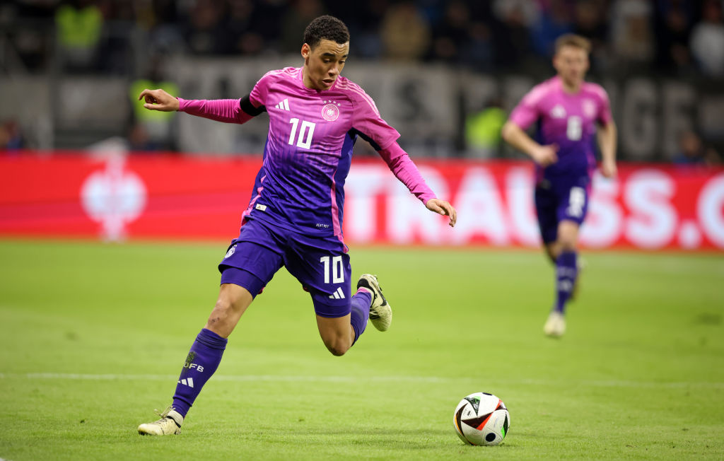
Now, pulling this off around the pool while on holiday definitely won't work for the vast majority of the population, but on the football pitch the pink and purple gradient is a real fashion statement. It's not too garish, with the pink quickly shifting to purple in that classic Adidas pattern, while the white accent
As bold efforts go, it's certainly tasteful, and the FFT judges were certainly fans - all except one, who offered a measly one out of ten for this kit. Ah well, can't win them all.
11. Scotland Home
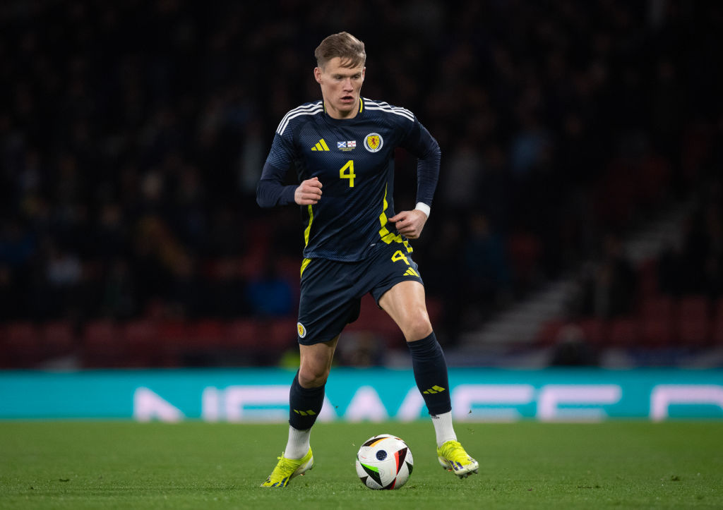
The Tartan Army will be adorning this shirt on the streeets of Germany this summer, such is the masterpiece Adidas has created here.
It's not just the tartan print; it's not just the geometric shapes; it's not just the touches of yellow and white interspersed with the deep dark blue base - it's all of those aspects combined.
Whether Scotland finally reach the knockout stages of an international tournament is a different matter, but one thing is for sure: this is a kit that'll go down in history.
10. Turkey Home

Taking the decision to swap the colours of the home and away kits is certainly a brave one, but Nike has succeeded with their latest effort for Turkey. A centralised badge and Swoosh always has a certain air of traditional elegance to it, and is something FFT is enamoured by if executed correctly.
Adding a red, horizontal sash on the chest is where this kit truly comes to life, though. Breaking up the white base of the shirt is a phenomenal decision, while the two colours just work in perfect harmony together.
9. Italy Away

While Adidas creating kits for Italy just feels wrong, this new shirt is a simplistic masterpiece. Utilising the template design is a risk, especially for a nation as fanatic as Italy, but on this occasion it's certainly paid off.
With the red and green colours taking up the accents on just one half of the shirt, and the white base, the Italian flag is subtly represented. Of course, so is the classic blue that has become synonymous with the Azzurri, creating a clean, fashionable aesthetic that is no less than expected from the nation.
8. Portugal Away
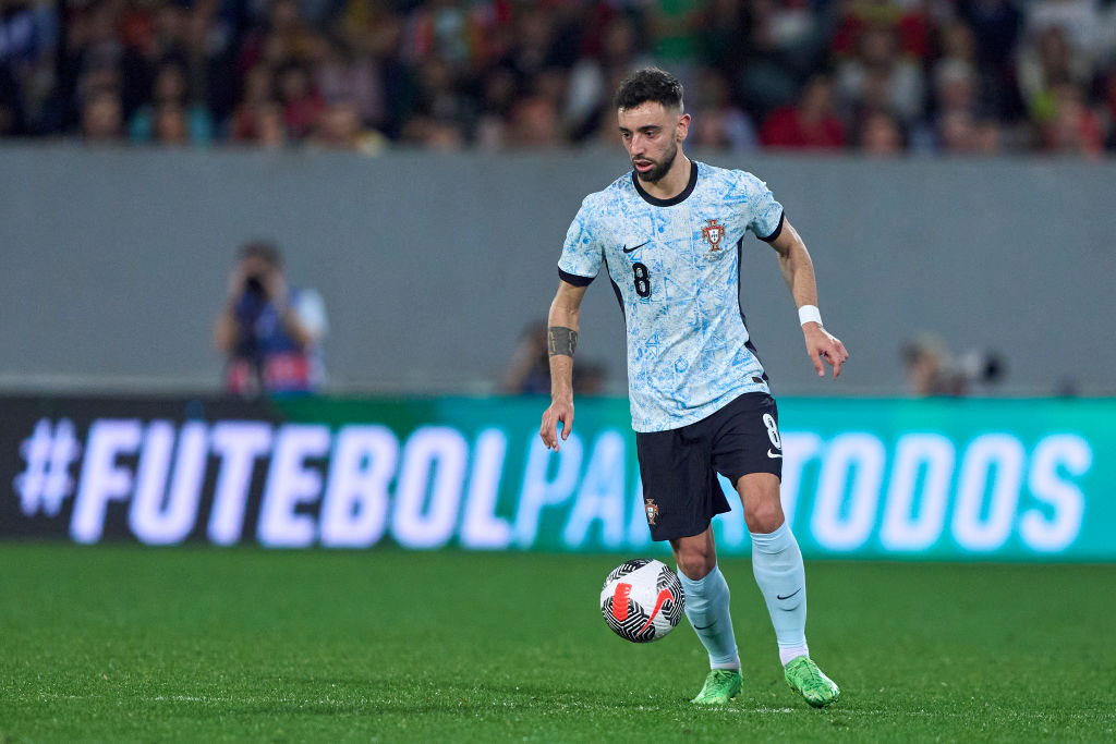
Away kits offer teams and manufacturers to expirement, the freedom to create a design that is truly different to the essential need for traditionalism on the home offering. For Portugal, that freedom has been exploited expertly by Nike.
While the same sail shade from 2022 returns this time around, the shirt has more of an off-white finish, with an Azulejo-style pattern - a major aspect of Portuguese architecture - giving this kit a real flourish. Still, we're sure Cristiano Ronaldo will find a way to moan about it...
7. France Home

After years of dark navy, France have reverted back to a brighter, bolder blue that feels truly French - and we mean that as a compliment. As much as France should look oh-so-cool in deeper shades, there's something nostalgic about this shirt that we just adore.
The tricolour piping and yellow cockerel look fantastic, too. With Kylian Mbappe the posterboy of the national team, this is a kit that is truly worthy of success this summer.
6. Belgium Home
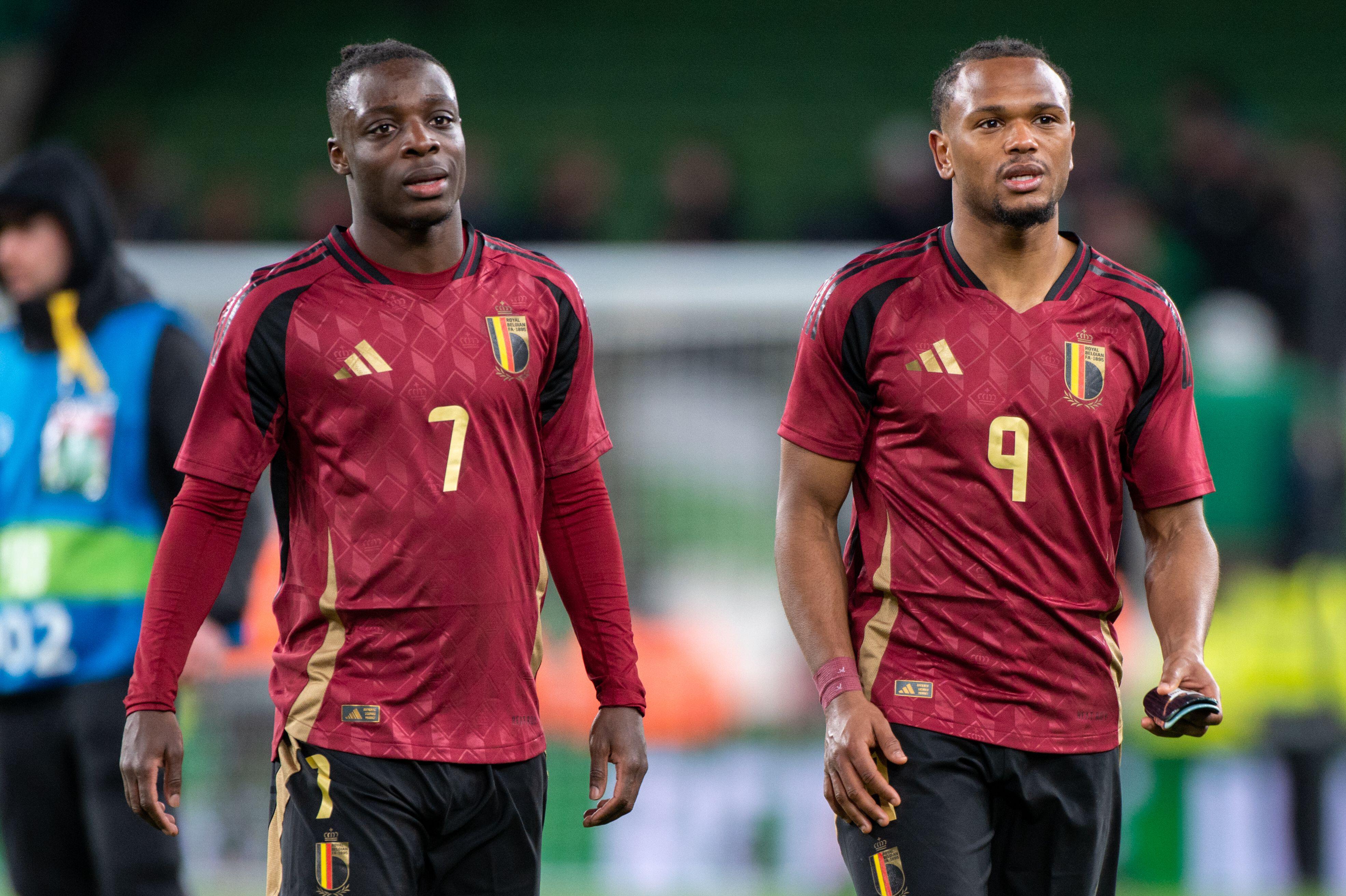
Classy, regal,
Regal and elegant, the latest Belgium home shirt is perhaps the nation's classiest ever kit. Similar to when Arsenal signed off from Highbury in 2006, Belgium have gone for a deeper red at Euro 2024 - is this in tribute to the final tournament featuring the last of their Golden Generation? Perhaps not, but we're here for it nonetheless.
The golden touches are simply stunning, while the base pattern really helps to eleveate an already beautiful-looking shirt. It seems harsh this hasn't quite managed to make the top five.
5. Denmark Home

After deciding to implement a monochramatic design on World Cup 2022 kit, in protest against the tournament being held in Qatar, Hummel has decided to opt for a unique square design in varying shades of red that look absolutely fantastic.
It has a slightly old-school feel to it, too, what with the polyester look, earning a couple of 10/10 ratings from our critical judges. Those Hummel logos on the shoulder also add a couple of extra marks, that's for sure.
4. Netherlands Away
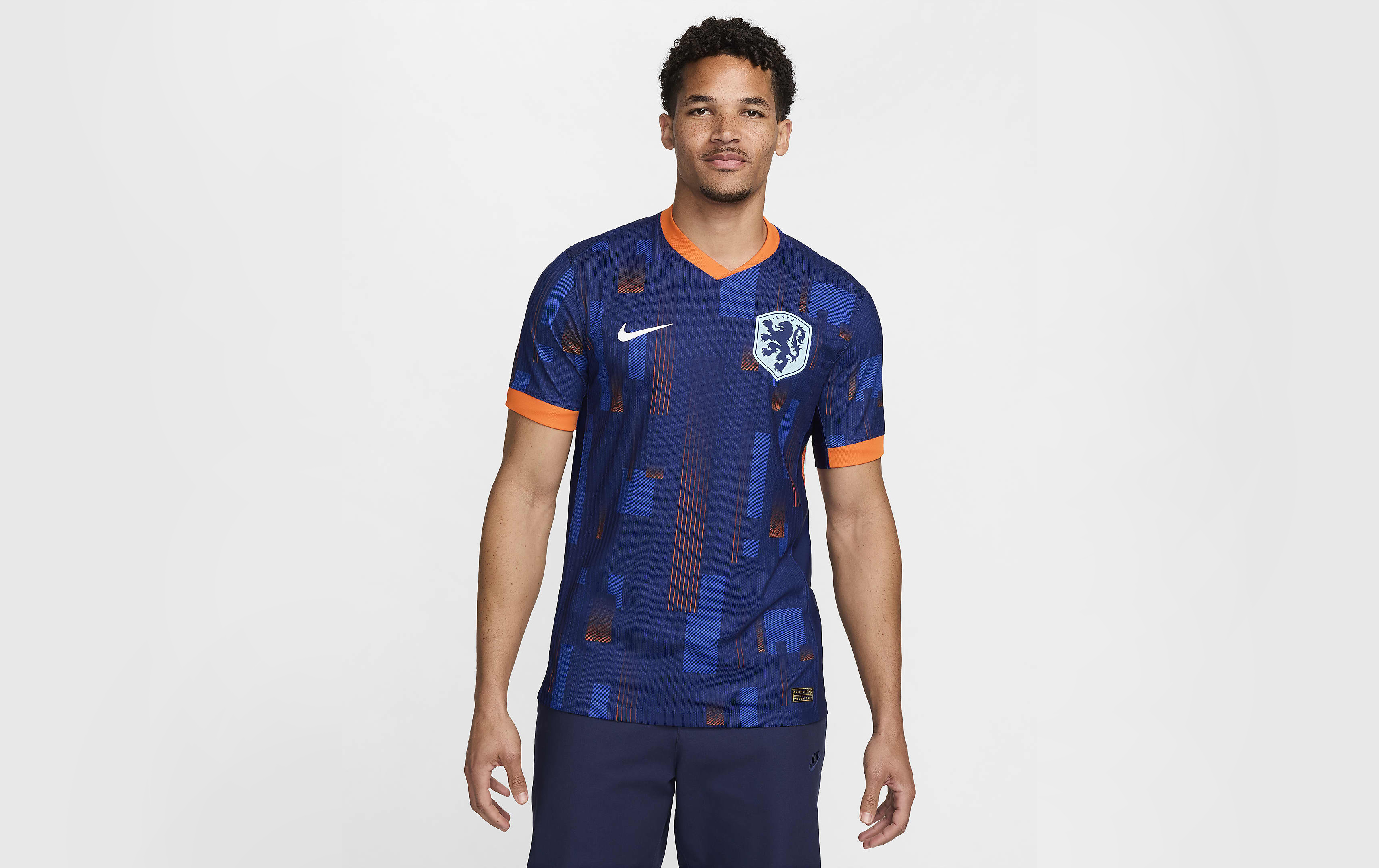
At first glance, the Netherlands away kit simply looks navy with hints of orange accents. Upon closer inspection is where to get to marvel at the true beauty, however.
Inspired by the block shapes of De Stijl – the 20th-century movement of Dutch artwork in which the likes of Piet Mondrian created minimalistic artwork consisting mostly of rectangles of colour – Nike have gone polygonal with this effort, covering a navy blue jersey in different tones of blue and orange for something modern, sleek and quintessentially Dutch.
A cross between Mondrian and modern shirt graphics, the Oranje potentially have a new iconic shirt to worship on the streets of Amsterdam, alongside their 1988 beauty.
3. Austria Home
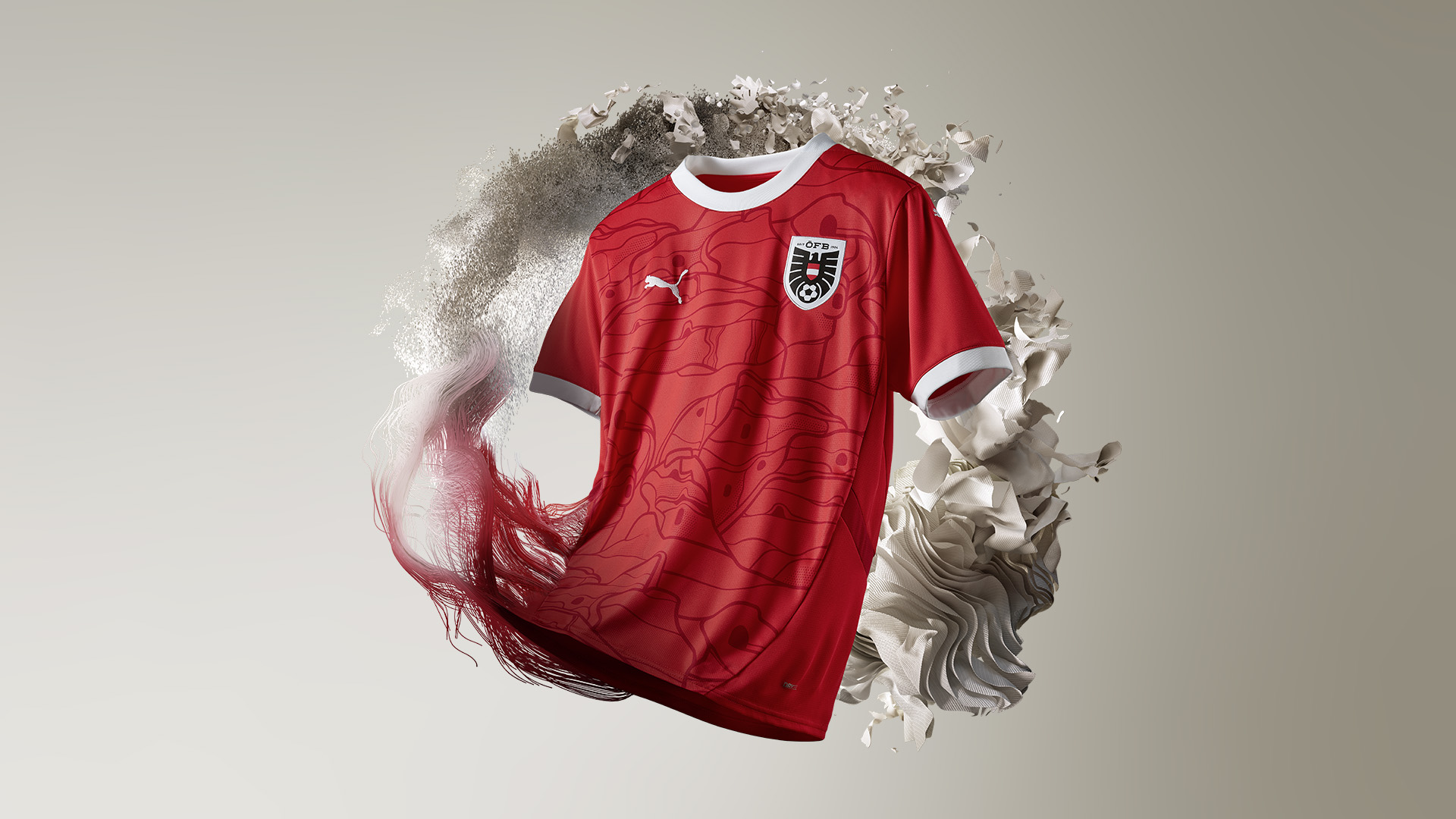
Sprucing up a red jersey can often prove problematic for some brands, but Puma have absolutely smashed it out of the park with Austria's latest kit. The round-neck collar and white accents are stunning, while the bespoke graphics meant all of our judges rated this effort highly.
Those bespoke graphics are inspired by a Jugendstil architectural design - an artistic movement that came to prominence towards the end of the 19th century. So, not only does it look cool, but there's a relevancy and meaning behind the design, too.
It's just a shame David Alaba won't be captaining the nation in the kit this summer, with the Real Madrid man missing the tournament through injury.
2. Germany Home

Alright, we know what you're thinking: 'How have they ranked a kit resembling those flame shirts kids used to wear in Year 6 discos second out of all 48 kits set to be worn at Euro 2024?' Well, to be honest, it's for exactly that reason. Reminding FourFourTwo of a simpler time, when England hoped but never really believed in success. This summer is different, and that's a scary concept.
Germany's new shirt utilises the iconic geometric patterns on the shoulders, while there's plenty of subtle detailing: at the base, there's a pattern resembling the logo of the old DFB – the German football governing body, making this one ornate without being over the top.
Plus, it's the penultimate Germany kit manufactured by Adidas we're going to see for a while before Die Mannschaft switch, uncharacteristically, to Nike in 2027, so enjoy the Three Stripes on their shirt while you can.
1. France Away

Euro 2024's pièce de résistance. A nation forever linked to luxury and artisanal creation, their change strip sees Kylian Mbappe and Co. earn their stripes with a beautifully traditional, ultra sophisticated get-up.
Harking back to the days of Michel Platini and pals, when pinstripes ruled supreme in the 80s on France away shirts, there's a modern twist this time around that really elevates its stardom. With the lines converging from one side to the other to form the French flag, it's this subtle detailing which will see festival goes inevitably adorn in 20 years time with 'MBAPPE 10' emblazoned on the back.
The golden, oversized Gallic rooster really helps the French tricolour pop, too - c'est très belle.
