There's been a lot of lamenting about how fashion logos tend to look very similar these days. With some notable exceptions, high-end fashion houses and also high street brands have been tending towards minimalist logotypes, often with sans serif fonts. While minimalism can feel classy and elegant, the trend does sometimes seem perverse in an industry where brands want to stand out.
Those tired of the trend may exclaim a small yelp of glee at the sight of the new Puigo logo. As part of Puig's rebranding for its stock market debut, the Barcelona-based perfume and cosmetics giant, known for brands like Carolina Herrera, Paco Rabanne, and Jean Paul Gaultier, is going against the grain with its new design. Just what thing... what is it?
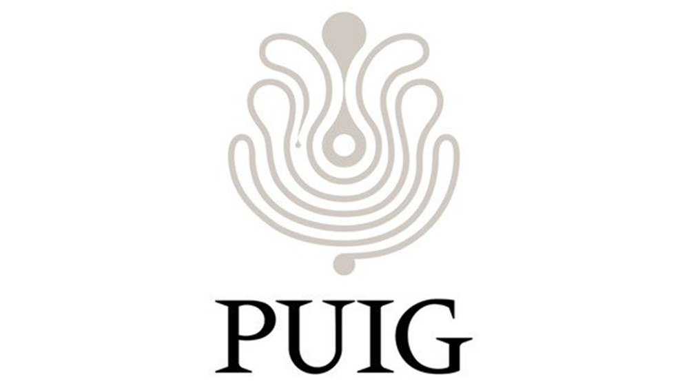
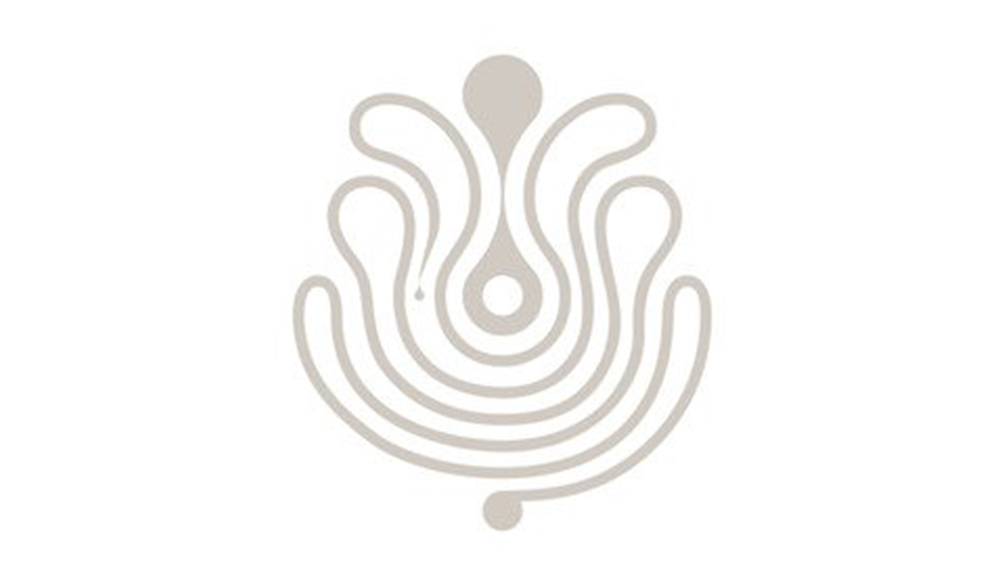
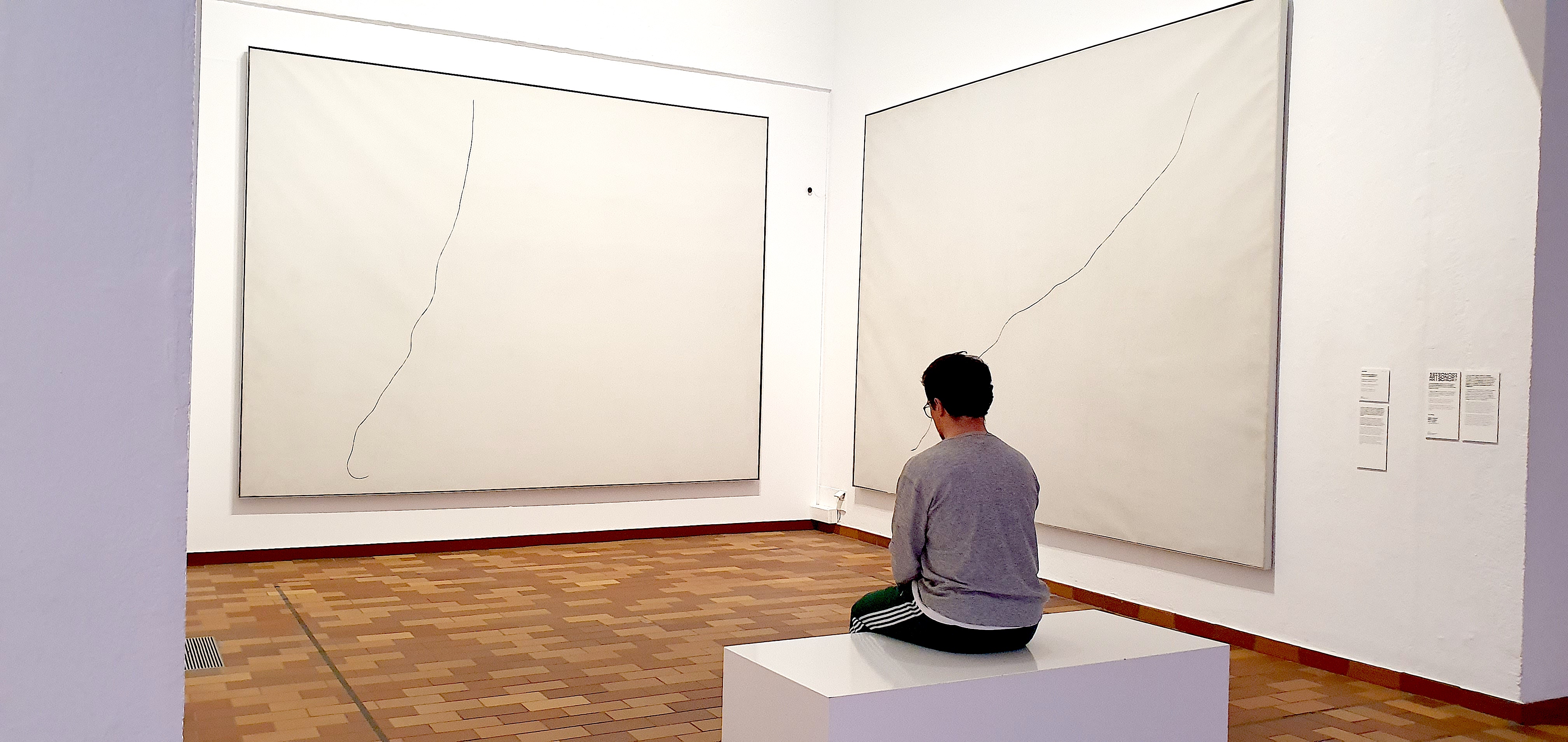
If you think the new Puig logo looks kind of abstract, there's a good reason why. The brand says the concept of the logo is an "infinite line" inspired by the triptych Painting on White Background for the Cell of a Recluse by the great Catalan painter Joan Miró. Those three minimalist works show nothing but a wonky black line on white canvases.
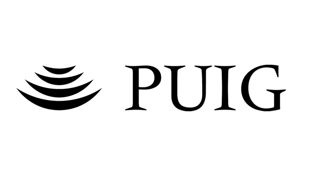
That's not the only inspiration though. The French art and design agency M/M (Paris), also delved into the company annals and took inspiration from its very first logo design from the 1970s. The work of the Swiss designer Yves Zimmerman, this was known as the artichoke. The agency also created a bespoke typeface, Paralelo, which is itself based on the spirit of Méridien, a 1955 typeface by Adrian Frutiger that Zimmerman put to work for Puig.
An abstract painting might seem like an unusual inspiration for a logo design. However, speaking in the video above, M/M (Paris) co-founder Mathias Augustyniak, says that the brand had lost its human touch and that creativity needed to be put at the heart of the new identity, which was devised to encompass two contradictory ways of seeing the world: reason and emotion.
It certainly has more personality than the previous logo design. The comments on social media have been incredibly positive for a rebranding. The design will be especially welcome among those who say fashion logos all look the same. The new Massimo Dutti logo was described as "cheap and nasty" by customers after the high-street brand became one of the latest to follow the trend.