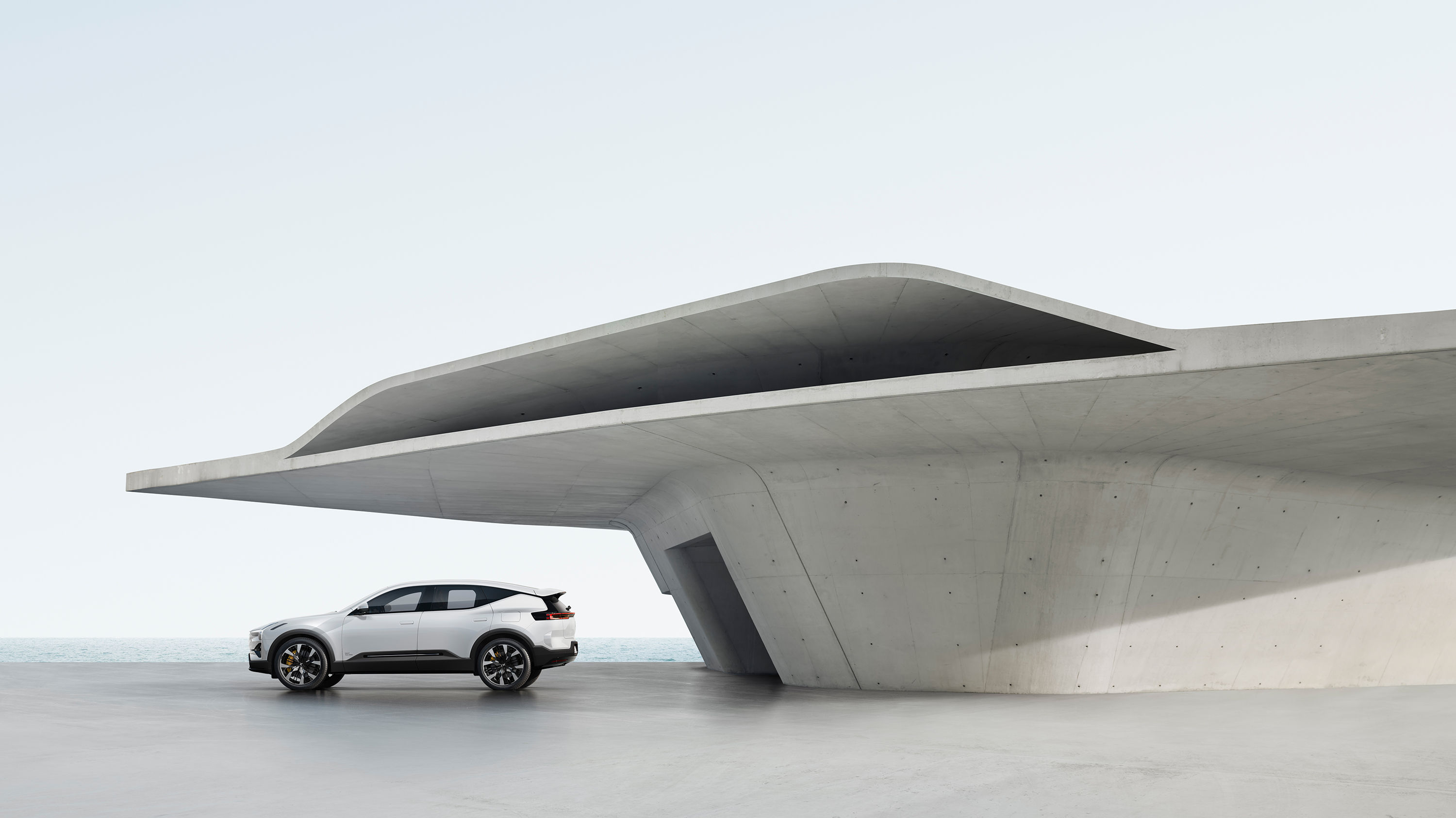
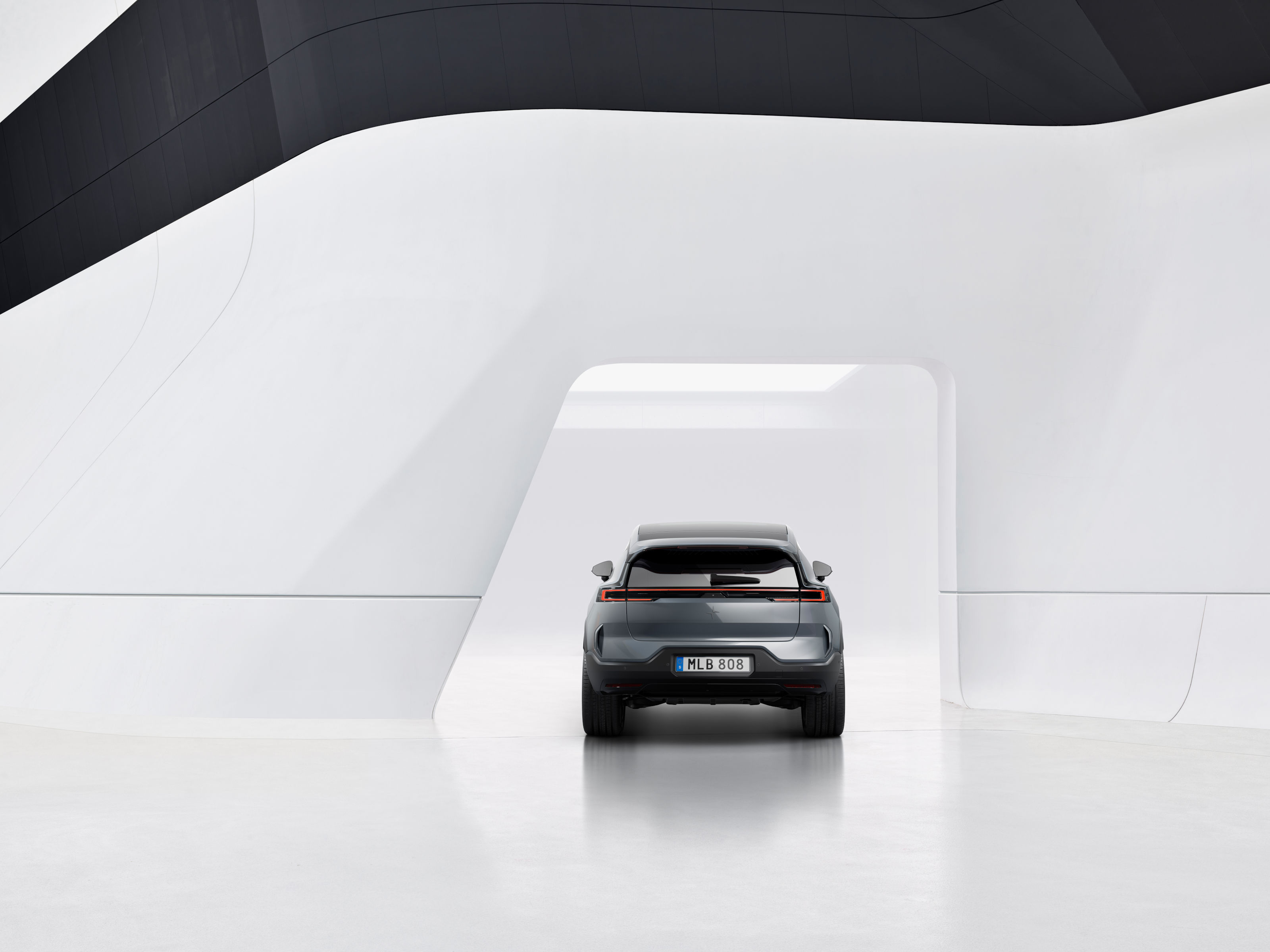
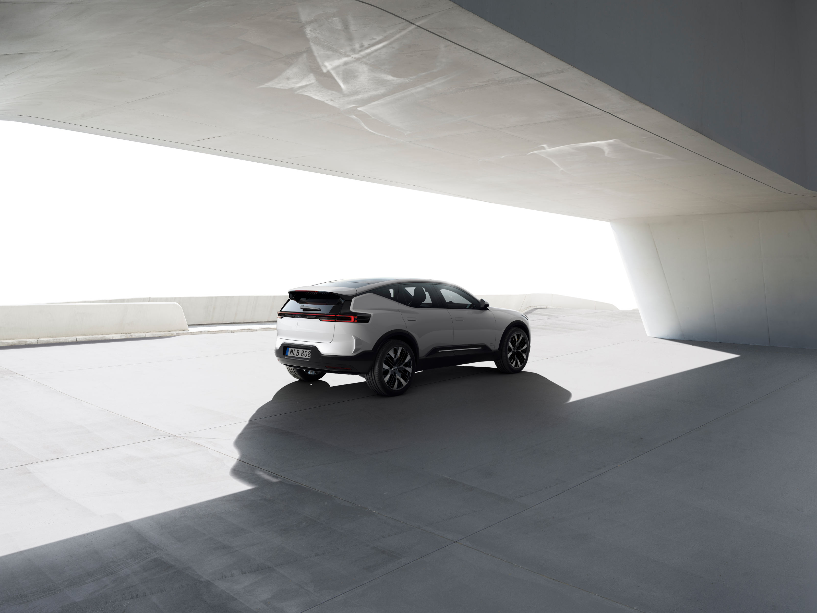
When it came to shaping the campaign for the forthcoming Polestar 3, the company had a flash of inspiration. To better capture its first SUV, Polestar teamed up with CGI and 3D design studio INK and Benedict Redgrove, a regular Wallpaper* contributor and a photographer with a passion for architecture and mobility.
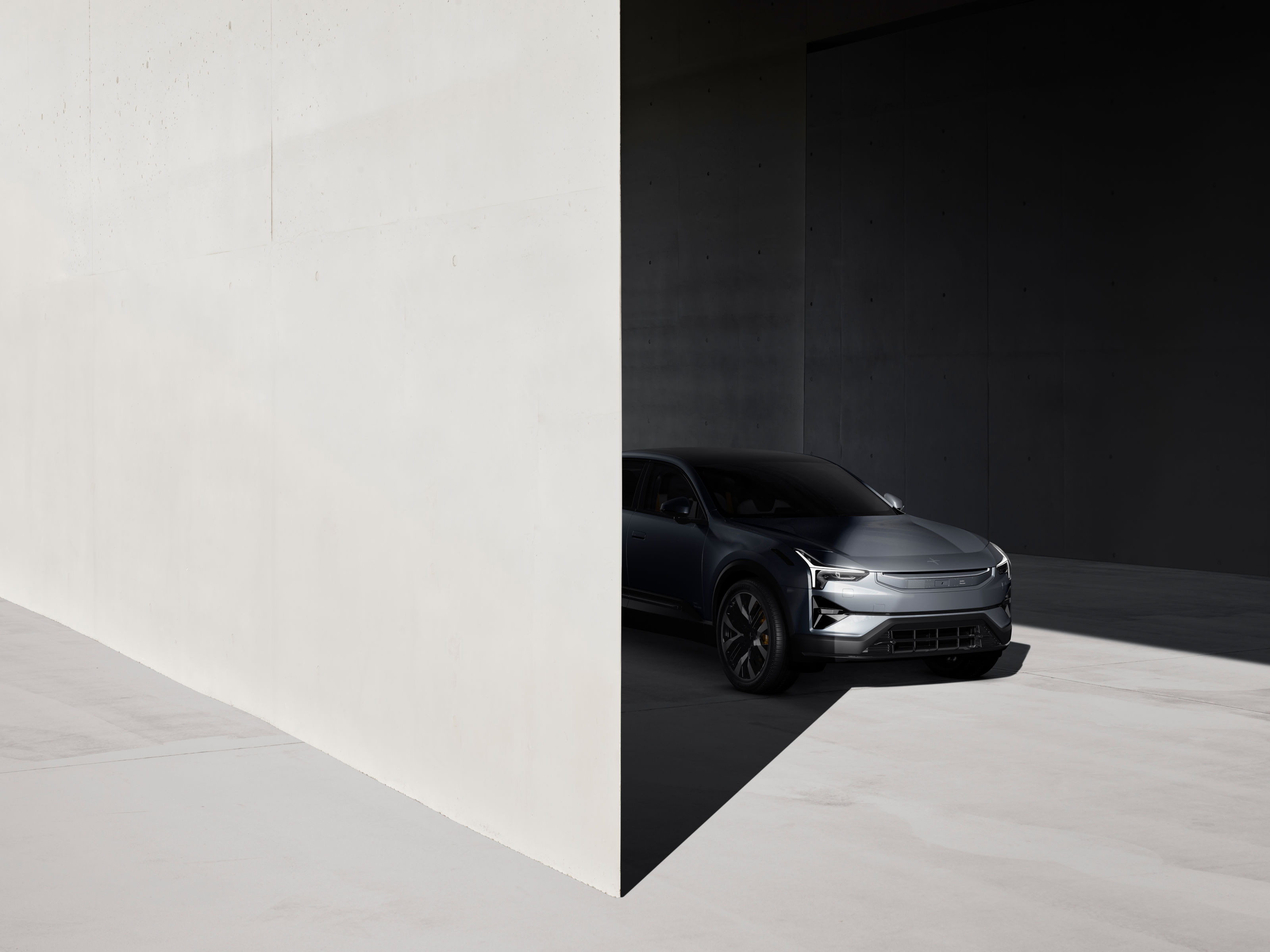
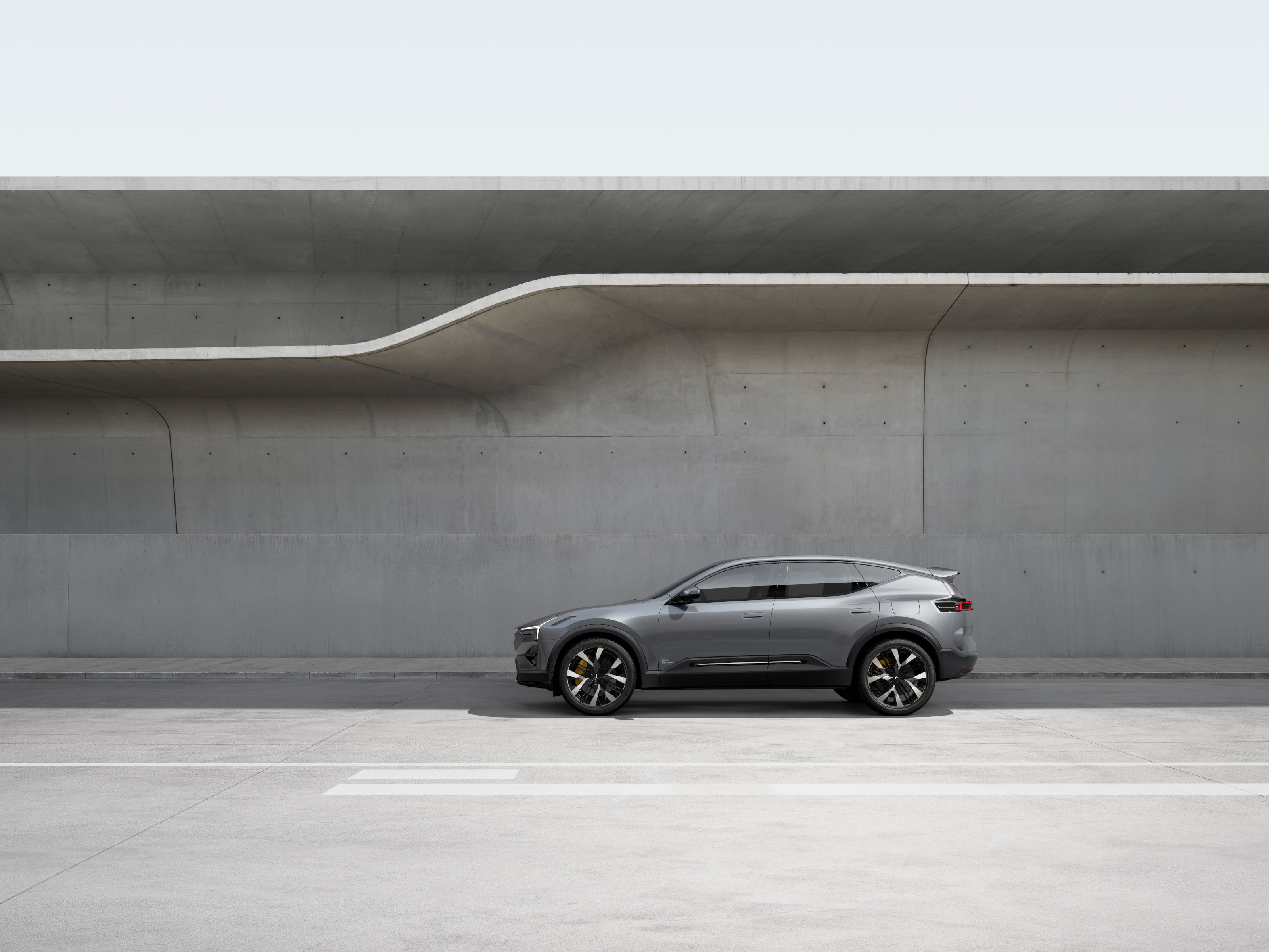
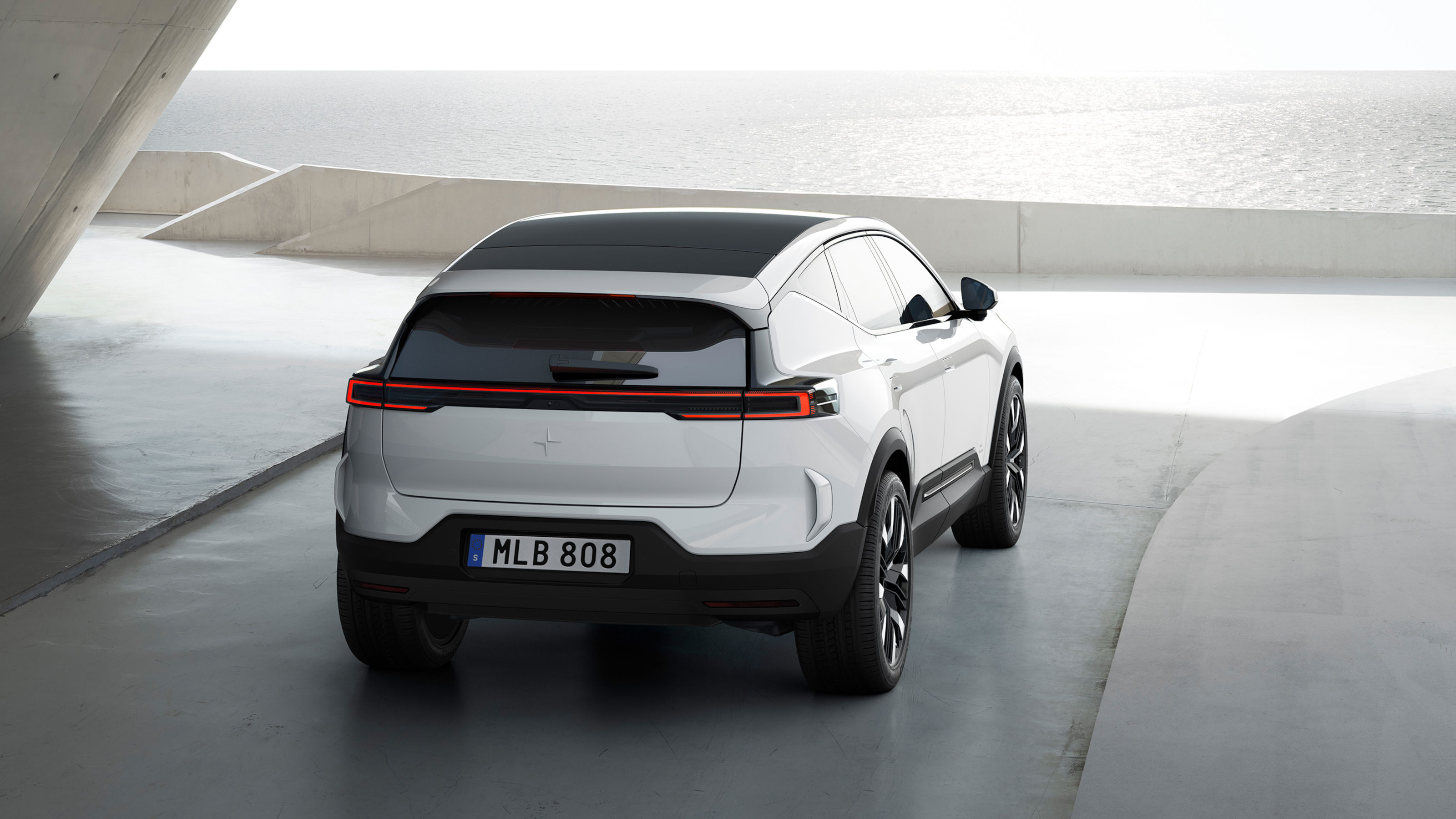
Crisp imagery of the new electric SUV has been combined with backdrops created by Ink using a mix of Redgrove’s location photography and digital renderings of two key projects by Zaha Hadid Architects, the Napoli Afragola railway station in Naples (2017) and the Salerno Maritime Terminal (2016) as the main backdrop. The result is an otherworldly and uncanny set of images that create a sense of hyperreality.
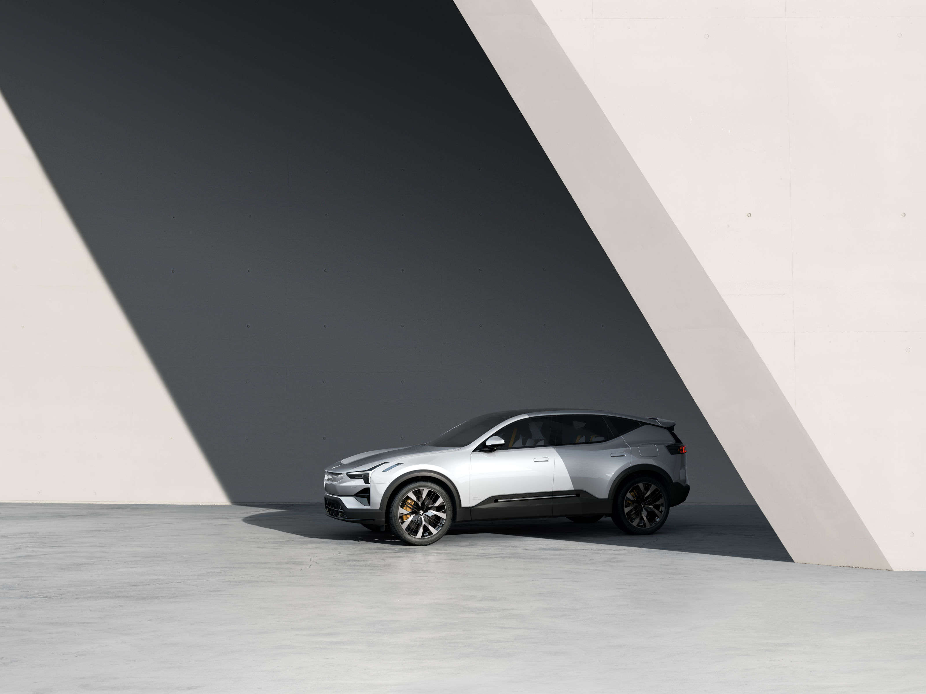
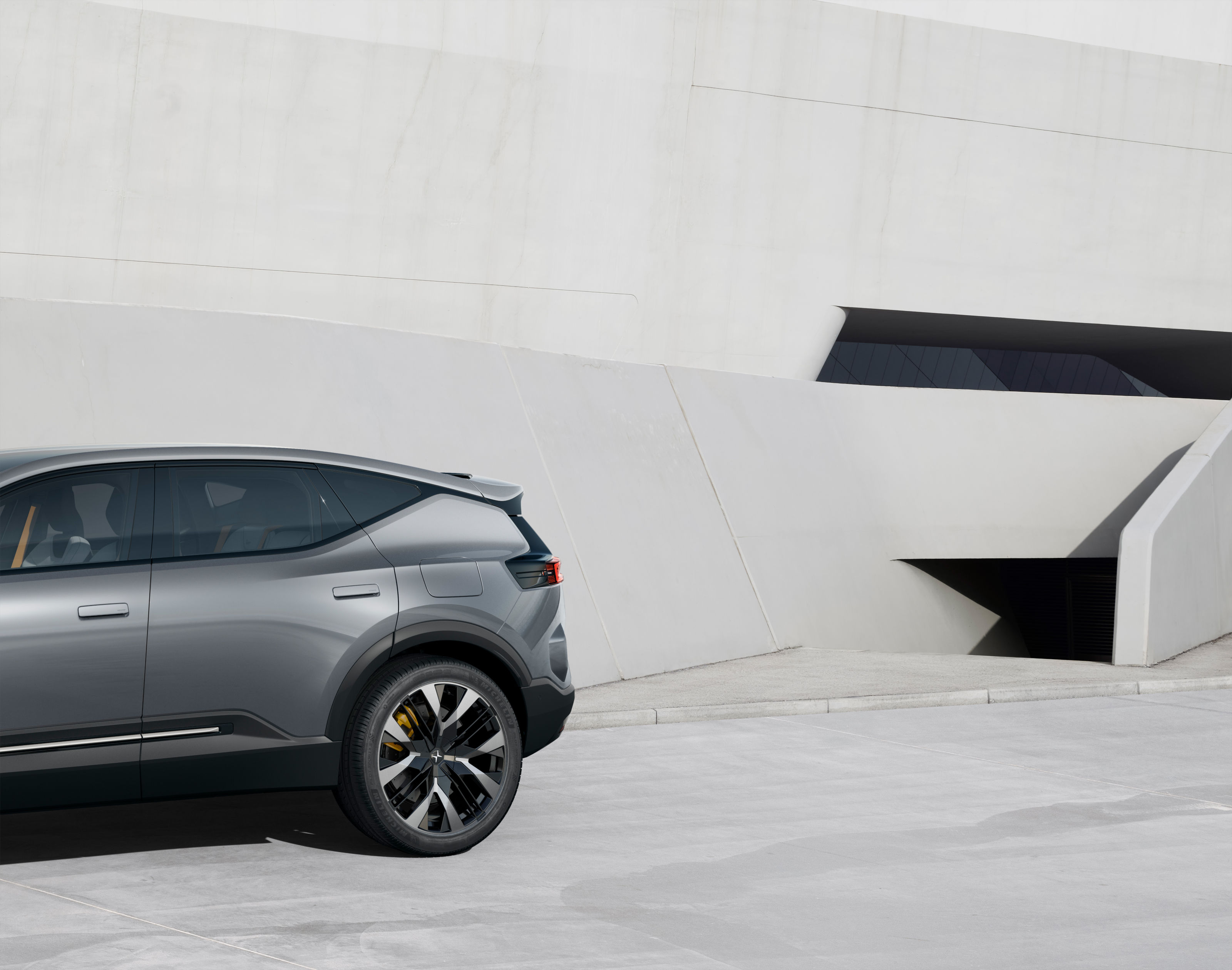
Available from early 2024, Polestar 3 will be, unsurprisingly, the third model in the company’s portfolio. Continuing the stripped-down, simple design language and graphic minimalism of the Polestar 1 and 2, the 3 adds the practicality and space of a mid-sized SUV. Expected range is up to 379 miles, with a power output of over 500hp. Wallpaper* asked INK's co-founder David Macey and Redgrove about the genesis of the project.
Wallpaper*: How did this collaboration came about?
David Macey, INK: We’ve always loved the Polestar brand from the very beginning, in 2019 we were given the opportunity to work alongside Benedict Redgrove to launch the Polestar 2. We photographed the Dongdaemun Design Place in Seoul to form part of the futuristic backdrop for the Polestar 2 imagery. At the time the car was highly classified, so the brief was to shoot location photography and then using CGI, digitally compose the car into the backplates.
During the shoot we helped Benedict and Polestar with a number of different augmented reality techniques to help visualise the car and bring the images to life, live on location without the requirement to have the car present. The images were hugely successful, and we developed a strong creative bond with the brand, based on our shared values for technology and effortless design. As a team we have since gone on to collaborate on a number of projects, most recently the Polestar 3 launch.
W*: Why did you choose buildings by Zaha Hadid?
DM: We think Zaha’s work is uncompromising and clearly futuristic but the forms also feel progressive and somehow optimistic. The sculpted forms of the buildings share a certain pared-back aesthetic that can also be seen in Polestar and Benedict’s work.
W*: What was Ink's overall creative vision?
DM: The story of the images was initially about bold forms, creating clear connections with the sculptural elements of the car and architecture. Through an iterative process of reduction, we found beautiful harmonies between car and architecture, resulting in the images feeling connected – a subconscious feeling that both the car and the building are optimised.
W*: How do you think these images reflect Polestar?
DM: As a studio, we believe in technology and the symbiotic relationship with design. Polestar's philosophy is that design should be progressive, sustainable and connected but above all to improve the human experience. We were trying to capture this distinctive aesthetic and vision in the images.
W*: How did the partnership come about?
Benedict Redgrove: I have always loved Zaha Hadid’s work, and I had seen some of Polestar’s early work and the beautiful Polestar branding work, so when Polestar approached me via INK with the campaign for Polestar 2 I was extremely excited to see what we could make together.
We photographed the Dongdaemun Design Plaza with Polestar 2 and we were at Napoli Afregolo Station and the Salerno Maritime Terminal for Polestar 3. There is a common theme, a futuristic element between Zaha Hadid, Polestar’s and my work; we share and appreciate the same language, so it’s easy to work together.
W*: What was it like working with Ink and Polestar?
BR: The same can be said with INK, this is how we started working together, a shared vision. It helps that we have all become friends too, but when you have the same values and ideas and want to develop them together, you encourage each other to explore and fulfil the potential you see in each other.
The design and art direction team at Polestar knew of my work previously and felt their values and mine were a close match. Their design language is pure and crisp, they think differently and do things in their own way. Everything is considered and then developed to its purest form. This is how I like to work.
W*: Why did you choose Zaha Hadid’s work in particular?
BR: I think you can say the same things about Zaha Hadid. The practice has always gone its own way, and not only that, but it’s been a pioneer with its design language and methods. Like all stand-out architecture, it’s not just one thing that makes a building special. A walk around and through Zaha Hadid’s architecture is filled with lines and forms that curve and change, from materials to wide and narrow vistas that close down and then open up.
W*: Do you see an affinity between the work of ZHA and Polestar?
BR: Polestar designs have similar moments, corners and surfaces that open up to an angle that expands to the complete car. It’s a clever design that invites and entices your attention. The final images are used in such a way that expands on all those values. Their recent London advertising boards are free from branding in the main image, so you see only the car and the architecture. It’s such a pure and bold way of showing your designs and says that Polestar knows that they have a knowledgeable community that appreciates the purity of the designs and images. That is true belief in the work.
W*: What’s the ultimate vision for you as a photographer with this kind of project?
BR: It's a rare and wonderful opportunity to work with a client like Polestar who is prepared to invest time in developing ideas and finding the right location and methods to make the work. The architecture is chosen because its design is considered and developed to its purest form. The architecture and Polestar's designs are harmonious in that respect. One doesn’t fight with the other because they share a similar ethos.
The vision is to produce images that match that of many architects. The world where you see the design and understand its intention, detail, and form. It is calm, clear and considered. The narrative between the car and the architecture showcases a sort of potential brave new world. We are trying to improve on what’s already here, by showing how good design increases your enjoyment in life.


