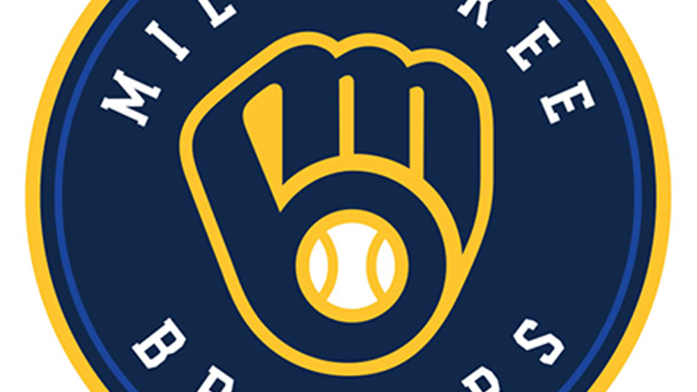
We love a good logo design secret, but it's not often that we discover one from a game show. At first glance, the Milwaukee Brewers logo looks like a ball in baseball mitt. At second and third glance too. In fact, it turns out that even players on the team took years to notice anything else.
But once it's been pointed out on the quiz show Jeopardy, it suddenly becomes obvious that the design has a clever secret: it also references the team's name. We might need to reassess our pick of the best MLB logos because we missed this too!