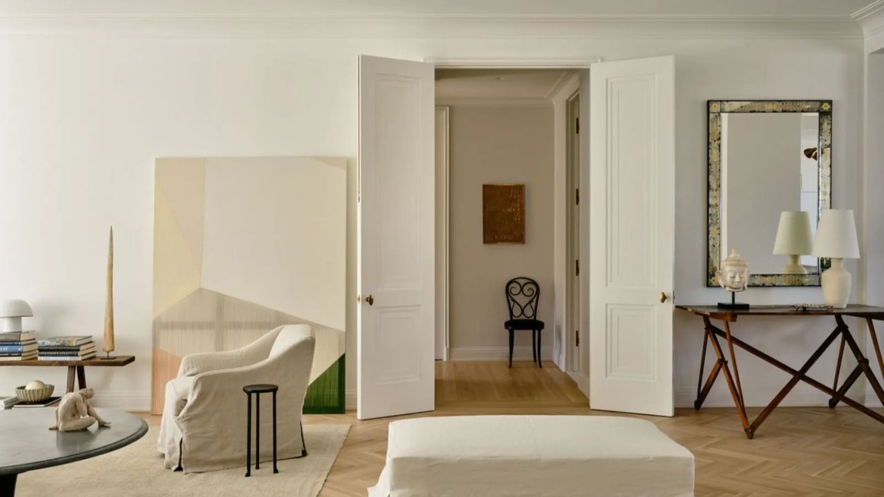
Negative space is not nothing. It only sounds like emptiness, but in practice, is very much something: a pause, a pocket of air, a moment of visual restraint that spotlights the pieces you love most. It’s balance, flow, and calm all at once, and it’s arguably one of the most transformative tools in interior design.
Despite its reputation, negative space isn’t exclusively for minimalists. It’s just as powerful in a traditional home, a contemporary one, or even the residence of the most devoted maximalist – because no one actually wants clutter, and everyone wants rooms that breathe. Even the most intentionally layered interiors rely on a certain amount of ‘nothing’ to make all the ‘something’ work.
With this interior design principle, what you omit often carries more weight than what you include. And since we’re talking about space – the rare design element that costs nothing – there’s no excuse not to use it. Ahead, how designers leverage negative space, the discipline that doubles as design’s greatest freebie.
What is Negative Space and Why is it Important?
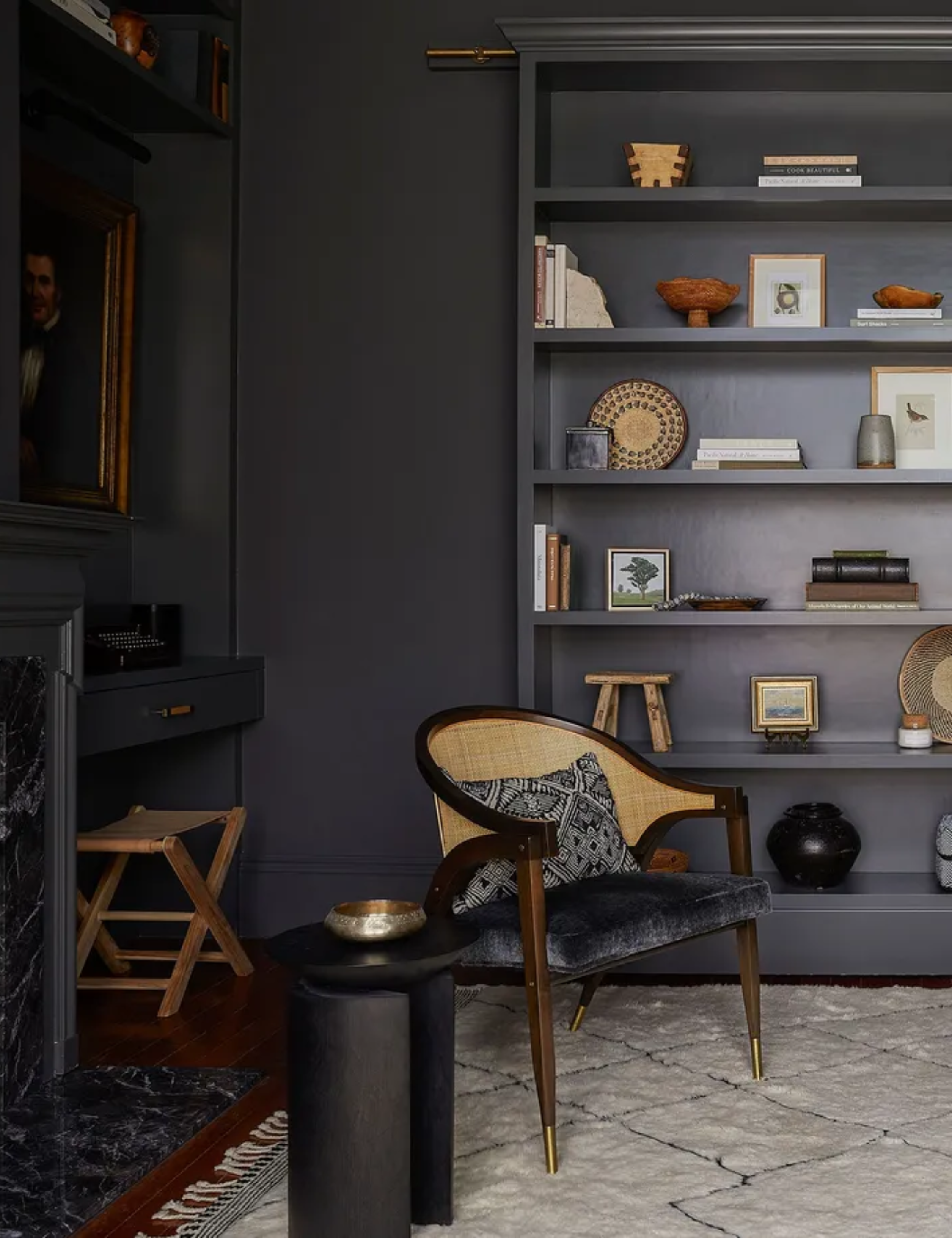
‘Negative space is the deliberate absence of objects,’ notes Philip Thomas Vanderford, Owner and Founder at Studio Thomas James. Negative space isn’t a prescribed measurement, nor is it – apart from its ability to foster freedom of movement – purely practical.
‘It’s the breathing room that allows architecture, proportion, and select pieces to register with clarity,' Philip continues. 'Rather than feeling empty, good negative space feels intentional – it gives the eye pause, creates hierarchy, and allows a room to feel composed rather than crowded. In my work, negative space is never a lack of design; it is the design.’
‘Not every space needs to be filled,' echoes Sarah Hart, Owner and Principal Designer at Sarah Hart Interior Design. 'Sometimes empty space is not just okay, but it’s needed in order to create balance. Too often, I have people asking me, "But then what do I put on this wall?" if I’ve left a spot blank in a design.'
'... Nothing,’ she quips.
7 Ways Designers Use Negative Space in the Home
Negative space is the interior's equivalent of Chanel’s take-one-thing-off rule in fashion. It isn’t about what’s missing; it’s what makes everything else make sense. Here, seven ways designers use negative space to make rooms read sharper, calmer, and more intentional.
1. Drawing Attention to Favorite Pieces
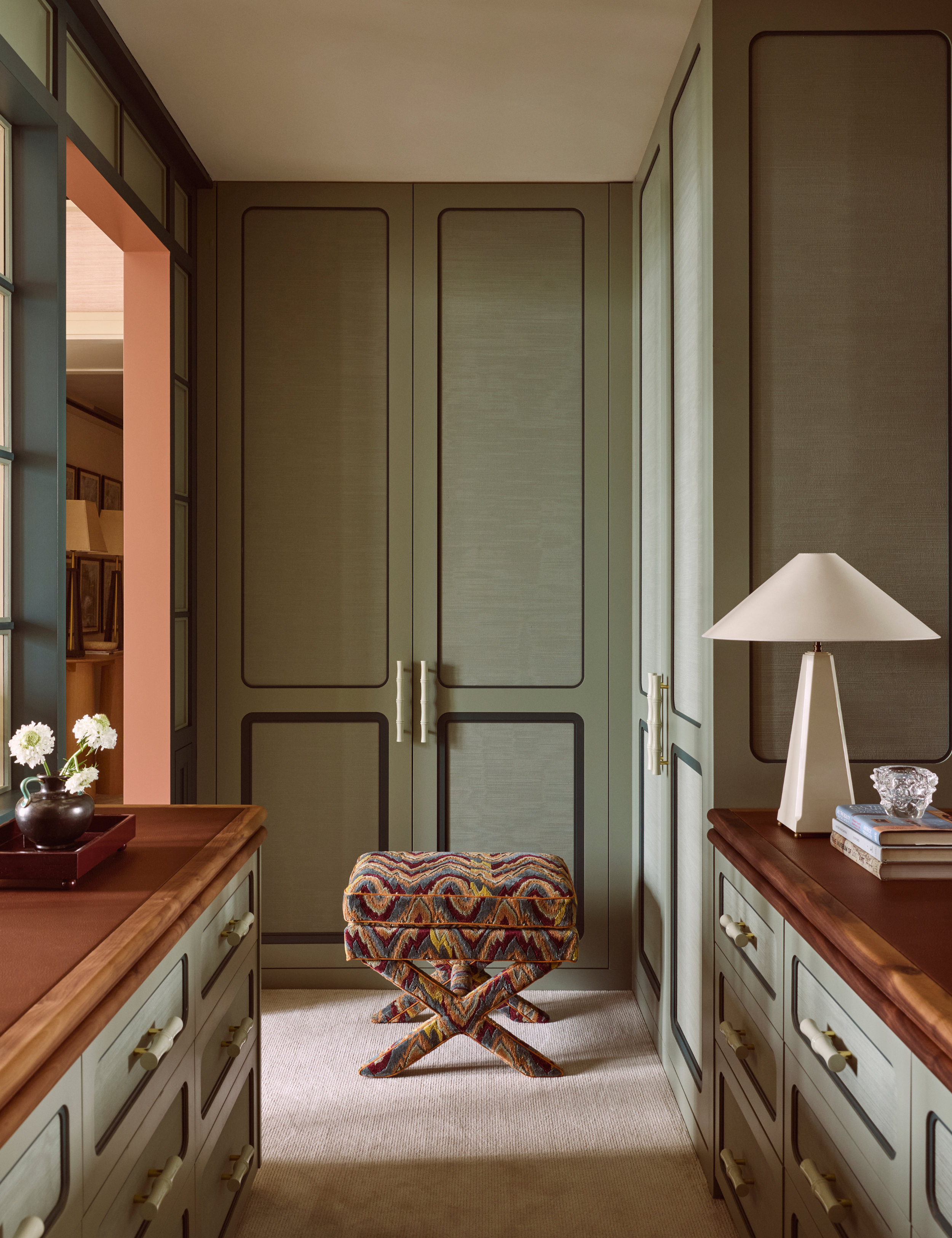
One of the most effective – and most borrowed – uses of negative space is how it reframes the objects you love. Whether it’s a hero sofa or a single vase on a shelf, the breathing room around it changes how you see it.
‘Allowing objects room to breathe gives each piece greater presence and importance,’ explains Los Angeles–based interior designer Dre Shapiro of Dre Design. ‘Rather than competing for attention, each item is elevated through restraint. Negative space, in this way, becomes a form of emphasis.’
Charleston-based designer Sarah Hart agrees: ‘Negative space can help draw attention to your showcase pieces: artwork, fireplace, furniture, etc. Surrounding that showcase piece with some breathing room makes it feel elevated and intentional.’
It’s a bit like a museum display, minus the velvet ropes. The show-off sensibility holds: don’t crowd your star players. Even your favorite pieces need distance, from other furnishings and from each other, to truly land. When the visual noise drops, what you love comes through loud and clear.
2. Floating Furniture
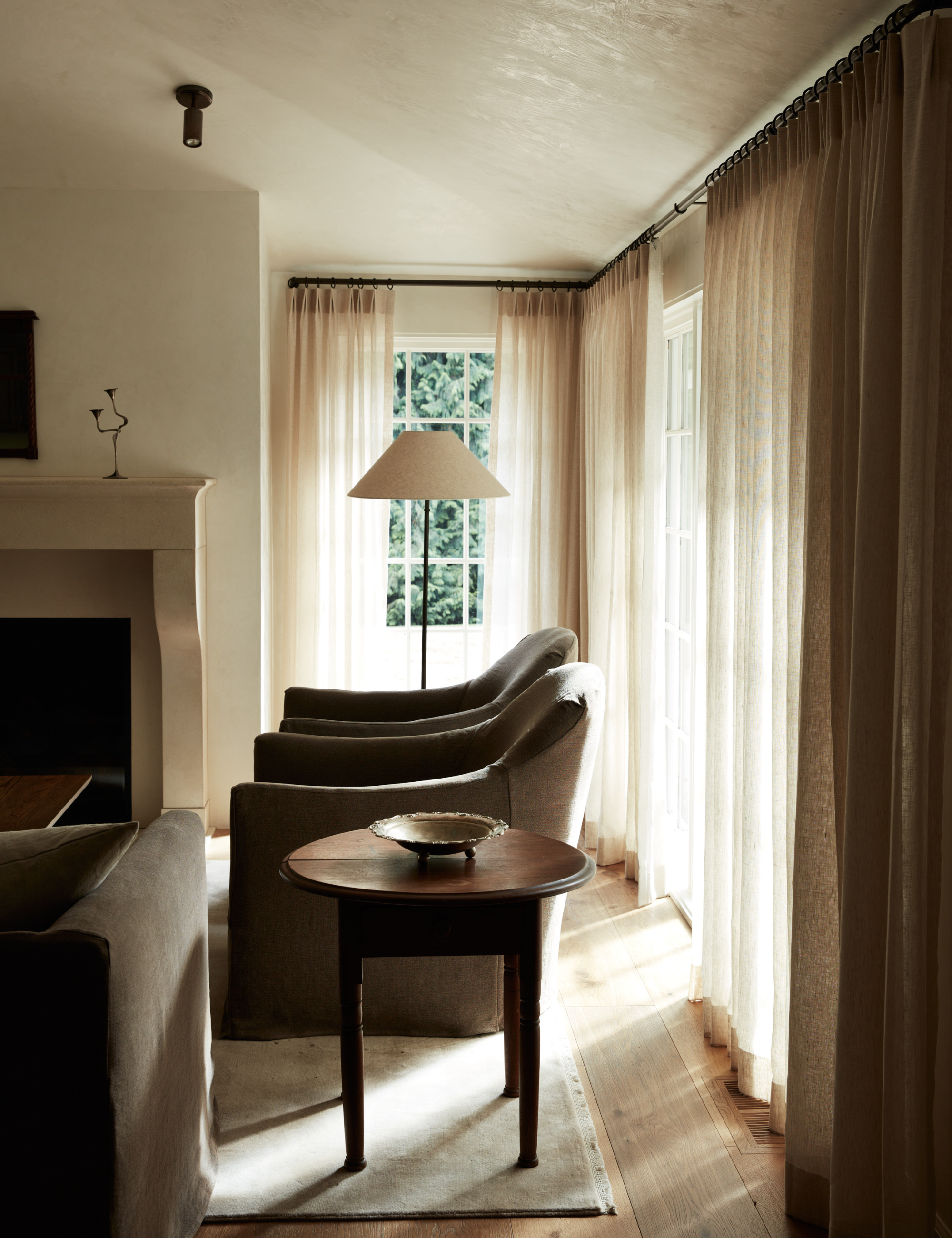
In a well-composed living room, the first question isn’t what the sofa is – it’s where it’s sitting. More often than not, the most commanding rooms are the ones where the furniture isn’t clinging to the perimeter like it’s afraid of being noticed. A sofa floated even a couple of feet off the wall, suddenly has presence; a seating arrangement pulled inward creates a sense of intention.
‘Float your furniture. Get it away from the walls,’ urges Sarah Hart. ‘This may seem counterintuitive, but trust me. Bring it all in. Away from the walls. Think 90-degree angles when arranging furniture, (typically) nothing should be on a weird angle or caddy-cornered.’
The bonus of all that breathing room is that it creates natural pathways and conversation pockets – an easy, intuitive flow no wall-bound layout could dream of.
3. Enhancing Architectural Features
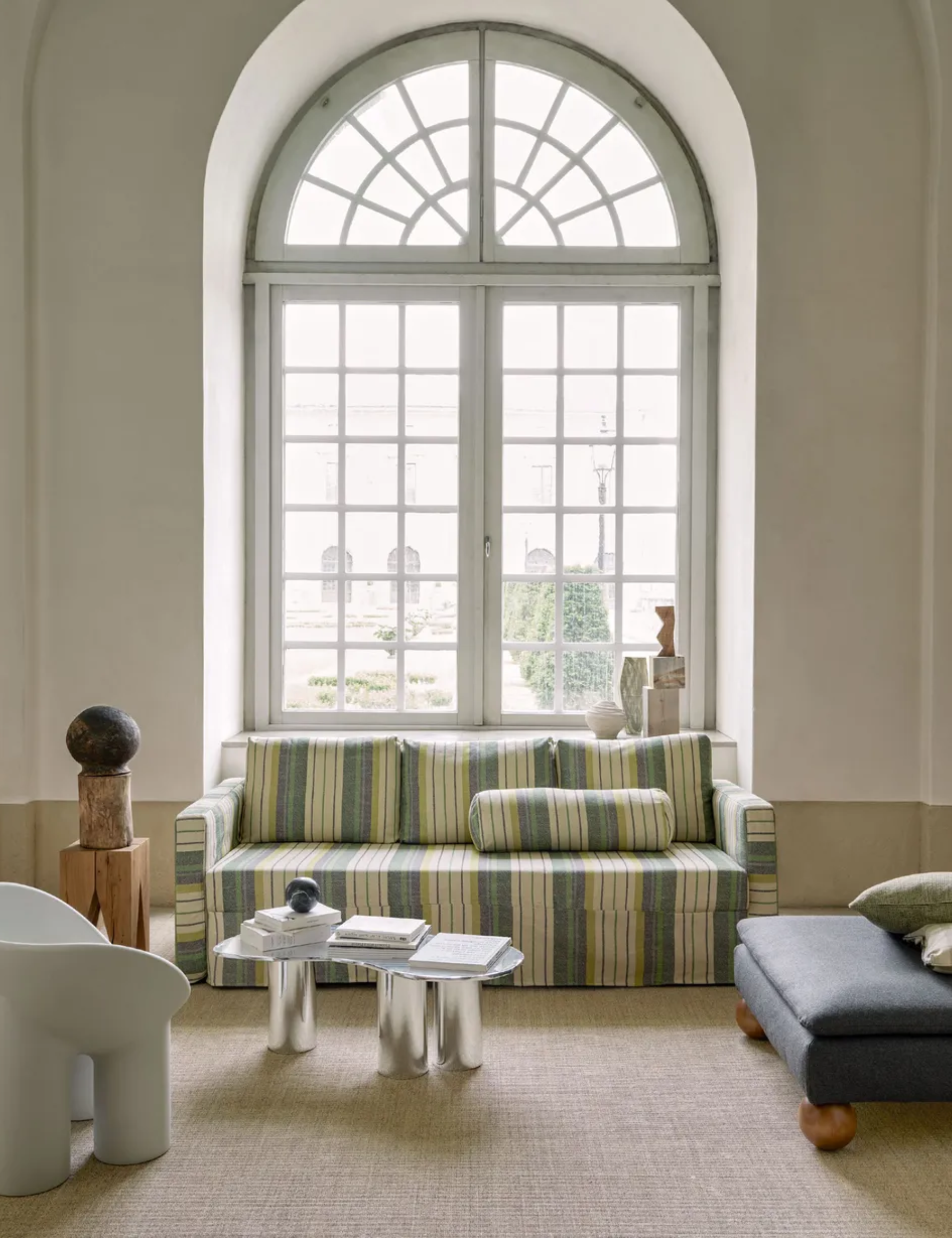
Negative space isn’t just for highlighting your favorite lamp or objet – it’s one of the strongest tools for letting the architecture itself take the lead. If you’ve been blessed with arches, maybe don’t flank them with a hulking bookcase. If your windows are generous, resist the urge to crowd them with tall furniture. Sometimes the most luxurious move is simply stepping back.
‘If a room has strong bones – scale, ceiling height, windows, or millwork – I resist the urge to decorate across every surface,’ says Dallas-based designer Philip Thomas. ‘Allowing expanses of wall or ceiling to remain unadorned highlights what’s already there. This restraint creates quiet confidence rather than visual noise.'
In other words: when the architecture is doing the heavy lifting, just let it.
4. Adding Interest to Art
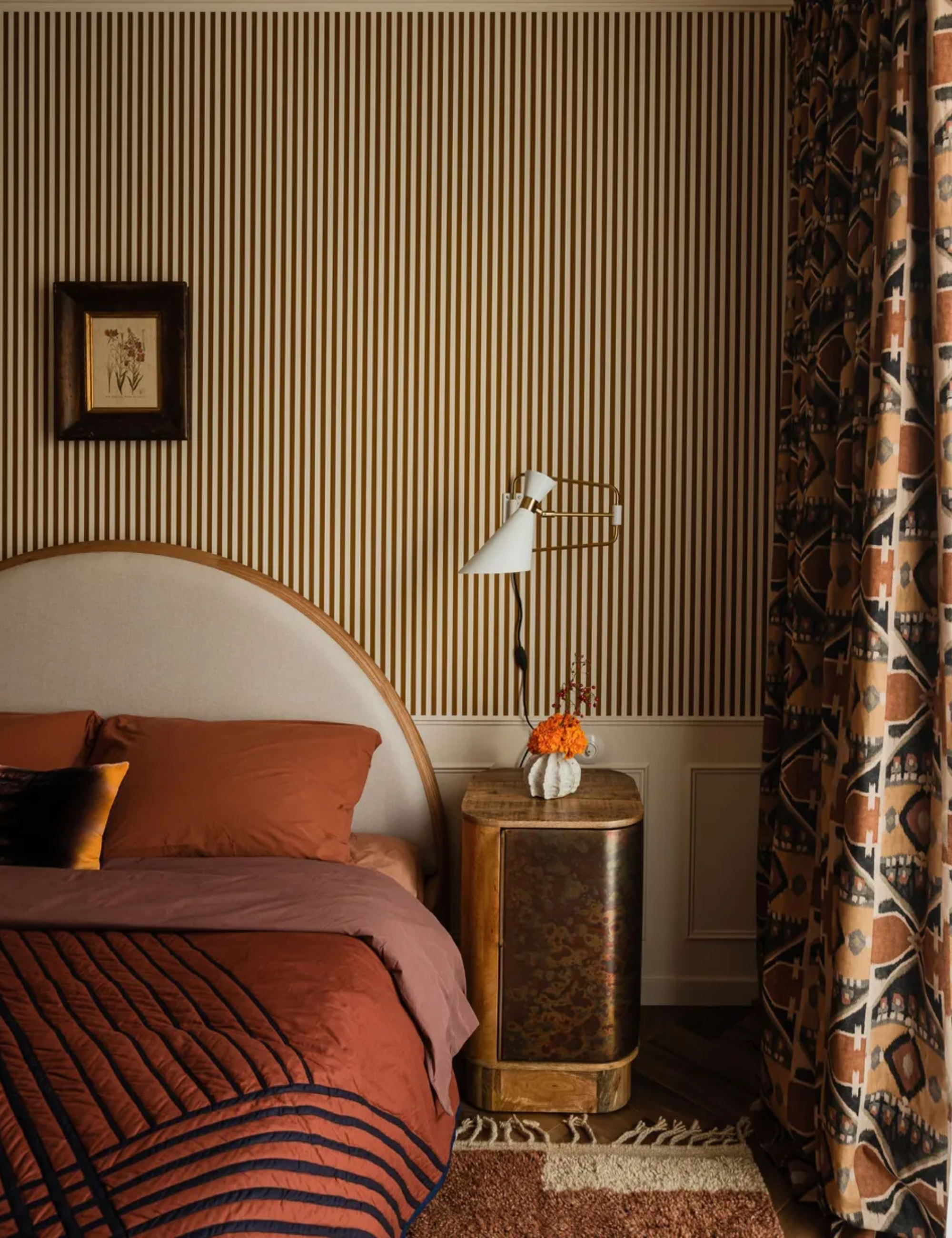
Negative space isn’t just about breathing room – it can be an active part of the composition. In fact, Dre Shapiro often pairs asymmetry with negative space to make decorating with artwork hit harder.
‘When hanging art on a large wall, for example, it can be far more compelling to place a small piece low and pushed dramatically to one side, rather than centering a large work or filling the wall entirely,’ she explains. ‘The surrounding emptiness becomes part of the composition, creating tension, intention, and quiet drama. The space itself begins to speak as loudly as the artwork.’
So yes, negative space supports the classic centered-art moment. But it's also the reason the 'tiny art' trend is having a moment right now. Simplicity gives you permission to break the traditional gallery grid, letting the blankness do some of the storytelling.
5. Juxtaposing Busy, Pattern-Filled Pieces
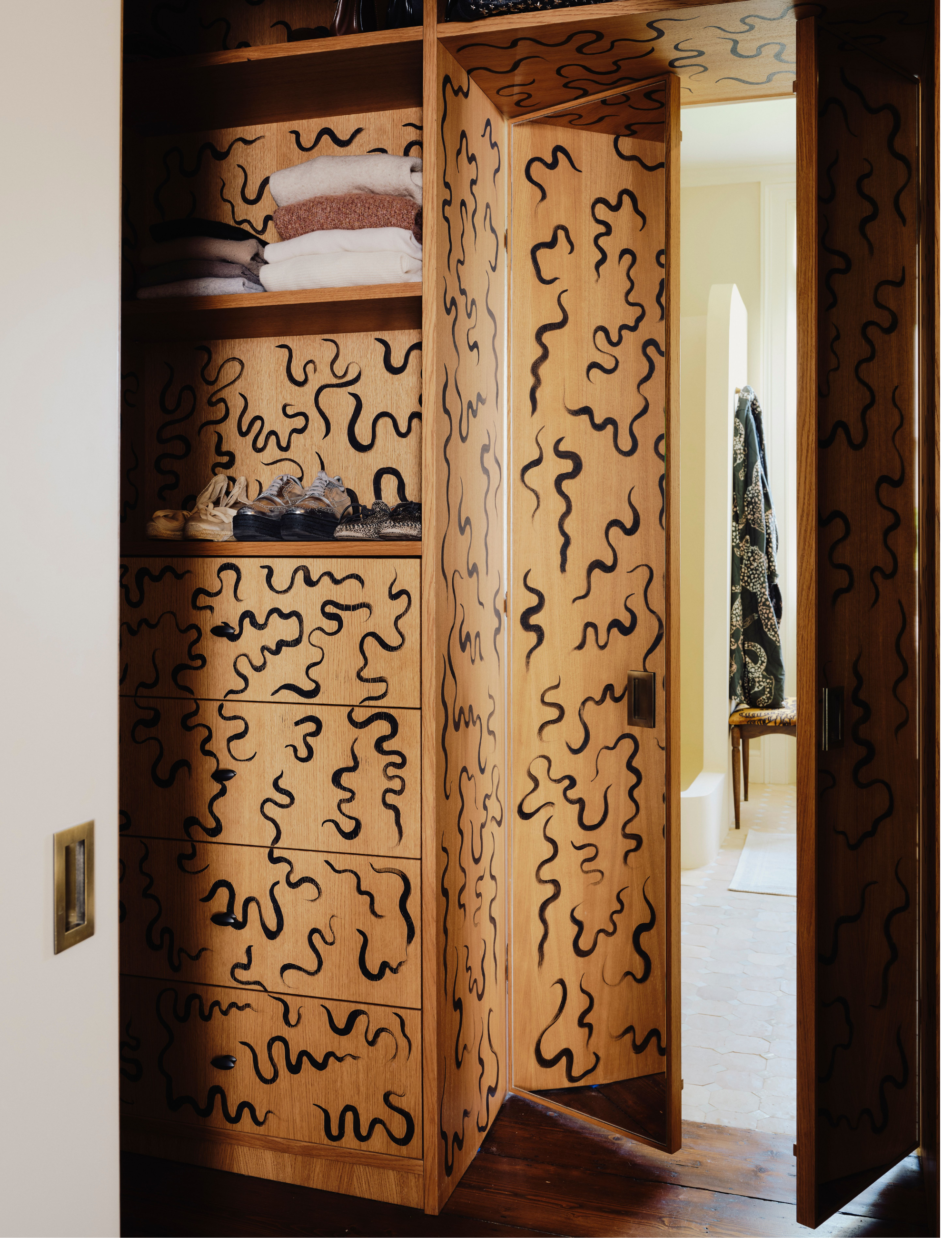
Place two terracotta patterned cushions side by side, and, from across the room, they merge into one louder, blurrier motif. Spread them out – suddenly, each pattern has something to say. This is where negative space becomes strategy, especially when you’re working with prints.
Designer Sarah Hart frames it as offering the eye a place to land. ‘Negative space could also be interpreted as a place for visual rest,’ she explains. ‘If some of your furniture is bold, colorful, pattern-heavy, plush, etc… maybe a simple accent chair is the way to go to let those showcase pieces shine. Always be looking for the juxtaposition to help balance the visual weight.’
In our first example, that might mean the bench beneath those pillows is white. The bench still exists, but because it doesn’t fight the pattern, it functions as a pause – the contrast that lets the print register. It’s the same logic behind designers’ enthusiasm for Cloud Dancer, Pantone’s Color of the Year: a ‘negative’ shade that steadies everything around it and builds in the breath that pattern needs.
6. Editing Your Furniture Layout
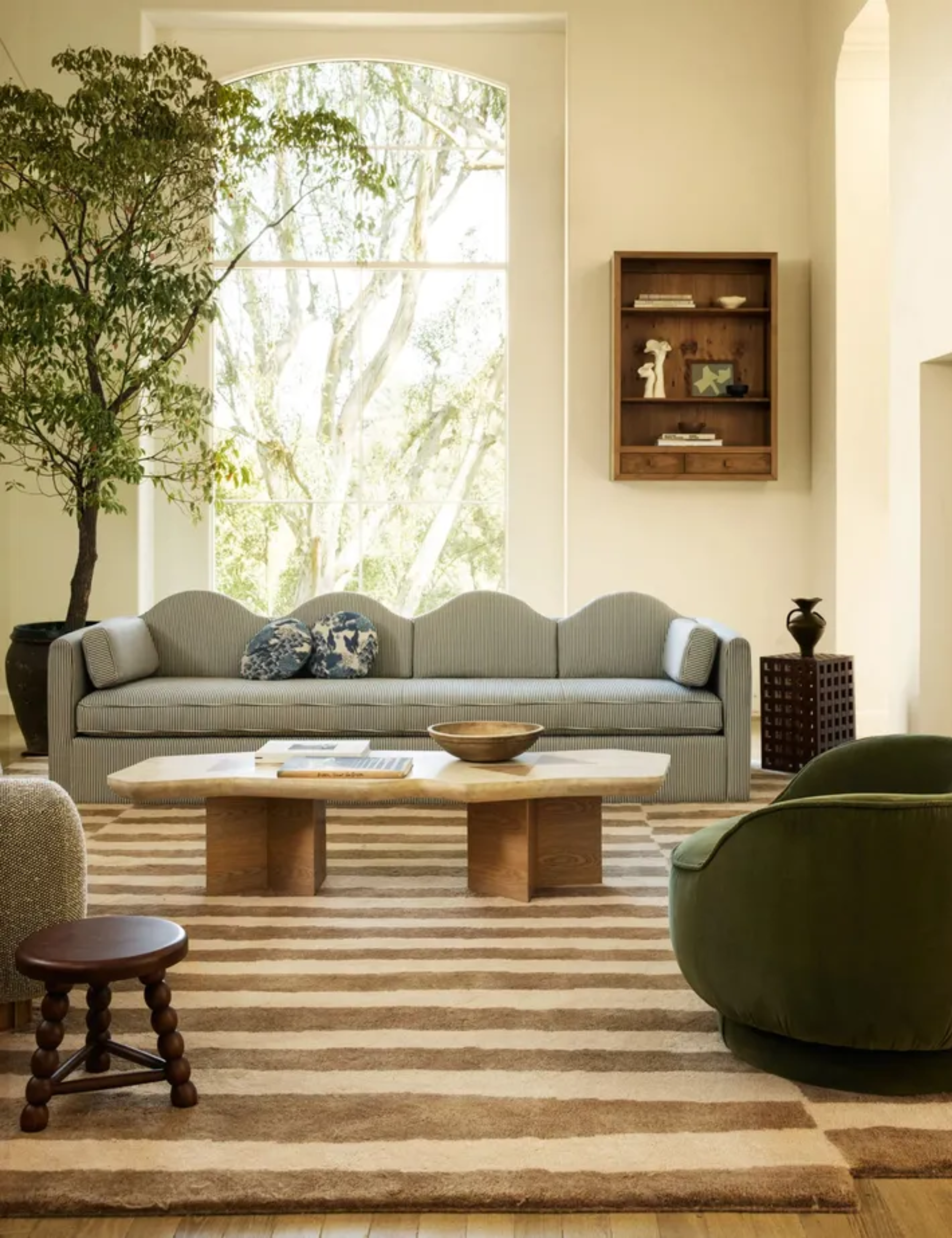
How many accent chairs does a living room actually need? Fewer than most people think. Overestimating only crowds the room and dilutes the impact of the pieces you do love. Thinking about negative space before you start sourcing – or before you add that one extra chair – is essential.
‘Fewer, better pieces always outperform too many,’ says Philip Thomas Vanderford. ‘I often leave generous clearances between furniture groupings so each piece has presence. This not only improves circulation, it creates visual calm – especially in large rooms where overcrowding is the fastest way to undermine scale.’
It’s quality over quantity. ‘A single substantial sofa paired with empty floor space can feel more luxurious than filling a room edge to edge,’ Philip adds. ‘I think in terms of visual mass – where the eye rests – and counterbalance it with openness elsewhere.’
Edit your space with the same ruthlessness you’d bring to a high-stakes email. A thoughtful deletion almost always lands harder than an unnecessary addition.
7. Establishing a Visual Rhythm
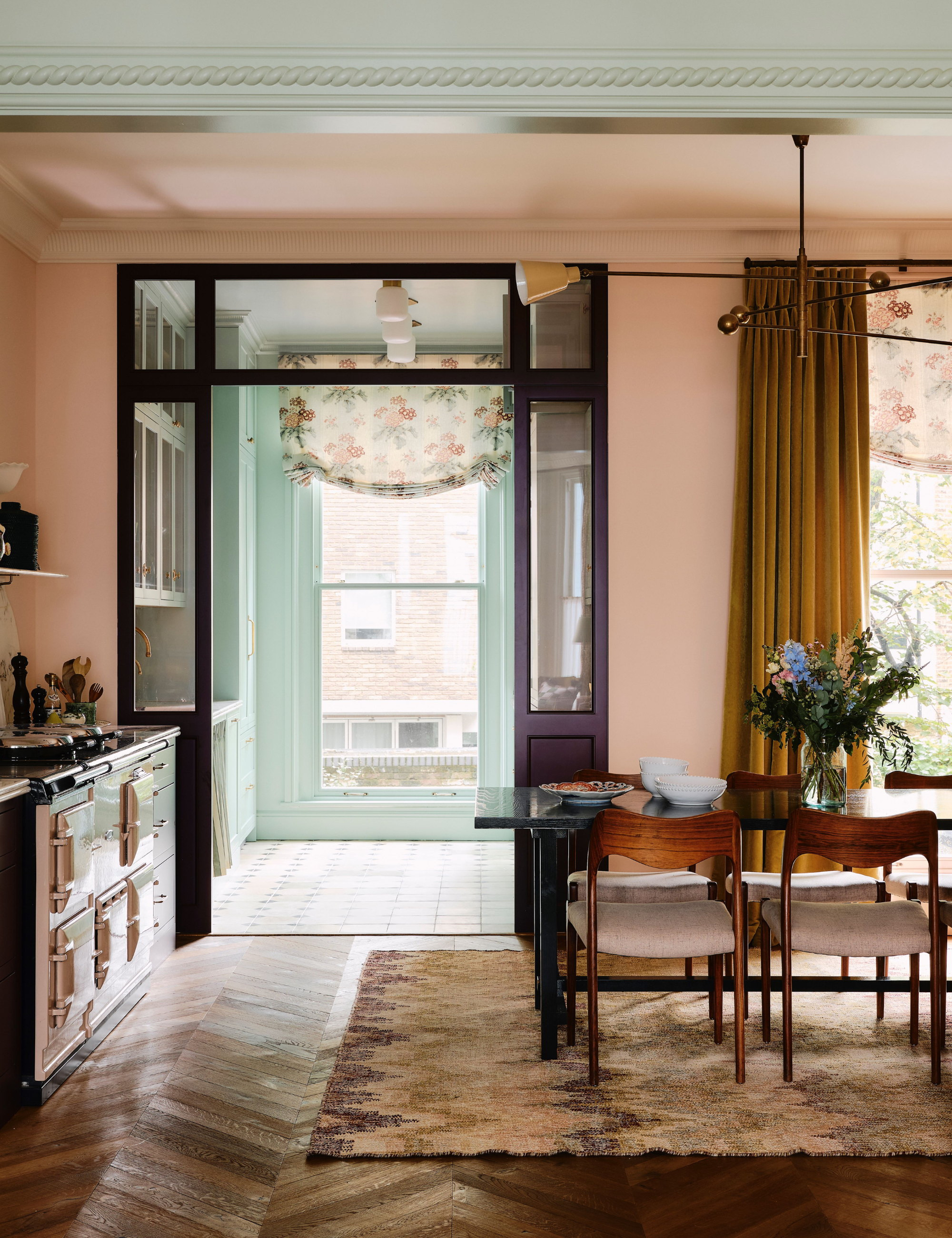
Every room has an energy, as do the items inside it. Spacing out your most expressive pieces lets the eye, and eventually the body, move through the room with ease. A glossy lacquered vase pulls you in at the entry; a tufted leather chaise a few paces away becomes the next beat. You’re not just decorating; you’re choreographing how someone experiences the space.
‘Alternating filled and open spaces in a room establishes visual rhythm and guides movement,’ shares Sarah Hart. ‘Negative space ensures the room doesn’t feel chaotic, crowded or busy’ – both within a room, or even among them.
Because, yes: that rhythm can operate between rooms, too. Let one space be richly layered and the next noticeably pared back – the contrast strengthens both. It’s why bedrooms, almost universally, are the most edited spaces in a home – negative space functions like a visual deep breath, and nothing supports rest quite like that.
Negative space is balance. Its intention. And it is decidedly not emptiness. Think of it as a wide-open easel: permission to pull furniture back, give your favorite pieces room to breathe, and let your home actually exhale. Done right, negative space doesn’t feel blank. It feels confident.


