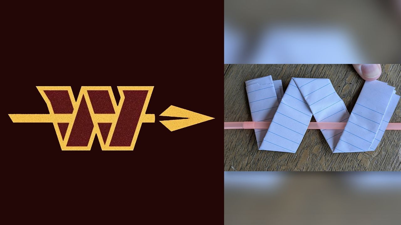
New logo designs always face scrutiny, especially when it comes to sports teams. Fans can be particularly territorial about their favourite team's design language, and it can take a while for a new design become accepted – if it ever does. But here's an example that's taking design scrutiny to the next level.
A new 'alternate' logo for NFL's Washington Commanders has been revealed, featuring an arrow passing through the folded 'W' shape of the original logo. The symbol is part of a new suite of branding assets revealed by the team (below), and has led to an unexpected design debate: does it actually make physical sense?