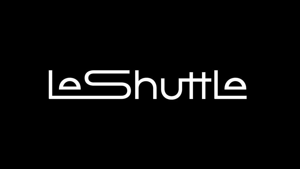
There's nothing like a radical logo redesign to start a debate, and Le Shuttle – sorry, it's now LeShuttle – has certainly done that. It's a very different look for the Channel Tunnel railway service. It's sleek and very now (detouring via the 1920s).
The new logo drops Le Shuttle's nationalistic red and blue for a more universal Uber-like white on black, emphasising speed, efficiency and modernity (complemented by 'Electric Lavendar' highlights in wider branding). But is it readable? (see our tips on how to design a logo for ideas for your own work).