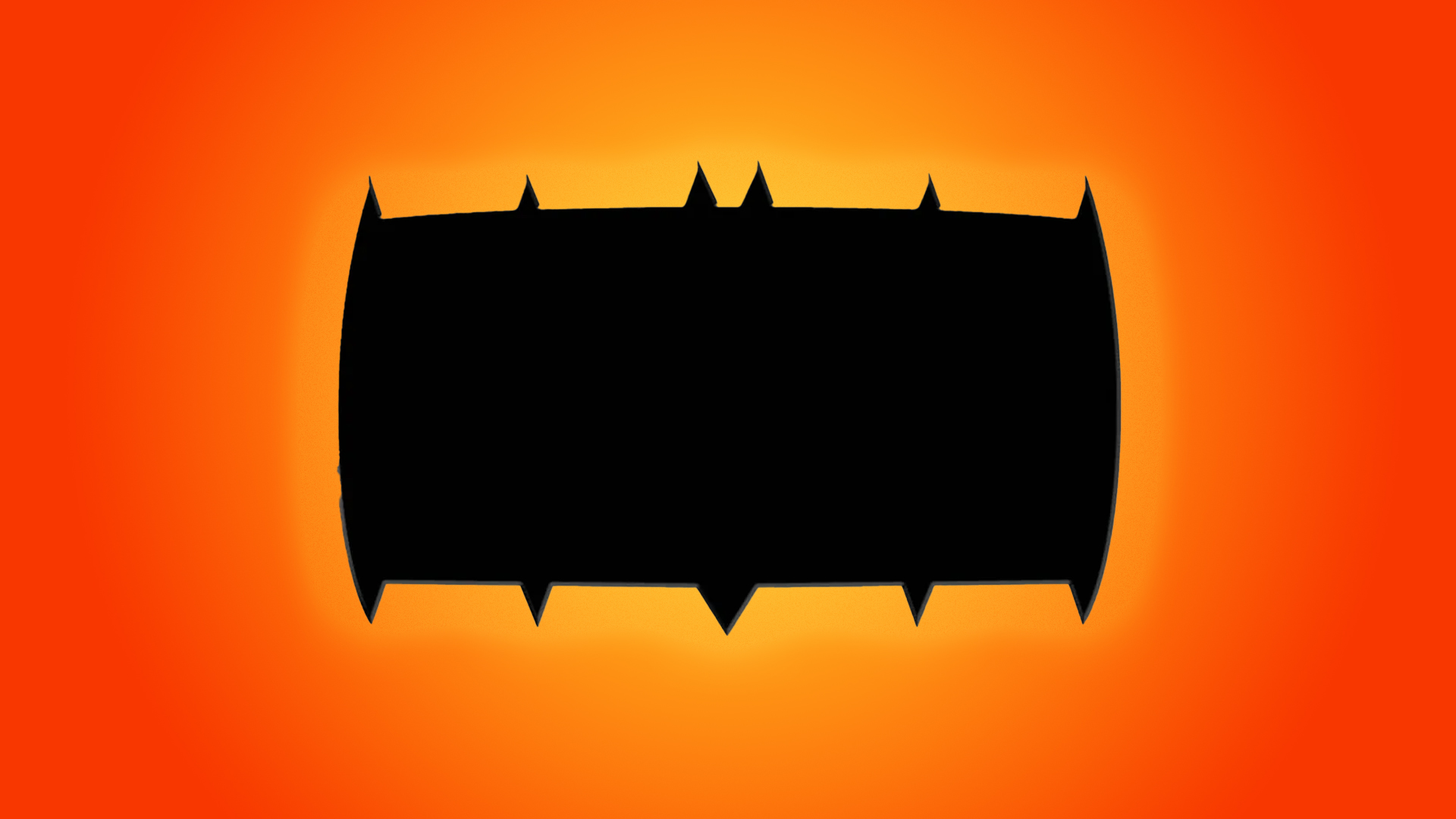
Last month, comic book publisher DC revealed the revamped character design for its new series, Absolute Batman. While most fans were on board with the pumped-up, exaggerated design of the new Dark Knight, one issue has caused major contention – the bizarre redesign of the iconic bat symbol.
Initially, I brushed it off as a simple costume redesign, but it turns out the brick-like bat logo is here to stay and some fans are not happy, with some even calling for James Gunn to scrap the design altogether. Love it or hate it, the fierce backlash to the new Batman logo is a testament to the importance of comic logos as a symbol of a fanbase (and confirmation that you can't please everyone).