When you think of a beach house, there are certain images that instantly come to mind. Blue and white color scheme, shiplap walls, stripes, beachy memorabilia– shells, ships in bottles, signs expressing 'Life's better at the beach'. It's a nostalgic look for sure, and although I jest, beach house decor has had a bit of a tasteful glow-up in recent years so the cliché isn't as kitschy as it once was.
Although from the outside this house does pretty much fit the cliché. It's a classic clapboard beach house in Los Angeles, it had great bones, but has just been subjected to a quick (and relatively cheap) builder flip, so it was going to take a bit of vision. It needed the character adding back in. And not only that, the homeowners, despite buying a home less than half a mile from the ocean, wanted this beach house to look nothing like a beach house.
Designer Christine Costa Zippert, founder of CC Zippert Design, took on the challenge and here she talks me through the whole process, and the very unexpected inspiration behind the remodel.
'We were brought on board right after the family purchased the property, which is in an extremely competitive and hot neighborhood south of the heart of Los Angeles – they were just happy to have gotten their hands on the multiple-offer listing,' explains Christine. 'Because the market in the area is so desirable, it's more about the property and the location than it is about the house itself when you purchase, so when the family moved in, they knew they had work ahead of them to make this their home.'
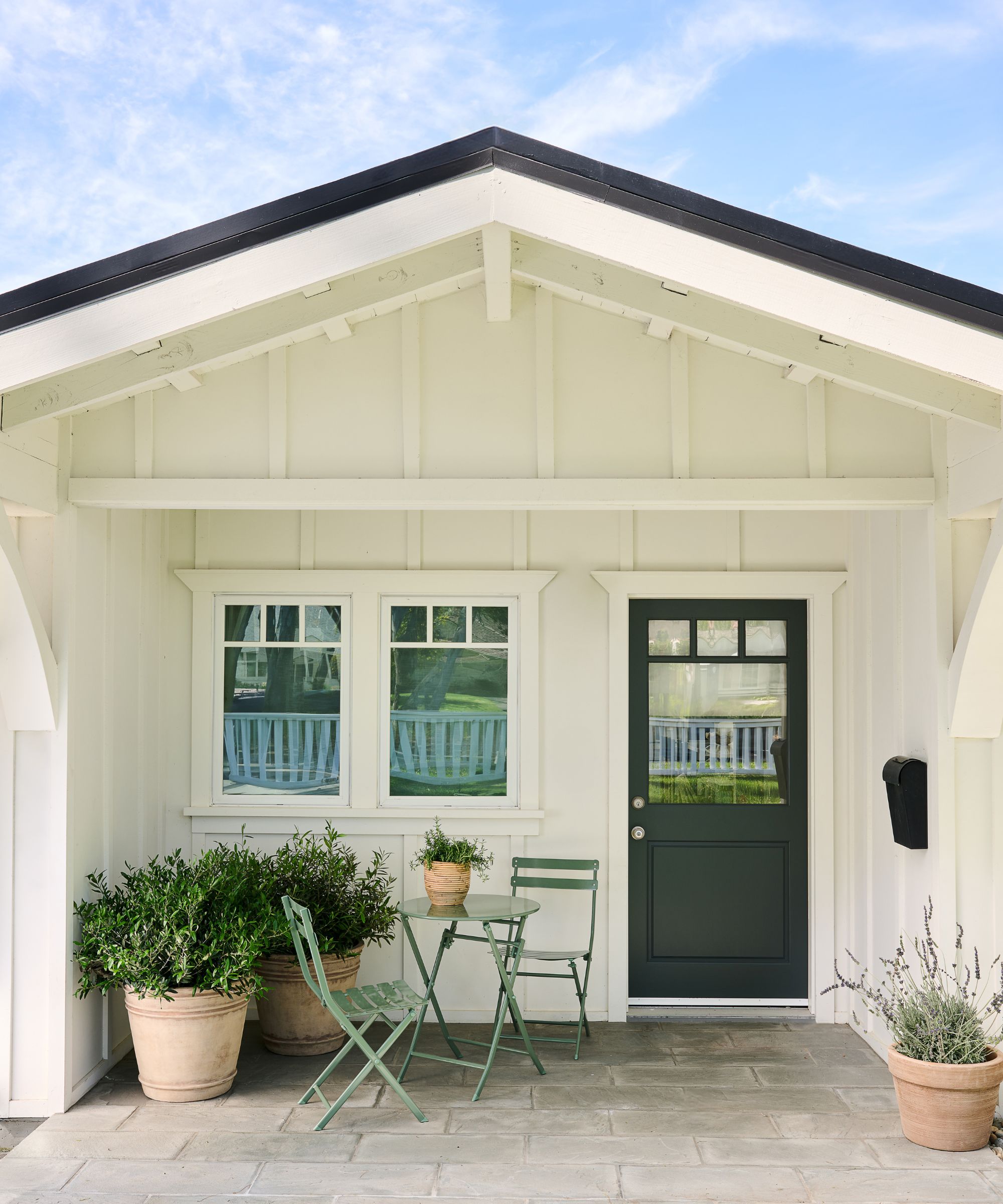
'The exterior of the home has great curb appeal, it’s a white clapboard ranch house with a California Craftsman feel. It had great bones, but a developer had come in and done a quick flip, painting everything yellow, gray and white. Once we saw the house, we knew we had to breathe life back into it, and loved the challenge of working with the existing structure, while adding back the charm of more classic millwork, cabinetry, finishes, and furnishings.'
'The homeowners are a hardworking family with two young school-aged girls. They wanted to feel warm, cozy and comfortable in their home after their busy days – a refuge and place that reflected the beauty of the canyons and cliffs that surrounded them. They also wanted the inside to feel more like the historied exterior of the home, with more layers of time, character, quirks and materials built into it.'
'So inspiration came from an unexpected place. At an antique market in a small town in Sussex, England, I found an oil painting that had the moody mid-century tones and old-world flair we were looking for and built the scheme from there.'
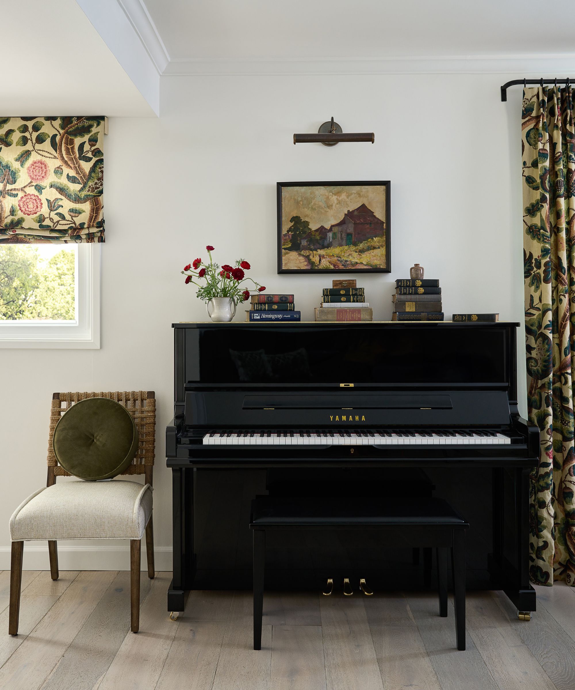
'Today, that painting hangs above the piano and ripples through the home. The Claremont Tree of Life window treatment fabric that adorns the living room came next, along with an eggplant color custom banquette. We worked our way into the rest of the rooms, painting the office and all the interior doors Farrow & Ball’s dark Studio Green, integrating richly colored and darkly stained built-ins throughout, and refinished the builder-white kitchen without having to gut it, infusing the space with color and texture.'
'Of course, there is much more to this project, but I know when people think about transforming their home, construction and color can feel overwhelming. Here’s a project where we did not move any walls. We used a single painting to inspire a color palette that changed everything. I think this is a great way for homeowners to make designing their home more manageable and fun – building an entire scheme room by room, around one small object that they love.'
'We loved the visual direction the family gave us – the house is a quarter mile from the ocean but it’s also in horse country. They wanted us to lean into the horse country feel and strip out the beachier elements – with our studio located in a coastal town in Southern California, this client brief was a breath of fresh air.'
'As they put it, make our house feel like a well-traveled mid-century modern loving professor lives here. We decided to pull inspiration from English country homes, that felt collected over time, with a richness in their materials, while still keeping California-inspired elements – stripped down, simplified built-ins and cabinetry, mid-century furnishings, and plenty of color a la the British, but in a more neutralized way.'
'We loved the concept of melding the spirit of a collected English country estate with California horse country. And we really wanted it to feel natural to the California landscape.'
'I serendipitously had gone on a trip to Sussex to visit the Bloomsbury Group’s Charleston House and antiquing the small medieval town of Lewes in the midst of design development, and had found a small oil painting from the 1800s. It had these rich, jewel tone colors with brown undertones.'
'The palette’s earthiness felt familiar to the rocky, fog covered coastline that our project resided in, but the image itself was quite English countryside – and so this served as a leaping off point as we began to pull together our materials palette together and define the overall mix of furnishings and forms in the house.'
'The house felt carved up into different spaces with no cohesion between one room and the next. There were barn door systems breaking up rooms. The primary bathroom had a giant tub awkwardly shoved in next to the shower that made it impossible to get in and out of.'
'Because the house is shaped like a U, it was easy to stop and stay in the front of the house, with nothing drawing you into the other living spaces deeper back. The kitchen had pre-fab gray cabinets and basic Carrera subway tiles. All the walls were yellow and royal blue and 5000K lightbulbs that couldn’t be dimmed throughout the house made it feel like a hospital. There were no doors to the outside from the main living spaces and there wasn’t any storage.'
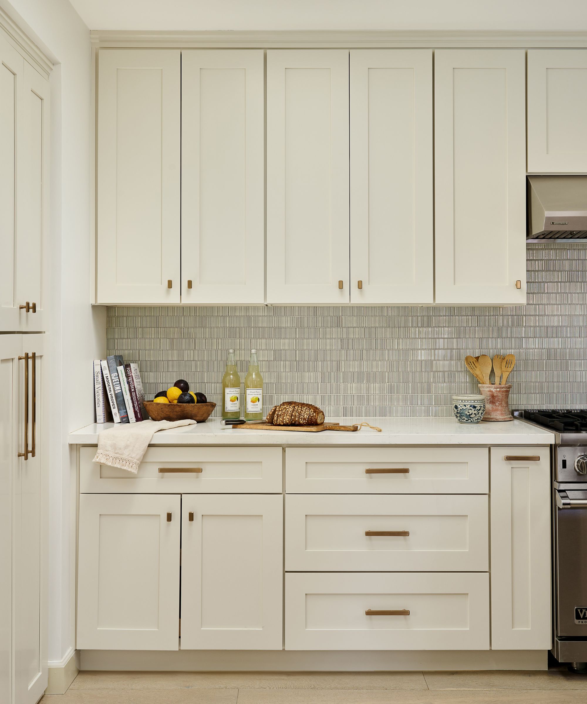
'All the cabinetry, floors, and lighting throughout were low-budget builder grade and pre-fabricated, but they were also all brand new. When this is the case, from a sustainability standpoint, it’s hard to waste perfectly functional items that could have a life for many more years, even if they don’t perfectly fit the desired aesthetic. So, one of our first challenges was to decide what we could refinish and keep and what needed to go in order to create a more cohesive space, that moved from one area to another and felt solidly built for years to come.'
'We chose to keep the cabinetry and appliances in the kitchen because they were brand new and overall functioned well, but refinished everything, replaced plumbing, hardware, lighting and tile to give it a more custom feel. We also decided to keep the engineered wood floors . This was a tough decision because they weren’t exactly what we would have chosen, but they were new and in great shape – they had a decade if not two left in them.'
'However, we completely overhauled the electrical plan and all of the lighting – switching to 2700K temperatures on dimmers throughout, reducing the amount of recessed lighting by at least 50% and replacing with chandeliers, sconces and lamps that created more ambient warm glowing light.'
'We decided to completely gut the primary bathroom because even though it was new, the space plan was so poorly done, there was not enough floor space for two people to navigate through it. We also redid the fireplace and surrounding wall because it was the true heart of the home.'
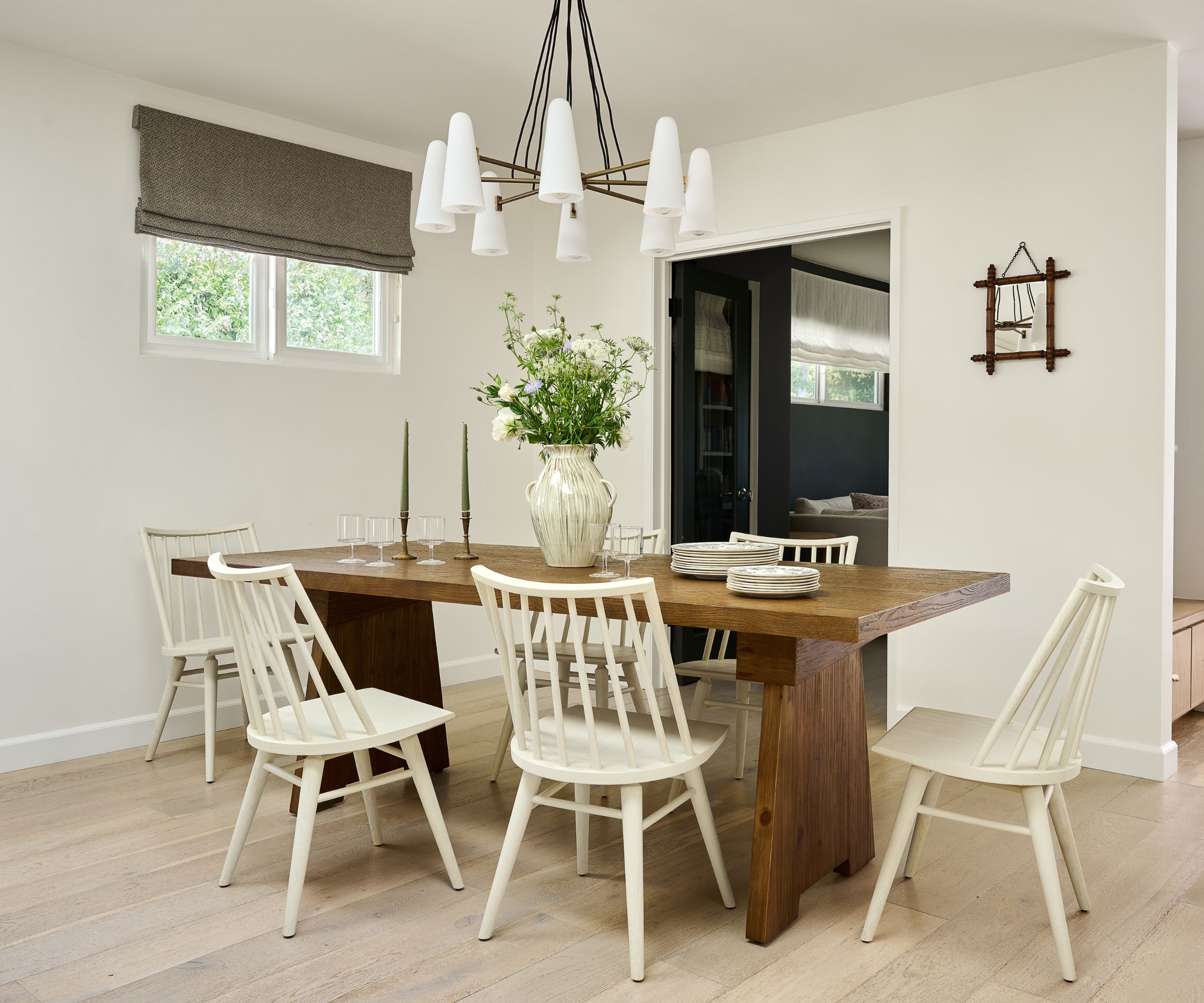
'The family has two young kids, who play hard and don’t worry too much about the furnishings around them. We needed to make sure to balance higher-end furnishings and investments, with elements that were durable and not so precious that the family would be heartbroken if something happened to them.'
'Keeping this in mind – we invested in high-quality lighting, beautiful fabrics for the window treatments, sculptural accent pieces and art that we knew the kids wouldn’t directly be touching or impacting. And then paired these elements with more durable, hard-wearing upholstery, solid wood tables, and wool rugs that could take a beating.'
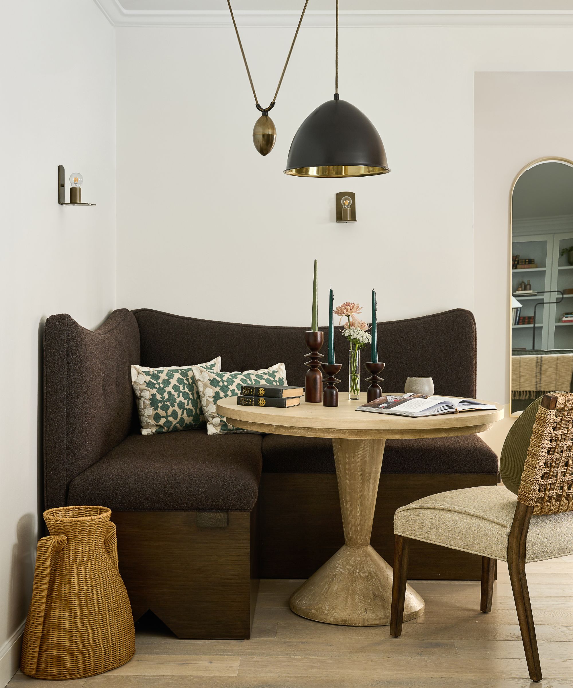
'The living room was awkwardly long, so we carved out a corner game table area for the kids to eat breakfast at while they watched cartoons, for the parents to work from, for family game nights. We took inspiration from brutalist furniture designs to inform the custom corner banquette that our local workroom built for us and pulled in a brown eggplant colored boucle fabric to continue to push that rich earthy color palette from the painting.'
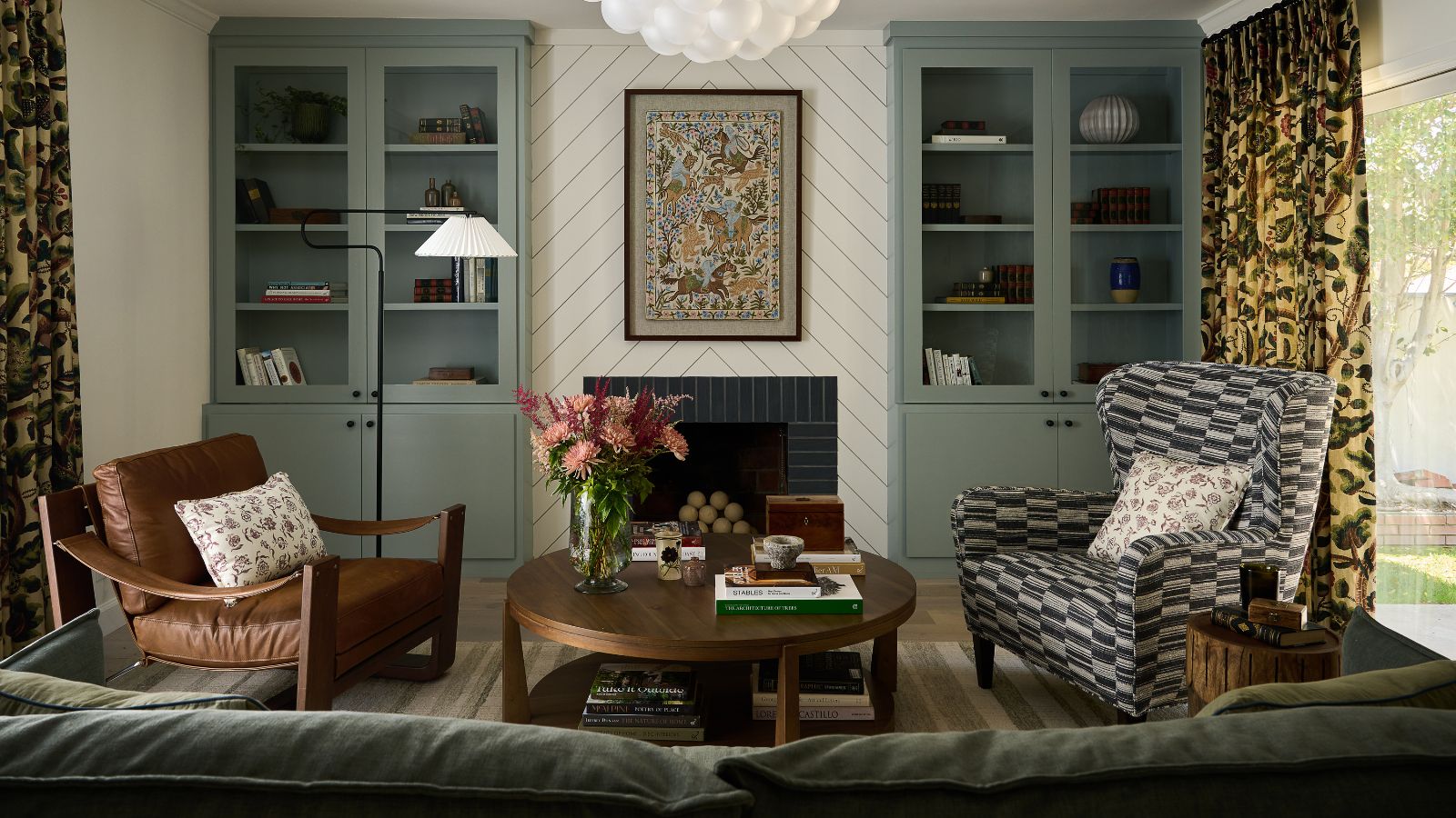
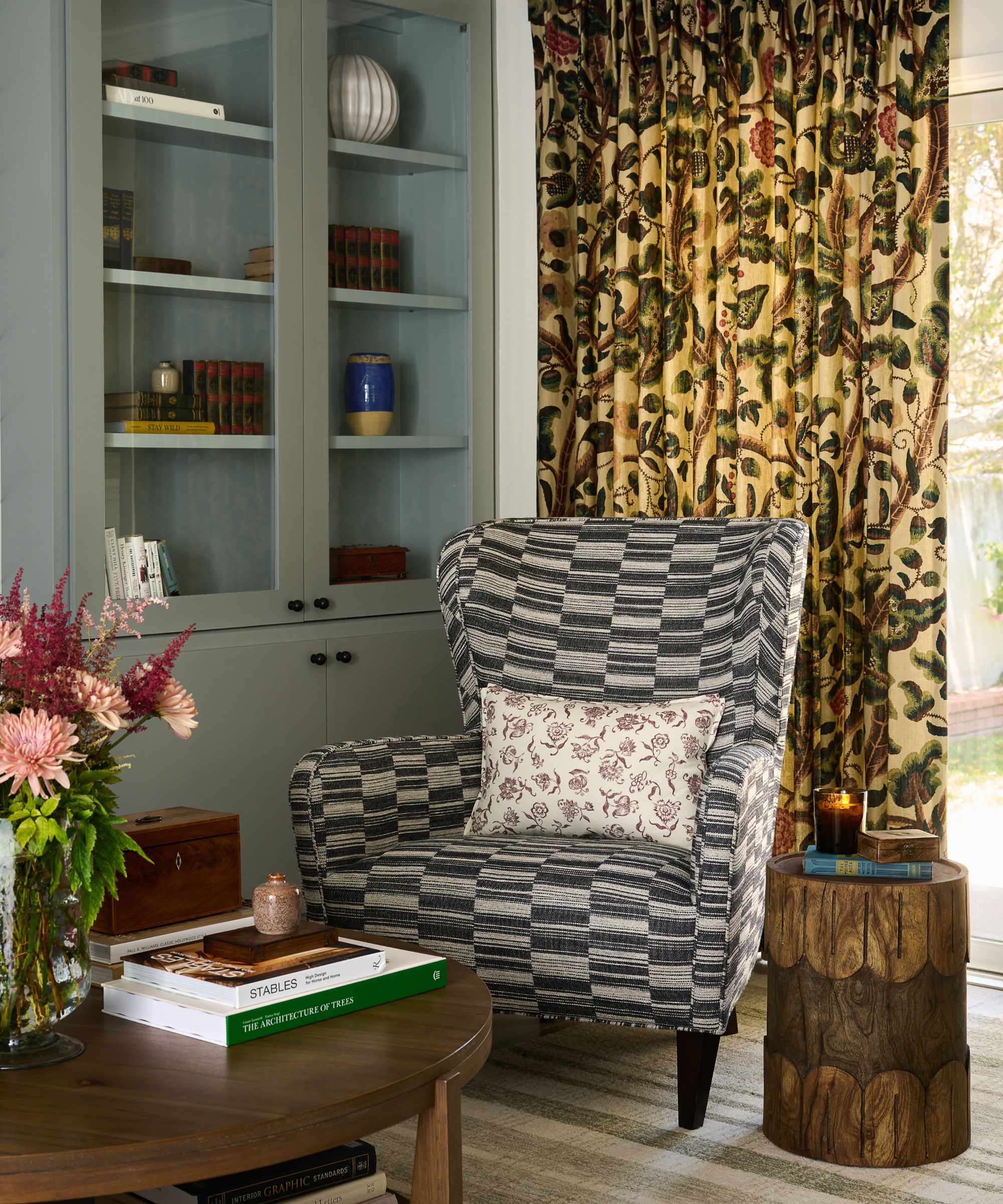
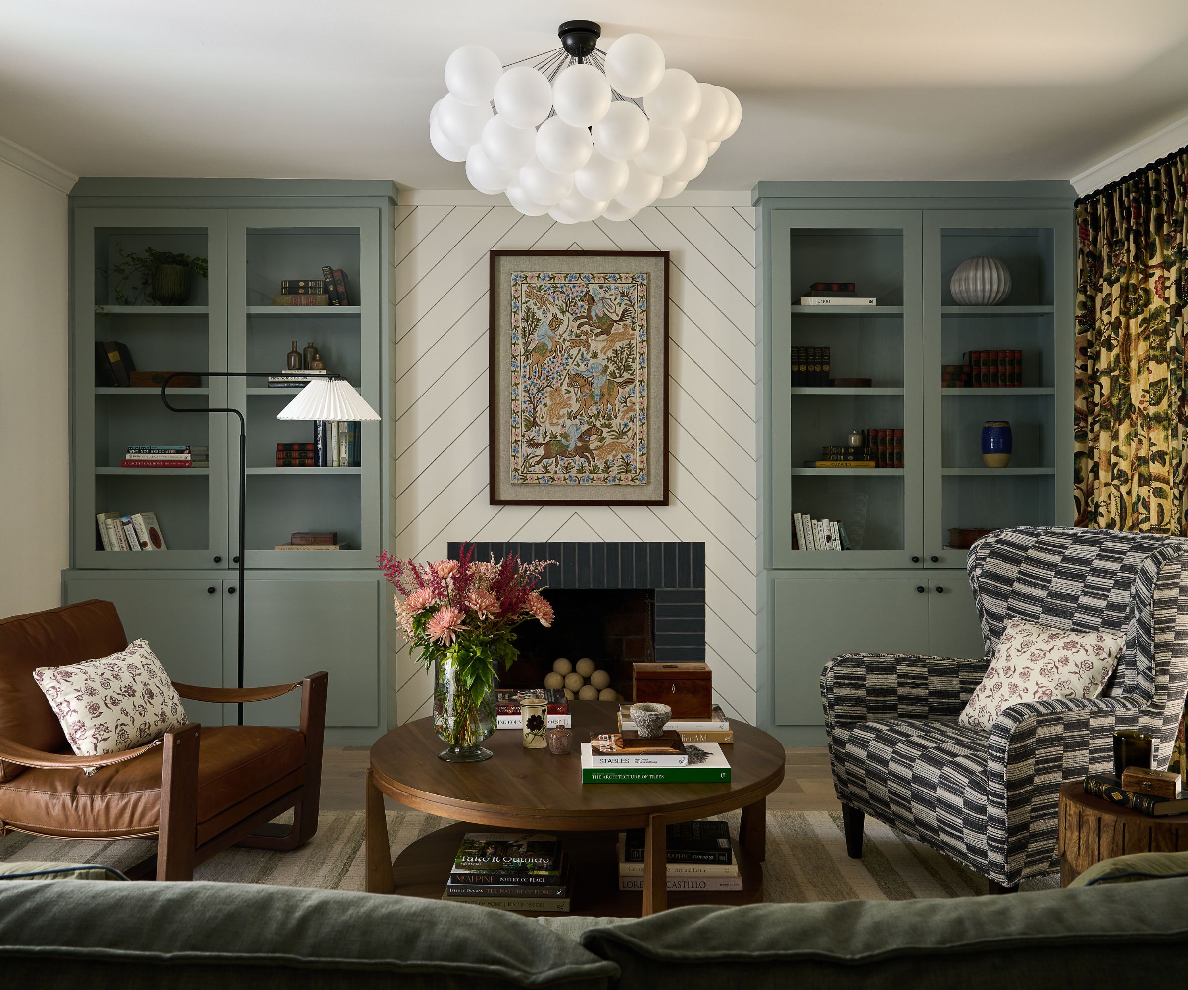
'We love designing living rooms because of all the opportunities for pattern mixing. Working from the antique-find painting’s palette, we immediately fell in love with Claremont’s tree of life pattern for the living room curtain panels. It has those same jewel colors with brown undertones as the painting and the large scale immediately helped transform what felt like a rather boxy space into something a bit more fanciful.'
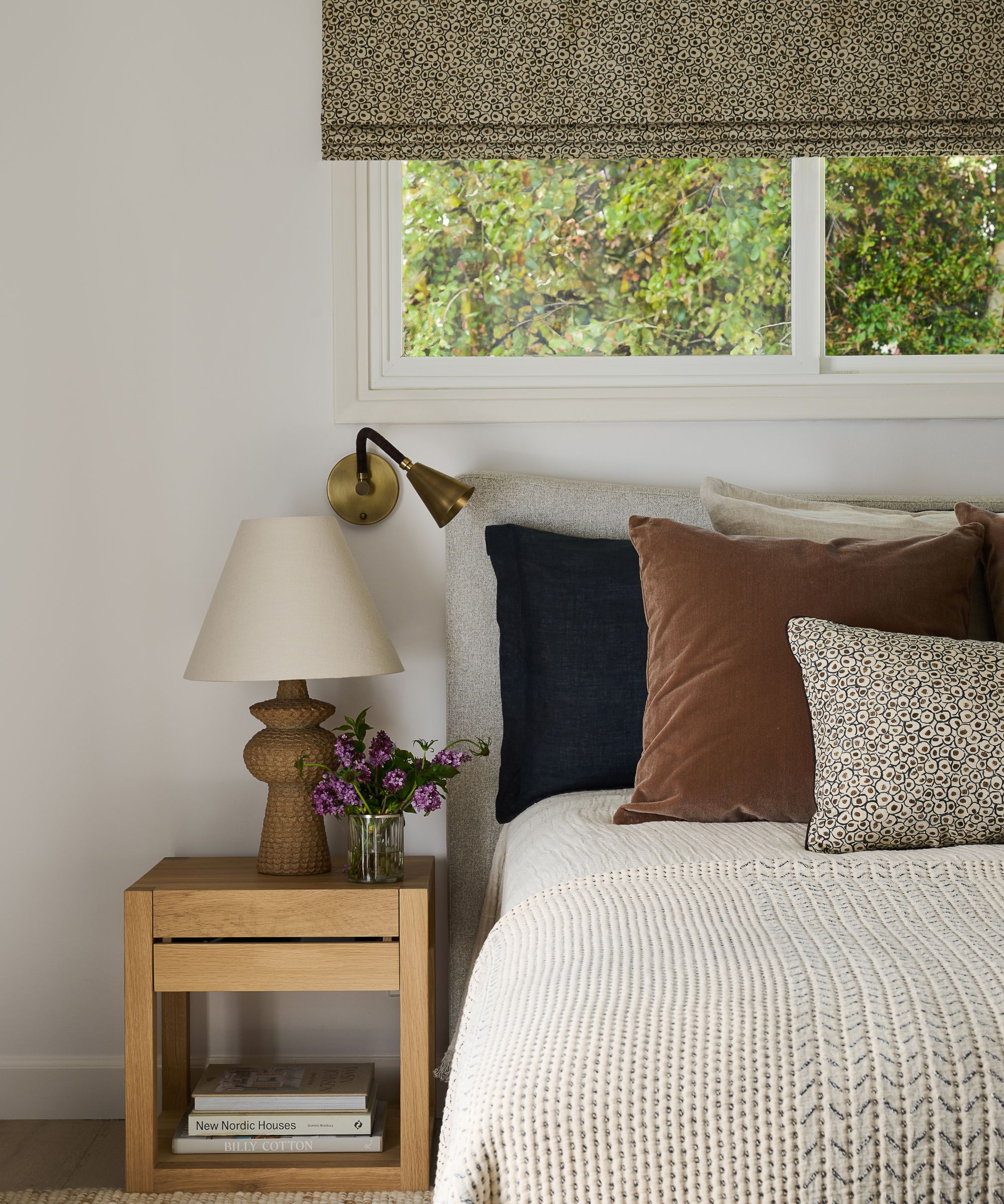
'We paired these richer, earthier tones with fresh white gallery walls, which is a very Californian way to go, to make sure we had that mix if English countryside meets California. Then we pulled in olive greens that mirrored the eucalyptus trees outside and dark brown woods and leathers with a touch of mid-century to infuse a bit more of a Californian professor feel into the space, if there is such a thing!'


