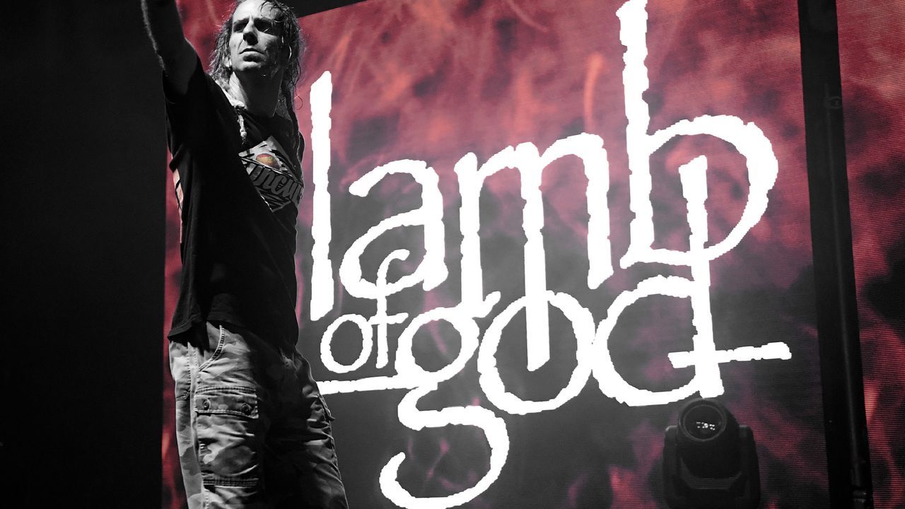
Metal band Lamb of God has retired their iconic wordmark logo after 22 years of action, ushering in a fresh modern era. Comparing the old design to a "falafel restaurant menu," it seems the band had outgrown the logo, calling for a modern revamp.
While the band seems happy with the upgrade, some fans were distraught by the change, claiming that the new design had lost the band's signature style. While new band logos are never going to please everyone, it's surprising to see how nostalgic fans are for a little bit of Papyrus font.