When it comes to brand slogans, few are as familiar as Kit-Kat's 'Take a break'. The line has given rise to all sorts of ingenious branding concepts over the years, from lockdown posters to a dig at AI. And now, the slogan is taking up residence on the iconic Kit-Kat logo itself – in visual form, at least.
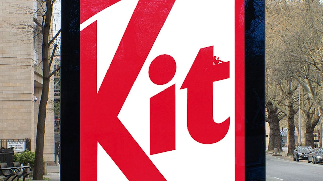
Titled 'Little Breaks', Kit-Kat's latest delightful print campaign features tiny characters nestled in various corners of the Kit-Kat wordmark, depicted in the act of taking a break – reading, strumming a guitar, etc.
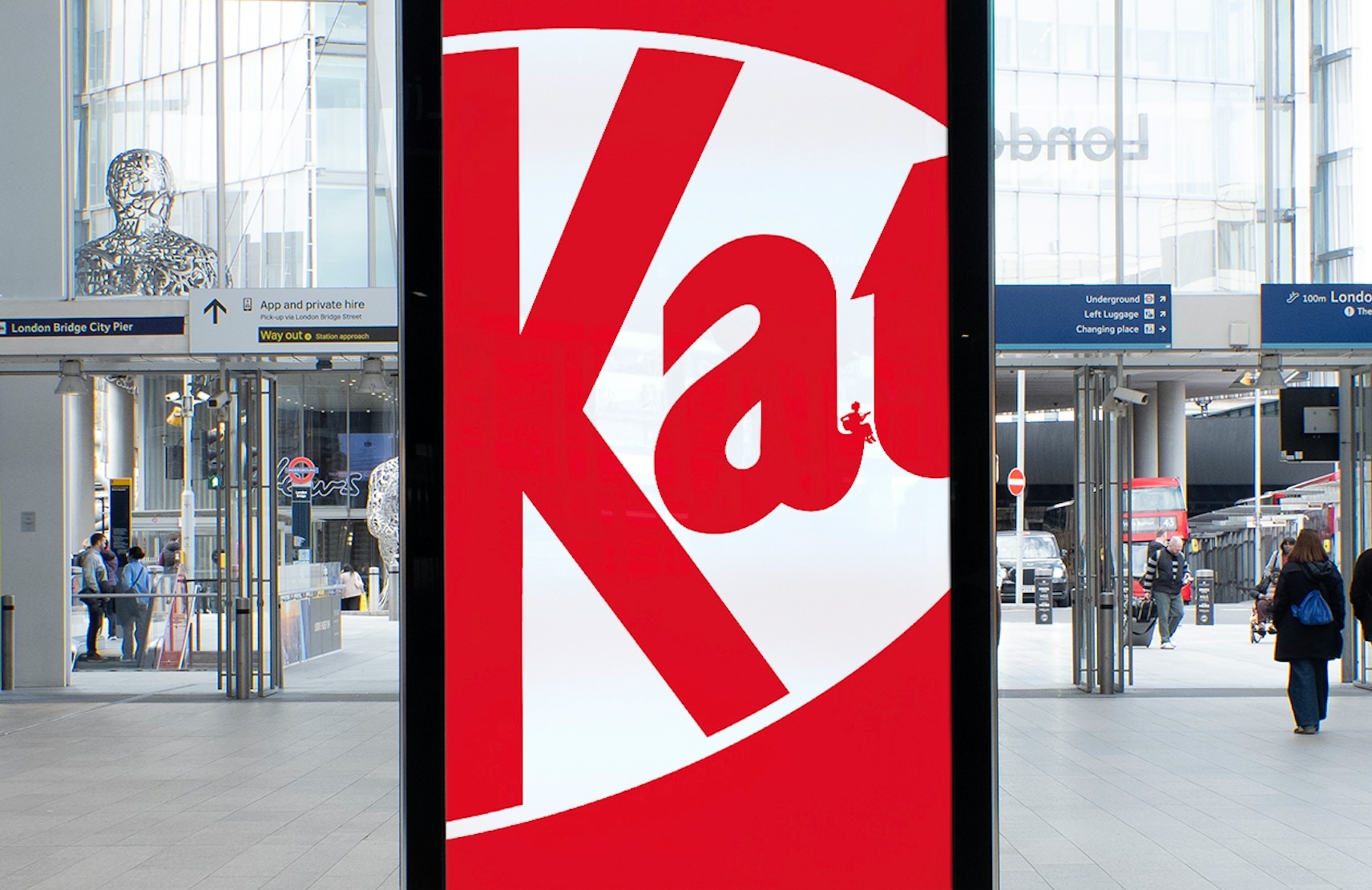
Created by creative agency VML, the campaign is a testament to the iconic nature of not just one, but two elements of Kit-Kat's brand identity. The close crops on various details of the Kit-Kat wordmark are hardly going to cause viewers trouble in identifying the brand – that bright red logo is famous enough.
And it was a smart move not to spell out the concept by slapping the text 'take a break' on these ads – plenty will be savvy enough to make the connection.

Indeed, Kit-Kat has been on strong form when it comes to viral advertising lately. The brand's response to the recent Kit-Kat heist was a masterclass in turning a potential PR disaster into marketing gold.