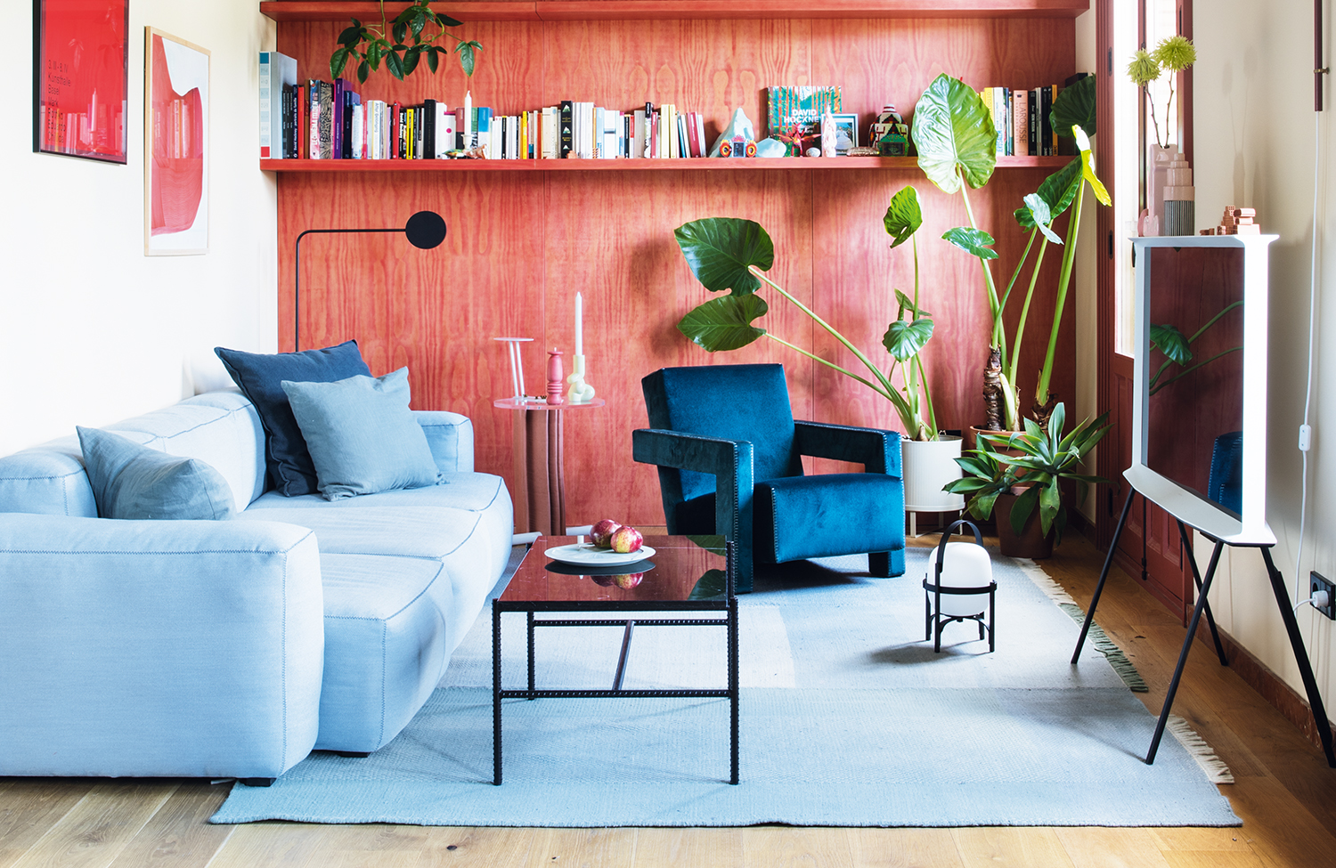
It can be tempting to go neutral when space is tight. But actually, by getting the ratio of bold to pale colors just right, a small living room can become an impactful and vibrant space, full of personality and charm.
Livingetc's resident color expert Ruth Mottershead - who is also the creative director of Little Greene - knows the perfect formula. Based on this example of a bold red and pale blue living room by Spanish creative studio Plutarco, the trick is in the split between bright and calm, in matching tones and finding the right pigment. She explains how it's done.