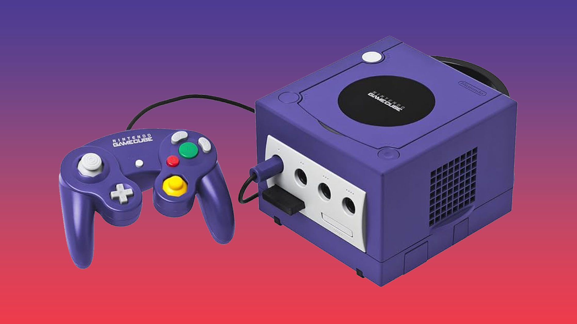
Video game console branding isn't always the most exciting, as proved by the recent Switch 2 logo (what a yawn, right?). But there's one logo that keeps coming back into discussion because of it's clever design – the Nintendo GameCube logo. It's not one we haven't covered before, but its design is blowing minds again so I thought it was time for another deep dive.
Created alongside the purple box that is the GameCube in 2001, the GameCube logo has got it all – a G, a C and a cube, all packaged beautifully into an optical illusion. It looks so 3D it's delicious – and certainly in contention for one of the best logos ever.