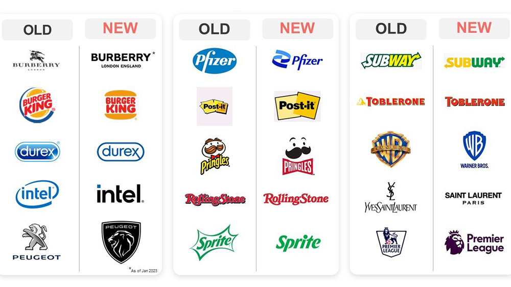
Anyone keeping an eye on logo design over the past few years may have noticed a certain trend. Logos have been getting simpler, flatter and more minimalist. For many, this makes sense. A simple logo is easy to recall and it has the flexibility to work in small digital uses such as in favicons and app icons.
But this logo design trend may have some downsides for branding, it turns out. New research warns that "debranding" – stripping away elements that made the brand unique and recognisable – may be turning brands into 'blands' (see our guide to how to design a logo for tips on developing your own designs).

It's not the first time that the minimalist logo design trend has been questioned. We've explored before the question of whether all logos are starting to look the same, concluding that, actually, logos have always 'looked all the same' to a degree (just look at the elaborate script logotypes of the 19th century).
But the brand asset research company Distinctive BAT has carried out a test to explore how people react to the current reductionist approach. It surveyed 750 UK consumers on a clutch of old and new logos with the brand names removed. It aggregated the results of three metrics: asset recognition (how many people recognise the logo) brand attribution (how many people attribute it to the right brand) and misattribution (how many people misattribute the logo to a competitor)..
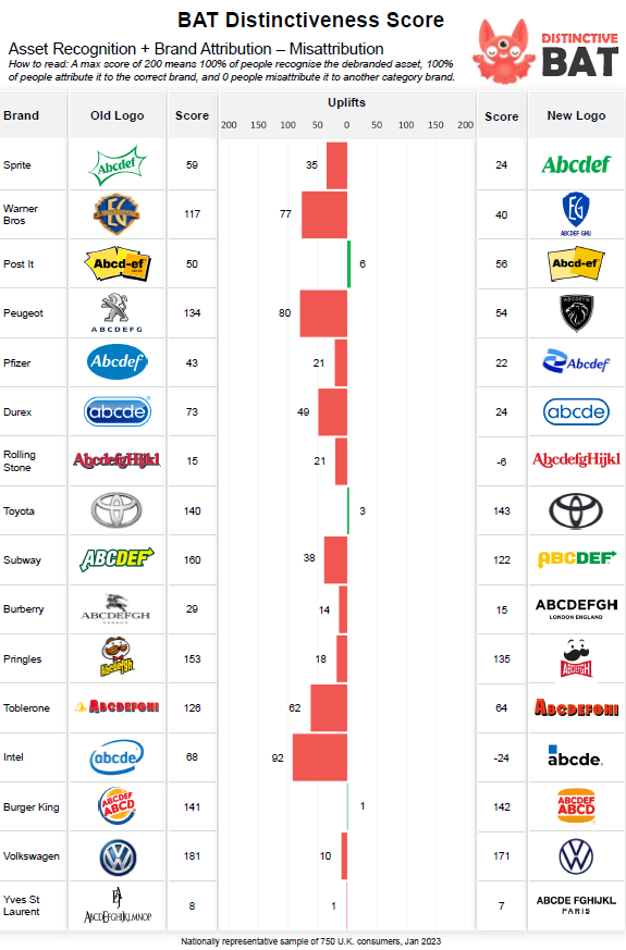
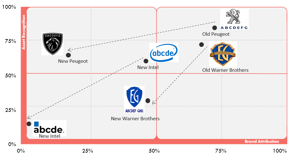
The results show a negative effect among brands that removed major elements of their branding – for example, Peugeot, which reduced its famous lion to just its head, Warner Brothers, which flattened its legendary monogram, and Intel, which removed its circular swoosh.
Meanwhile, new logos for Toyota, Burger King and Post It actually resulted in improved in brand attribution. Distinctive BAT suggests this is because although they simplified their logos, they enhanced the elements that made the logos distinctive in the first place. The Toblerone logo was also found to have maintained important equity, in this case, the Matterhorn mountain (now a generic mountain).

Distinctive BAT warns that the results show that "while some of the new logos on the market are aesthetically more appealing, many of them throw the baby out with the bathwater”. Head of strategy Cathal Gillen believes that while the most common reason given for simplifying a logo trend is the move to a mobile-first approach, design trends are also at work.
"Designers draw inspiration from other designers, and, c’est le vie, a trend develops. In recent years, the fashion industry has seen a strong shift toward minimalist sans-serif logos," he says. "Another reason is that marketers are doing what we do best: changing things up although this isn’t always necessary!”
Recommendations for logo redesigns
All logo redesigns will disrupt consumer memory structures, but the extent to which a logo design diminishes brand recognition and attribution can depend on how far it strays from the original – and how legible it is (we're looking at you, Kia). Time, reach, and money can help bring a new logo’s score back up, but Gillen warns that the biggest disadvantage is the lost opportunity to embed additional branding assets (like Intel's circle swoosh, Microsoft's four-colour window or Adidas's three stripes).
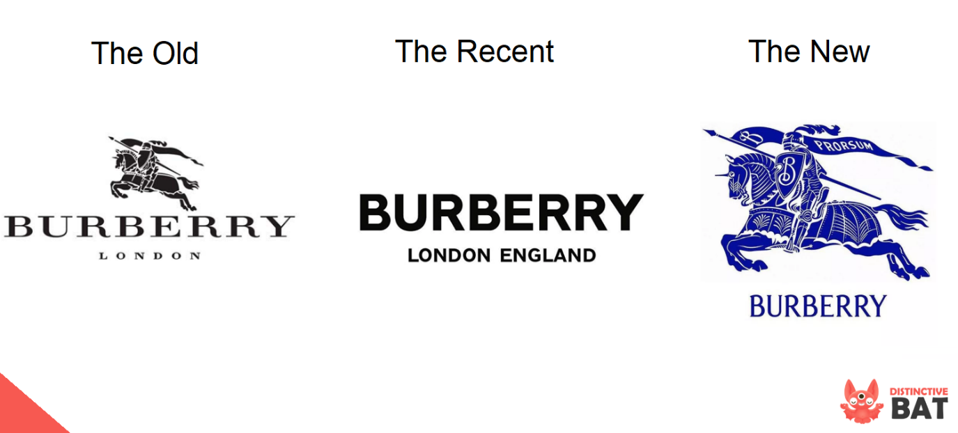
Distinctive BAT recommends treating a logo as an embedding vehicle for this kind of additional branding device that can then be used in other ways. Burberry seems to have recognised this, bringing back the Burberry knight, which it had previously dropped in favour of a minimalist sans serif logotype.
The company also suggests that it's vital to understand what makes the current logo distinctive and to amplify that feature, suggesting that small adjustments can answer the brief without having a major impact on consumer memory structures. Finally, it warns against following design trends and copying other brands.


