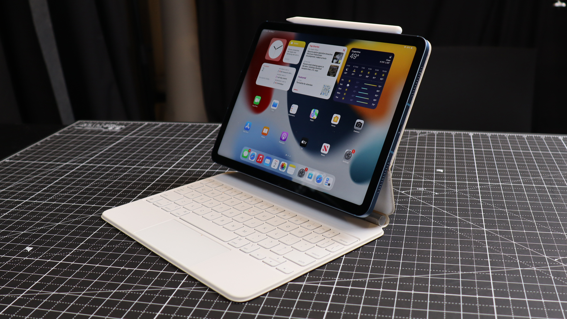
On May 7, Apple will likely tear the wraps off a bunch of new iPads, ranging from new OLED iPad Pros to larger iPad Airs, at its "Let Loose event". It's been too long since Apple updated its tablet line but perhaps that's because not much needs changing. In truth, I love my iPad Pros, Airs, and minis almost as they are, though I have some notes and, more specifically, some requests for these new iPads.
A curved or waterfall back
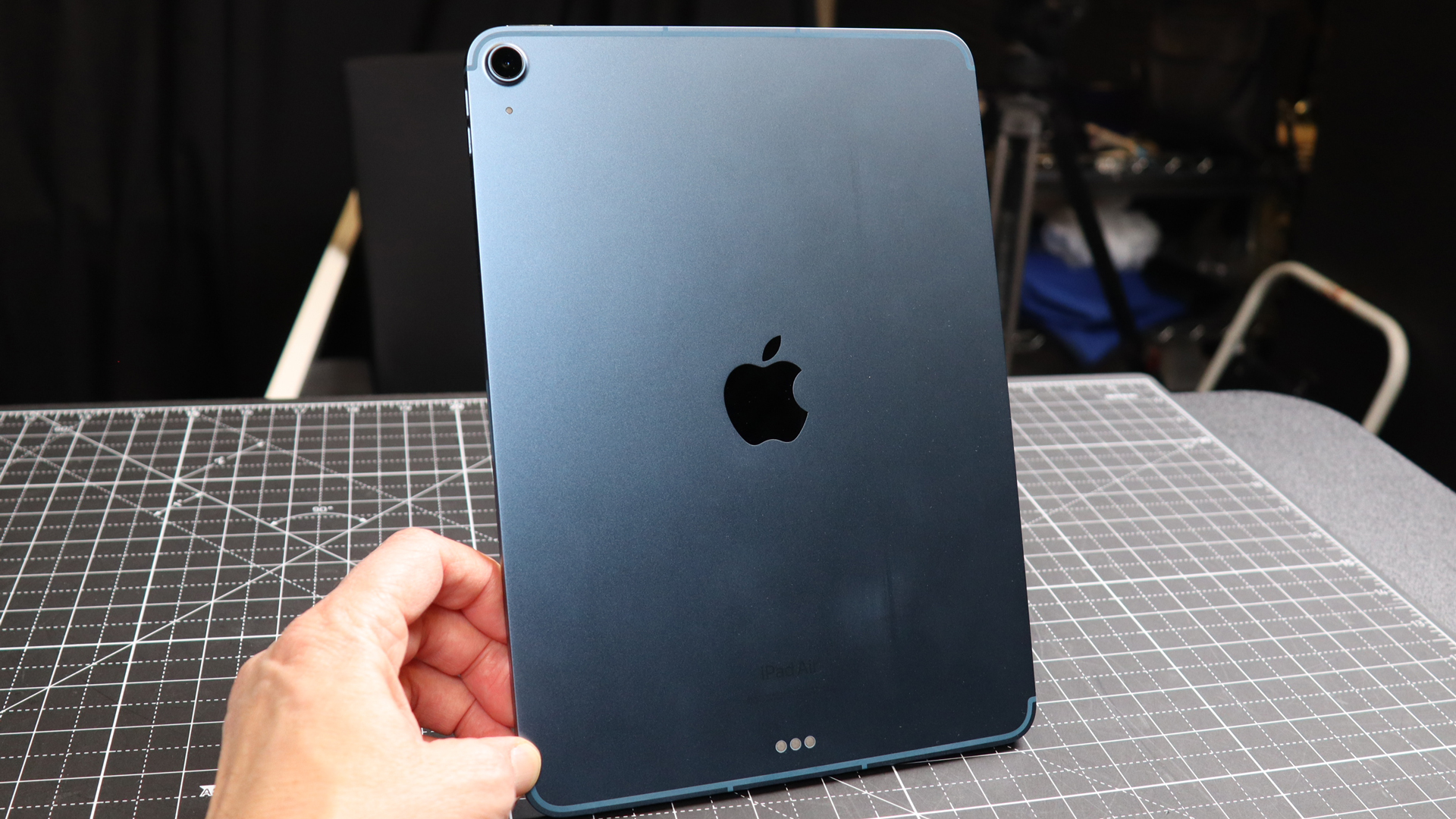
At 6.1mm, the iPad Air is incredibly thin and yet never feels flimsy. Weighing just over a pound, it feels good in the hand. Still, if I had my way, I would bring back the curves, or, more specifically, introduce a waterfall back to remove or at least soften the sharp edges and make the iPad significantly more comfortable to hold and even rest in the curve of your arm or on your lap.
Such a redesign would also be a nod to the iconic original iPad design. It also has the edge around the back, but there was also that curve that made the device look and feel friendlier.
Shrink the bezels
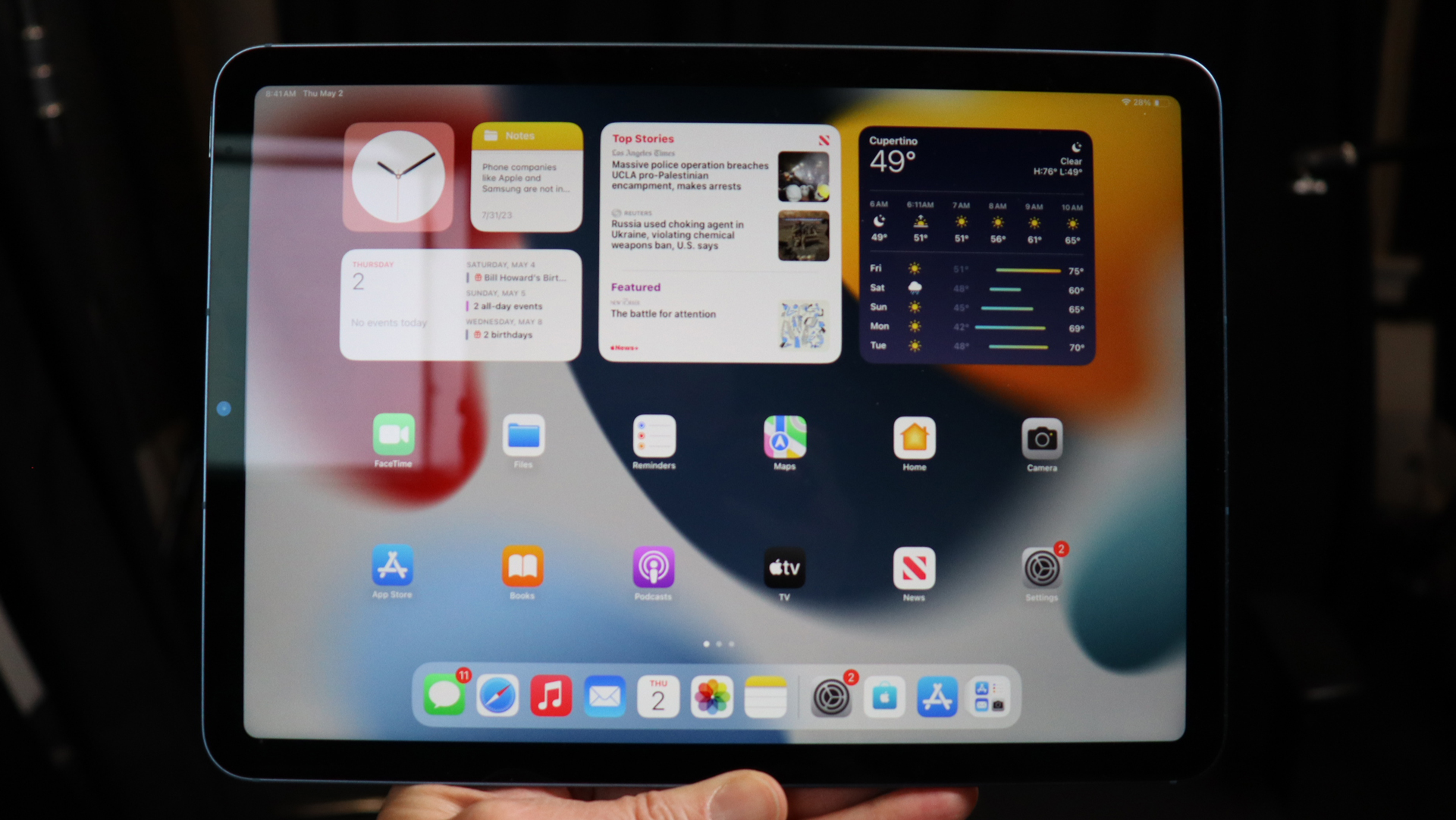
The iPad has come a long way since the nearly inch-wide black bezels surrounding the first iPad screen but I think Apple can go further. The current iPad Air's bezel is still noticeably wider than what you'll find on the MacBook Air 13-inch.
On the new iPads, I'd like to see bezels that can be measured in a few millimeters. Give me, Apple, as much drawing real estate as possible. If you must, go ahead and introduce a notch similar to what exists on the MacBook Air. I'd appreciate it if you made it smaller but I can live with the cutout if the end result is more screen. I would also accept a punch-hole camera approach.
What I really want, though, is a Dynamic Island on the iPad; an update that would require both hardware and iPadOS changes. Just think of all the bits of information and interaction that could be delivered through that fungible, pill-shaped interface.
Move the camera
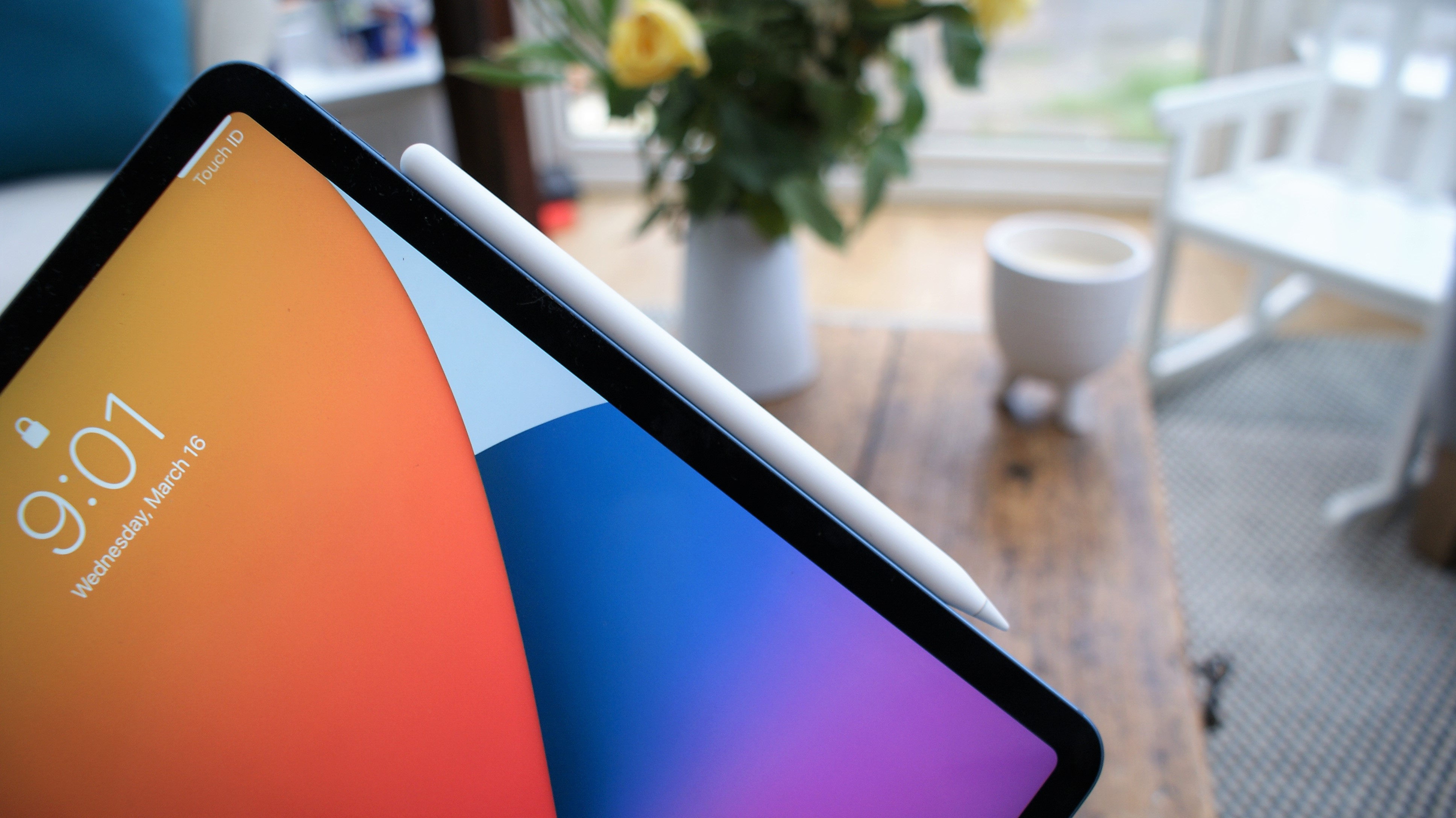
It's time for Apple to acknowledge how 99% of us use our iPads. We work on them, watch TV, play games, and FaceTime in landscape mode. The FaceTime camera has inexplicably remained on the short side for Portrait mode use. It's a legacy feature from when people first bought iPads and ran vertical iOS apps in 2X mode. If a FaceTime call came in, you'd just look up at the camera along the top edge.
iPadOS now has its own apps, and the majority of them are designed to work in landscape mode. When I conduct a FaceTime call, I'm always looking at the wrong place and sometimes cover the camera with my fingers because I keep forgetting the camera is on the short left side.
This is a simple and much-needed change. Apple, put the camera on the long edge – yes, right below where we dock our Apple Pencil – and let's move on from this legacy issue.
Wireless charging
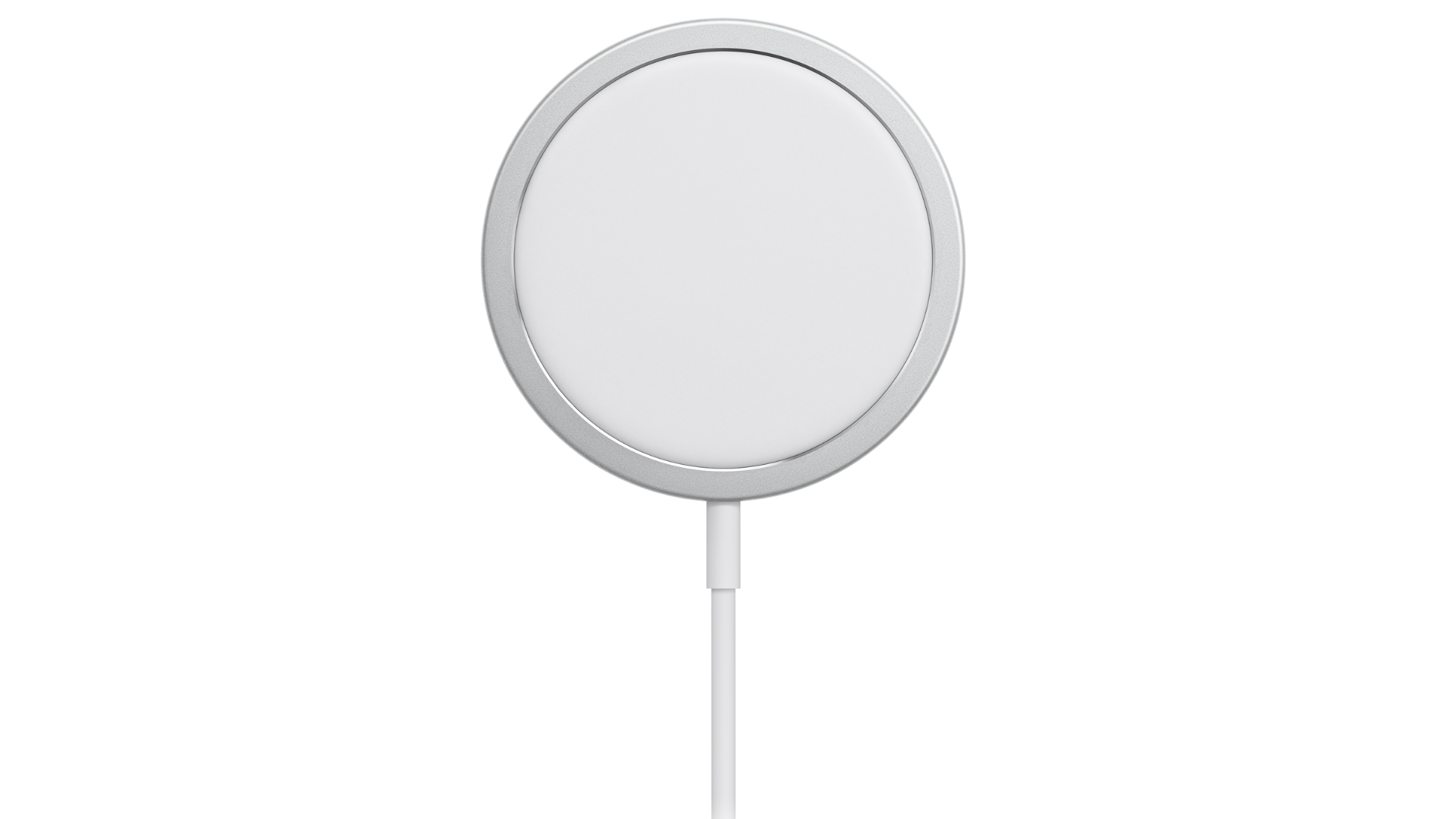
This is such a no-brainer and I have seen rumors that promise such a feature.
It's been 7 years since the iPhone line got wireless charging, and the Apple Watch and AirPods all arrived with it. It's almost inconceivable that Apple's other popular mobile technology still doesn't have it.
All I want is a nice MagSafe inductive charge ring on the back of every new iPad, from the Air and traditional iPad to the iPad Pro (and the iPad mini, if it survives). I don't think it will increase the thickness of any iPad.
Imagine the convenience of dropping your iPad on an iPhone MagSafe charger or, perhaps a new iPad MagSafe chargepad, one large enough to support the entire iPad back. Come to think of it, this could be a new Smart Folio cover.
A moveable dock
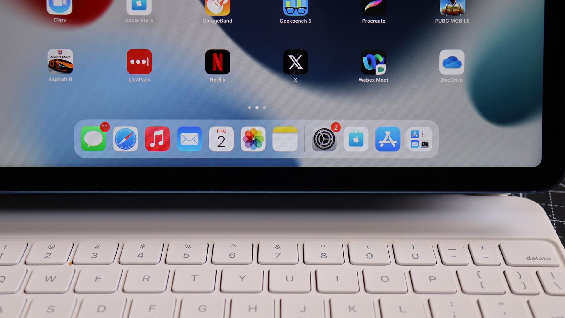
I keep my iPad Dock pretty clean, there are just a handful of go-to apps in there. This means it's never cluttered and can feel almost like an app widget. The problem is that it's glued to that one spot at the bottom of the home screen.
For the new iPad (I know, this is primarily an iPadOS update), I want the ability to move the dock from the bottom edge to the right or left side of my screen as a vertical dock.
It's not just that I demand flexibility – because I do – I think the dock might be more useful sitting next to one of my open apps. I also think that home screens should be less prescriptive and more adaptable. Such a change also fits with the home screen and lock screen enhancements Apple made in recent years to iOS and iPadOS
Bonus request

The modern iPad is so powerful that when paired with a keyboard it easily doubles as an ultraportable, touchscreen laptop. I like the Magic Keyboard Folio for iPad but I'd like it even more if the keyboard were on a slider so I could pull it away from the iPad screen. If it can also tilt up a bit to meet my touch, that would be even better.
It's not that I won't appreciate the new iPads if Apple doesn't do some or all of these things, but if it does, it'll nudge some of the best tablets on the market to near-perfection and who can argue with that?


