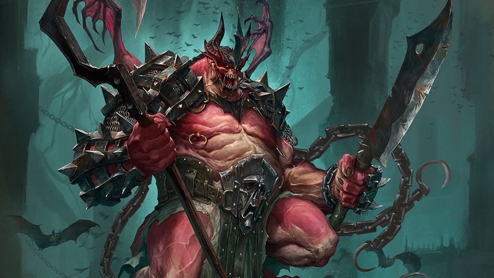
This is a character concept for Kimera Models, a miniatures brand for war game and hobby painters. I was commissioned to make a demon, similar to the mood and style of Blizzard’s Diablo saga.
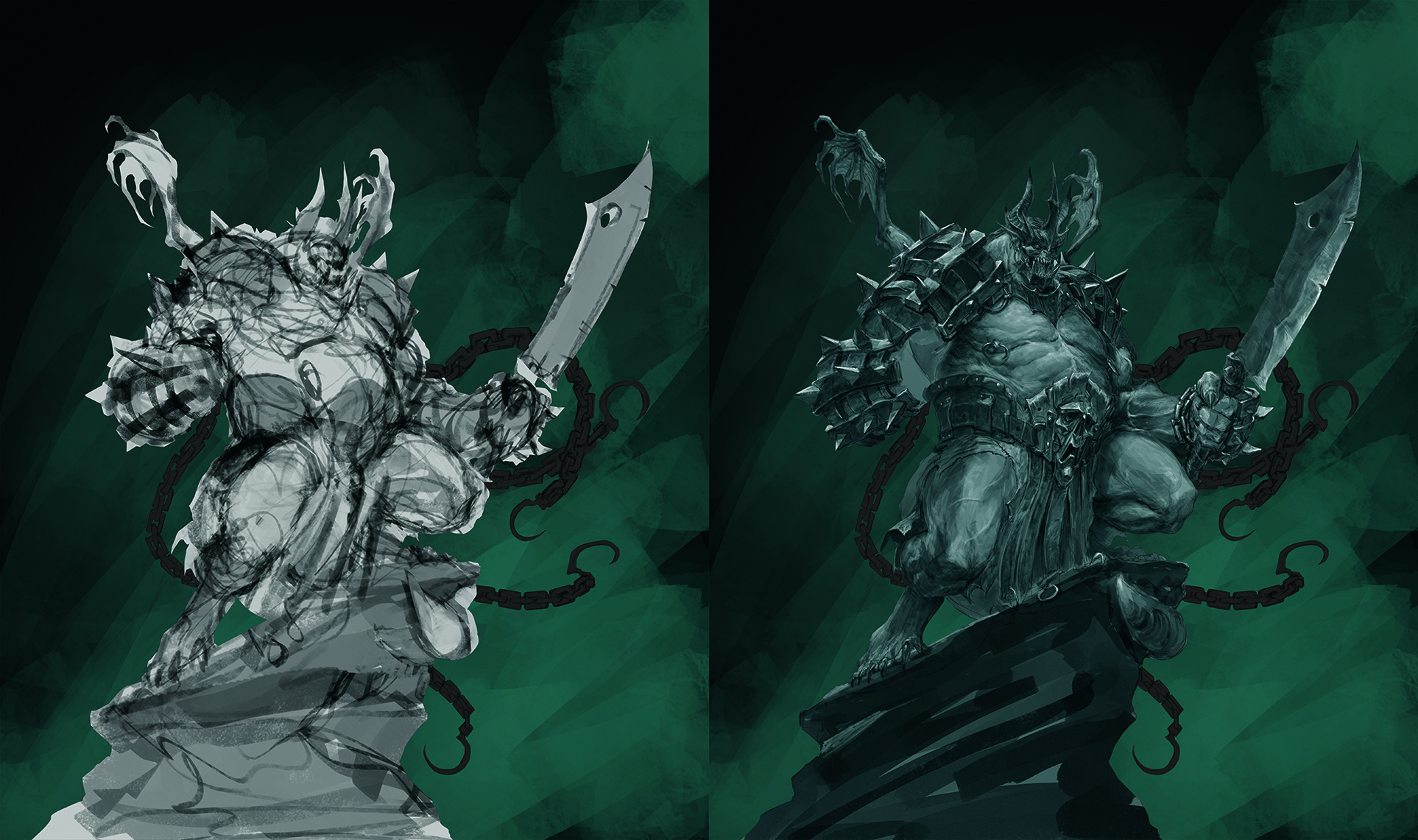
My process is quite simple. Although I use digital art software like Photoshop, I try to stay as close as possible to how I would work with traditional media. I usually use greyscales as they help me to quickly establish solid values and lighting. I then work on a Multiply blending mode layer, using black and white to build the main volumes with a very noisy brush.
You can achieve this by going to Brush settings > Color dynamics > Foreground/Background Jitter and increase this by 2-5 per cent). This will help your strokes look more traditional.
Once I achieve a solid greyscale, I use Color Balance to kill the greys and Soft Light layers to colour it, keeping an eye on the resulting contrasts by using complementary colours to make my design vibrant. The render stage is where I put all my attention on the details and shapes.
01. Ensure a strong sense of identity
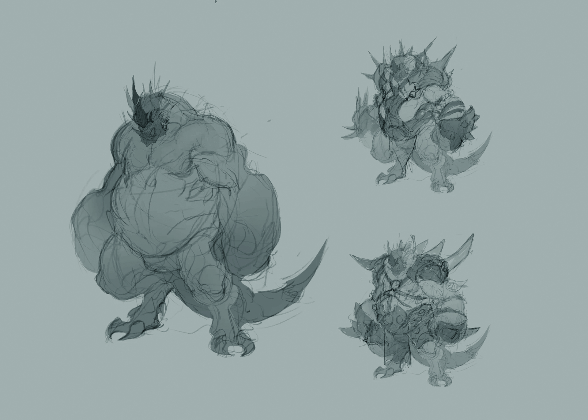
Initially, I focus on the shapes of the character with loose strokes. This achieves a freshness that will help with the pose by giving him a strong sense of identity.
Once I’m happy with the result, I start with the values. I like to work with a greyscale to quickly establish the volumes and lighting.
02. Adding colour
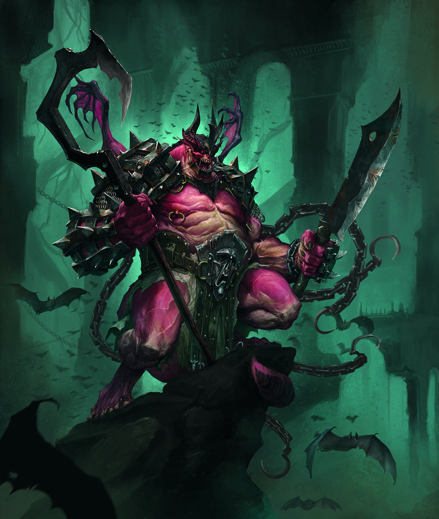
It’s time for the colours to do their thing. A Color Balance adjustment layer helps me to define the early temperature of the illustration.
I love to use complementary colours, so on this occasion I use a cool red, closer to magenta, that helps to lift the demon out from the turquoise background.
03. Establish the narrative
Once the character is fully coloured it’s rendering time! I just let myself go, focusing on materials, details and narrative. It’s fun to give the character some lore even though it’s concept art.
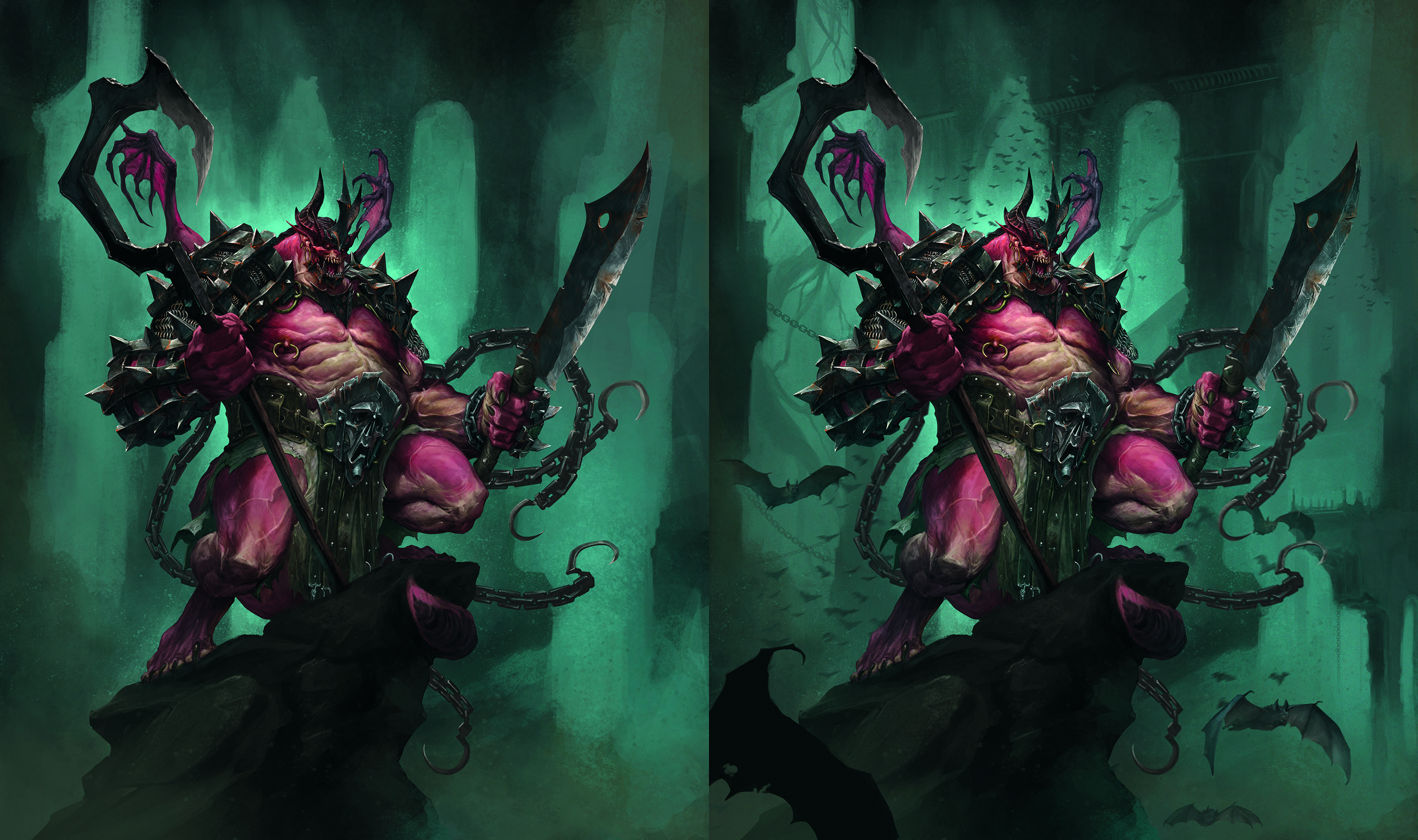
I don’t spend a lot of time on the background, and keep it loose. I don’t want it to steal the show!
This article originally appeared in ImagineFX. Subscribe to ImagineFX to never miss an issue. Print and digital subscriptions are available.
Need the tools?
Need the gear to create your own character art? See our pick of the best drawing tablets and the best laptops for drawing or check below for current deals on tablets we've reviewed.