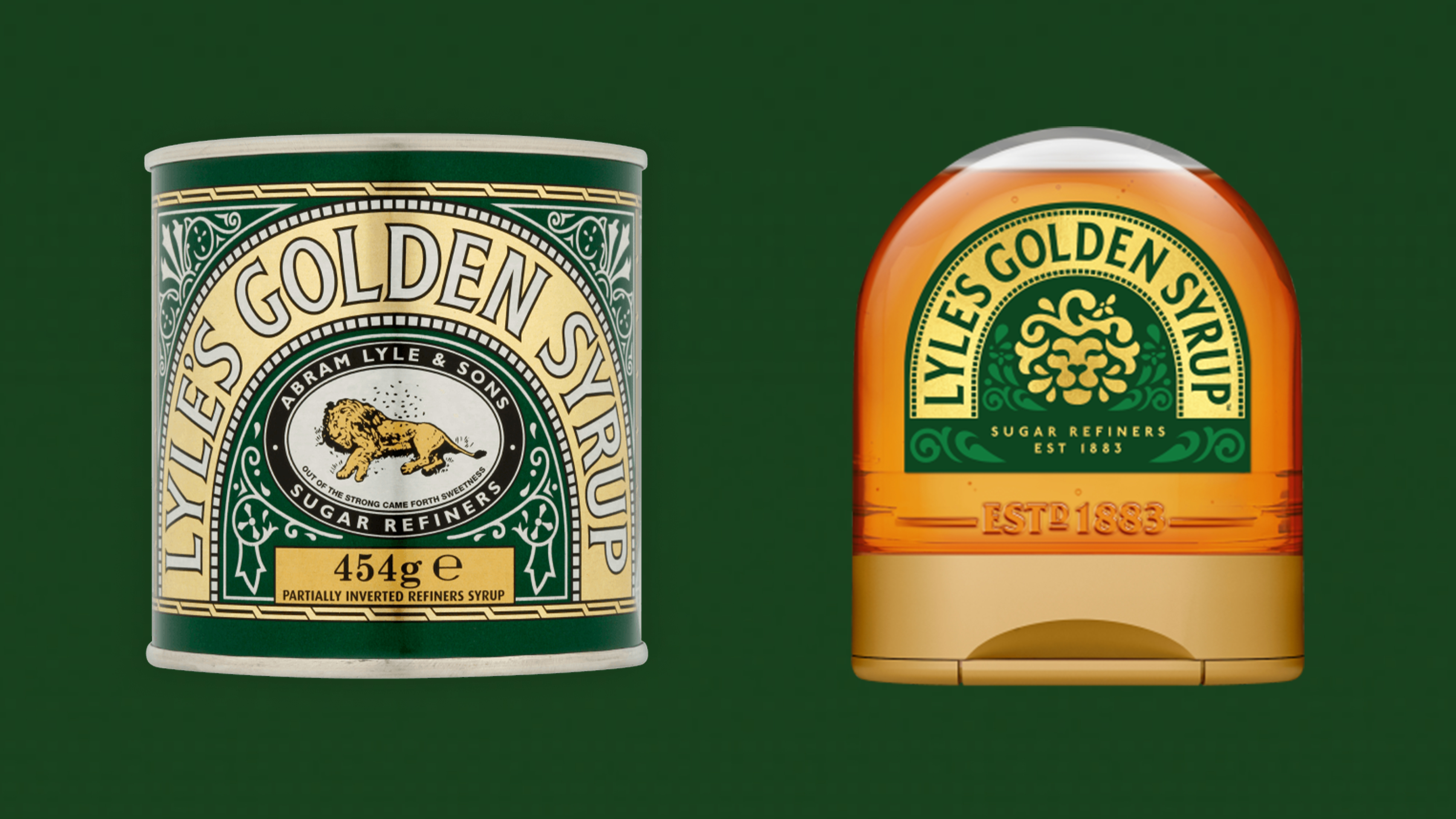
Brand heritage has been in the news lately, with the controversial Lyle's Golden Syrup rebrand causing many to lament the loss of a heritage brand (in this case, a dead lion with flies around it) and WHSmith choosing not to use some golden design from its archives, consisting of a beautiful brand icon (below), and instead going for a rather boring white on blue typeface, a choice which baffled many.
But how can brands get it right when using archival material? Can you ever go back too far? And what happens when brands overlook their heritage? I spoke to Karl Wills, creative director at Taxi Studio to get his top tips for using brand archives.